[divider] One key for a simple, elegant photo book is to have a few images – even just one photo – per page. Not every page has to have just one photo per page, but it is a great way to highlight photos and break up the monotony of page after page full of photos. I like to think of it as adding a deep breath to your photo book.
Even though it sounds really simple, one photo on a page – done, I wanted to prepare a design tutorial for you to explain there are actually quite a bit of options when it comes to having just one photo per page. Take a look at my examples below. Determine what you like and try them out in your photo book!
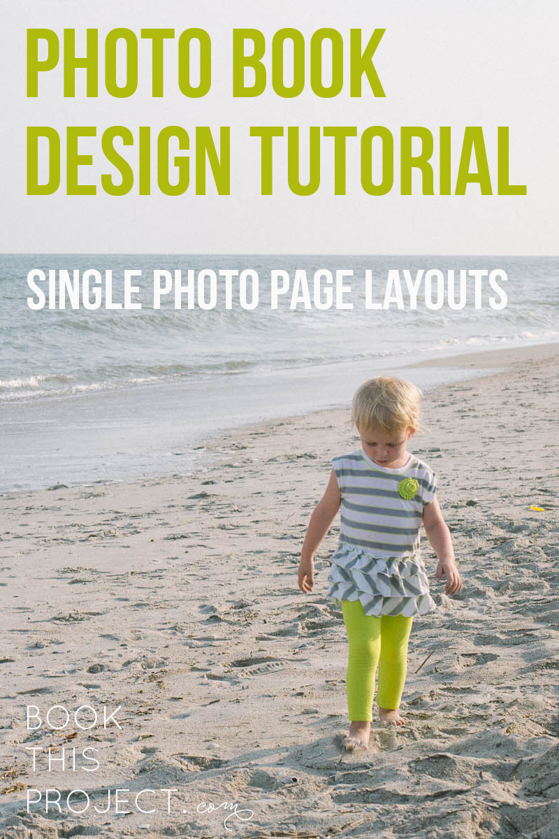
Let’s start with the photo!
[divider] Now the layouts!
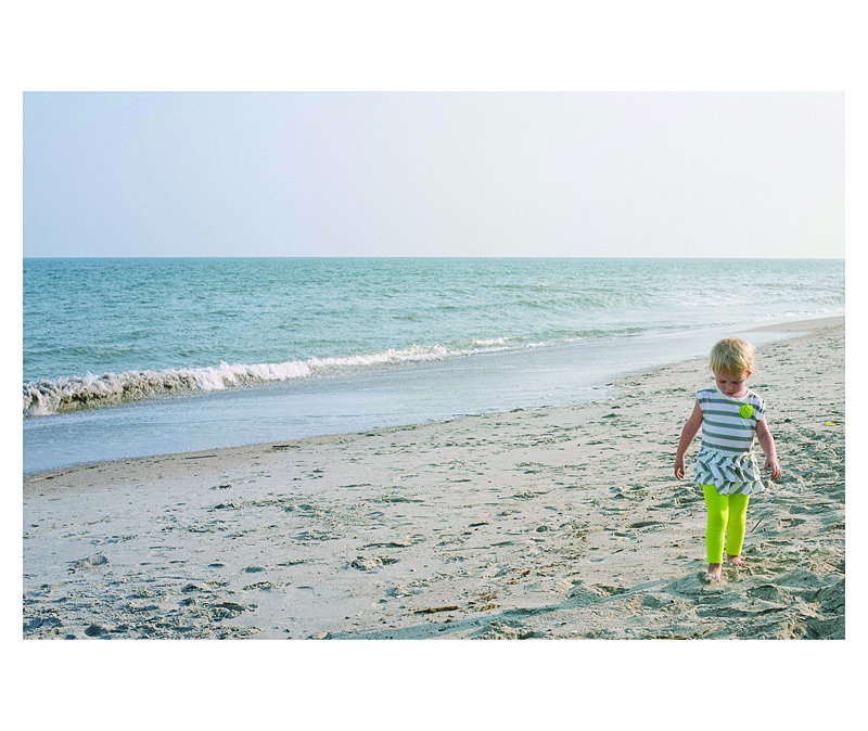
1 – Full Page Bleed
If you want your photo to extend off the page on all sides, this is called a bleed. The photo will have to be slightly larger than the page size to ensure when they cut the page, there is no white page at any part of the edge.
One thing to notice, this photo is a 2:3 crop but the page size is a 4:5. This means a portion of the photo will be cut off.
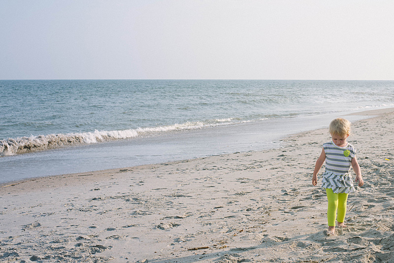
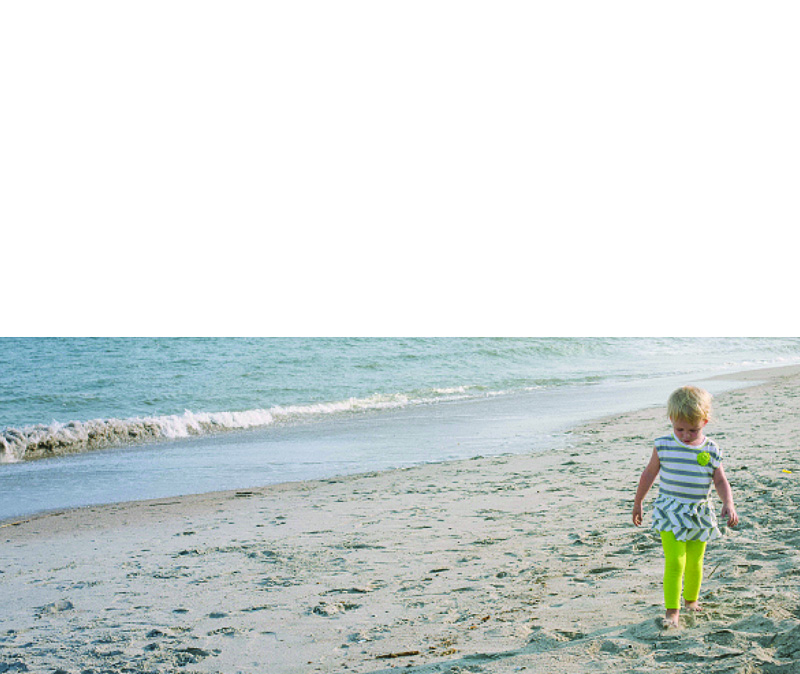
2 – Two Edge Bleed
Another option you have is to bleed the photo on one or two sides. With this option, you will be able to see the entire photo and you will have some white space on the top and bottom. If this was a vertical photo, you would have white space on either side of the photo.
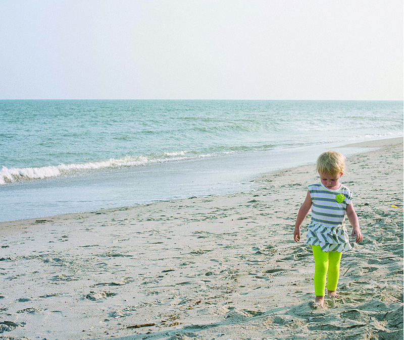
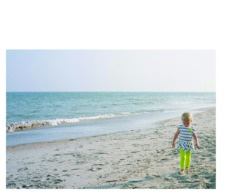
3 – Three Edge Bleed
In this example, I pushed the photo all the way to the bottom of the page so there is a three edge bleed. I also forced the top edge of the photo down to cut off the sky. I did this because the top edge is in center of the page.
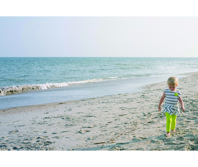
4 – Large Photo
This option is great if you want the photo to be large but not extend off the page, I recommend maintaining the 2:3 proportion as large as it will fill on the page with at least a 1/2″ margin. Center the image or if you have a designed margin, place the photo to this line.
5 – Designed Margin
If you have a designed margin, place the photo to this line. In this example, there is larger white space to the top of the image. This may look a little odd with one page, but if you are consistent and use this margin on a large number of pages, it defines the particular look you have for your book.
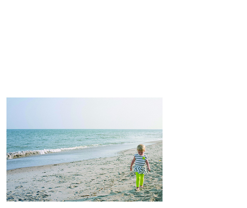
6 – Negative Space
You can make a large impact by reducing the photo and having a lot negative space on the page. This option may look best with particular photos but don’t be afraid to a single photo on the page small. Embrace negative space!
I hope you enjoyed these examples. Next month, I’ll show you how to add color to your single photo page layouts!


