Have you ever tried to capture motion? Every step of an activity? These provide for really fun design layouts in a photo book. I want to show you a couple of examples of photographs in a series in order to document the movement and energy of a task.
First, the photographs.
Burst mode:
Be prepared to take several photographs in quick succession. Some cameras have a burst mode. You press and hold the shutter and the camera takes photographs in a row until you release. Although I typically recommend shooting in RAW, when I use my point and shoot, RAW photographs took too long for my camera to process. If you find this is the case, switch to jpeg in order to get several photos in a row.
Subject matter:
Subject matter is key. Make sure the activity documents the event in a series of steps. It could be a sport – kicking a soccer ball – or – it could be the expressions within a given moment. The point of the photographs shows a beginning, middle, end in a very succinct moment.
The frame:
Consider the frame. In a successful series, the subject in the frame should be consistent in order to keep the focus on the activity itself and not the subject moving around the frame.
Second, the layouts.
In a line:
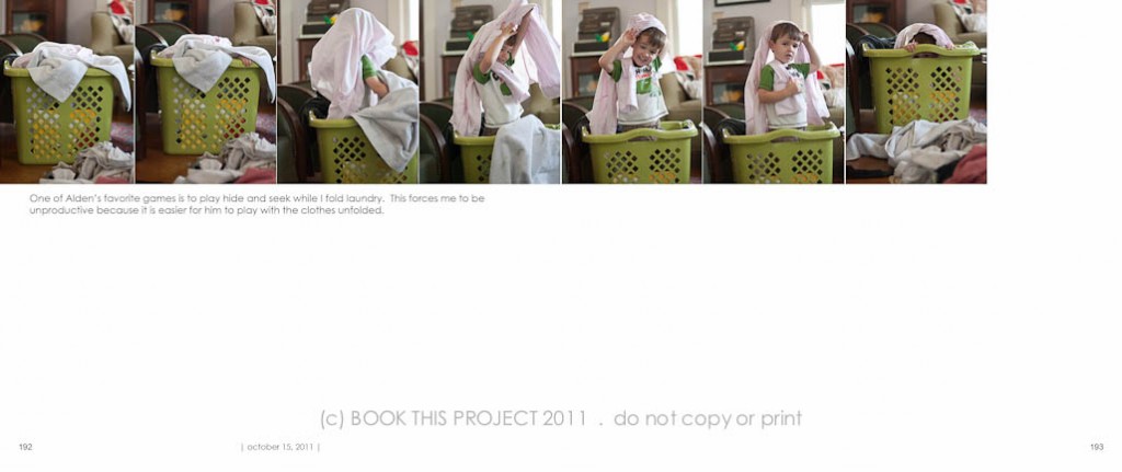
The key to the photo book design layouts, in most cases, is linear. To fully appreciate the action, it is best to see the photographs in a line. My preference is to keep a simple layout with the photo boxes the same size and same orientation (vertical or horizontal).
In a square:
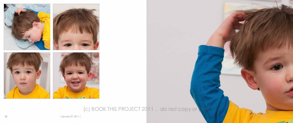
Even though a series looks fantastic in a line, don’t think it always has to follow this format. Consider arranging your photographs into a square format.
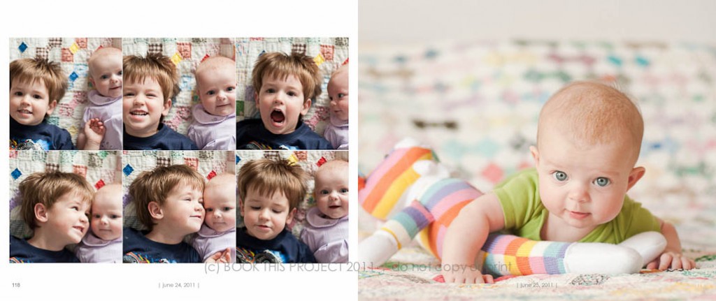
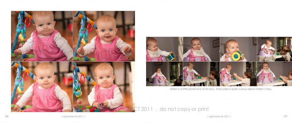
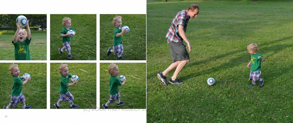
Above photographs copyright of Shumaker Family 2011.
Notice the spine:
Take note of the spine. The hardest part of arranging photos in a linear fashion across an entire book spread is the middle photograph; the photo on the spine of the book. A majority of the photograph in the center will be invisible in a book where the pages do not lay flat. In order to keep the subject matter visible in the book, increase the size of the photo book in order to position the subject within the visible guides. In the layout below, all photographs are the same size except for the photo in the middle. The width is increased in order to keep the subject visible on the page.
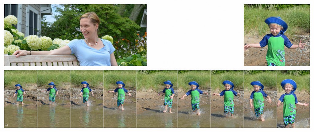 Above photographs copyright of Shumaker Family 2011.
Tell the story:
If your photographs tell a story but the subject is not consistent within the frame, make is apart of the layout. The example below illustrates my son waking up from his nap. His perfectly round face and puffy eyes are exhibited on the left. The unusual crop on the right focuses on his habit of twisting his hair when he wakes (or when he falls asleep)! This layout would not make sense as a line because it captures all different aspects of waking up. Preparing the layout in a square allows the viewer to pay attention to the moment, the story, rather than the sequence.
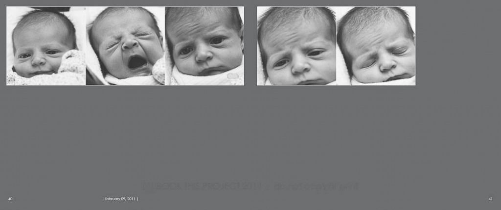
My original intention of these photographs was not to display in a line; however, I loved the raw documentation of sleep. The yawn! With consistent black and white processing, the photographs read as one to convey this moment. Even though the my daughter’s face occupies the frame at different scales, placing these photos in a line highlights the sense of time elapsing.
[divider]
Be unique:
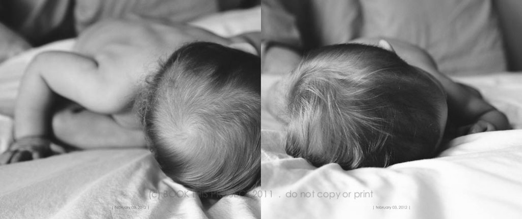
This final example approaches a series in a slightly different way. First of all, only two photographs are included. A full bleed is utilized to maximize the content. This series played with scale more prominently than action. My daughter loves to lean completely over while sitting cross legged. The photo on the left informs the photo on the right.
[divider] What activities have you shot in a series?
If you have an example, I would love to see a link to your blog post!

