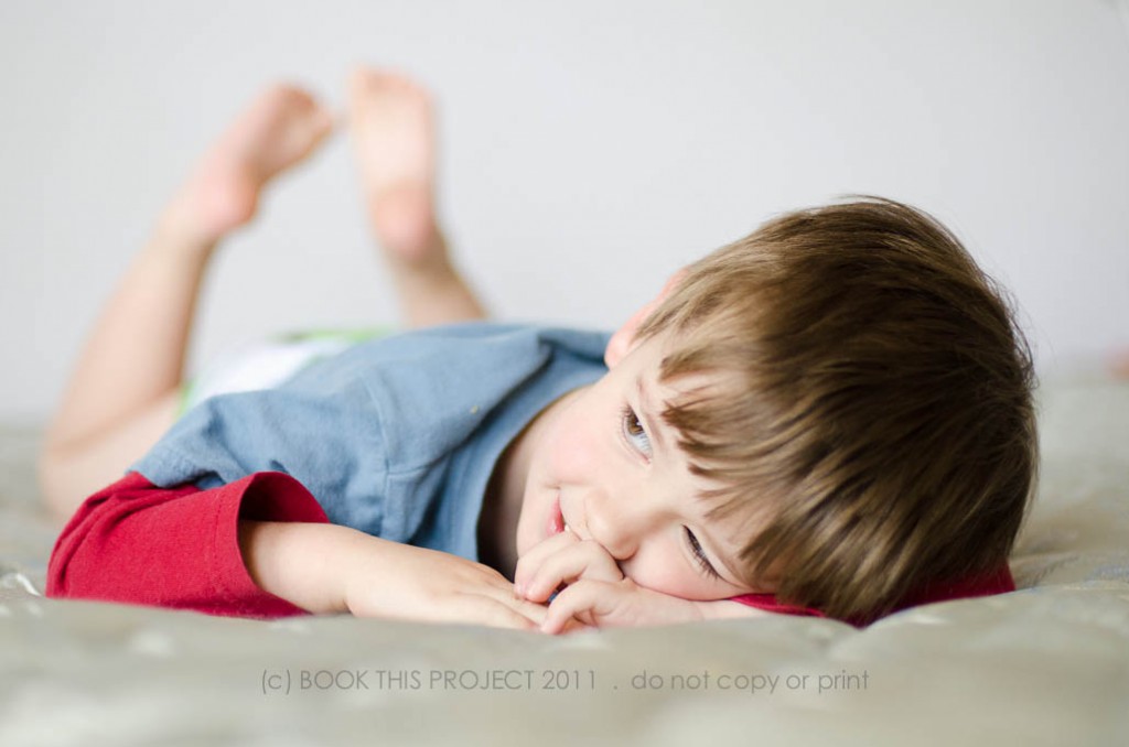
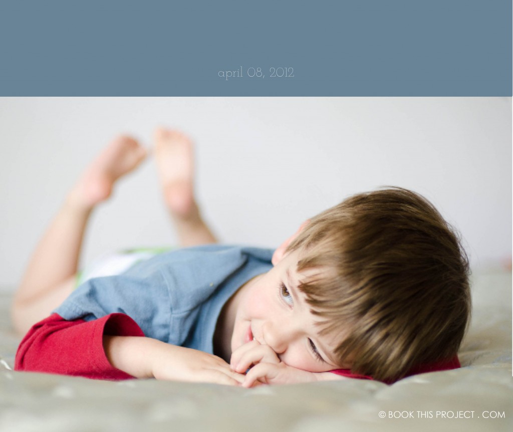
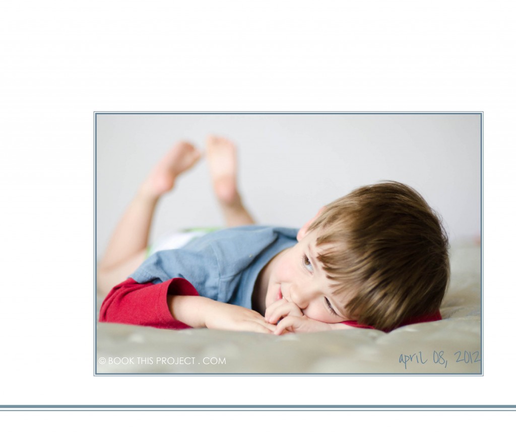
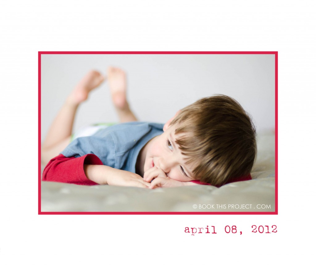
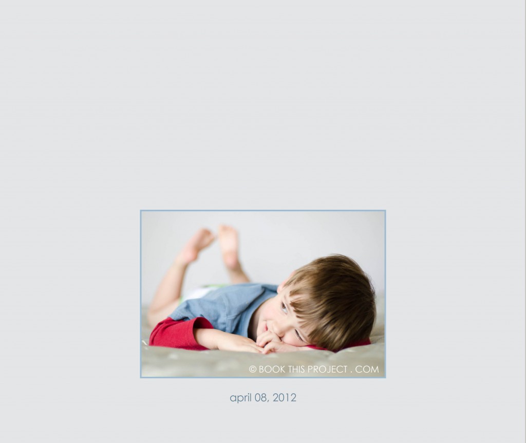
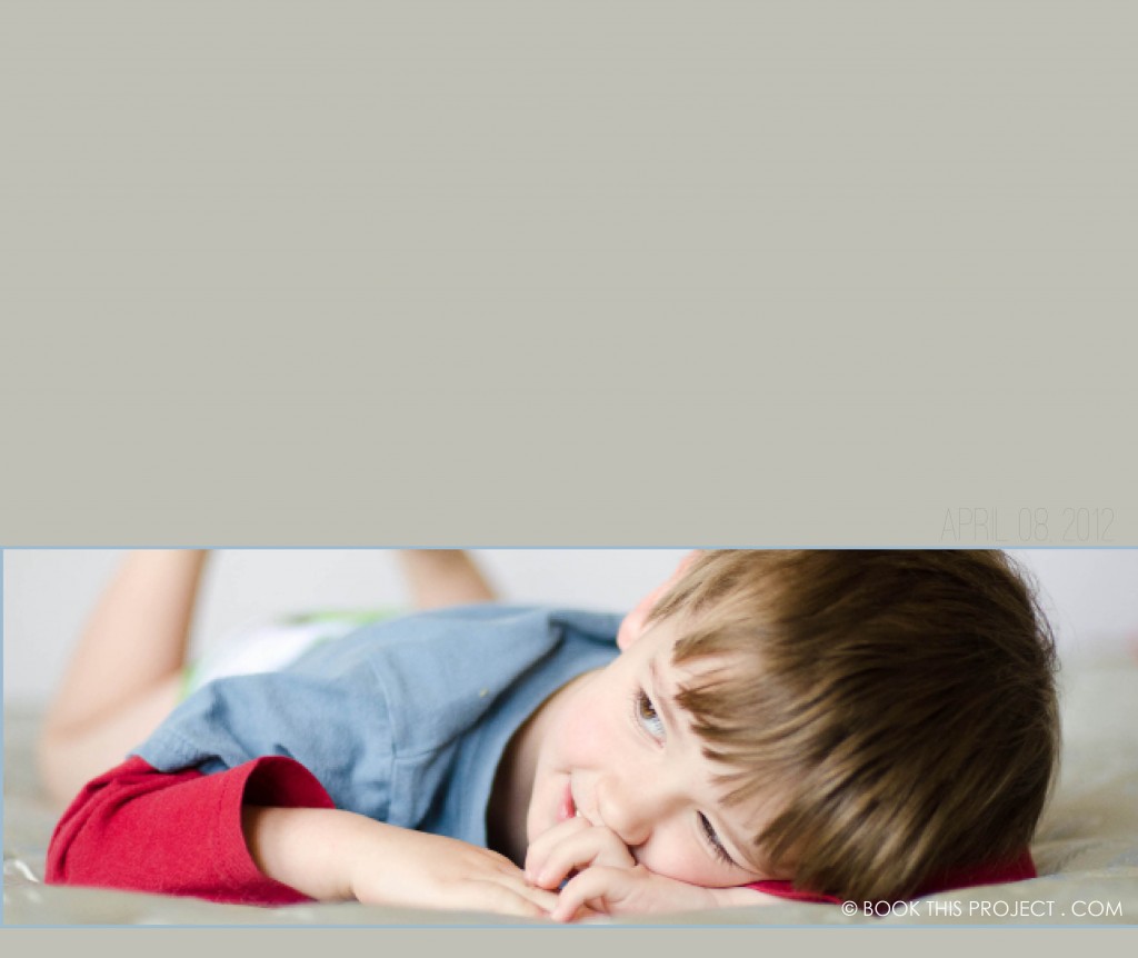
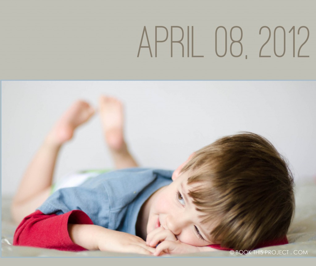
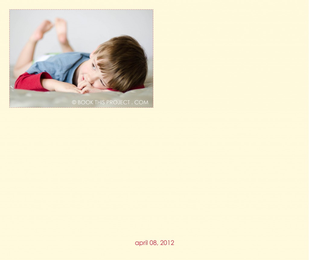
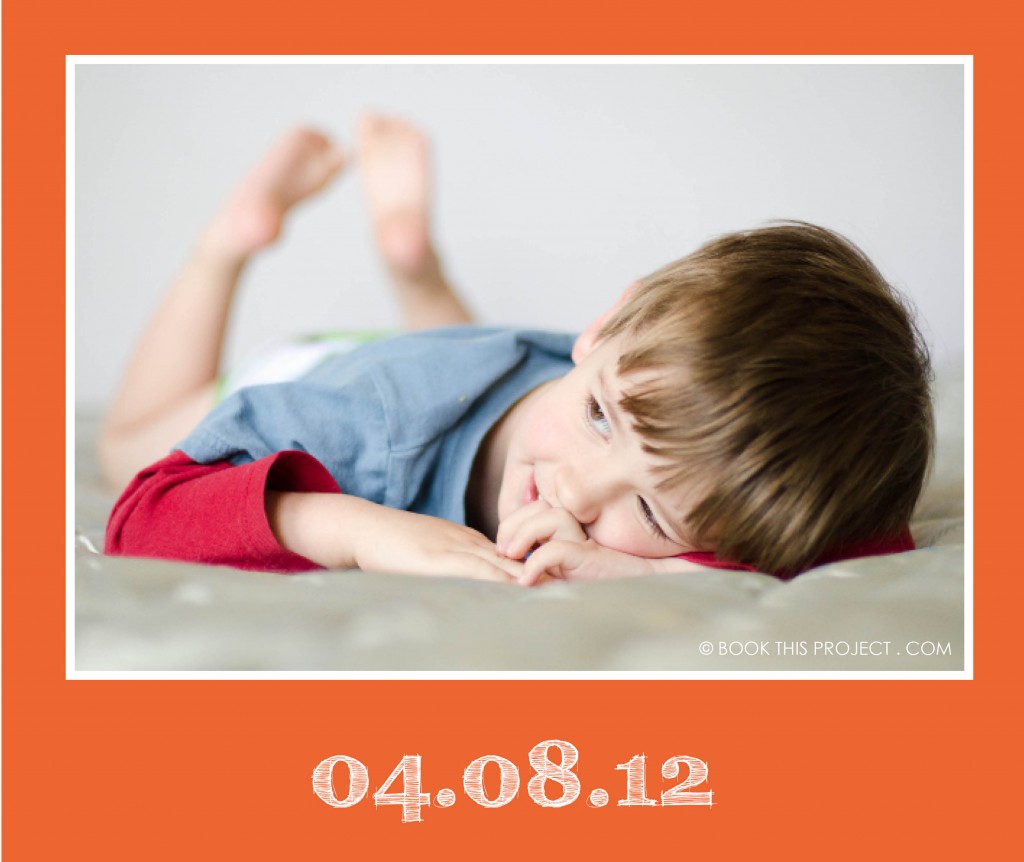
COLOR! It is so important in design and can add so much to your photo book layouts. I have decided to start a new monthly series that examines the impact color has on layouts. I will take a photograph – or a group of photographs – and run through a series of different design layouts – exploring color, type, size, orientation, and proportion.
First, to start off this series, I want to mention the beautiful and inspiring site: Design Seeds. If you are not familiar with them, I hope you will check out their site, facebook page or pin boards. This site examines the rich color groups found within evocative photographs. If you are ever in a color rut or looking for color inspiration, you should check out their work!
Photo
[divider] Layouts
[divider]Get a free download listing the colors used in this series (RGB and CMYK) – here!
[divider] Would you like one of your photographs featured in this series? Email me your photograph and I will let you know when your photo will appear.
I hope this gets your creative juices flowing!
And if you love any of these, share this post on your facebook page or pin your favorite(s)!

