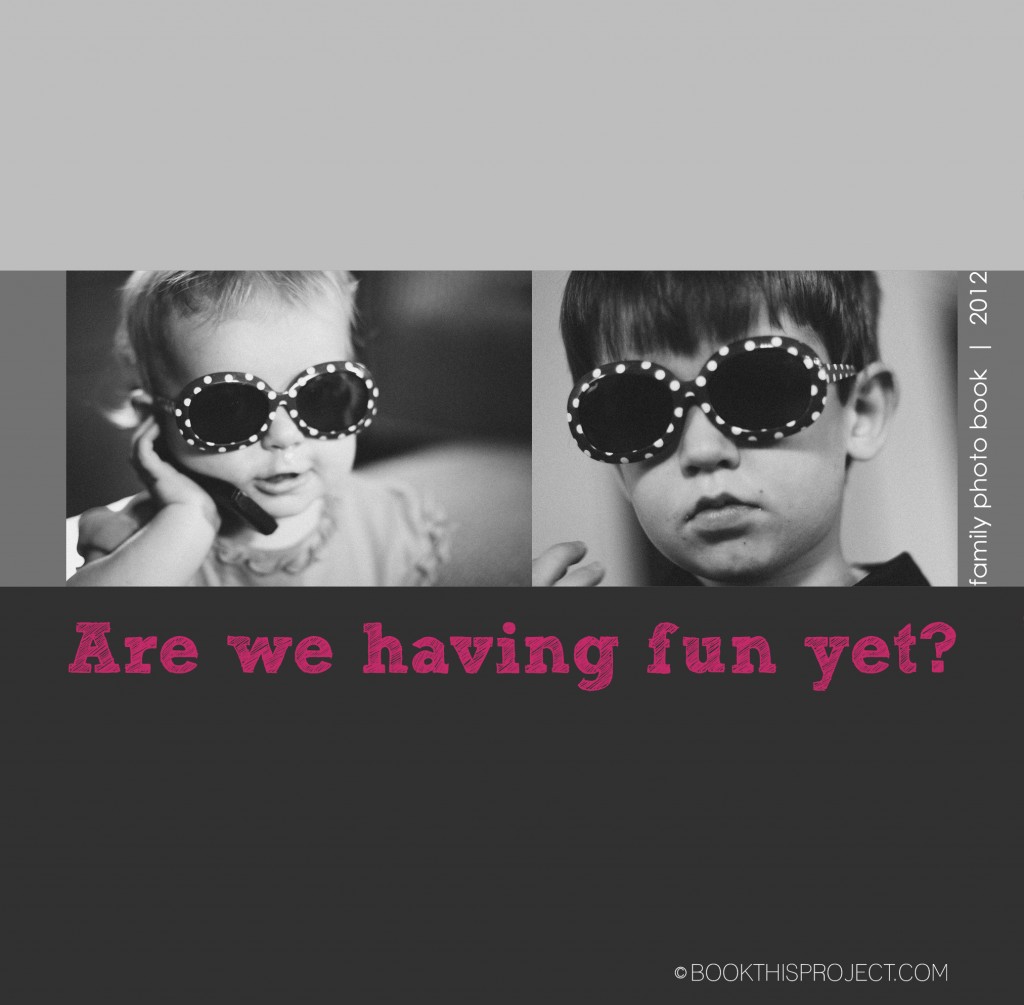
My previous cover examples all feature one photograph. In this cover design, I am featuring one photograph of each of my children. However to tie them together, the two photographs have something in common – sunglasses. They are wearing the same sunglasses and I thought it was really cute, not only of my little girl wearing her glasses…but also big brother! This is a great tip for you as you begin thinking about your cover. Perhaps it is a couple of photographs of your kids doing a similar activity. Or it could be a from a similar season – ie two photographs from the summer time.
Another thing to keep in mind when using two photographs on the cover is the scale of the subject. This particular example could be improved, my son’s face fills the frame a little more than my daughters, but you will notice they are both head shots. If you have a full body shot of one kid, it is a good idea to include a full body shot of the other. It ties them together. Of course there are exceptions, but starting out, it is a good idea to keep things similar!
Finally, for the title of the book, I decided to use a phrase or question. If there is something that really ties to the photograph on the cover or something that you or one of your kids likes to say, this would make a perfect cover title.
[divider] If you love this example or gives you some ideas for your photo book, pin it!


