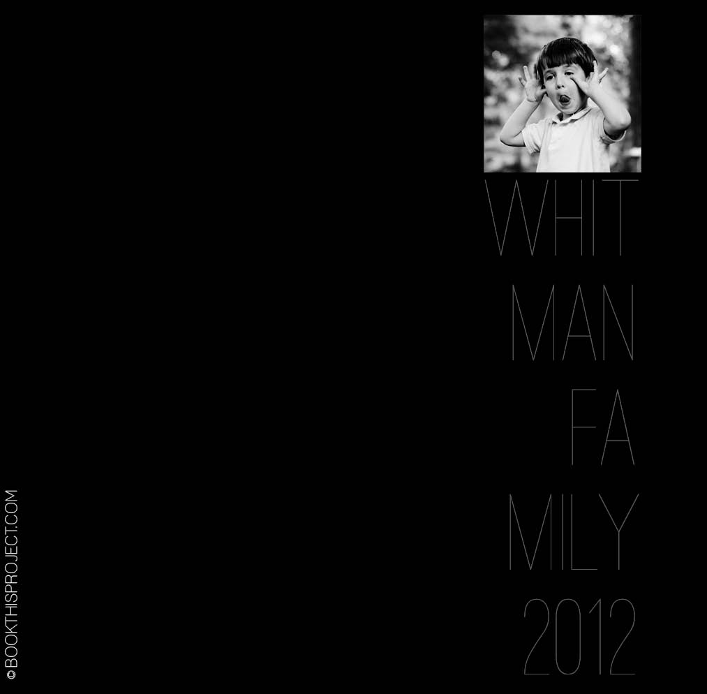
This cover is serious and silly at the same time. A silly black and white photo is paired with a stark black background and a thin gray text. The font happily takes a backset in this design…and that is the point. Nothing over-done. It is very simple…and in its simplicity, it makes you want to pick it up and view the pages inside.
 The inspiration for this cover is on my pinterest board “Layouts.” Are you following me yet?
If you love this example or if it gives you some ideas for your photo book, pin it!
[divider]Make sure you sign up for the Book This Project weekly newsletter. I have a free download when you sign up!


