Two weeks ago, I had a post about my daughter’s new (and slightly too big) dress (here). In this post, I am going to share with you how proportion factor into photo book layout design. If you have ever had to print the same photo as a 4″x6″ and a 5″x7″ or 8″x10″, you realize that each of those show a little bit different crop of the photograph.
What works as a 4″x6″ does not always work (or work as great) as an 8″x10″ photograph. This is true for photo book design as well. You may love an image and want to feature it large in your book, but it may not work.
The concept of proportions is most easily described through photographs, so let me demonstrate.
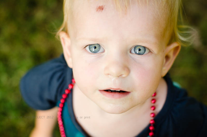
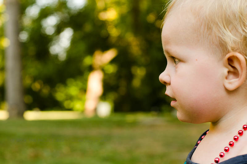
I loved this photograph of my daughter.
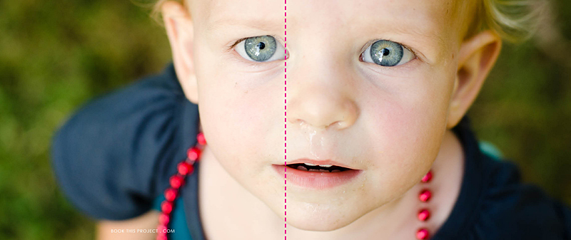
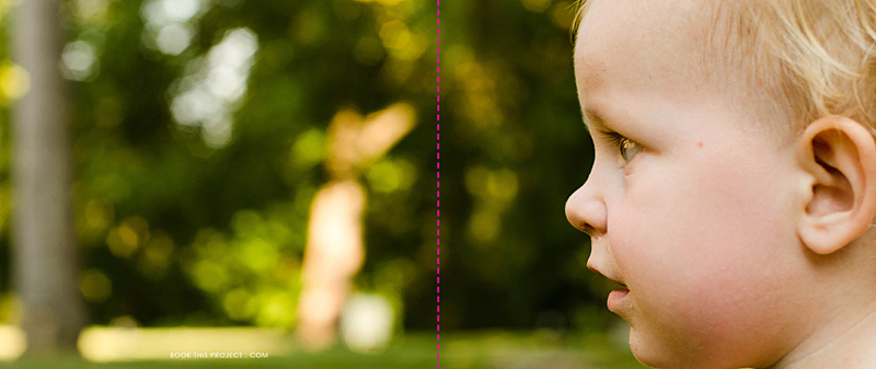
And as you know, I also love to feature my favorite photographs as a full spread (image on both the left and right hand side of the page). But this photograph is not the right size for a full spread.
The pink dashed line indicates the center of the book, or spine. See how the pink line goes right through her eye. Not good! The layout design is taking away from the best part of the photo.
Plus, do you notice how her boo boo is now missing? This is because the proportion (the width in relation to the height) of the photograph is different as a 4″x6″ photo than when it is put in a photo book which is 8″x20″.
To clarify a little more, we doubled the height (from 4″ to 8″) but we more than tripled the width (from 6″ to 20″). If you wanted to keep everything in the 4″x6″ photo, you would need a 8″x12″ photo box in your layout. Does that make sense?
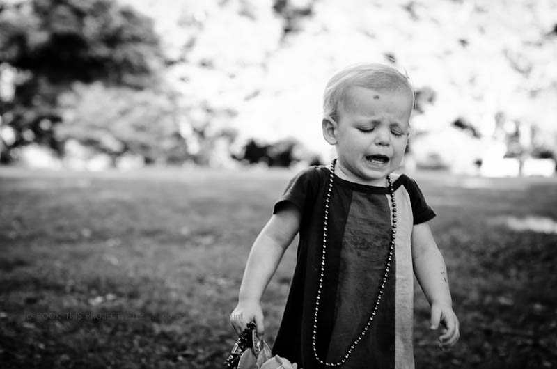
Here is a an improved example.
Photo:
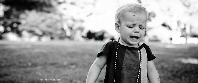
Layout:
In this example, the action, or main focus of the image is occurring primarily on the right side. It is true that her arm is located in the spine of the book, but this does not take away from the purpose of the image…which happens to be her frustration!
For the final example, I think this photograph lends itself really well to a full spread layout.
Photo:
Layout:
As you can see, selecting each photo and how it is shown on the page takes more than just selecting your favorite photograph. Key to any great photo book design is knowing how to design the layout that best suits the photos.
Let me know in the comments below, did this inspire how you will design your personal photo book?

