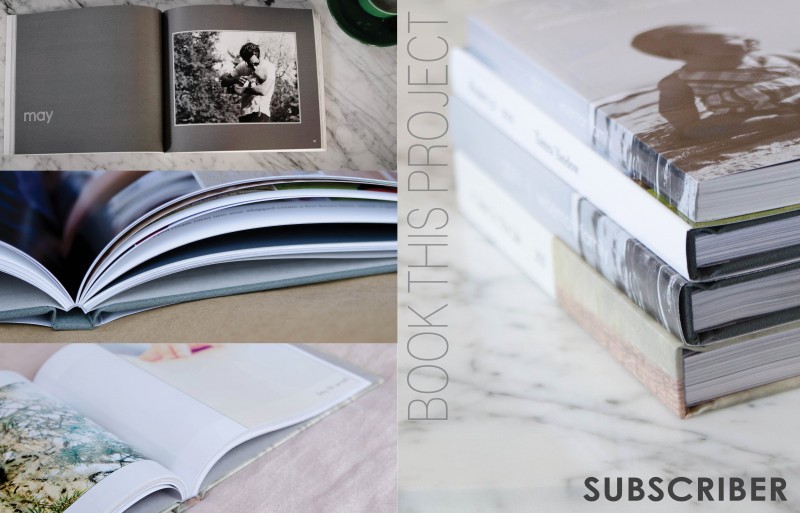
I prepared a special little design project for all of my photo book subscribers and clients. I wanted a cover design that had one descriptive photo on the front cover and the back provided three sample photographs. The vertical text is a thin font style which contrasts the bold font in the lower right corner.


