Last month, you may remember my blog post about creating a photo book layout with a single photo on the page. This month, I want to share how to incorporate color onto those layouts.
There are several difference options when it comes to adding text to your page.
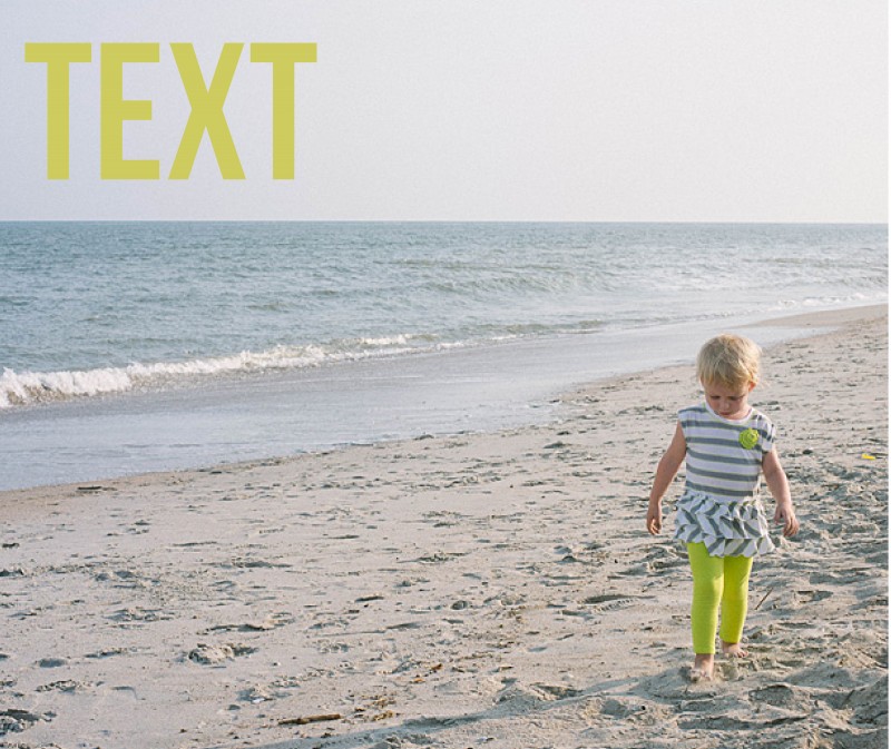
1. Color Font in the Title
For this layout, I used a bold font with color that picks up on the color of my daughter’s leggings. In this example, the title is in an opposite direction of her pants, so it balances out the layout. The color of her leggings is not the greatest (I should have picked a different color of leggings for her…but she has a fashion mind all her own!) but this should give you an idea of how to incorporate a bright color without it overwhelming the page.
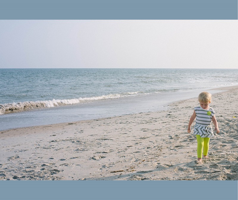
2. Background Color
In this example, the color of the ocean is a subtle background color. Since this is a two bleed layout option, there is minimal space on the top and bottom of the photo. This color adds a nice touch to fill some of the void, while still keeping it a simple one-photo layout.
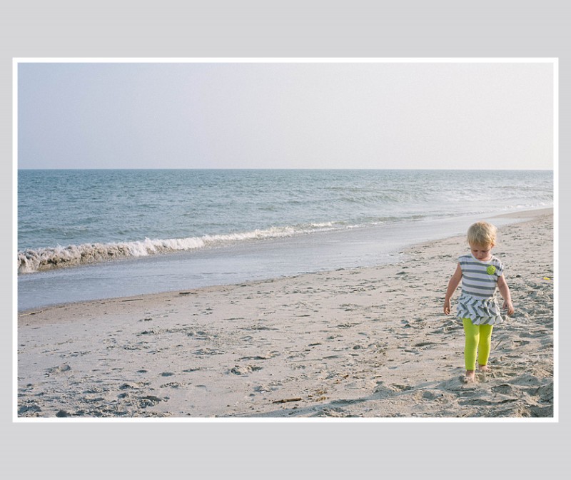
3. Background with a Border.
In this example, I used a neutral color of the sand (just above her head) to create a background color. Then I used a thicker white border to get the photo to stand out a little more on the page. This is a way to keep the color palette simple, yet in tones from the photo.
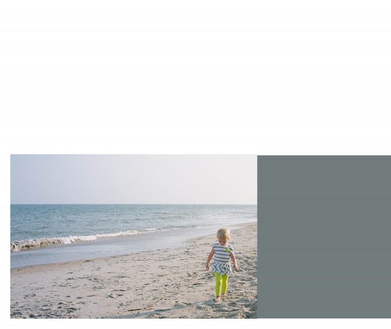
4. Color Block.
For some pages, you may want to include a small touch of color without it extending the entire page. You can easily add photo caption in this color space or leave it blank. In this example, I used a more blue-gray tone from her shirt that I think picks up nicely to the ocean, without it being ‘ocean blue.’
Leave a comment below letting me know your favorite way to add color to your layouts!


