This is the third and final tutorial in this series about one photo per page.
First, I described the various layout options available with only one photo box on the page.
Second, I showed how to add color to these layouts.
Today, I’m going to show how to add text to the layouts.
Let’s look at four ways to add text:
(and don’t forget to pin any layouts you enjoy to your pin board!)
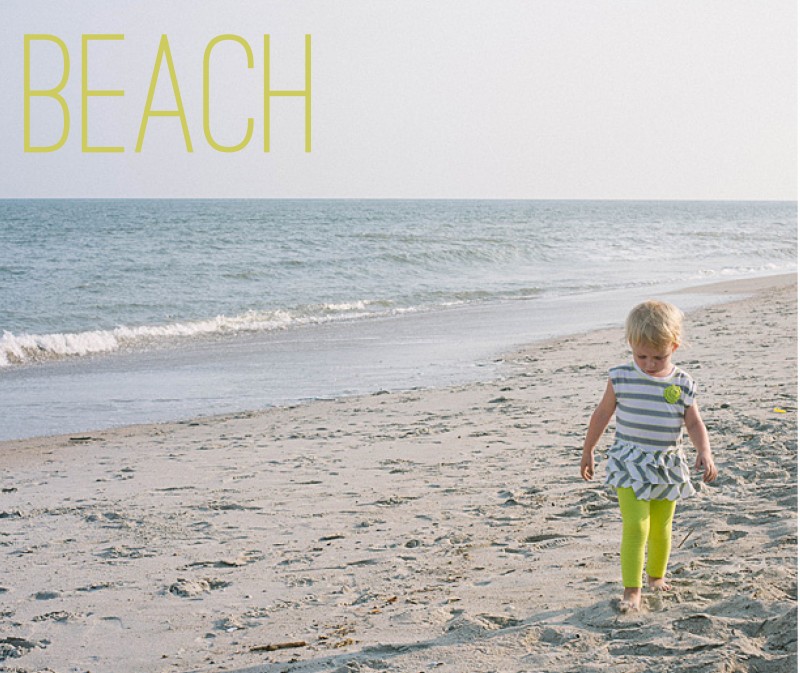
1. Title
For this title, I used a slim font and the color in her pants. The yellowish color does stand out from the blue of the ocean to make a nice contrast on the page. It’s simple, descriptive, to the point.

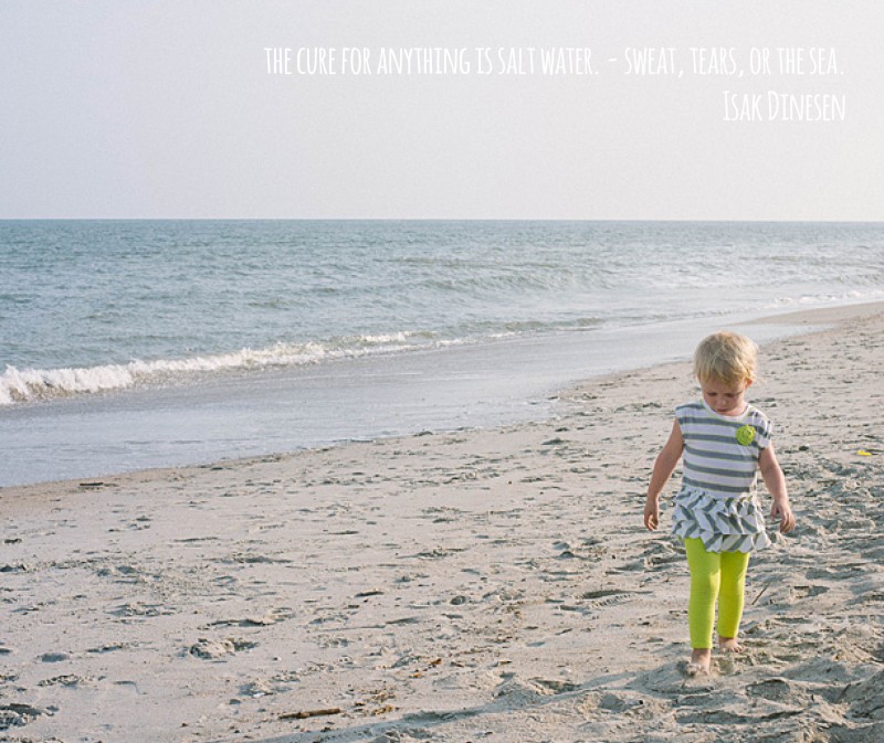
2. Quote
The quote is in a white font, so it does not detract from the overall image. Although I will agree that the color choice could be a little more dramatic, maybe a light gray, to make the quote stand out a little more. Quotes can be a fun way to describe the event without having to come up with a lot of words.

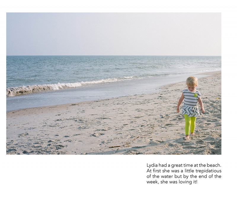
3. Caption
This example uses a right aligned text box directly under the subject. There is definitely more weight to the right side of the page but I think the ocean is enough to act as a backdrop and it really takes your attention to the subject.

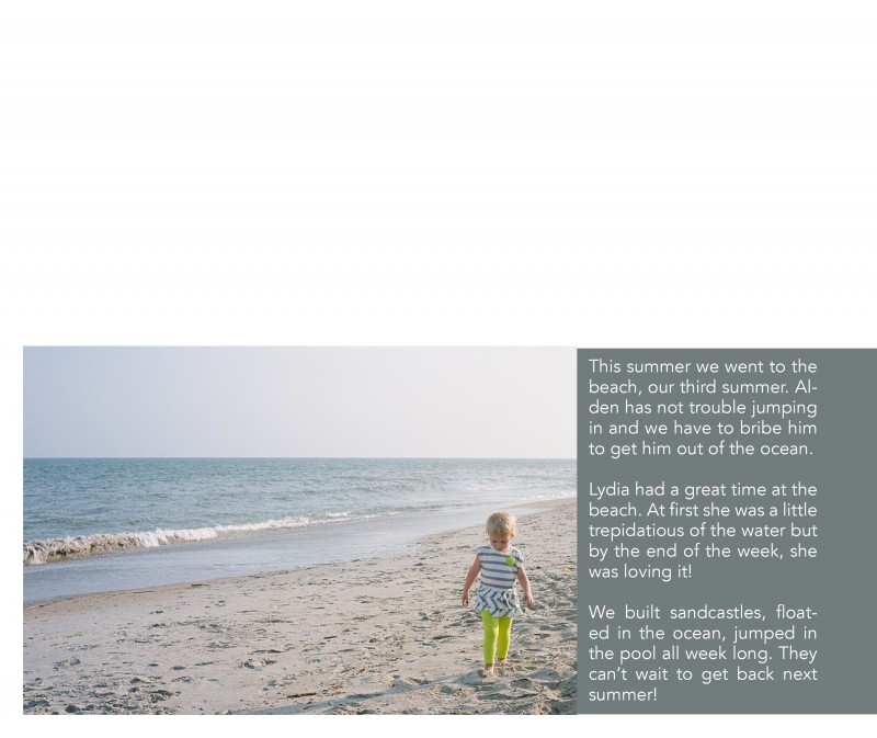
4. Text
Including a little bit longer of a text or description can work really well for your photo book too! In this example, I placed the text in a color bar so it reads as a seamless bar running along the bottom of the page. There is a lightness from the negative space at the top of the page, yet it is still informative and colorful. I used a simple font in white to contrast against the dark background.

Leave a comment below with your favorite way to incorporate text in your photo book!
[divider]


