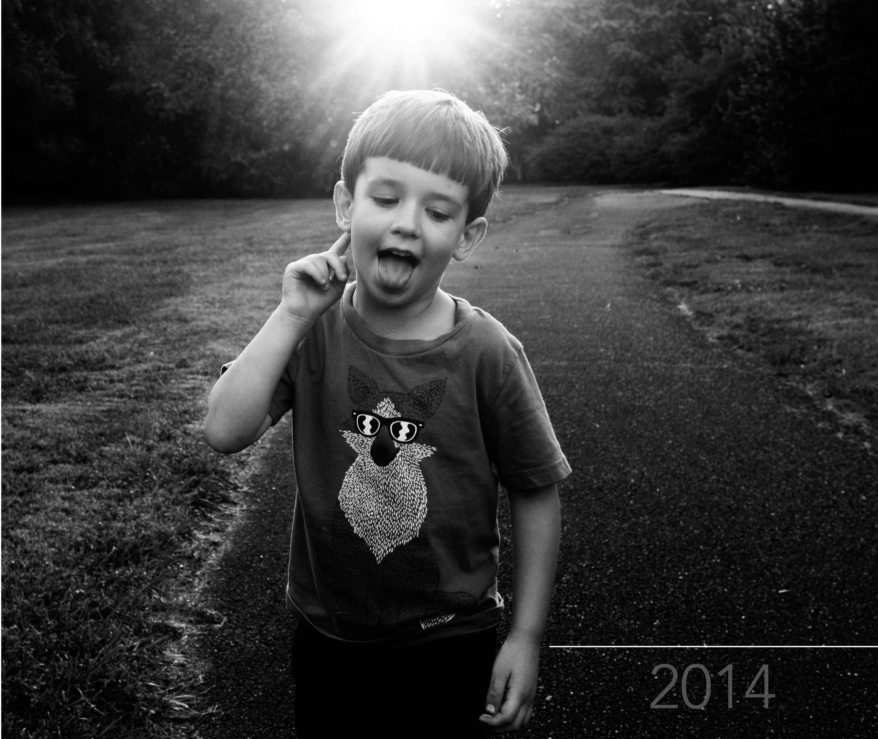
Today’s photo book cover design takes a prominent photo and stretches it over the entire cover. Because the sun was prominently placed at the upper edge, I wanted the year to occur along the bottom edge.

[divider] I started with this image above. Which I liked…but I thought the white was almost too bright for this photo. The “2014” was a (very) slight distraction in the lower right corner, pulling me away from the sun and my son’s face.
So in the version below, I changed the opacity of the date. This allowed it to fade into the background.

[divider] Of course there is no right or wrong answer. To me, the first version, the year is prominently displayed. If it’s important to have that announcement, it makes sense that this would be a white text (and could maybe increase in size). If you wanted a cover that is more about the photo and less about the book title or year, the second version is the one to go with. In this example, you have to almost discover the title of the book.
In this final photo, I wanted to demonstrate that the text of the year, is centered between my son’s hand and the edge of the book. To make sure, I used a line tool to map out the entire distance. Then I centered the text and aligned the center of the text box with the center of the line. You could always create a text box that is the full dimension you want, then center the text…the line just helps to illustrate the point!
[divider] Pin your favorite version and share with your friends!


