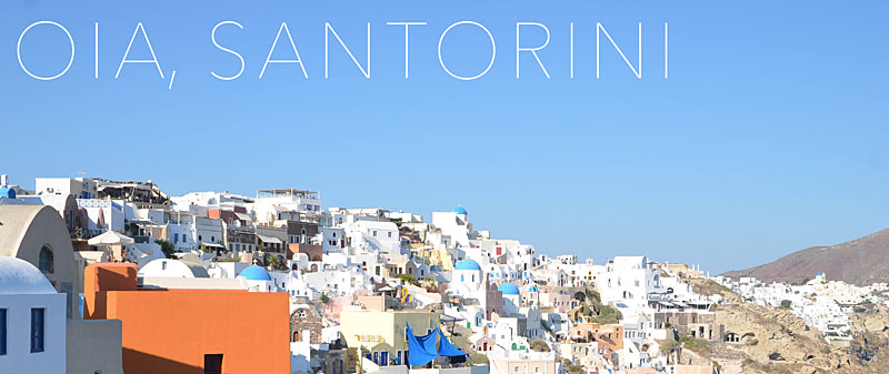
This is the first of a new blog series I affectionately call: Good, Better, Best.
In these posts, I’ll show how to improve upon a layout. For this example, I’m focusing on the page or section titles.
Good.
I start with a title all in the same font, same line. In this case the font is a size that fills the negative space. It spans over the gutter. But it seems a little boring.

Better.
Then I decide, I want it the text to expand to two lines. This will add a vertical dimension to the title. It’s better…but I still think there’s room to improve.

Best.
I decide to adjust the tracking in the top line and decrease the size of the font in the second line. This creates a very subtle contrast which adds a bit of interest on the page.

This is a great way to adjust how you are using the font on the section pages of your photo book.
If you enjoyed one of the layouts, make sure you pin it…or share on your Facebook page.
[fbshare url=”https://www.bookthisproject.com/2014/03/good-better-best-using-titles-in-a-layout/” type=”button”]


