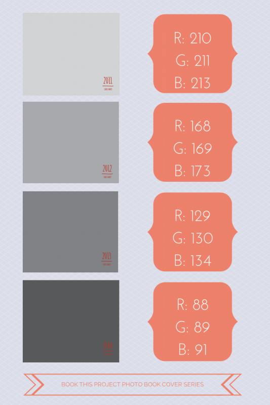
I hear from so many people who are a little behind on making their family photo books. Like….several years behind. And that’s okay. Any time is a good time to start.
It can actually be a luxury.
And here’s why. You have the opportunity to think about your photo books as a set. Designing the cover is the perfect way to execute a shared vision over several books – or several years.
Now there are many ways to approach this. For this example, I’m using various shades of gray to signify the different years. The text is very simple and remains the same for all of the covers.
The key here is to think about how many years you want to design photo books and adjust your shades accordingly. Of course, you could always keep the shades in groups of 3 or 4. But if you are looking for subtle changes, variations of gray over 4 years is very different than variations over 18 years.
So think ahead and decide if this could work for you!


Here is a great graphic for you to pin!


