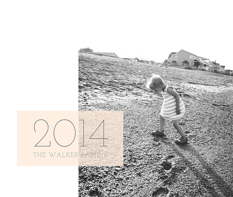
For this photo book cover design, I wanted to try a vertical photo with a landscape orientation cover. In this case, you’ll either have negative space (to fill with color, text, or leave it blank) or you’ll cut off a large part of the image at the top and/or bottom.
In this case, I went with the white space. I added a soft color box overlapping the photo in order to add the title.
Make sure you pin it and I’d love for you to follow bookthisproject!


