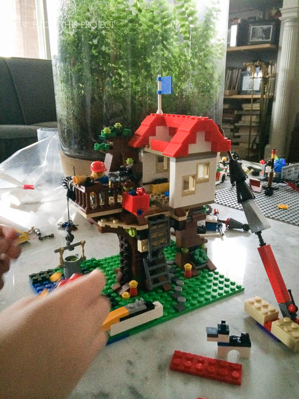
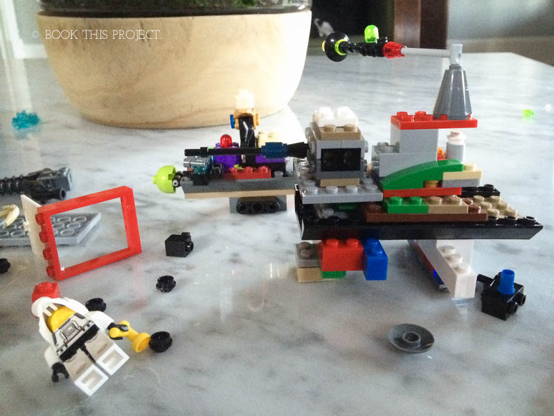
Right now my son is obsessed – no wait – OBSESSED with all things legos. It’s the first thing he does in the morning and last thing he does at night before bed. When we force him to break from lego building and do something vital, like eat or go the bathroom, he takes along the lego instruction manual to study the pieces, the characters and the steps.
Yes, we’ve seen the lego movie and even read the chapter book. (He could surprisingly remember what would happen next as we were reading!) What I loved about the movie is how it dissected lego builders into two types: those who go by the instructions and those who don’t.

Of course there is no right and wrong answer here. It’s the beauty of the toy. Either way, legos require a lot of imagination to build and play with. A skill I’m very happy to foster with my 5 year-old….who is a make-up his own invention kind-of boy!

This got me thinking about my own design inspiration when it comes to photo books. Often I start with an image off-the-box – either from a website, a physical book, or a product around our house. Pinterest and magazines provide an endless source of inspiration. At this point I’ll adjust the elements to suit my tastes.
Occasionally, I’ll stick pretty close to a given design – particularly when I’m testing out something and want to see how it looks with my photos or preferred font style. This often describes my photo book cover design explorations.
But most of the time, I like to take something I see and adjust and tweak to fit my own unique personal style and vision.
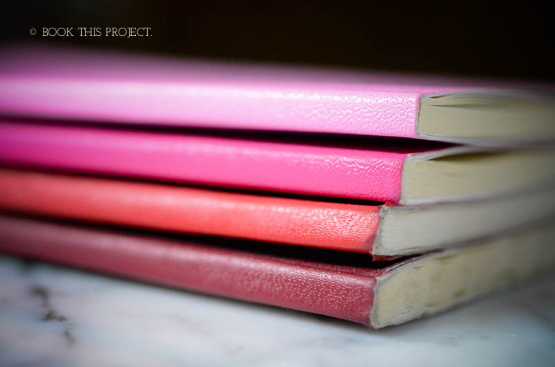
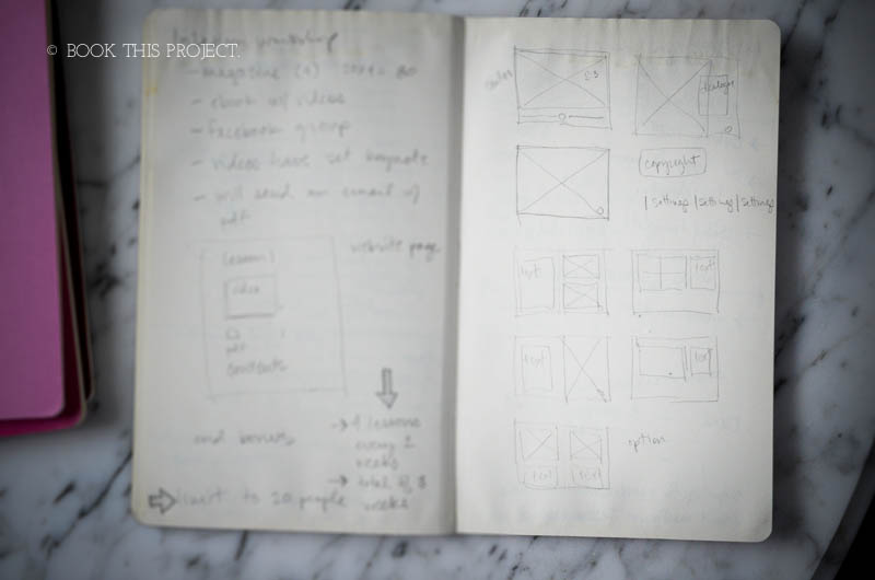
For this, I’ll use beautiful moleskin notebooks to collect ideas, thoughts, diagrams, and to-do lists on the photo books I want to create and how I’ll set out to accomplish them. With this method, I close down all websites and put away the magazines in order to think through how it is I want to use design elements into a project.

My particular style and strength is developed around a simple design move that is executed primarily through organization. So a lot of times, I’ll use the notebooks to write out how I want to structure an idea which informs how I organize my photos and how I want to graphically convey the structure.

In the end, there are a lot of design concepts frequently used with great success (for example, adding a line under a large title or a bold number in a circle). We should never look to copy directly but understand why the design element works and how it can be applied to your project.
Whether you are starting with something you’ve seen or really thinking out-of-the-box with your design, it’s best to develop a style that is consistent, cohesive and executed with confidence to your vision.
I’d love to hear what’s your design inspiration when taking photos and designing books. Do you start with a visual or do you love to create free from distractions?


