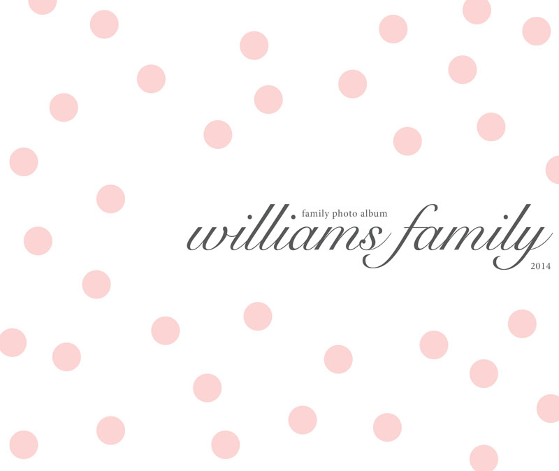
Here is a very fun and simple text-only photo book cover design. I love this cover idea because you can easily see how this can translate into month section dividers.
I chose a soft pink color for the dots and a dark gray for the text but you could easily switch this out for colors that match your book design or favorite colors!
Another great feature to this photo book cover is the pairing of fonts. I used a decorative Snell Roundhand for the name and a classic serif font for the family album and year text. I increased the kerning of these subtitles to provide a bit more space.
Love this? Make sure you pin it!


