You may have noticed that Blurb no longer offers BookSmart as part of the free software options. It’s now officially been replaced by BookWright.
While I’ll miss being able to create text styles and having a grid to help with design, there are a few aspects that I love about BookWright:
- being able to design as a spread (instead of customizing a single page at a time)
- setting up grid lines to create a custom margins for a photo book
- a more user-friendly interface
In this month’s tutorial, I’m explaining how you can make a small adjustment to Blurb’s 4-photo layouts to customize it to your photos.
Plus, if you’re starting to get a little frustrated with BookWright and ready to go all in with designing photo books, I’ll share how easy it is to design a 4-photo layout with InDesign.
Out of the box, here are the 4-photo grid layouts included in Blurb’s standard layouts:
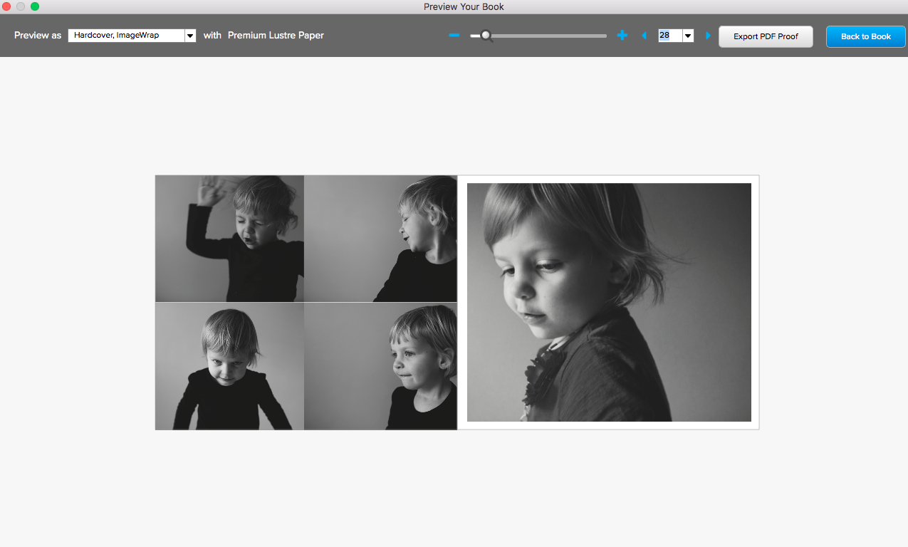
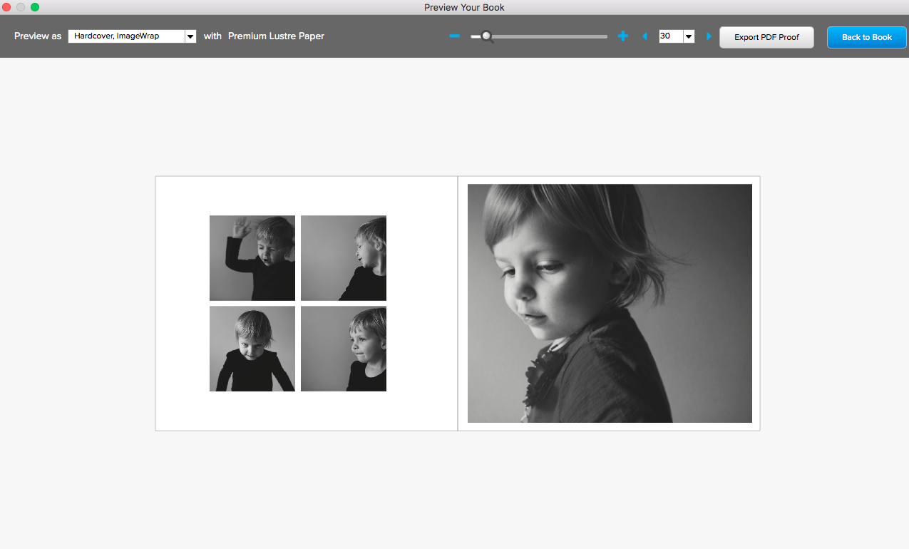
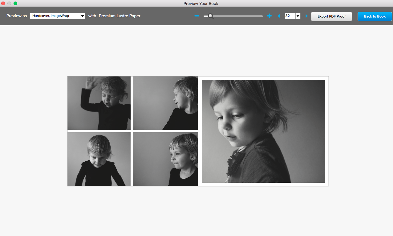
It’s true, these layouts are centered and will work for a photo book, however, it’s important to recognize that these boxes don’t fit the standard proportions of a photo – creating more work for you later. You’ll have to adjust your photos if you don’t want them perfectly centered in the photo box.
And for some layouts, you may want more space around the photos without using a square box.
Here’s the finished layout I created in BookWright. It’s still centered but in this layout there is extra space at the top and bottom and the entire photo is shown on the page.
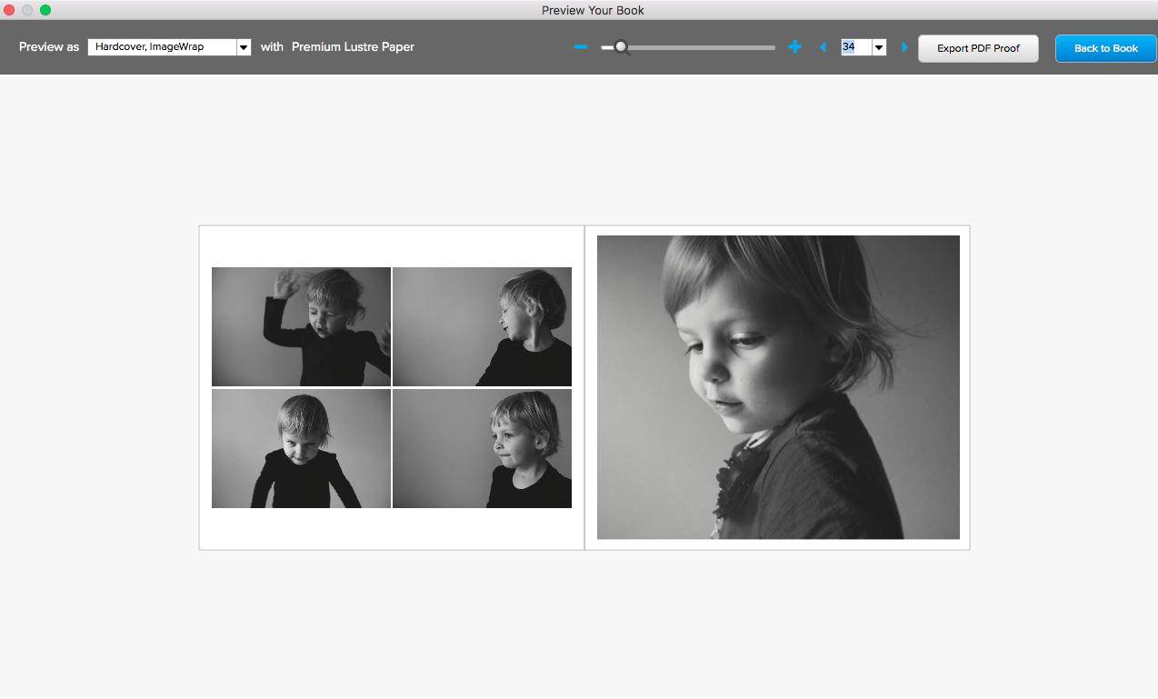
To see how I skipped the standard layouts and created my own 4-photo layout, watch this video:

