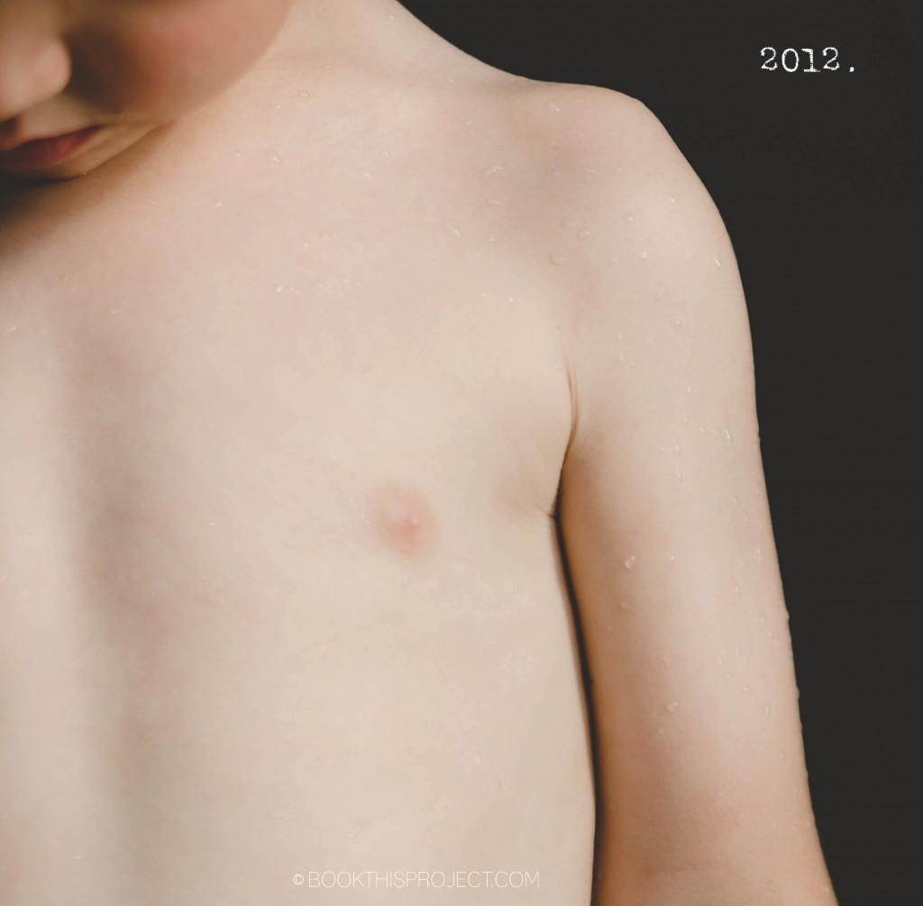
I love the simplicity of this photo book cover design. The photograph is simple and concentrated. A minimal “2012” is in the negative space of the photograph to indicate the year. And that is it! Voila!
[divider]

If you love this example or if it gives you some ideas for your photo book, pin it!
[divider]Make sure you sign up for the Book This Project weekly newsletter. I have a free download when you sign up!


