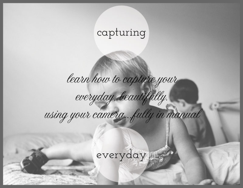
For today’s photo book cover, I’m featuring something I’m working on for my brother and sister-in-law. They just had a baby and want to know some basics of their camera. So I created a little pamphlet and this is my cover.
I know I have a limb chop with my daughter’s hand, but there is something that really speaks to me about this image – especially when discussing everyday photos in my home. I used a circle graphic with a slight transparency to bring the background in.
And I’m using two different types of fonts – serif + cursive – to distinguish the Main Title from the Sub-Title.
One final think, I added a gray border to give a sense of enclosure and framing. It also highlights the two different shapes going on – the square and the circle!


