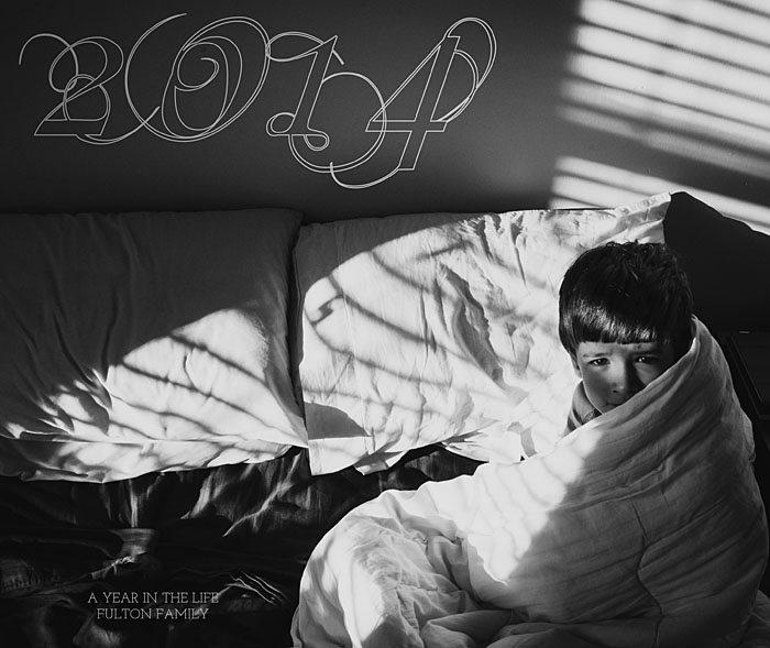
For this week’s photo book cover design, I took a highly ornate, script font and turned it into an outline. This minimizes it’s presence on the cover, yet still provides some visual interest in the negative space of the photo.
Since the subject is on the right of the photo, the title occupies the left side of the cover. In the upper corner, there is the year. In the lower corner, a short description and family further defines the book.
This example shows how to take advantage of a very dynamic photo and use the empty spaces in the photo to place the text. If you’re stuck on what photo to use for a cover, look for one with a large space for text.


