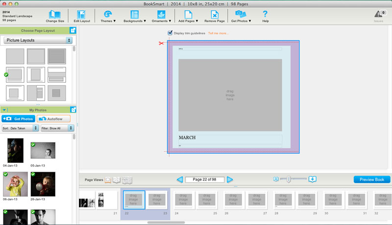
[divider] Answer: Oh – great question! This is a little more technical of a question when it comes to the book design process. If you are brand new to making, designing or custom design services for photo books, you may come across this term and think, “What in the world is a spread?”
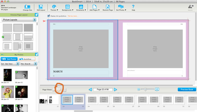
[divider] With books, a spread refers to the pages of a book laid open with both the left and right page showing.
[divider] So why is this important…well, when you are designing books, the typical default is usually to see and design one page at a time.
[divider]
[divider] But, why would we design one page at a time when we actually see the pages together when we are experiencing the actual book. You’ll see great improvements in your layout design when you can design with the spread in mind.
[divider] Yep, paying attention to a book spread, immediately ups the game on your photo book layouts! [Click it Tweet]
[divider] Look for a tool to view the spread as you are designing.
[divider] Now, let’s take a look at some layout examples from my 2014 Spring Colors Post.
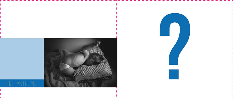
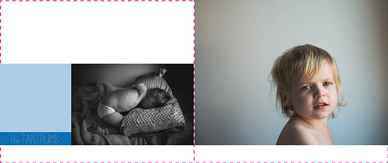
[divider] Without paying attention to the spread, you could design a layout that looks like this:
[divider] Not terrible…but it could be better. Nothing feels together and well-thought out with this design.
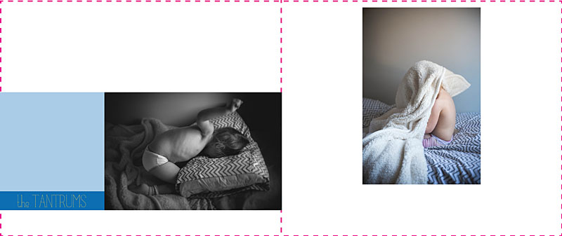
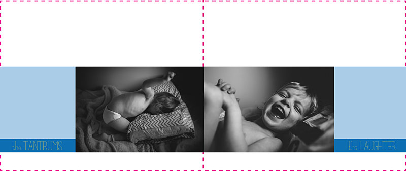
[divider] By paying attention to both the left and right page, we can begin to align the bottom edge of the photo to create a layout like this:
[divider] And if we are really looking for a layout that fully considers the spread and create a story between the two pages, we could create a layout like this:
[divider] All because I was designing with the spread in mind.
[divider] I’d love to hear from you, what question do you have about book design? Leave your question in the comments below!


