When designing a photo book, an event can be slightly redefined. It doesn’t have to be a huge deal, such as a birthday party or celebrating a graduation. It can also be a smaller activity, like an afternoon of coloring, playing legos, or picking out clothes.
Photo books are actually a collection of these types of events – or moments. Today, I want to share how you can design a layout for a small group of photos describing an everyday event.
A couple of weeks ago, I was working on a challenge within David duChemin’s The Visual Toolbox for The Photographer Within’s forum. For this particular lesson, we had to capture our subject in a variety of angles and perspectives. When my daughter wanted to use sidewalk chalk, I knew this would be a good time to practice.
Here are the photos that I captured:
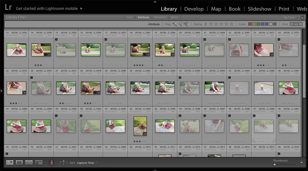
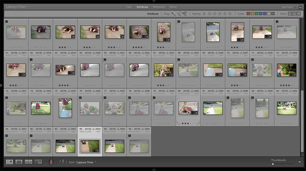
Notice how many photos I’m deleting versus how many I’m keeping. You’ll also see that I’ve starred my favorites. I start with three stars. Once I’ve selected photos that achieve the variety of angles and capture a part of the story, I filter all of my 3-star photos.
My 3-Star Photos
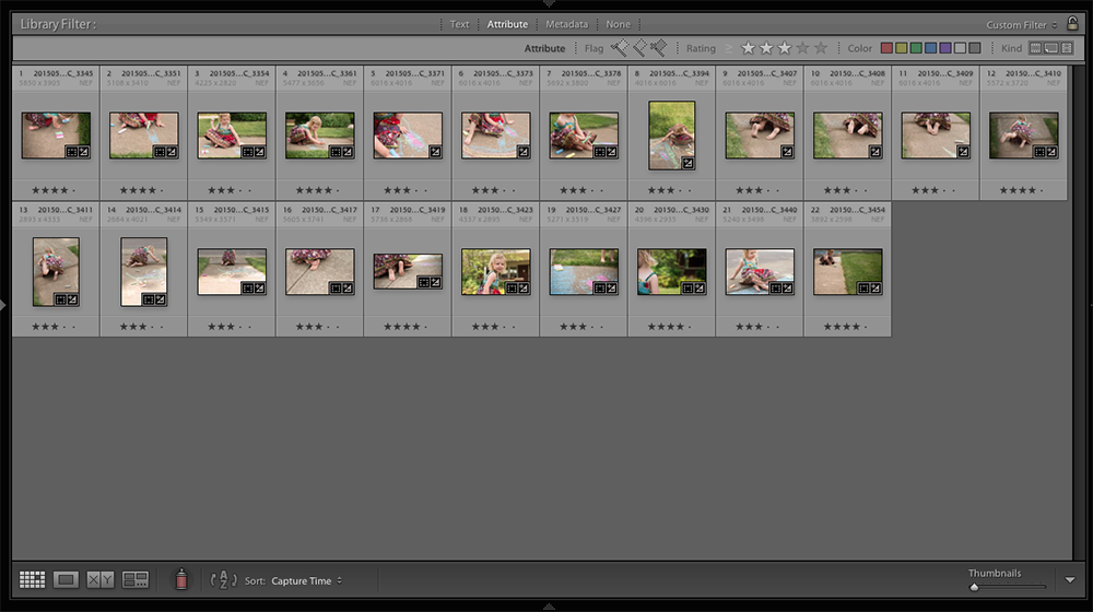
The next step is to narrow down my selection even further by designating 4-stars. These are the photos that really tell the story without being too repetitive.
My 4-Star Photos
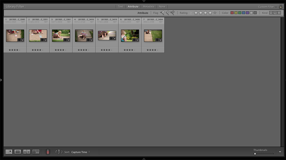
With the 4-star photos filtered, I now make sure the editing is exactly the way I want it for a book. I check for white balance and exposure consistency.
When ready, I export out my photos and move to my book design software.
Good Layout
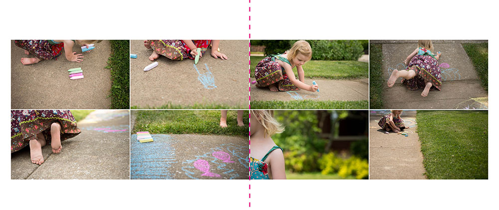
One option for a layout is to prepare a normal grid of photos, vertically centered on the page.
This works but is kind of typical (read: too boring for the activity).
Better Layout
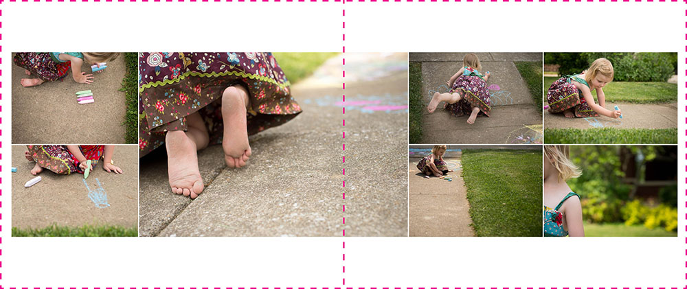
With these photos, I want to accentuate certain actions or details. In layout design, you can use the size of the photo box to establish hierarchy.
This layout improves on the first by adding a central photo that is larger than the others.
Best Layout
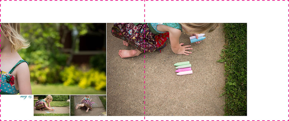
While there is more interest in this layout, I wanted to test out one more layout. In the final layout, I reduced the number of photos and paid more attention to where the white space is happening on the page. Also, I used three different sizes of photo boxes making for a more dynamic layout. Finally, I added the date to complete the layout.
Take Action!
That’s how I work through my photo selection and book layout process. Good, better, best!
Of course, the varieties are endless. You could imagine a completely different layout for these photos, based on your style and preferences. It’s what makes photo book design so fascinating.
Hopefully, this has inspired you to get out there and document an everyday event and create a layout for your photo book!
To get even more layout design inspiration – and – a special discount on my signature workshop, Document Your Year, sign up below for 5 free design lessons.


