by Stacey Wiseman | Sep 15, 2014 | 50 Children's Book Design Tips, Design Series
In the adorable children’s book, Hurry! Hurry! by Eve Bunting and illustrated by Jeff Mack, a rooster calls all farm animals to join to greet a new friend to the farm.
And my design tip for you is an easy one if you have a children who love to tell stories…or better yet…jokes!


by Stacey Wiseman | Sep 12, 2014 | Cover Series, Design Series
I’ve got a simple cover for you. The premise: an initial. One letter. Symbolizing your last name….your family.
I like the fact that this photograph is a slightly more obscure photograph.
But I think what really works is using a somewhat abstract photo with negative space.
In order to customize it, select a decorative font that speaks to you and specify the color.


by Stacey Wiseman | Sep 9, 2014 | Design Series, Inspiration, Photo Book Design Layout
We are four steps into my photo book design process and – finally – I’m placing the photos on the page!
I’ve taken the photos, selected which photos to use, edited the photos and now is the time to figure out how they will work together on the page.
Often times, when I’m selecting photos I have a pretty good idea of a layout arrangement but not exactly sure on the specific layout.
This perfectly describes the photos I’ve selected for this particular photo book.
During my selection process, I had an idea to include a solitary portrait of my son and daughter on one page plus a collage of them together on the opposite page. But…I’m not really sure how that will look on the page.
So I test. I try different layouts. I see how the photos look on the page and then determine which one looks the best. What makes the most sense on the page? What scale, spacing, and positioning works the best for the photos.
You should know, there is no wrong answer and what may look best to me, may not be the same for you. And that’s ok. It’s what defines our personal style and vision. That being said, I do think your skills are refined, the longer you design.
Watch this video to see how I test my page layouts.
Next month, I’ll finalize the layout with some text and color!

by Stacey Wiseman | Sep 7, 2014 | 50 Children's Book Design Tips, Design Series
My design tip for today comes from Suzanne Bloom’s A Splendid Friend, Indeed.


This book is a great one for young kids who are very sleepy before bed but want to read one quick story before the lights go out.
I like reading this book to my kids for it’s design simplicity and use of strong colors. But today’s tip, deals with how to isolate your subject when using a photo in a spread.


by Stacey Wiseman | Sep 1, 2014 | 50 Children's Book Design Tips, Design Series
This week’s design tip from a children’s book is a little more complicated unless you use InDesign (or a whiz with Photoshop or Illustrator). But….I’m guessing there are a few online programs that make this tip possible.
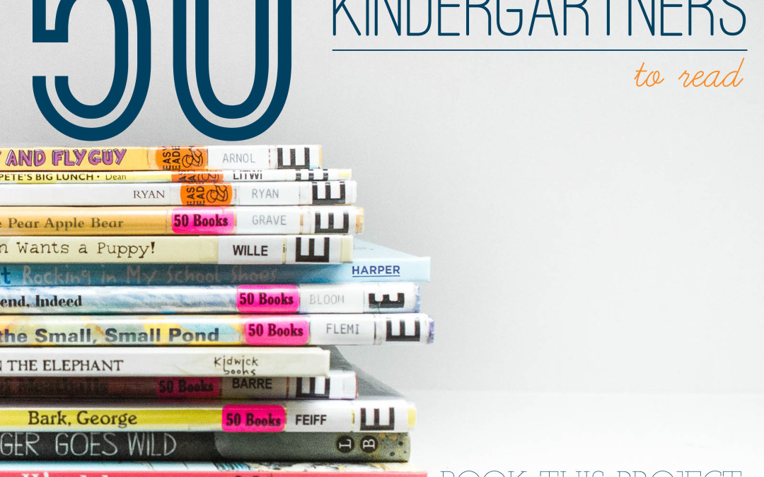
The next children’s book all kindergartner’s should read is In the Small, Small Pond by Denise Fleming.


And here’s the design tip!

by Stacey Wiseman | Sep 1, 2014 | Description, Photograph, Photography Tip
It’s the last weekend of summer! Are heading out to the pool this weekend? Or perhaps trying to editing your vacation photos?
Recently, I told you about my love of taking underwater photos. While I’m definitely not the expert or take stellar underwater photos, I still love documenting them.
But editing them?!?! I was lost.
Until I read through Lynne Rigby’s Splash! Getting Started in Underwater Photography and Editing with Presets. Right now, this is available for FREE through The Photographer Within for about one more week. After that, it will be up in the store for purchase.
Lynne’s PDF walks you through her gear, steps, and process. She includes an editing video so you can see how she edits her underwater photos. Plus, she provides some presets she created.
This PDF was immensely helpful for me…as you will soon see! I thought it would be fun to share my before and after.
Let’s start with this one:
BEFORE.

AFTER.

Look at how much better the skin tones are!!! This is using Lynne’s Nevis Preset.
Here’s another example using the Barbados preset.
BEFORE.

AFTER.

BEFORE.

AFTER.

And I thought I would end on a selfie with my son. I used the Barbados preset and did absolutely nothing else. I seriously was never able to get right skin tones until I read this PDF! Definitely worth my membership with this one download!
BEFORE.

AFTER.


by Stacey Wiseman | Aug 25, 2014 | Design Series, Inspiration
Our next book in the Children’s Book Design Tip Series is:
Bark, George by Jules Feiffer.


This cute little book is a quick and even though it seems a little too silly, my kids got a genuine chuckle at what the vet found in George’s belly!
As for the design, I love how the pages alternate a bright, pastel color as the background for the story.
Check it out!


by Stacey Wiseman | Aug 24, 2014 | Cover Series, Design Series, Family Photographs
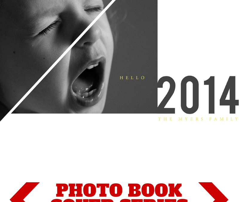
Hello 2014!
I’ve got a fun photo book cover design today! And it starts with the photo. We all know it’s common for children to have their moments of screaming and crying. Here’s your opportunity to photograph this moment and turn it into something creative for your photo book cover.
I broke up the photograph using triangular shapes via the pen tool in InDesign. This added more interest to the photo but definitely not necessary. The photo in a rectangular box can stand on it’s own too.
Pairing this photo with a bold font for the year and a small, classic font in a stand-out color (yellow) helps to make this dynamic cover design down to each detail.
Let me know in the comments below what you think!


by Stacey Wiseman | Aug 18, 2014 | 50 Children's Book Design Tips, Design Series, Inspiration
Today’s Children’s Book Design Tip is from the book: Cloudy with a Chance of Meatballs by Judi Barrett and Ronald Barrett.
I know this became a popular movie (actually, 2 movies) but it started as a great book to read to your kids. A little warning: This book does have more text than most children’s books….so it takes a little more time to read!


by Stacey Wiseman | Aug 11, 2014 | 50 Children's Book Design Tips, Design Series, Inspiration
In honor of my son’s first year at school (yay for kindergarten!), I’m going to share a quick design tip for 50 Books to Read in Kindergarten list recommended by our public library.
Every Monday, make sure you check out my blog and Facebook page for a tip for your photo book.
Today’s book: Orange Pear Apple Bear by Emily Gravett.


(The 50 Books to Read in Kindergarten includes an affiliate link. I’m reading them to my kids and would love for you to check them out too!)
