by Stacey Wiseman | Aug 10, 2014 | Family Photographs, Inspiration, Podcast, Tutorial
I have to be honest, of the various steps in making a photo book, editing the photos is not my favorite part. Occasionally I get sucked into the editing process and really enjoy fine-tuning and improving a photo through the various tools in Lightroom (my preferred editing program).
But for the most part, I do very minimal editing. I cover the basics with my go-to steps. Crop, white balance, adjustments in the basics panel (exposure, highlights, shadows, black and white sliders) are common adjustments I make with pretty much every photo. Some photos require additional editing in the tone curve, HSL panel, cloning, filters and the adjustment brushes.
While that explains my typical workflow, it sounds a little cumbersome but I can actually move through the various panels pretty quickly. Another tip, I’ve created presets based on common adjustments I make to most photos.
My video tutorial this month illustrates how I typically move through editing my photos. If you remember, the first video showed how I take the photos; the second video showed how I select the photos for a book. Today, I’m revealing how I edit – without any presets.
Make sure you stay tuned for next month where we finally see how these photos are translated to a book layout!

by Stacey Wiseman | Aug 2, 2014 | Cover Series, Family Photographs, Inspiration
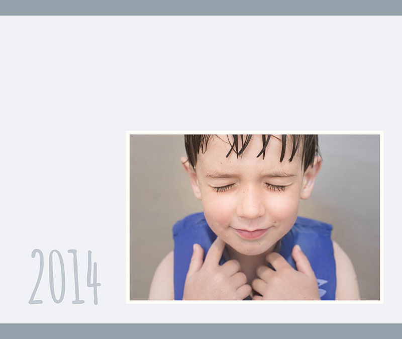
Even though it may seem counterintuitive, if you make something really small and/or really minimal – it can heighten the experience.
Think about it, if you are in a crowded busy place, a whisper isn’t going to make much of an impact. However, if the space is cleared out, there are no distractions, a soft whisper becomes amplified and sole attention. It doesn’t have to be loud at that point because all of the focus zeros in on the very quiet voice speaking. In fact, you listen more attentively and pour your whole energy into what is being said.
The same is true with design. By stripping the page down and adding something very small, it creates laser focus directly in on the photo or small text that is included.
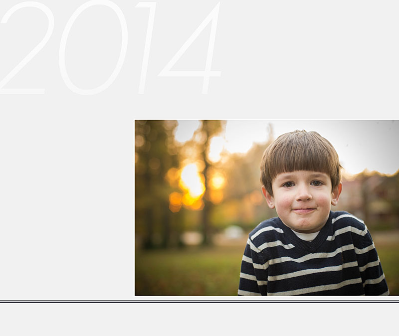
This concept is exhibited in this week’s photo book cover design. I added a soft color and a very small photo. Yet it speaks volumes and makes a large impact. It’s hard to not pay attention to this cover. And I love when being minimal provide maximum results.
Check it out, pin it and share it!


by Stacey Wiseman | Jul 20, 2014 | Photo Book Design Layout, Tutorial
One of the reasons I LOVE Blurb and will probably never stop making at least several books a year with them is because I can use Adobe InDesign and publish my books through them.
Why do I love InDesign???
Because I can create almost any artistic vision I want with this program. I’ve been using InDesign for 14 years and I used Quark Express (a book publishing software) 3 years before that. In that time, I’ve learned to design efficiently and use the program to achieve particular layouts.
If you’re intrigued by what InDesign can do but don’t know much about it, I’m sharing the numerous reasons I love InDesign. Plus, I’m sharing a few layouts that I would not attempt without InDesign. And seriously, for about 85% of my books, I use InDesign.
62 Reasons Why I Love InDesign
1. I can see all of the pages in my book at one time in the pages panel.
2. I can easily add as many pages as I want, where I want.
3. I can move the pages with a simple drag and drop.
4. I can delete the pages by dragging them to the trash can.
5. I can change the properties of the page with a right click.
6. I can add any size of photo box.
7. I can type in the dimensions I want for each photo box.
8. I can place the photo box exactly where I want by using guides or typing in coordinates.
9. I can overlap and layer as many photo boxes as I want.
10. I can add a simple border to the photo boxes (and text boxes).
11. I can rotate my photo box to any degree.
12. I can rotate only the content within a photo box to any degree.
13. I can scale a photo within a photo box.
14. I can scale the photo to fill the frame.
15. I can size the frame to match the photo.
16. I can add a grid of photos by using the arrow keys.
17. I can make a circle photo box.

18. I can make a photo box out of any shape.
19. I can place my text any where on (or a portion off) the page.
20. I can adjust the text to any style, size, color and alignment.
21. I can align the text toward the spine or away from the spine – which is awesome for book design.
22. I can adjust the leading and tracking (vertical and horizontal spacing between lines and letters).
23. I can make the text all caps or small caps with one click.
24. I can increase the size of only the first letter of the paragraph with one one click.
25. I can easily outline the text.
26. I can add a photo inside of the letters.
27. I can add a gradient to my text.
28. I can add a gradient to my photos.
29. I can adde a gradient to only my photo box outline.
30. I can use a gradient color or transparency.
31. I can wrap text around a particular area of a photo.

32. I can connect the text between multiple text boxes and pages.
33. I can align the top, bottom, right, left and center edge of any box.
34. I can space boxes by a specific dimension.
35. I can use smart guides for placing and spacing. They are super smart guides.
36. I can create lines with a particular weight, color, and style.
37. I can create a style for objects within my book.
38. I can create custom colors.
39. I can use color for boxes, shapes, text or outlines.
40. I can make a gradient of several colors or shades of colors.

41. I can use transparency for photos, text, and colors.
42. I can create a paragraph style of all text properties and alignment.
43. I can create specific styles for bold, italic, color, hyperlinks, etc.
44. I can link color to a particular text style.
45. I can change any aspect of a color or style and it immediately changes everywhere it’s used.
46. I can create multiple master pages for different sections or types of pages in my book.
47. I can apply a new master page to pages already in my book with a simple right click.
48. I can make a master page that is dependent upon another master page.
49. I can set up consistent margins for a cohesive book.

50. I can customize my page numbers.
51. I can create a Table of Contents with proper page numbers without having to go through my book.
52. I can use layers or I can ignore them.
53. I can display all of my photo book links.
54. I can refresh links when I make a change/edit to a photo in my book.
55. I can spell check, of course.
56. I can easily find out where my text doesn’t fit in a box or my photo resolution is too low.
57. I can create hyperlinks to my text or images.
58. I can assemble all photos, text, and graphics when I’ve completed a project.
59. I can export to blurb in one click.
60. I can export to pdf or jpeg in one click.
61. I can customize my export options.
62. I can make an interactive pdf with embedded hyperlinks.
If you’re interested in learning more, you’ll be excited to hear that I’m opening up my InDesign Workshop where I show you exactly how I design a photo book using InDesign. If you’re unfamiliar with InDesign, I walk you through every tool you need know. Each lesson comes with a pdf download and video tutorials.
This workshop experience is unlike any other because it is a combination of a workshop and a mentorship. I’ll open up the program for three months. Within that time, you can tell me when exactly when you want the lessons to start.
You’ll receive the lessons via email, access to a private Facebook group and two private 1:1 calls to discuss how to apply the material to your specific project.
For more information, click here.
If you want to remember this tutorial, make sure you pin this image.


by Stacey Wiseman | Jul 9, 2014 | Design Series, Tutorial
One of the biggest struggles I hear from my readers is the photo selection process. We are all connected to the photos we take. So connected in fact that it’s hard to choose one photo over another. However, photo selection is a crucial component of a photo book. Too many photos in a book creates an almost overwhelming aspect to your photo book and in the end, it can take away from the photos themselves.
I’m in the process of developing something to tackle this issue but for now I have a video that I hope will help. This is the 2nd of 5 videos on the photo book process.
If you remember the first video, I showed you how I photograph my kids on a casual Saturday afternoon.
Today, I’m going to show you my unedited, unculled photos – specifically so I can show you how I narrow photos of my kids for a photo book.
My white balance was crazy – especially in the first couple of photos. But that’s fixable. As you see next month!
Plus one thing to keep in mind, the funky white balance, under/over-exposed photos may not be the photos you want to include for your book. So you don’t always have to obsess over the details. Especially at this stage.
Check this video out and share this post with your friends!

by Stacey Wiseman | Jul 8, 2014 | 10in10, Family Photographs, Photograph
On the Fourth of July, I realized it had been a while (a long while actually) since I completed a Day in the Life. While I don’t think our routine has changed all that much in the last few months, it’s always fun to peel back the curtain a bit and reveal what goes on inside our household. Of course, with the holiday, it was somewhat atypical….but still really fun to do.
I hope you enjoy!!!
In the morning, a 10k race happens at the end of our street.

L was a little unsure what to make of the runner in the middle of the road.

Then, a VERY simple breakfast of toast with butter. aka – nothing else in the house, aka – grocery shopping on the agenda today.

After breakfast, I had a quick conference call to chat with a lovely Accountability member.

Now, it was time for cleaning. My husband and I thoroughly cleaned our house.

While the kids watched some television. Or in my daughter’s case, the iPad in her room.

After several hours of cleaning, I decided to get a snack and take the kids to the park while my husband went to the grocery store.

My son picked out the spot for our picnic.

What’s a park visit without a turn at the swing?

If that wasn’t enough activity, it was now time for my afternoon walk. I loaded up my daughter in the stroller…

…hoping she would take a nap.

Success!
This next photo doesn’t really describe anything we did during our day. It’s a Just-Because photo. My daughter’s hair is just now starting to pony-tail-able.

It’s now about dinner time and my husband is getting things ready for the grill.

After dinner it was a little relaxation before…

FIREWORKS!!!

We let our kids stay up for the first time to watch the fireworks. Thankfully, we are able to see our city’s fireworks from our front lawn so my kids could be in pjs and we could easily take them to bed once they were finished. Man, were they wired though! They loved them.
This was my first time truly attempting fireworks. I’ll definitely have to try again next year!
So that was our day! What did you think! I’d love to hear from you and leave you some blog love back. Leave a comment below with your website so I can check out your Day in the Life, or most recent blog! 😉
