by Stacey Wiseman | Apr 17, 2014 | Family Photographs, Inspiration, Photography Tip
 Last year, I added a waterproof camera to my Christmas wish list. I thought it would be a fun way to experiment with my photography and a new way to capture our kids. Our goal is to spend a little more time in the pool this summer…and when we go on vacation – the ocean.
So I was delighted when I received the Nikon COOLPIX AW120 16.1 MP Wi-Fi and Waterproof Digital Camera for Christmas. Even though it was made to be an indestructible camera…it still felt a little weird to actually submerge the camera under water.
But on our Spring Break vacation, I did it. I dipped the camera underwater looking for those elusive, floating photos.
So here are my 5 tips for taking those fun, underwater photos on your next vacation. (At least my experience with a point and shoot camera.)
1. Shooting Blind.
For this first trip out, my method was about shooting blind. This means, I was in a 3′ high pool, without going underwater myself. I held the camera underwater in the general direction of my target and shot without knowing what I was capturing. This trial-and-error approach means that you have to try several times to get the hang of it. But it’s also really freeing. Don’t worry about limb chops or composition. The goal of the photo is to capture your kids doing something truly fun.

2. Snap and Hold.
When I was using my camera, I had to hold it underwater, push the shutter about 1-2 second before I really wanted and then hold down on the shutter for about 5 seconds. I was never quite sure when the photo actually snapped. It takes a couple of times to figure out they rhythm. And maybe you won’t ever really figure out when it takes. But there are always different stages of the cannonball jump to capture.

3. Embrace any imperfections.
If you are shooting blind (#1) and holding down the shutter because you’re not sure when the actual shutter will happen (#2), then you need embrace the imperfections in the photos. They won’t all turn out. But that’s ok. They don’t have to. Keep trying. Eventually you’ll get something that you love. With water, it’s almost impossible to get something that isn’t fun, creative, and inspiring.
4. Discover new layers and textures.
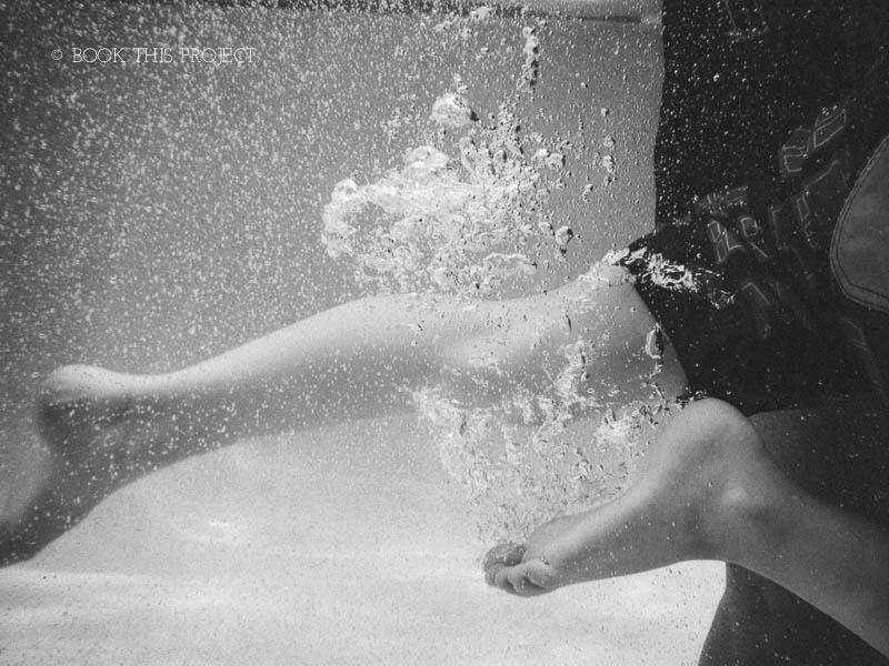
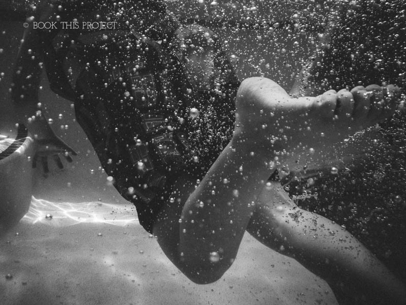
One of the beauties of water is the layers associated. The waves, ripples, bubbles, sunlight and calmness. Water captures them all. Use your camera to capture as many different modes of water you can. Test it out by moving your hand to create a tide. Or do like I did and capture as your son or daughter jumps into the water. You’ll get plenty of water bubbles floating to the surface.
5. Video’s worth it.
You have a camera that captures above and below water. By using video you can seamlessly move from one environment to the other – all within a matter of seconds.
If you’re looking to add a little fun to your vacation photos, I highly recommend getting a waterproof camera. The point-and-shoot cameras are lightweight, relatively inexpensive (especially when compared to waterproof housing), and can capture a perspective of your trip that people typically don’t get to see.
I’d love to hear your summer vacation plans! What fun summer trip are you planning now?

by Stacey Wiseman | Apr 11, 2014 | Cover Series, Design Series
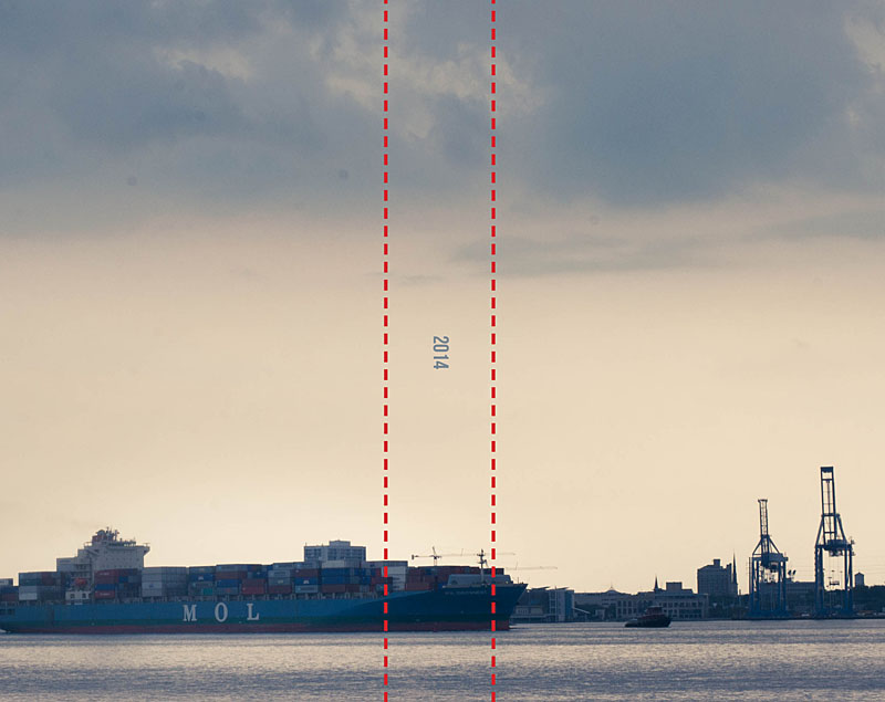
I hear from so many people who are a little behind on making their family photo books. Like….several years behind. And that’s okay. Any time is a good time to start.
It can actually be a luxury.
And here’s why. You have the opportunity to think about your photo books as a set. Designing the cover is the perfect way to execute a shared vision over several books – or several years.
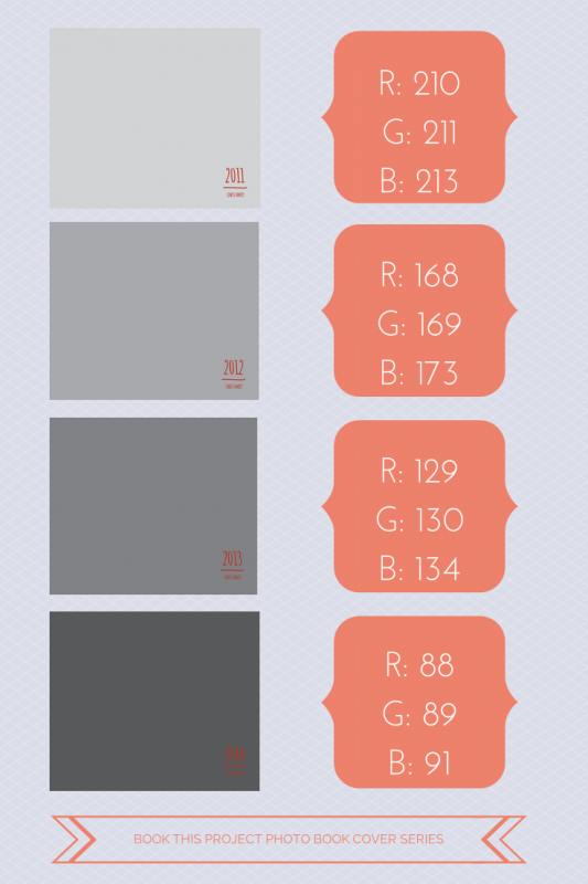
Now there are many ways to approach this. For this example, I’m using various shades of gray to signify the different years. The text is very simple and remains the same for all of the covers.
The key here is to think about how many years you want to design photo books and adjust your shades accordingly. Of course, you could always keep the shades in groups of 3 or 4. But if you are looking for subtle changes, variations of gray over 4 years is very different than variations over 18 years.
So think ahead and decide if this could work for you!


Here is a great graphic for you to pin!
by Stacey Wiseman | Apr 9, 2014 | Design Series, Podcast, Tutorial
This month’s photo book video tutorial is a special behind-the-scenes on how I approach design – specifically when designing a photo book cover.
Covers are the outward face of your book and are really the place where you can be the most expressive! Because of this, it can sometimes be a little daunting to create.
Lucky for you, every Friday, I provide a photo book cover design for you to pin or to inspire your own creation.
In this video, I’m going to show you the 8 steps I took to create last week’s cover example.
I would love to hear from you! What other design aspect can I go behind-the-scenes and show you? What are you yearning to learn how to do? Let me know in the comments below – or – if you have 3 minutes, fill out my brief survey.

by Stacey Wiseman | Apr 6, 2014 | Contest, Description, Promotions
Have you heard? Blurb has a book design contest with a $2,500 prize. And not just 1 $2,500 prize – but $2,500 for each of the 7 categories. Plus awards for runners up.
The theme for the contest is: My Favorite Person Photo Book. (use this link for all of the contest details)
Totally doable. Will you do it with me?
This contest is due in less than 30 days so I want to make sure I cater my book design into something small, unique, and manageable. (April 28, 2014 is the due date.)
I’m opening up my 30 Day Photo Book Challenge ebook specifically to help you with this contest!
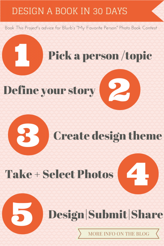
Here’s how I’m approaching the contest.
 [hr]
[hr]
Let’s break this down a little more.
| 1 | Select a Person / Topic.
For this contest, it’s all about the people. So select your person, your category.
Now, let’s define them. Here are some questions to get you thinking.
Who are they? Why did you select them? What do they like?
What are quotes that they would say? Or quotes that describe who they are / their attitude in life?
How would you write a little to them / about them? Can you include this in your book?
|2| Define your story.
What your angle? Your take? It doesn’t have to be a beginning-middle-end type of story. But defining a concept will make it easier to execute. Since this is a contest, you want to develop a specific concept that will stand out beyond the entries and define your subject.
Can you document a day in the life to describe this person? Maybe each page is a “[Person] is ____” and then the photos on the opposite page describe the adjective.
For another example, instead of designing a generic book about my son, I could develop a photo book around his current obsession for legos. I could structure the ‘story’ (think book) around the legos all neatly put away in the morning, the mess created after 10 minutes of play, his creativity of characters, vehicles, and buildings, and the specific lego creation he chooses to sit next to his bed as he falls asleep.
|3| Create a design style.
Now that you have you story, you need to create a style that suits your person and story. Look for inspiration all around you. Maybe your favorite person has favorite colors or a graphic style that you can incorporate into your book.
For this portion of your book, you should consider the colors, fonts, margins, amount of text and/or white space you want on the page. Keep this consistent throughout your book.
|4| Take + Select your photos.
Use a shot list (list of photos that fit your theme) to take (or select) photos that will match your story and style. The more specific the concept for the book, the easier it will be to develop your must-have shots! Plus this will save you time as you take or look for photos that are going to satisfy your vision.
|5| Design – Submit – Share
Time to design, submit and share! The Blurb contest ends on April 28, 2014 – so start designing now!!! I would love to see your finished book. Make sure you tag #bookthisproject when you share your photo book.
Want to see how I’m using these tips to design my book? Sign up for my 30 Day Photo Book Challenge ebook to watch my process. With this ebook, you’ll join my Facebook group where I’ll be sharing what I’m going to submit. Plus you’ll discover my 30 tips for designing an ebook!
Creating the first book is always the hardest. Once you get this book under your belt, I’d love you to join my Intro to Photo Book Design Workshop. To find out when the next workshop runs, sign up here.
Good Luck!!!
My 30 Day Photo Book ebook!
To enter this content, you must use Blurb’s software. My 30 Day Challenge ebook will show you exactly what you need to use their BookSmart program.


by Stacey Wiseman | Apr 4, 2014 | Cover Series
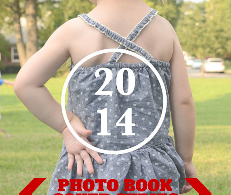
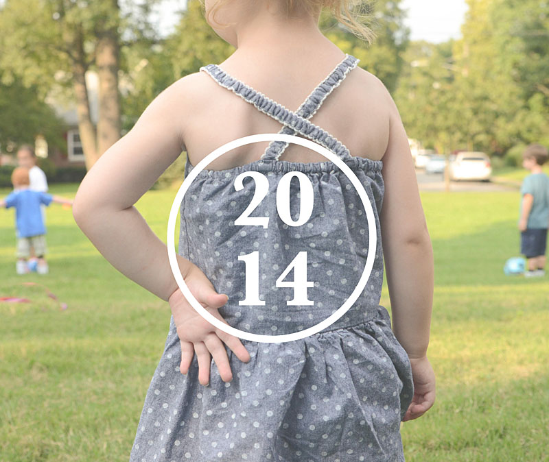
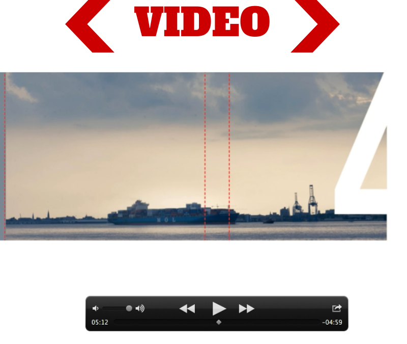
Today is a fun photo book cover design. This example would be great if you saw your photo books as volumes. It takes a really large number – 880 point font size in my example below – and sneaks a photo behind it. This photo book cover is a great way to envision your book cover front and back as a seamless design.
In this case, I went with the number 4 to signify 2014.
To see a behind the scenes on how I created this cover from start to finish, make sure you stay tuned for my April Video Tutorial next week. To make sure you don’t miss it, sign up for my newsletter!


by Stacey Wiseman | Mar 28, 2014 | Cover Series, Design Series, Family Photographs
Sometimes it takes an unusual perspective in a portrait to turn a photo book cover into something a little abstract and very interesting.
Try out an unexpected yet defining portrait for your photo book cover. Pair it with a simple title and a straight line graphic – or a circle graphic as shown below.
This is an elegant way to achieve an cover that doesn’t put the focus on the face, the smile, the eyes.

by Stacey Wiseman | Mar 19, 2014 | Photo Book Design Layout
This is the first of a new blog series I affectionately call: Good, Better, Best.
In these posts, I’ll show how to improve upon a layout. For this example, I’m focusing on the page or section titles.
Good.
I start with a title all in the same font, same line. In this case the font is a size that fills the negative space. It spans over the gutter. But it seems a little boring.

Better.
Then I decide, I want it the text to expand to two lines. This will add a vertical dimension to the title. It’s better…but I still think there’s room to improve.

Best.
I decide to adjust the tracking in the top line and decrease the size of the font in the second line. This creates a very subtle contrast which adds a bit of interest on the page.

This is a great way to adjust how you are using the font on the section pages of your photo book.
If you enjoyed one of the layouts, make sure you pin it…or share on your Facebook page.
[fbshare url=”https://www.bookthisproject.com/2014/03/good-better-best-using-titles-in-a-layout/” type=”button”]

by Stacey Wiseman | Mar 14, 2014 | Cover Series, Photo Book Design Layout
Here is a very simple yet effective cover for your photo book. It features one photo – not a bleed – on the front. It’s slightly off-center but you could definitely adjust the alignment to fit your taste.
For the title below it lists the name of the family but in between the surname and the word ‘Family’ is the introduction of the year. This font is slightly smaller and set in with a line graphic to set it apart.
So imagine using your favorite fonts and colors to customize this cover for your book. If you like this cover, pin it to your photo book pin board so you can save the idea for later!


by Stacey Wiseman | Mar 10, 2014 | Photo Book Design Layout, Podcast, Uncategorized
As you may have read, for 2014 I’ve set up a Photo Book Accountability Group. That’s right, this is the year where you don’t wait until the end to design your photo book!
In this video, I include a sample of how I addressed a particular question in her book. She was trying to connect how to create a template of the month section divider for her photo book.
If you’re curious to see how I can answer your photo book questions, email me, info@bookthisproject.com, and I’ll fill you in on the details. This product is only available until the end of the month so make sure you check it out now!
To join, click here!

by Stacey Wiseman | Mar 7, 2014 | Cover Series, Family Photographs
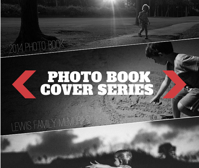
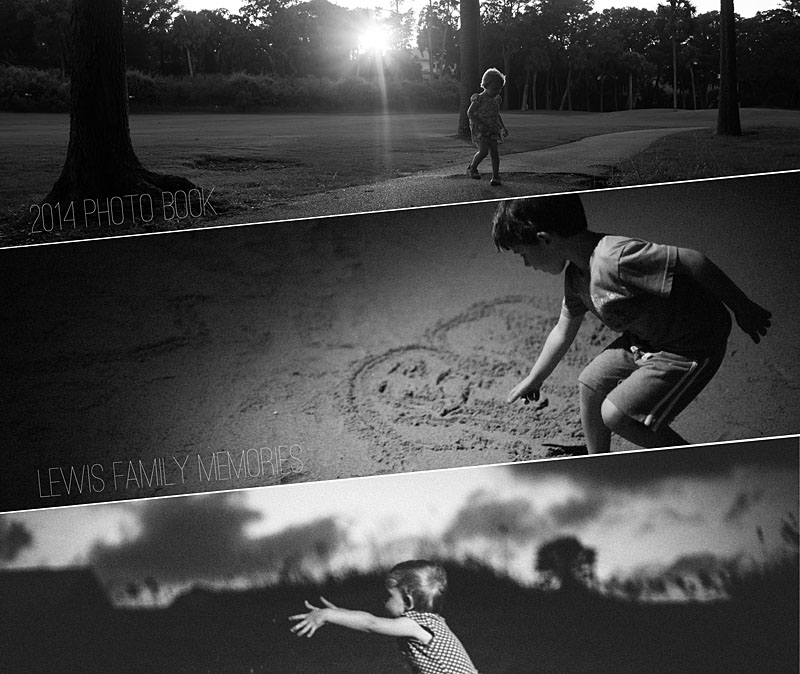
For this photo book cover design example, I decided to shift the rectangular photo boxes to create a dynamic and unusual photo book. This design creates a strong diagonal to the cover. I used this line to rotate the text to follow the line created by the photo boxes. With three photos, there is a variety of photos on the cover – but they are all black and white and strong linear photographs to pull the cover together.


 Last year, I added a waterproof camera to my Christmas wish list. I thought it would be a fun way to experiment with my photography and a new way to capture our kids. Our goal is to spend a little more time in the pool this summer…and when we go on vacation – the ocean.


 [hr]
[hr]


