by Stacey Wiseman | Nov 19, 2013 | Design Series, Photo Book Design Layout
This is the third and final tutorial in this series about one photo per page.
First, I described the various layout options available with only one photo box on the page.
Second, I showed how to add color to these layouts.
Today, I’m going to show how to add text to the layouts.
Let’s look at four ways to add text:
(and don’t forget to pin any layouts you enjoy to your pin board!)
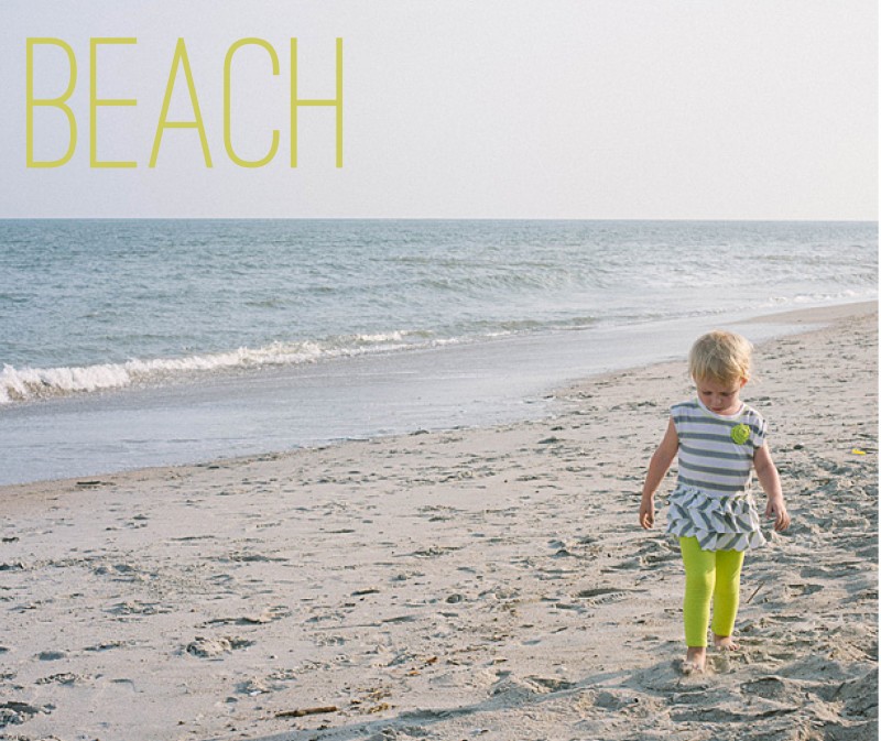
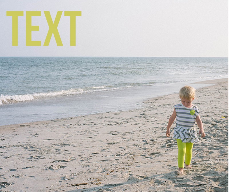
1. Title
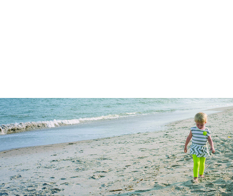
For this title, I used a slim font and the color in her pants. The yellowish color does stand out from the blue of the ocean to make a nice contrast on the page. It’s simple, descriptive, to the point.

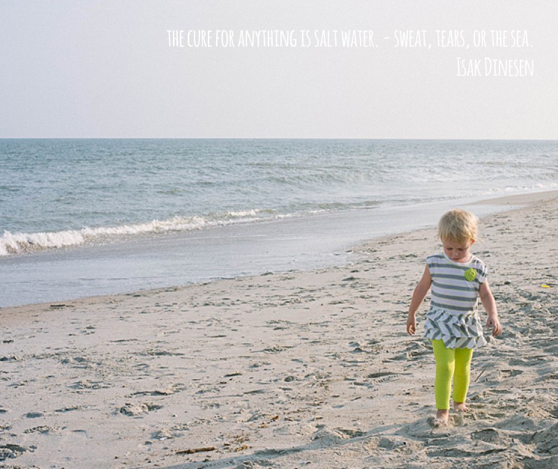
2. Quote
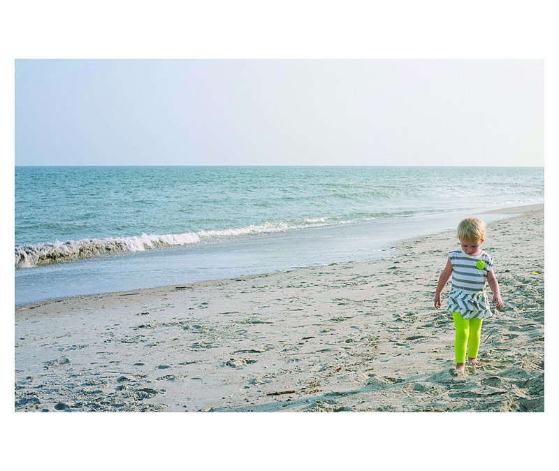
The quote is in a white font, so it does not detract from the overall image. Although I will agree that the color choice could be a little more dramatic, maybe a light gray, to make the quote stand out a little more. Quotes can be a fun way to describe the event without having to come up with a lot of words.

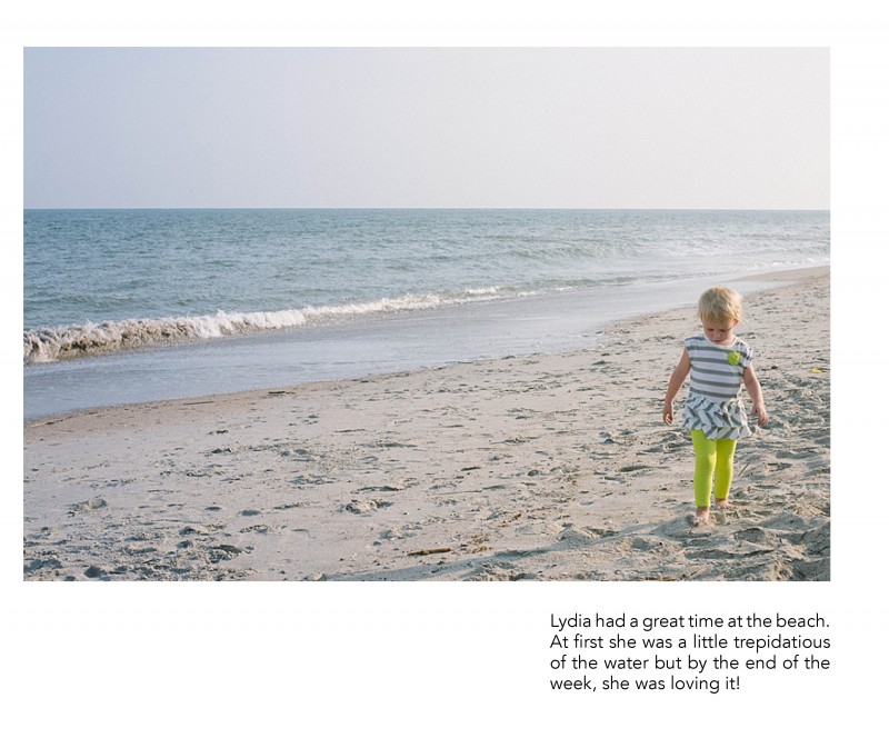
3. Caption
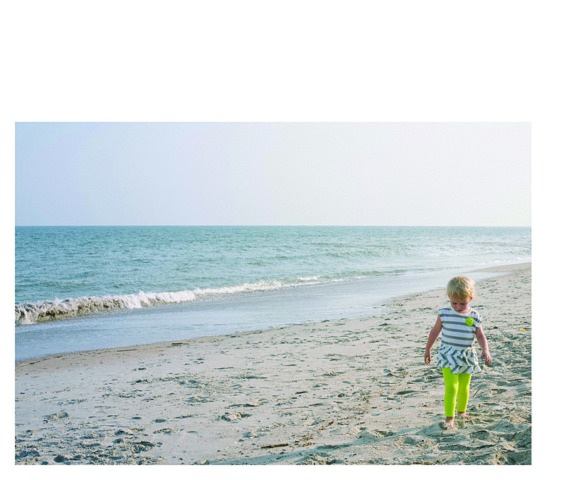
This example uses a right aligned text box directly under the subject. There is definitely more weight to the right side of the page but I think the ocean is enough to act as a backdrop and it really takes your attention to the subject.

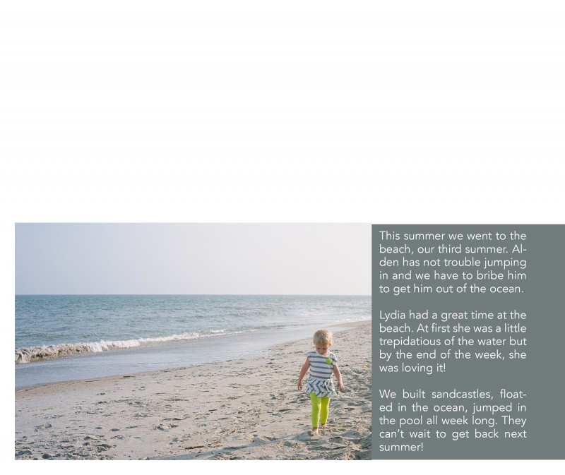
4. Text
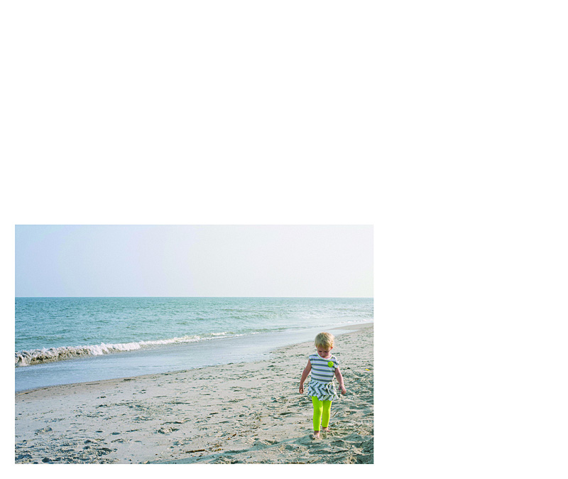
Including a little bit longer of a text or description can work really well for your photo book too! In this example, I placed the text in a color bar so it reads as a seamless bar running along the bottom of the page. There is a lightness from the negative space at the top of the page, yet it is still informative and colorful. I used a simple font in white to contrast against the dark background.

Leave a comment below with your favorite way to incorporate text in your photo book!
[divider]
by Stacey Wiseman | Nov 18, 2013 | Photograph, Photography Tip, Q&A
 Question: How do you edit your photos?
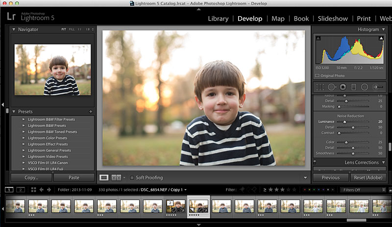
Answer: So even though I had a difficult time getting Christmas card photos, I thought today I would show you how I edited my fall photos.
First, I want to stress, I’m not the best photo editor, but I’m happy to show you what I’m doing at the moment. Usually my editing is minimal and has to happen pretty quickly.
Here are my basic steps.
1. Adjust exposure.
2. Adjust white balance.
3. Adjust the tone curve.
4. Adjust any color saturations or luminance.
5. Apply any specific crop.
6. Apply a slight vignette.
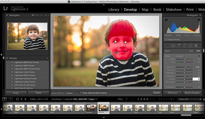
Now with fall photos, I want to play up the beautiful fall colors. So here is an extra step I did with these photos that I do not typically do on my photos. And it’s a new feature in LR5 – radial filter. If you haven’t used this tool yet, I really like it!
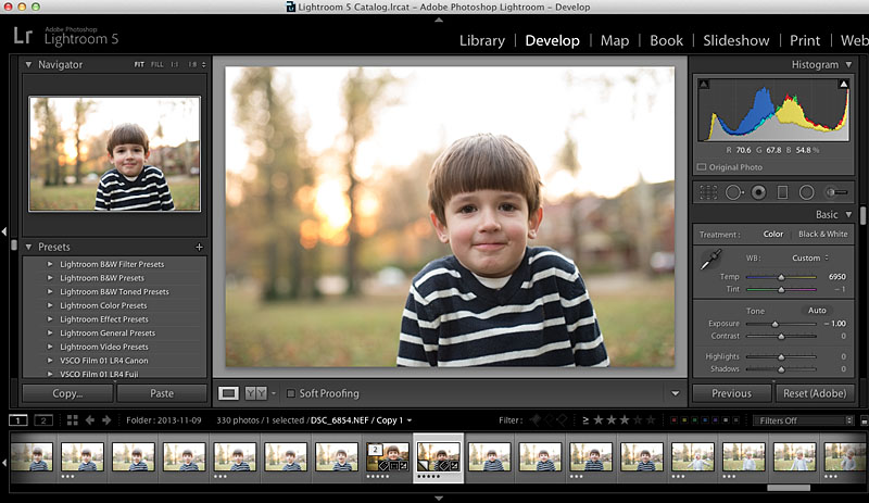
So let’s take a look at what I did for this straight out of the camera photo:
 The first step was to adjust my white balance and exposure.
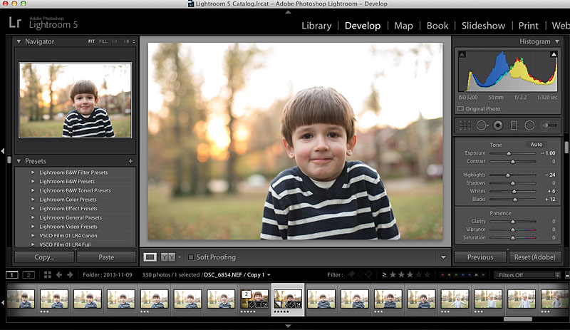
 Then I make some adjustments to the highlights, shadows, whites, and blacks.
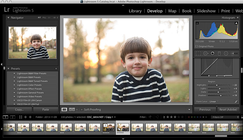
 Next up, the tone curve.
 Then a little Noise Reduction because even though this was outside, it was getting late and my camera was set to ISO3200.
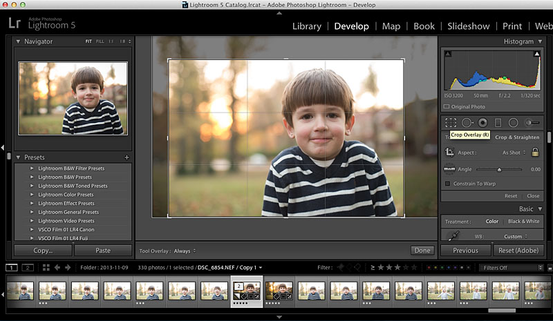
 A crop…for this photo, I used the rule of third guide within Lightroom.
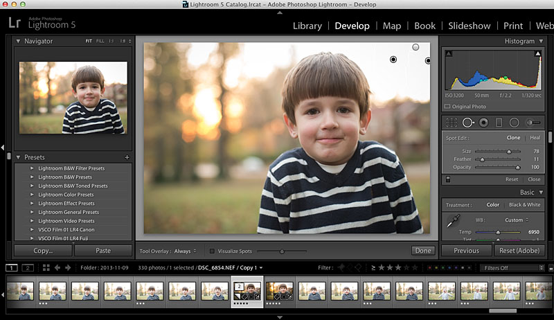
 Then I cloned out a few of the distracting elements in the background, to the right.

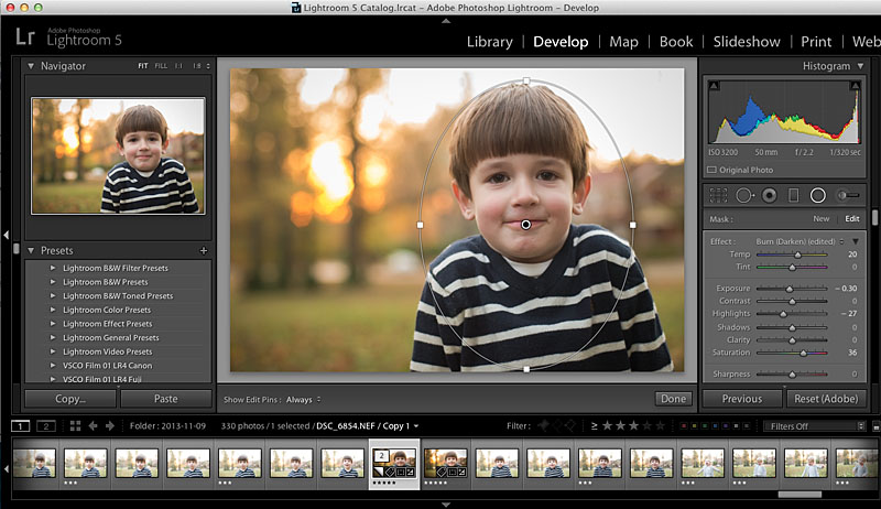
Next step, I get to use this awesome radial filter tool in Lightroom 5. This tool allows adjustments to be made, in this case the background, without affecting the subject. And you can invert it as well. So I wanted to lower the exposure and increase the saturation in the background. This plays up the fall-ness in the photo.

If you don’t have an earlier version of Lightroom, you can always use the adjustment brush to select the background. The radial filter is just a faster option!
Finally, I make a couple more edits to his face using the Adjustment Brush tool. I lighten his eyes ever so slightly, reduce the circles under his eyes by reducing the saturation and add a little warmth and increase exposure to his face.

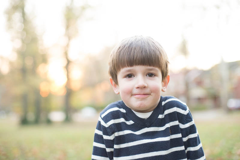
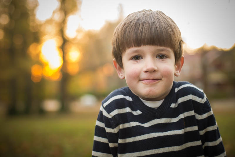
And there we have it! Here is my final photo…it’s not perfect but it’s definitely an improvement from where it started.

by Stacey Wiseman | Nov 17, 2013 | Photograph
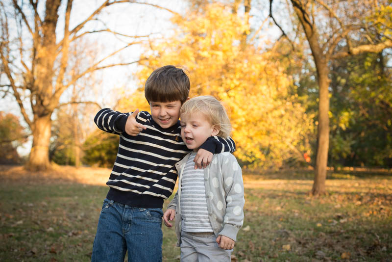
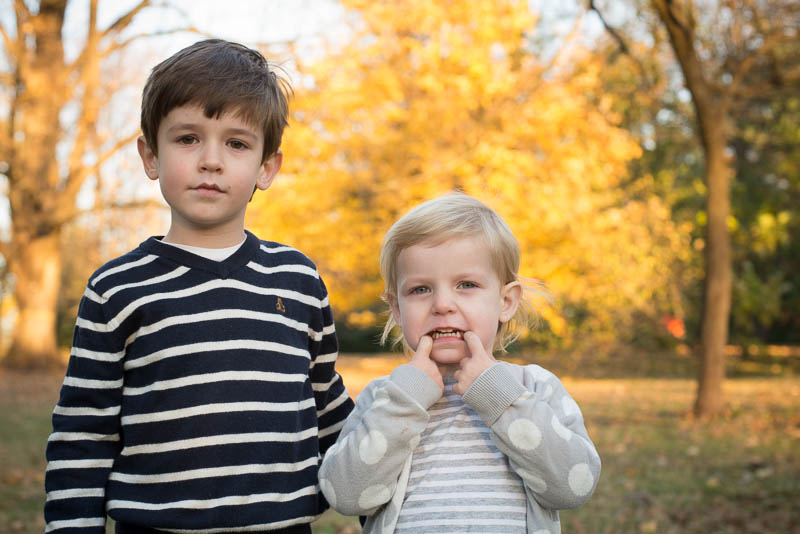
Oh how hard it is for me to get a family Christmas card photo! I think it is the pressure for me to:
a) to get a photo with people smiling,
b) to get eye contact from everybody at the same time, or
c) to capture something creative.
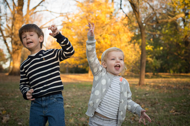
But yet I try. I try several times. Last weekend, we had a warm weekend so I decided to take the kids out, sans coats, to achieve my illustrious goal.
And yes, I bribed my kids for each halfway decent attempt with cheese balls (thanks Halloween basket o’goodies)!
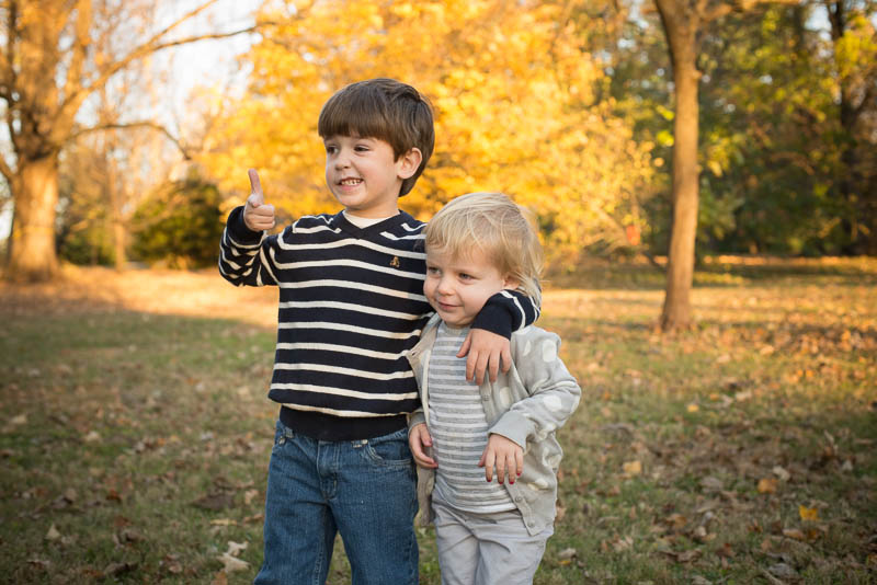
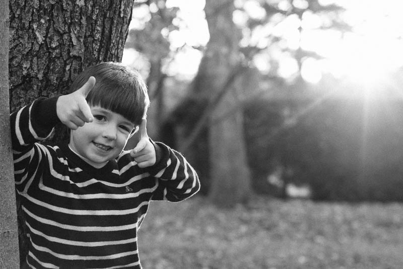
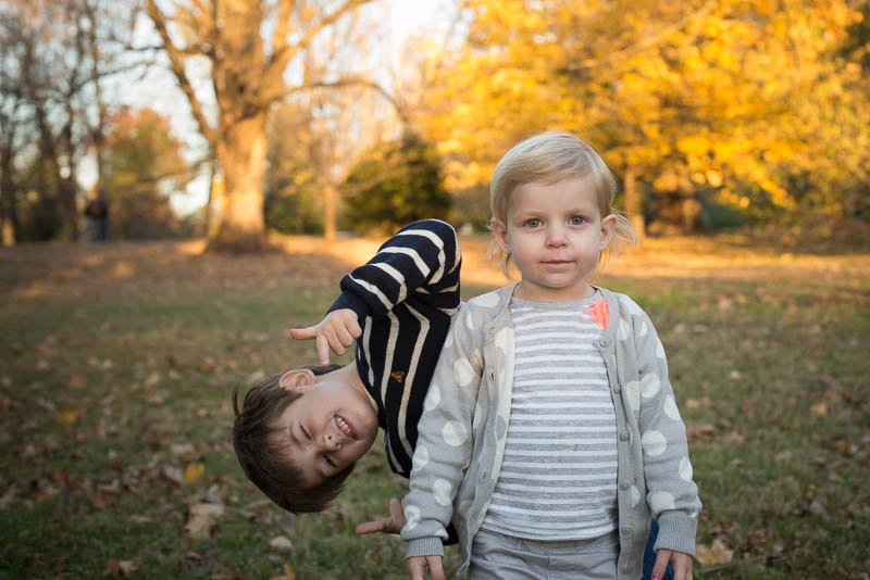
Apparently my son thought this was a pose I wanted.
 I’m not kidding. He did this over and over.


Then I’d get one looking at the camera while the other was looking silly.


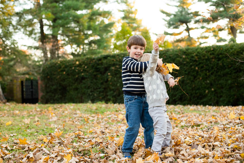
Then I’d get the hug that looked more like strangling.

Or silliness that is too silly.

Why oh why is this so difficult! By the end of the day, I think I got a couple that I might be able to use but I’m also going to try for some indoor photos as well.
Make sure to check out the blog in couple of days when I show how I edited my fall photos.
So tell me in the comments, what’s your secret for getting Christmas card photos? Or where do you get the inspiration for your photos?
by Stacey Wiseman | Nov 11, 2013 | Contest, Podcast

[divider] Let’s design a book in 30 Days!
Challenge
It can be done – I promise! In my November podcast (below), I explain 3 crucial steps to designing a photo book, in a time crunch.
We are all so incredibly busy…but I think it is so important to find the time to actually sit down and design your photo book. Whether you spend a couple of hours a night for 5 days or 30 minutes for 30 days, you can do this.
The result is having a fantastic looking photo book to share with family and friends over the holidays.
Special Product
Also with this challenge, I have a special new learning product, on sale during the month of November. You will receive a 45-page pdf download plus a 220-page book template for Blurb’s BookSmart program.
The pdf contains 30 tips to help you design your photo book, a calendar mapping out a strategy, and a guide on how to use and adjust the template to your book vision.
Also included in the purchase is a link to a private Facebook group where you can share your progress, ask questions and receive encouragement from others designing their books.
Contest
If you purchase this product, participate in the challenge and have your book ready (or almost ready) to order by December 9, 2013, you can enter my contest to receive $100 (via paypal) toward your purchase of your photo book. Only 1 entry will be randomly selected. More details are in the pdf download.
You do NOT have to print with Blurb or use the template to enter this contest. The main requirement is to have your book designed and ready to order by December 9, 2013.
Leave a comment below letting me know you are committed to designing a photo book over the next month. I want to see your progress and your book!!!
by Stacey Wiseman | Oct 20, 2013 | Podcast

If you are a newsletter subscriber, you know that we recently moved back into our house after a lengthy renovation. (If you’re not on my newsletter yet – sign up at the top of my sidebar –>.)
Even though it took over 10 weeks, we only renovated our bathrooms and added a bonus room in our attic. But it was a very needed bathroom so it was worth it!
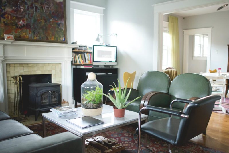
To check out a couple of photos from our recently finished space + to see my main workspace, watch this very quick podcast.
I’d love to hear where you do most of your photo / photo book design work? Is you computer in a separate office or in the main space of your house? Leave a comment below – should be fun to hear where everyone spends their computer time!
by Stacey Wiseman | Oct 19, 2013 | Q&A
Disclosure: Some of the links below are affiliate links, meaning, at no additional cost to you, I will earn a commission if you click through and make a purchase.
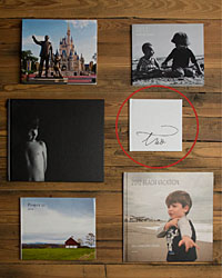
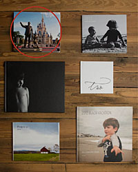
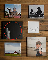
I’ve got a great Q&A for you today on how to get started and actually select the right type of book for your book project.
 How do I decide which type of book to use?
 There are a great variety of books out there…sometimes it can be hard to decide which book will be right for your specific need. Whether you have never made a book before and don’t know where to start….or always end up selecting the same book….here are a couple of great points to consider for your next book.
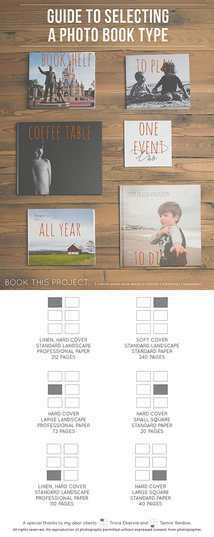
To Play – or – To Display
First Question: Is your book going to be for play or display?

 If you’re planning on your kids handling your book in a way that only kids can master, you know, rough with the pages, bending the corners, sippy cup in hand…you might want to consider a soft cover book. These are great alternatives to document your year and keep your kids entertained.
If you’re planning on creating a book more for display, you should design a book that is more professional looking with higher quality paper.
One Event – or – All Year
Next Up: Are you covering one event or your entire year?

 With only one event, such as a birthday, vacation, or christmas morning, it is easy to design a smaller, succinct book. This is also perfect if you want to include a lot of photos from your smart phone or point and shoot camera. You can easily bleed the photos on the page without having to worry about pixelated images.
For an entire year, chances are you will have a thicker book. Selecting a hard cover to support those pages is a good idea. Depending on the number of pages and your budget, it may make sense to use standard paper or upgrade to professional paper.
On the Coffee Table – or – On the Bookshelf
Finally: Where are you going to keep your book, on the coffee table or the bookshelf?

 A book on the coffee table wants to be a little bit larger, with professional paper and an intentional design. You should design a cover to really stand out and make visitors want to pick up this book and look through it.
If you are planning on a book resting on your bookshelf, take notice of similar types books on your shelf and match that with your photo book size. I tend to have a lot of standard landscape size books (at least in height) on my bookshelf, so it typically makes more sense for me to design standard landscape books.
And to top it off, I’ve got a great reference guide for you to pin and share. 😉

If you’ve got a question about your book, share in your comments below or send me an email!
by Stacey Wiseman | Oct 17, 2013 | Photo Book Design Layout, Tutorial
Last month, you may remember my blog post about creating a photo book layout with a single photo on the page. This month, I want to share how to incorporate color onto those layouts.
There are several difference options when it comes to adding text to your page.
1. Color Font in the Title
For this layout, I used a bold font with color that picks up on the color of my daughter’s leggings. In this example, the title is in an opposite direction of her pants, so it balances out the layout. The color of her leggings is not the greatest (I should have picked a different color of leggings for her…but she has a fashion mind all her own!) but this should give you an idea of how to incorporate a bright color without it overwhelming the page.

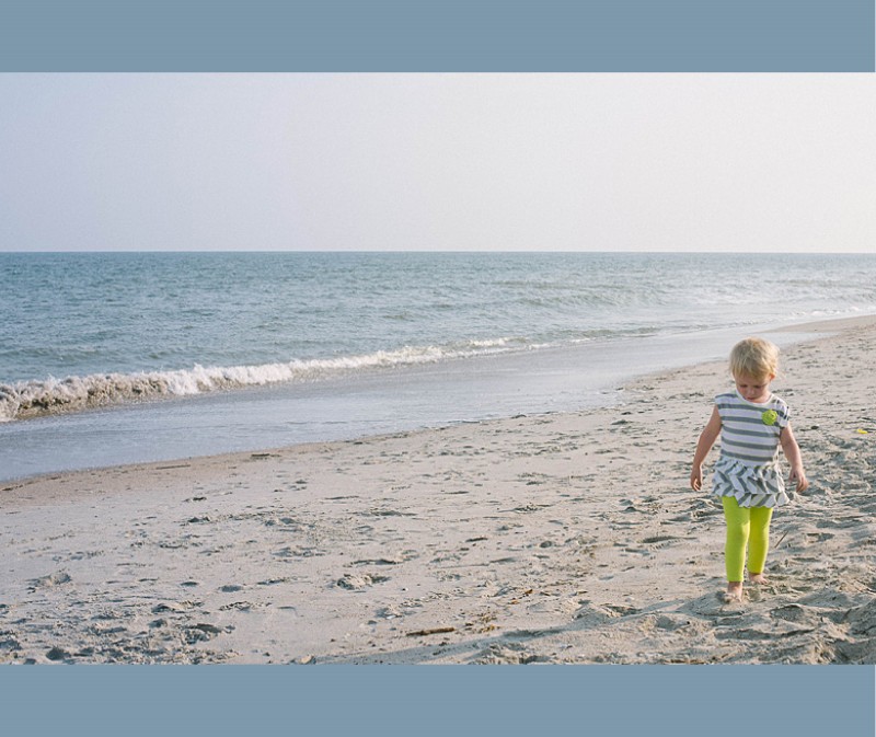
2. Background Color
In this example, the color of the ocean is a subtle background color. Since this is a two bleed layout option, there is minimal space on the top and bottom of the photo. This color adds a nice touch to fill some of the void, while still keeping it a simple one-photo layout.

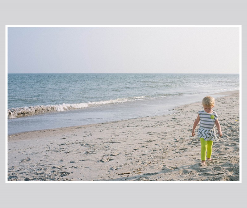
3. Background with a Border.
In this example, I used a neutral color of the sand (just above her head) to create a background color. Then I used a thicker white border to get the photo to stand out a little more on the page. This is a way to keep the color palette simple, yet in tones from the photo.

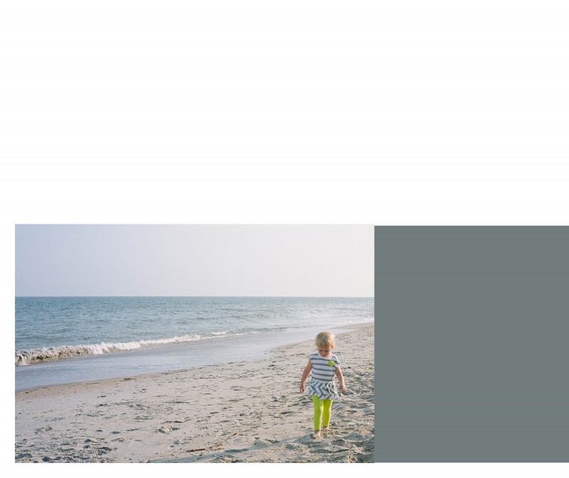
4. Color Block.
For some pages, you may want to include a small touch of color without it extending the entire page. You can easily add photo caption in this color space or leave it blank. In this example, I used a more blue-gray tone from her shirt that I think picks up nicely to the ocean, without it being ‘ocean blue.’

Leave a comment below letting me know your favorite way to add color to your layouts!
by Stacey Wiseman | Sep 21, 2013 | Photo Book Design Layout, Tutorial

[divider] One key for a simple, elegant photo book is to have a few images – even just one photo – per page. Not every page has to have just one photo per page, but it is a great way to highlight photos and break up the monotony of page after page full of photos. I like to think of it as adding a deep breath to your photo book.
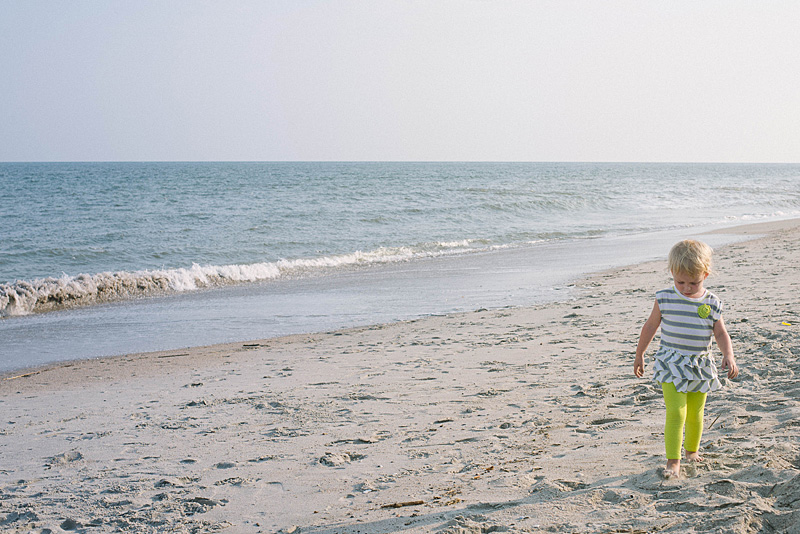
Even though it sounds really simple, one photo on a page – done, I wanted to prepare a design tutorial for you to explain there are actually quite a bit of options when it comes to having just one photo per page. Take a look at my examples below. Determine what you like and try them out in your photo book!
Let’s start with the photo!

[divider] Now the layouts!
1 – Full Page Bleed
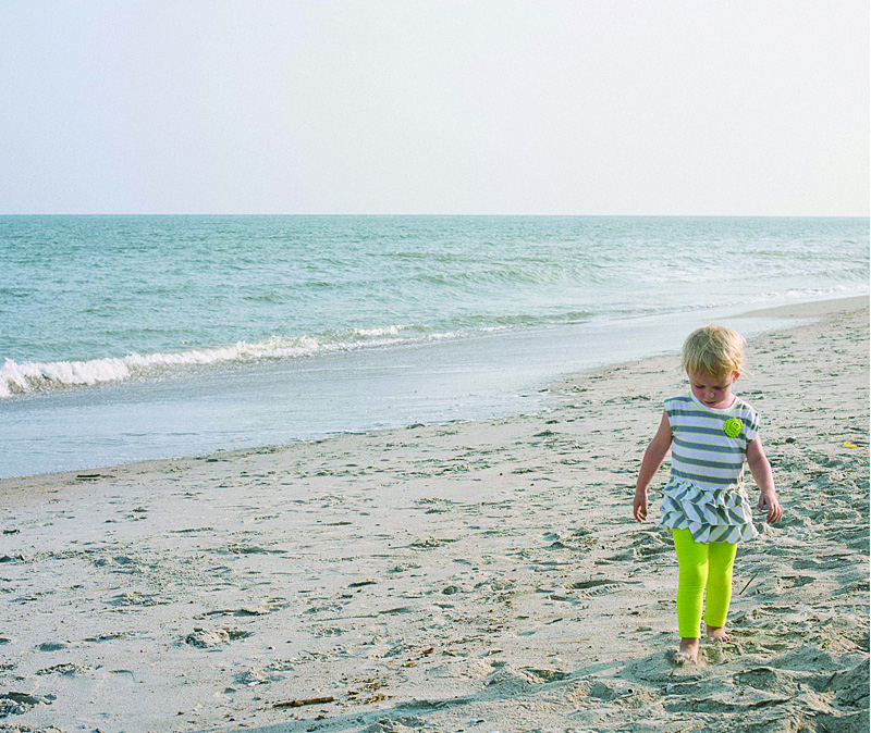
If you want your photo to extend off the page on all sides, this is called a bleed. The photo will have to be slightly larger than the page size to ensure when they cut the page, there is no white page at any part of the edge.
One thing to notice, this photo is a 2:3 crop but the page size is a 4:5. This means a portion of the photo will be cut off.

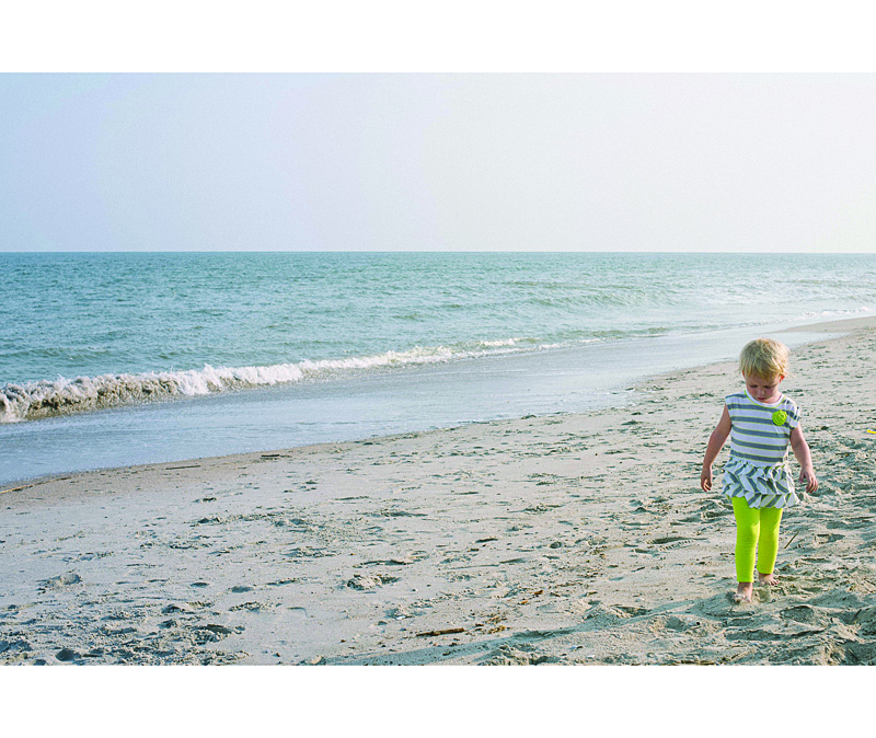
2 – Two Edge Bleed
Another option you have is to bleed the photo on one or two sides. With this option, you will be able to see the entire photo and you will have some white space on the top and bottom. If this was a vertical photo, you would have white space on either side of the photo.

3 – Three Edge Bleed
In this example, I pushed the photo all the way to the bottom of the page so there is a three edge bleed. I also forced the top edge of the photo down to cut off the sky. I did this because the top edge is in center of the page.

4 – Large Photo
This option is great if you want the photo to be large but not extend off the page, I recommend maintaining the 2:3 proportion as large as it will fill on the page with at least a 1/2″ margin. Center the image or if you have a designed margin, place the photo to this line.

5 – Designed Margin
If you have a designed margin, place the photo to this line. In this example, there is larger white space to the top of the image. This may look a little odd with one page, but if you are consistent and use this margin on a large number of pages, it defines the particular look you have for your book.

6 – Negative Space
You can make a large impact by reducing the photo and having a lot negative space on the page. This option may look best with particular photos but don’t be afraid to a single photo on the page small. Embrace negative space!

I hope you enjoyed these examples. Next month, I’ll show you how to add color to your single photo page layouts!
by Stacey Wiseman | Sep 8, 2013 | Podcast
This week I released the Pre-Workshop Lesson to my Intro to Photo Book Design Workshop. (There is still time to sign-up if you want a spot!) It is all about vision. Vision is one of the most important components to photo book design. Without it, it makes it harder to finish your book and with it your photo book is more intentional, specific and cohesive from beginning to end.
While I go into way more detail in my Intro Workshop, here is a brief description of five key elements to determining the vision for your photo book.
Here are five key elements I describe in this podcast:
1. Intent
2. Text
3. Color
4. Margins
5. Consistency
If you’re interested in the free worksheet to help define your vision, click here for the vision worksheet.
Leave me a comment below describing the vision for your 2013 family photo book!
by Stacey Wiseman | Aug 19, 2013 | Photo Book Design Layout, Photograph, Tutorial
Getting in the frame is challenging to accomplish but can be so rewarding. Often times, we are so busy practicing our photography or documenting out kids’ lives that we forget to get in the frame so your kids’ have memories of you as well.
One of the reasons I love designing photo books is to step back and shoot with a purpose – take photographs specifically to go in your photo book.
And this is the perfect opportunity. Plan to photograph with the intention of this going in your photo book.
Here are some of my suggestions.
– 1 –
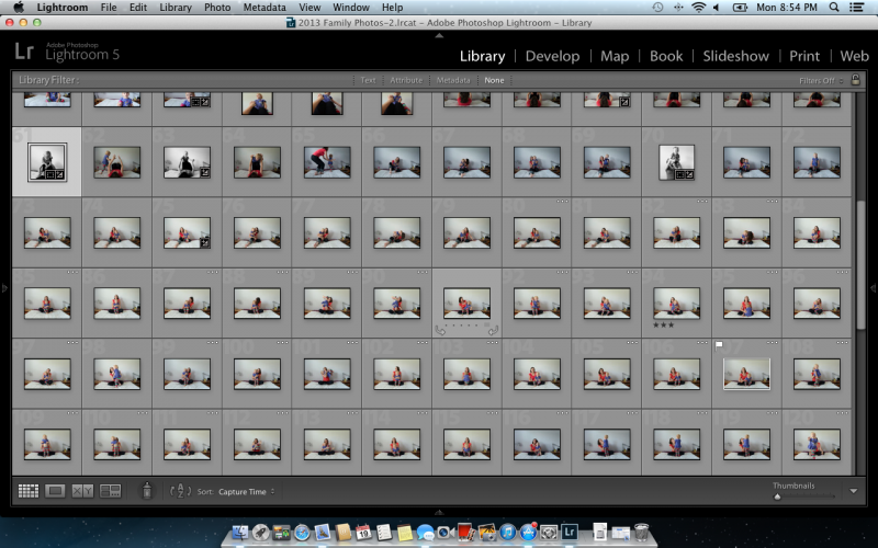
Set up the tripod.
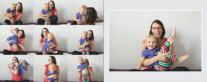
Set up the tripod, the remote, the timer or get a friend/husband/relative to take the photographs for you. For this layout, my design was to feature several ‘outtakes’ so I was okay with multiplicity and imperfection.
I set up the timer with 10 consecutive shots to be taken every 2 seconds. My daughter would push the button and then run towards me.
– 2 –
Take the photos.
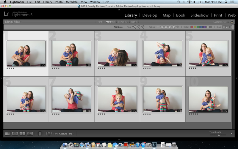
Take plenty of photos to make sure you get a few photos that will work for your book. The goal is to get at least one photo that you really love.

[divider] – 3 –
Select one.
Find your favorite photo, edit it as desired. Export to a larger size. For my photo book, I exported out at 9″ long by 6″ wide.

[divider] – 4 –
Select nine.
For this grouping, you don’t have to worry about perfect photos. This is mainly to get a sense of the fun that you were having with your little one. The key for editing this group is consistency. Export the photos at the same size. For my book, I exported with the short side set to 3″.

[divider] – 5 –
Design the layout.
Now it’s time to get the photos into your book. Select one layout with a grid of nine images and another layout with one photo box. If you had trouble narrowing your selection in step 4, create a grid with the appropriate number of photos. The key here is to create a grid of images. You decide if you want a margin or for it to bleed off the page. For the singular photo, decide if you want in the center or aligned to one side.

[divider] So make some time this week to get in the frame and design a spread for your photo book!
