by Stacey Wiseman | Aug 10, 2013 | FREE!, Photo Book Design Layout, Podcast
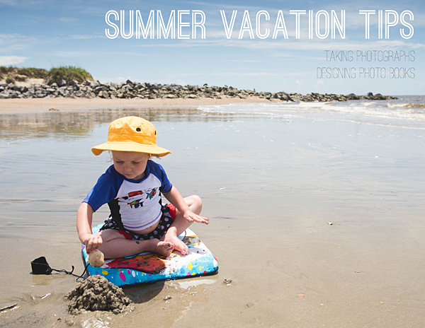
Lately I’ve been writing a lot about vacation photo books. Today I want to include a couple of tips on taking vacation photos and designing your vacation book.
This may help you decide which photographs to use and what to do with them. Or if you are like me, perhaps you have one vacation planned for Labor Day weekend!
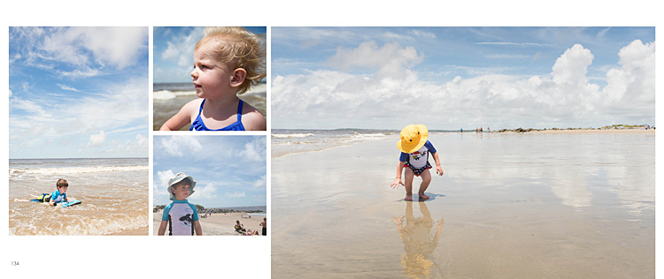
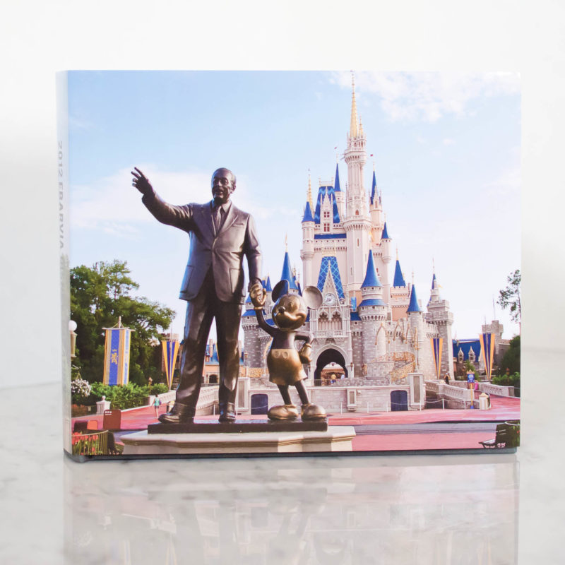
First, take a look at the vacation book I designed last summer.
[divider] Second, here is a free download of 8 tips for your vacation photo book. (Here is a smaller version of the download – perfect for viewing on your mobile device!)

[divider] Third, here is my August podcast. I apologize for the quality. I’m staying at my in-laws while our house is being renovated so I didn’t have my microphone – and – I have a bit of a cold!
Leave a comment below letting me know your favorite tip to use in your vacation photo book!
by Stacey Wiseman | Aug 6, 2013 | Family Photographs, Product Feature

In my last Q&A post about how to combine your vacation photos into your family photo book.
But sometimes…it’s best just to make your own vacation photo book. Stay tuned…in an upcoming post, I’ll share a couple of tips about how to photograph with your photo book in mind…and how to design a fun vacation book.
If you are overwhelmed with everything you have going on, I’d love to design your vacation book for you.
This is a smaller book than my typical family photo book. You upload fewer photos (200) and there are fewer pages (100) but I will design a gorgeous book documenting your family memories.
here are the details:
- One (1) hard linen cover custom photo book.
- 8″ x 10″ Portrait – or – 10″ x 8″ Landscape.
- 100 pages maximum.
- Upload 200 photos maximum.
- One (1) design consultation to ensure the design is just as you want it.
- One (1) hour of revisions to incorporate your comments.
Additional copies, 12”x12” hard cover, additional pages, additional photos, and numerous design review/revisions are available at an additional charge.
Sale price for the month of 2013 August. Only five custom designs are available at this time.
purchase

 [divider] The photograph for this book is copyright to Tricia Ebarvia, All Rights Reserved. Do not copy, use or distribute without owner’s written consent.
by Stacey Wiseman | Jul 19, 2013 | Photo Book Design Layout, Q&A
Yesterday, I showed you how I took some photographs on a crowded beach during our recent vacation.
Today, I want to show you how to incorporate your vacation photos into your annual family photo book.
 Q: We just got back from vacation and I would love to put some photos in my annual family photo book. But I have a lot of photos. How do I decide which photos to use and how to place them in my book?
 A: Yes! You should definitely put some of your vacation photos into your annual photo book. But it is easy to see how you could get overwhelmed with the number of photos…I have a couple of suggestions for you.
1 : Decide how many pages you want to include in your book.
This depends on how many pages are in your book – and – how long your vacation was.
If you have a 400 page photo book, it is easier to fit more vacation photo pages in your book. If your annual photo book is only 100 pages, and it was a week trip (or less), I recommend only one spread. (Unless you don’t take as many photos throughout year as I do.)
My annual photo book is 240 pages with about 20 pages per month. So I’m going to use 2 spreads (4 total pages) for my book.
Another family book I have designed, they took a very long vacation in June, so I devoted the whole month to their vacation.
2 : Decide how many photos you want on these pages.
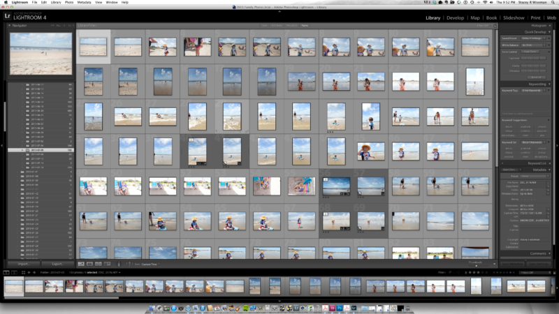
Once you know the target number of pages, you can decide how many photos you want to include. Use a rating system in order to narrow down your photos. Keep in mind the orientation and the content of the photos. You may only want to show certain photos that really tell the story.
If you have so many more photos that you can’t decide, design your own vacation book. That way you can include a lot of your vacation photos and only include your very favorite in your annual family book.

3 : Decide on the look of the layouts.
If you are familiar with this blog, you know I recommend designing your layouts while you are selecting your photos. How can your photos inform your layouts? Are they mostly horizontal? Vertical? Do you have a couple of standout photos? Or are you wanting to collage a collection of them together? Are they color? Black and White?
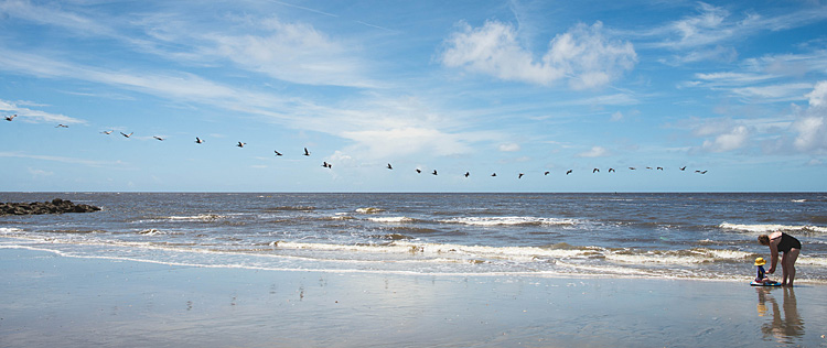
For my recent vacation, I had a lot of horizontal photos but one main vertical photo of my son on his boogie board. I decided I wanted to find one horizontal photo that could work as a full spread bleed. Then I would use the second spread as a collage, mixing in my vertical photo, with some beach portraits and another fun photo really showcasing the beach.
Here is what I came up with.

 I hope this Q&A has helped you with how to incorporate vacation photos into your book.
Leave a comment below letting me know where you went (or are heading) for your vacation this summer!
And stay tuned…in August I hope to have a custom book design option for your vacation photos.
by Stacey Wiseman | Jul 18, 2013 | Family Photographs, Tutorial
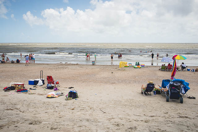
Over the Fourth of July weekend, we took a brief family vacation to the beach. Most of the time when you go to the beach you have to worry about the massive crowds…and trying to avoid the other beach go-ers from getting into your family photos.
In this tutorial, I want to show you that it is possible to capture photos without everyone and their brother in your shots.
The key is to time it just right…to find those moments when a group of people have gone back to the tent to get a drink or reapply suntan lotion.
Another helpful suggestion is to change your position to avoid people in the background. Sometimes that means, moving a little to the left or right. Or getting down low.
Finally, realizing that sometimes it is unavoidable, there are helpful tools in Lightroom and Photoshop to easily clone them out. I’m not the best cloner…so I try to get it close while I’m there.
Here are a couple before-and-after from our recent trip.
Just to prove it was Fourth of July and there were people on the beach…here is the view from our tent.

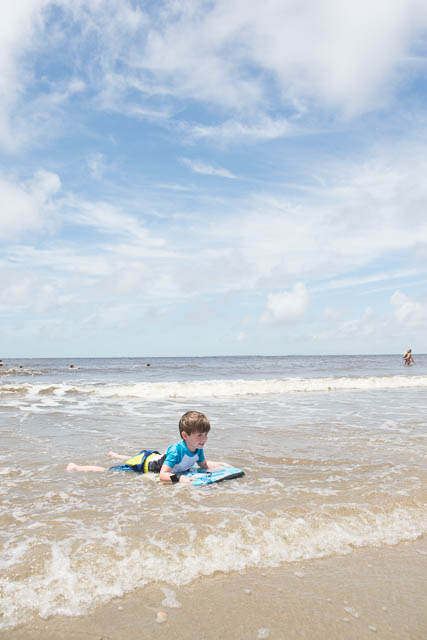
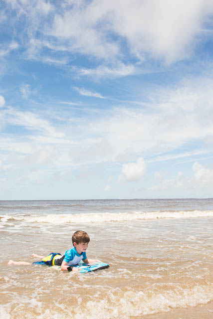
My son was trying a boogie board for the first time. I did take several of photographs as he was riding the wave in but I used the one where he had the most space in between the people to edit.
straight out of the camera (sooc):

edit:
 [divider_flat] Here was a moment where my daughter and mother-in-law was building sandcastles.
You will see in this one…I happened to get lucky, there were fewer people on this side of the beach at the particular moment. There were probably more swimmers to the right, but I used my in-camera crop to minimize those…so I only had to crop out one other family.
sooc:
edited:

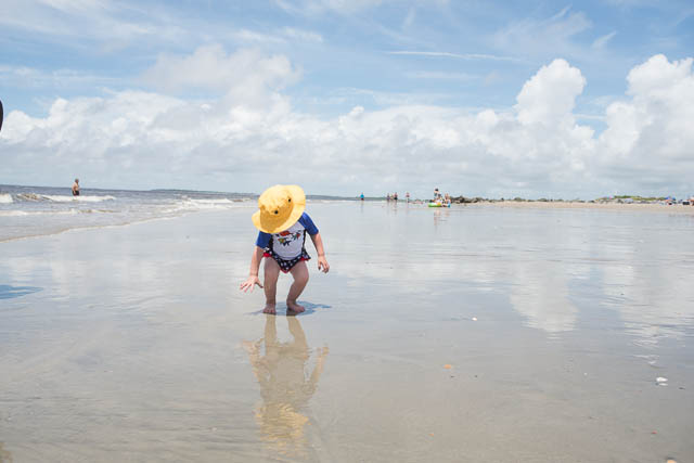
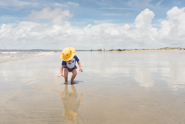
Finally, my daughter and her yellow hat. This one had the most cloning of people and I ended up leaving the people way off in the distance.
sooc:

edited:

[divider_flat] Stayed tuned…Tomorrow I’ll show you how I transformed some of my photos into layouts for my family photo book!
by Stacey Wiseman | Jul 3, 2013 | Photograph, wordless wednesday

by Stacey Wiseman | Jun 19, 2013 | Q&A
A while ago I received a question regarding preparation for a photo book. Even though this is not actual book design question, it is a foundational question for what makes photo books really work – the photographs.
 Question:
How much sharpening [do you do] for your book? One frustration for me is that I will get a photo looking good and sharp but then when the book comes back it looks soft. I have looked on the blurb forum and there is so much technical info re the colour proofing that my eyes just glaze over!! Oh and I have tried to crop the photo to the exact size of the blurb template vs just using the blurb resize tool and there doesn’t seem to be that much difference in terms of sharpening.
 Answer:
I’m not sure I have a definitive answer for you but I will share what works for me.
This is one of the hardest things to show / illustrate / test. Also, you may have personal preferences or standards for your photos that are different than mine.
So the best idea is to test specific approaches and see what works for you until you are satisfied.
I was glad to hear you say you tried sizing to the photo to the actual photo box versus using their slider to increase the photo within the box. That is what I was going to suggest.
I typically size my photos @ 300 ppi at the size I want to use in the book. But if you have already tried that…another thing I do in Lightroom is sharpen for print with matte paper when I export. I think I have had better luck with that.
I also use Blurb’s pro-line paper which may impact the quality of the printed photo.
I will say, I had better quality with the book I designed with BookSmart or InDesign compared to the Lightroom 4 Book Module. But I’m guessing Blurb is continually working to improve the book making qualities within Lightroom. I’ve heard they’ve already made improvements within Lightroom 5.
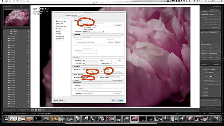
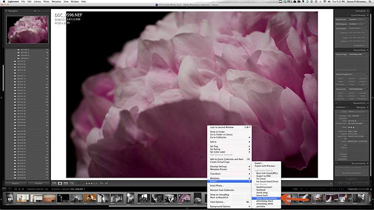
Here is how I export the photos for my book. I’m not guaranteeing success for your books…but so far…this method has worked for me.
First, I export to a specific location at 300ppi with sharpening for print with matte paper. I tend to size my photos to what I have in my layout but if I’m unsure, I will export at the largest size possible. You could also leave the size area unchecked and this will export the original photo at 300ppi.

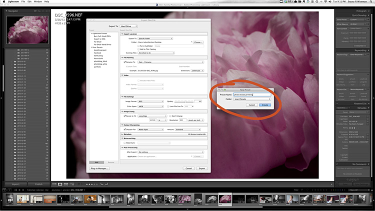
[divider] When I have these areas established, I will go to the left and select, Set a New Preset. This will save all of the settings for future use. This will likely change for each book project, but it’s easy to adjust it as needed.

[divider] Now, whenever I have a photo I want to go in my photo book, I just right click on the photo, go to export and then select the preset established for my book.

by Stacey Wiseman | Jun 19, 2013 | wordless wednesday

by Stacey Wiseman | Jun 12, 2013 | wordless wednesday

by Stacey Wiseman | Jun 10, 2013 | Inspiration, Photo Book Design Layout, Podcast

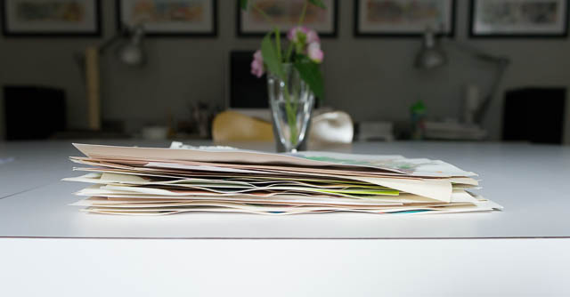
Do you have hundreds of your kid’s paintings laying around? You love them all but no sure what to do with them. You don’t really need to keep them all…but you hate to throw them away.
How about putting them in your photo book!
This is a great way to document and preserve them but not have them physically around. It makes your conscience feel a little better throwing them away to know that they will be in your photo book at the end of the year.
Of course you could frame a couple of your favorites but putting them in a book allows several to be on a spread every month so you can have variety and color all in one place.
Here are a couple of tips for including paintings, drawings or crafts in your photo book.
– 1 – Taking the Photos
When turning artwork into jpegs, the important thing is to standardize. Scanning is obviously the easiest way to achieve this because you can line up the artwork on the scanning guides. And it flattens the work while it scans.
If your scanner is not as accessible (as mine is) or the artwork is larger than the glass (again, my case here), then taking photos of the artwork is the next best option. Wait until you have a stack of artwork and set up an area to take the photos one by one.
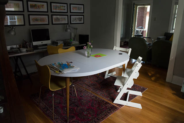
In this example, I used our dining room table. Although it’s not terribly bright, there was a nice gentle light in which to photograph. Setting up a tripod, in this case, setting it on the table, would help to standardize the process – every frame would be exactly the same.
 For this example, I decided to use a wall surface to photograph the work. Obviously the clipboard and the wall would be in each photo, but that could also add a design element to the layout. If you don’t want the clipboard showing, you could always use tape (adds a bit of time). Shooting on the wall is helpful because you can minimize the shadow created by the artwork itself.
– 2 – Editing the Photos
Next, you should import your photos using the method you typically do for sorting and editing. I use Lightroom, so I created a separate special collection with a keywork “artwork.” This helps to keep all of my kid’s artwork in one place in my catalog.
Then I added a noise reduction, slight increase in exposure and vibrance, and lifted the shadows a touch in my tone curve. I created my own preset to save time in the future.
Finally, I exported the photos at 300 dpi to the approximate image size in my photo book.
– 3 – Layouts
There are several different options for using artwork in your book.
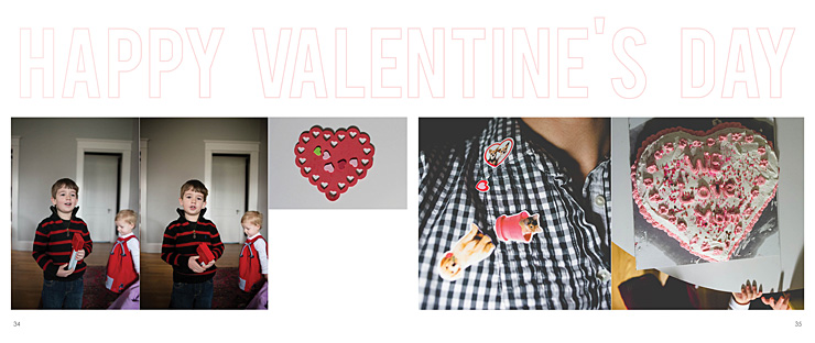
In this example, the craft is added directly to the layout with photographs.
[divider]

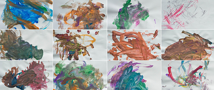
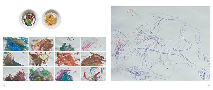
This example features a grid of the paintings on one spread.

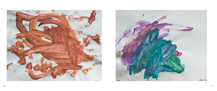
Here is how it would look with individual artwork from each of my kids.

Finally, here is a combination of the above. I have individual works from my kids (their handprints), a small grid of paintings, and a large drawing on the right hand side.

Here is a video providing a little more detail into how I took, edited and placed my kid’s artwork into a photo book.
Leave a comment below telling me your favorite option or what you do to preserve your kid’s artwork!
by Stacey Wiseman | Jun 5, 2013 | Photograph, wordless wednesday
