by Stacey Wiseman | Apr 20, 2013 | Description, Photo Book Design Layout, Q&A

[divider] Are you wanting to design your own photo book but have no idea how to begin?
You don’t even know how to select the best photo book company or program to use. This month’s Q&A will definitely help you out!
 How to choose which photo book program should I use?
 This is a great question and actually really influences the type of photo book you want … and the design process itself.
Are you looking for a no-fuss process? Do you want the fastest way to design a book? Are you looking for some creative choices but don’t want to be overwhelmed? Do you love having complete control?
Do you want a lot of photos in a grid layout? Do you want fewer photographs in a more specific layout?
Do you want to start with a clean / blank layout (think black or white backgrounds) or do you want a bit of design?
Every single one of these questions influences which company, process and program you should use.
The best single piece of advice I can offer: Spend a little time right now to decide what you want before you download a program. You’re more likely to get the results you want in the end, if you start with an intelligent choice in the beginning. Here are some options to consider.
First, start with the photo book company.
If you’re looking for a template to add photos to, check out Snapfish, Shutterfly or TinyPrints.
If you’re wanting to start with a basic background, white, black or solid color, look into Blurb, My Publisher or AdoramaPix Books.
How do you decide? Look for the specific design templates, page layouts and/or finish options that speak most to your vision. Look at the cover, the binding, the paper options.

[divider] Second, think about the design control you want to have.
Does the photo book company you are considering have an autoflow option (if you want a quick design) or a custom layout option (if you want more design control)?
I’m more familiar with Blurb so I wanted to outline the three options they provide to design a photo book.
1 – Bookify: This is purely an online, cloud-based, program. It does not have an application that you download to a desktop. This is great if you plan on working from various computers. You can not customize the page layouts and have to use the pre-designed templates. For simple books, chances are you’ll find what you want. These are great for autoflow books (where the program places the images for you automatically), especially if using instagram or facebook pics.
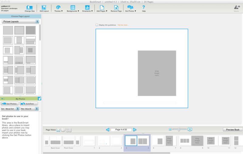
2 – BookSmart: This is an application that you download to your desktop. There are a variety of more advanced options that you can use to design layouts. There is an autoflow feature but you can also customize the page layouts. There are some restrictions to text – for instance size and rotation. But for the most part, you can be design a sophisticated book. There are layout options for full spreads (left and right side of the page) which is an awesome feature to have.
3 – Adobe InDesign Plug-in: Blurb provides a plug-in to be installed into Adobe InDesign in order to design photo books. All of the margins are established with the plug-in. You simply design what you want and upload it to their site. This option provides the maximum level of design and creative control. The only restriction is your knowledge and understanding of InDesign. I’m offering an upcoming workshop to educate how to design gorgeous books (and other documents) using this plug-in and InDesign.
Third, factor in cost. You don’t want to design your book and then realize the price is too high for you to order your book. Understand what to expect from the beginning.
There you go! My answer to help you select the perfect photo book program for you photo book project!
Do you have a specific request and want to hear my recommendation? Leave a comment below and I’ll let you know what I think may be the best option for you!
by Stacey Wiseman | Apr 18, 2013 | Family Photographs, Photograph

[divider]It’s no secret that I’m not the chef in our family. My husband cooks all of our dinners – and he is amazing!
But in the middle of March, we had a stomach bug move through the house. At some point, my husband was not moving from the bed and I was responsible for dinner! Oh dear, this was going to be a challenge, because, besides scrambled eggs, it’s been a while since I was responsible for dinner.
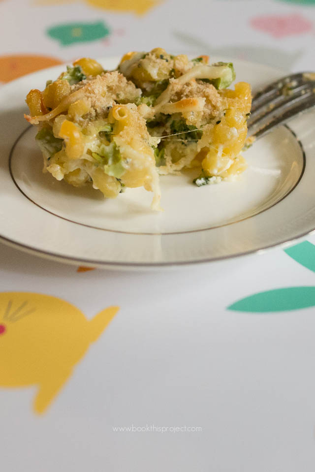
I pulled a very easy sounding recipe from a recent issue of Parenting magazine. The recipe requires some tweaking but my son loved it. I think because of the cupcake shape.
[divider]  Ingredients:
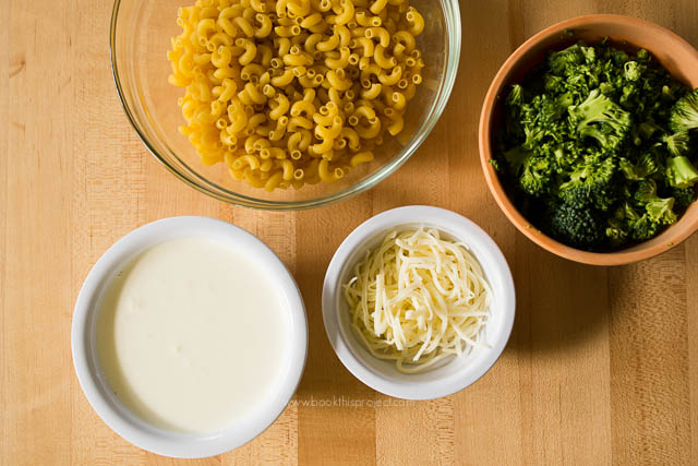
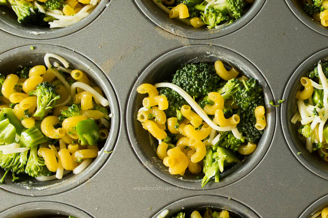
2 cups of dry pasta (but I recommend parboiling the pasta)
1-1/3 cups chopped broccoli
1 egg
3-4 tablespoons of shredded mozzarella and parmesan cheese (I used an Italian cheese pack.)
1/4 teaspoon garlic salt
Mix all of the ingredients together. Fill wells of a muffin pan with mixture – about 3/4 full.
Distribute 1 cup of heavy cream among wells. I added a bit more cream to avoid crunchy pasta (my original mistake!).
[divider]
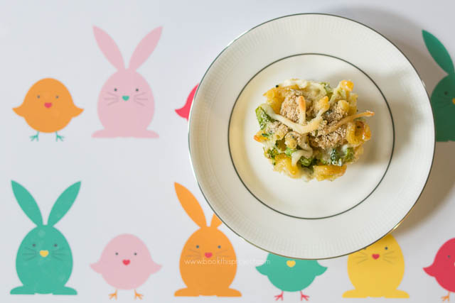
Top each well with bread crumbs.
Bake at 350 degrees for 20 minutes.
[divider]

[divider]
We now refer to them as pasta cupcakes!
by Stacey Wiseman | Apr 17, 2013 | Family Photographs, wordless wednesday

by Stacey Wiseman | Apr 12, 2013 | Cover Series
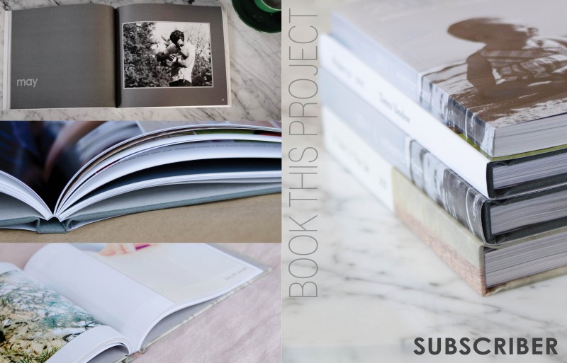
I prepared a special little design project for all of my photo book subscribers and clients. I wanted a cover design that had one descriptive photo on the front cover and the back provided three sample photographs. The vertical text is a thin font style which contrasts the bold font in the lower right corner.

by Stacey Wiseman | Apr 10, 2013 | Family Photographs, wordless wednesday

by Stacey Wiseman | Apr 10, 2013 | Family Photographs, Photo Book Design Layout, Podcast
It’s time for another video podcast where I illustrate steps / tutorials / examples for photo books. If you remember last month’s podcast, I started to fill in my outline with my monthly photo project – 10 photos in 10 hours. In this month’s video podcast, I fill in my 2013 January photos. You will see how I select photos and how I varied my layouts. And I critique my layouts – so you will see what I hope to change.
My goal is to show you my thought process as I design a photo book. Whether I’m designing your photo book – or you’re designing your own – you will see how the pages begin to come together. I’ll reveal a little bit of the design process each month – so make sure you follow along! Did you know you can sign up for my podcast feed in iTunes!
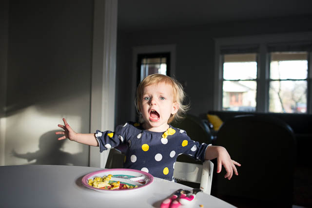
I’m really excited about this video because I’ll explain why I passed on this image with my son’s locked focus:

[divider] and instead selected this less than stellar image for my photo book.

[divider]
Make sure you leave a comment below with your favorite spread!
by Stacey Wiseman | Apr 2, 2013 | wordless wednesday

by Stacey Wiseman | Mar 27, 2013 | wordless wednesday

by Stacey Wiseman | Mar 22, 2013 | Cover Series, Family Photographs, Photo Book Design Layout
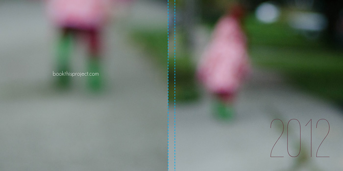
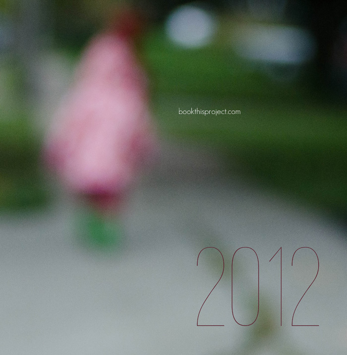
For this photo book cover, I wanted to use an out of focus photo to create a more abstract image for the cover. While this may not be the best photograph to use, it does point out if you like this concept for your cover to shoot with intention throughout the year. Every time you have a potential contender, give it a keyword like “cover” in Lightroom or iPhoto. Then at the end of the year, you can look through all of the options and decide which one works the best!
Here is the full image wrap cover for a square photo book.

Here is the front cover.

by Stacey Wiseman | Mar 20, 2013 | Photo Book Design Layout
 Q: How should I combine photos of my kids with photos of objects?
[divider]
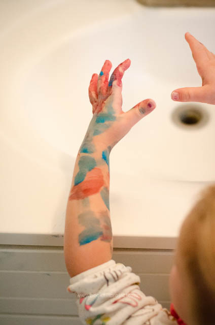
 A: This is such a great question. Often times we only want to photograph or print the photographs that have people in them. But sometimes the objects (toys, food, paint, bubbles, shoes, etc) can be just as telling and instructive about our daily lives – what we love, what we do, how we do it.
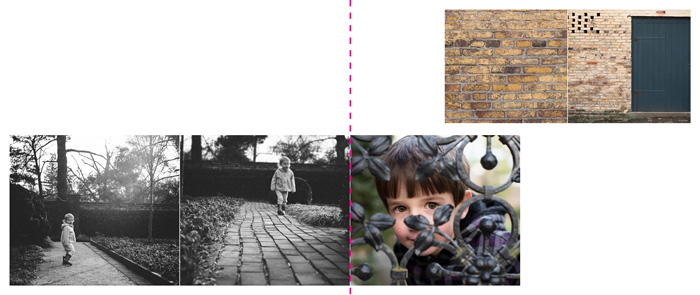
It can pose a bit of a challenge for how to combine the portraits with the still life’s when it comes to photo book layouts. Typically, I like to combine similar photographs to a spread. In these examples, I want to show how combining objects and faces on a layout can work.
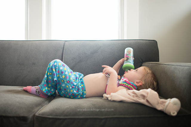
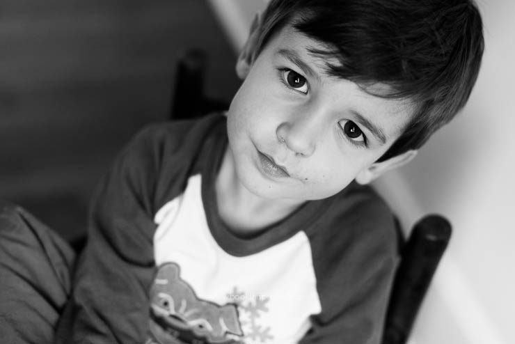
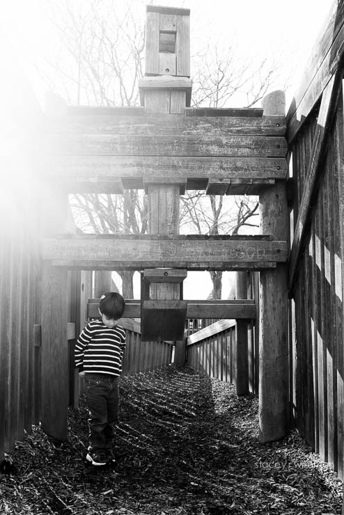
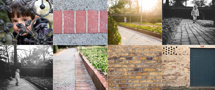
Here are a couple of strategies for you to consider. To test these strategies, I used this grouping of photos.

[1]
Group your similar photos together.
In this scenario, group your portraits together and group your objects together. This option provides a clean break between the two different types of photographs. By bridging the center line of the page, I’m subtly suggesting there is more of a blur or crossover than the initial grouping suggests.

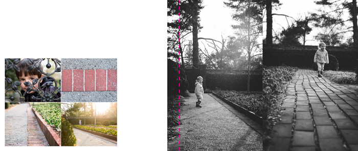
[2]
Mix your photos.
To mix the photographs together, I’m using a collage-board type layout. The object photos are interspersed with the portraits. In this set-up, there is no hierarchy or preference between the two different types of photographs.

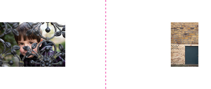
[3]
Use negative space to separate your photos.
I used negative space in this layout to separate or segregate the photos. To play a little bit with the layouts (don’t want to be too rigid!), I mixed the types of photographs together to heighten certain connections and relationships. Grouping in this way tells a different story.

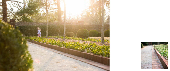
[4]
Use scale to isolate or group.
Finally, one option is to use scale to create distance. This is an easy way to feature the photograph you want to show, in this case a portrait, but also reveal the other aspects that inform the portrait.

Now, I’d love to hear from you. Leave a comment below with your favorite layout. I need help trying to decide which one should go in my photo book!
 How to choose which photo book program should I use?
 This is a great question and actually really influences the type of photo book you want … and the design process itself.