fbq('track', 'PageView');

Using ASE colors in your photo book project

This summer, I’ve been sharing how to add color to your photo book. Recently, I used a color palette from Pantone into layouts. There is one handy trick that I did not share in this tutorial: ASE files. Do you know about or have you used ASE files yet? If not, prepare to be amazed. I love ASE files!

ASE stands for an Adobe Swatch Exchange file which is basically a collection of colors that you can add to your swatch panel into Adobe programs. This makes it incredibly useful if you use Photoshop or InDesign to make a photo book. 
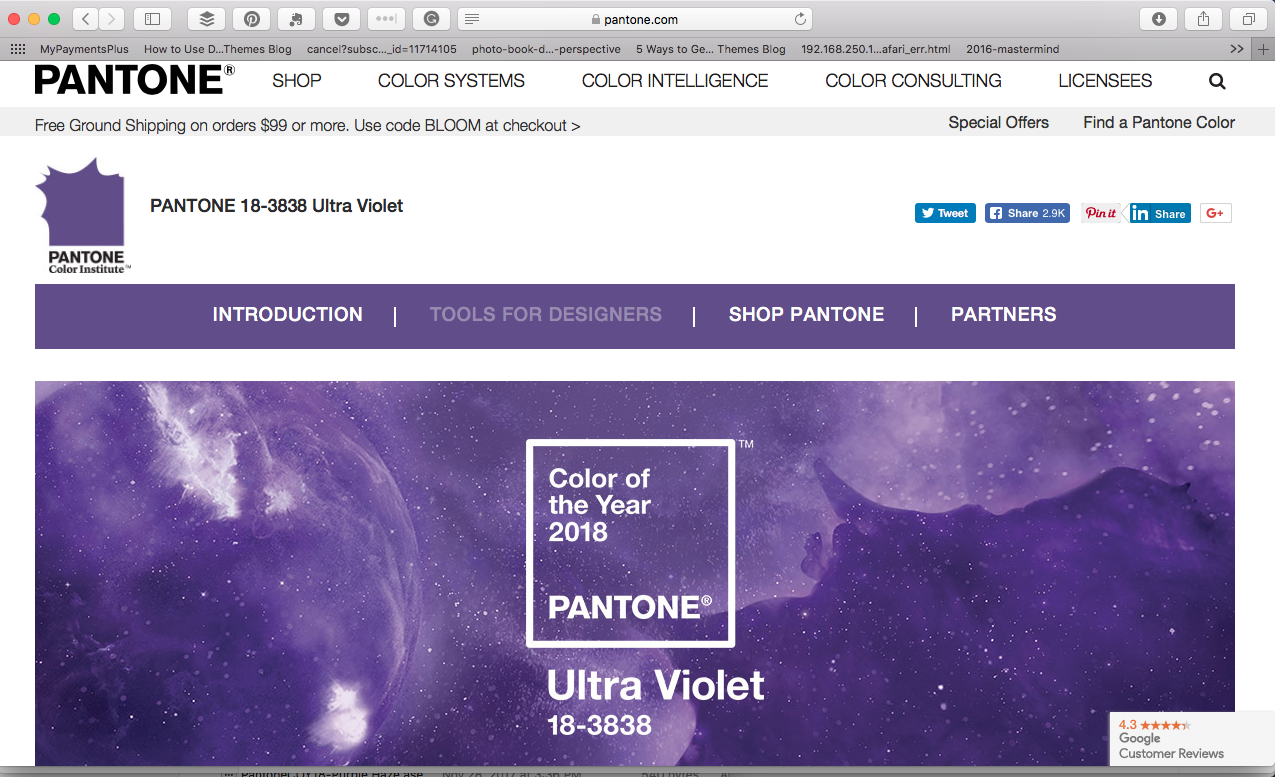
As I mentioned above, I referenced the 2018 Pantone Color or the Year in one of my recent blog posts. On this website, if you scroll all the way to the bottom, past all of the palettes, there was an ASE file download. 
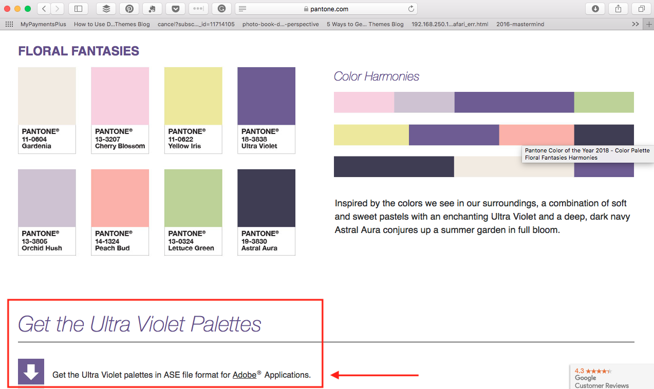
 

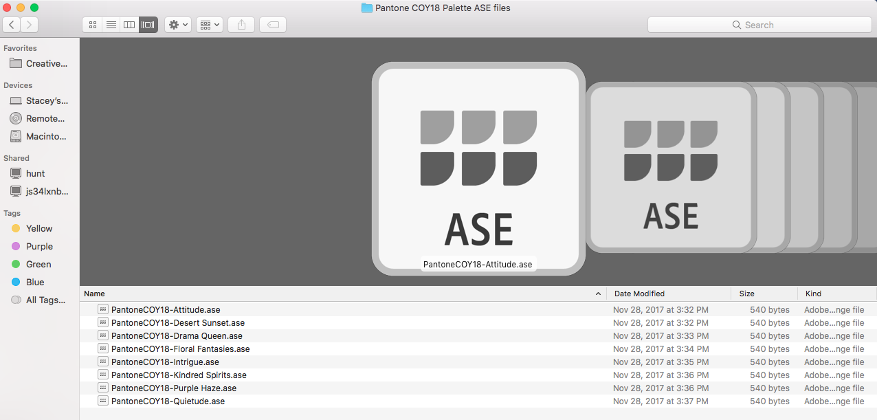
Once you click this button, the files will go directly into your “Downloads” folder on your computer. At this point, it’s helpful to move/copy these files into a folder you’ll remember. There is an Adobe Library folder that is installed automatically when you download the program; however, I create a folder specifically to house my color swatches in a place I frequently go to. 
Photoshop

First let’s look at how to install these ASE files into Photoshop. You’ll need to open up your Swatches panel. If it’s not open already, simply go to “Window” and select “Swatches”. 

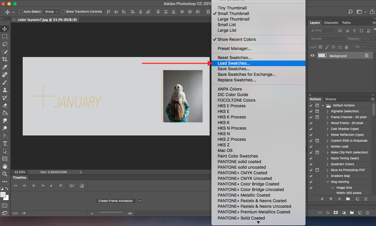
Next, click on the three small lines in the upper right corner of this panel. A pull down menu will appear. 
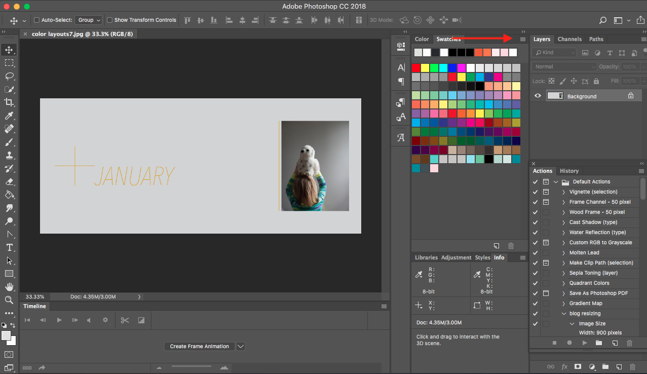
 

Under the pull down menu, select “Load Swatches”. A dialog box will appear to locate the files. 


At this point, you’ll want to find the ASE files, wherever you placed them. As a default, make sure you check your “Downloads” folder. 
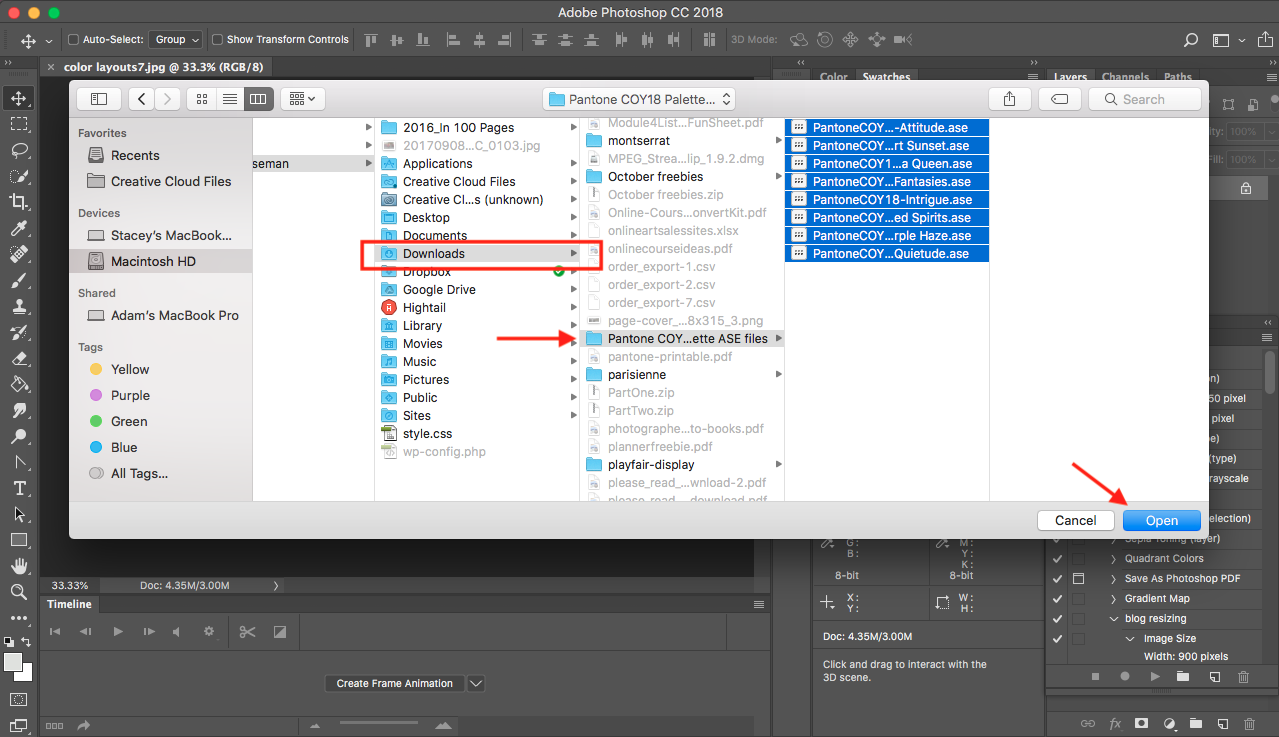
 

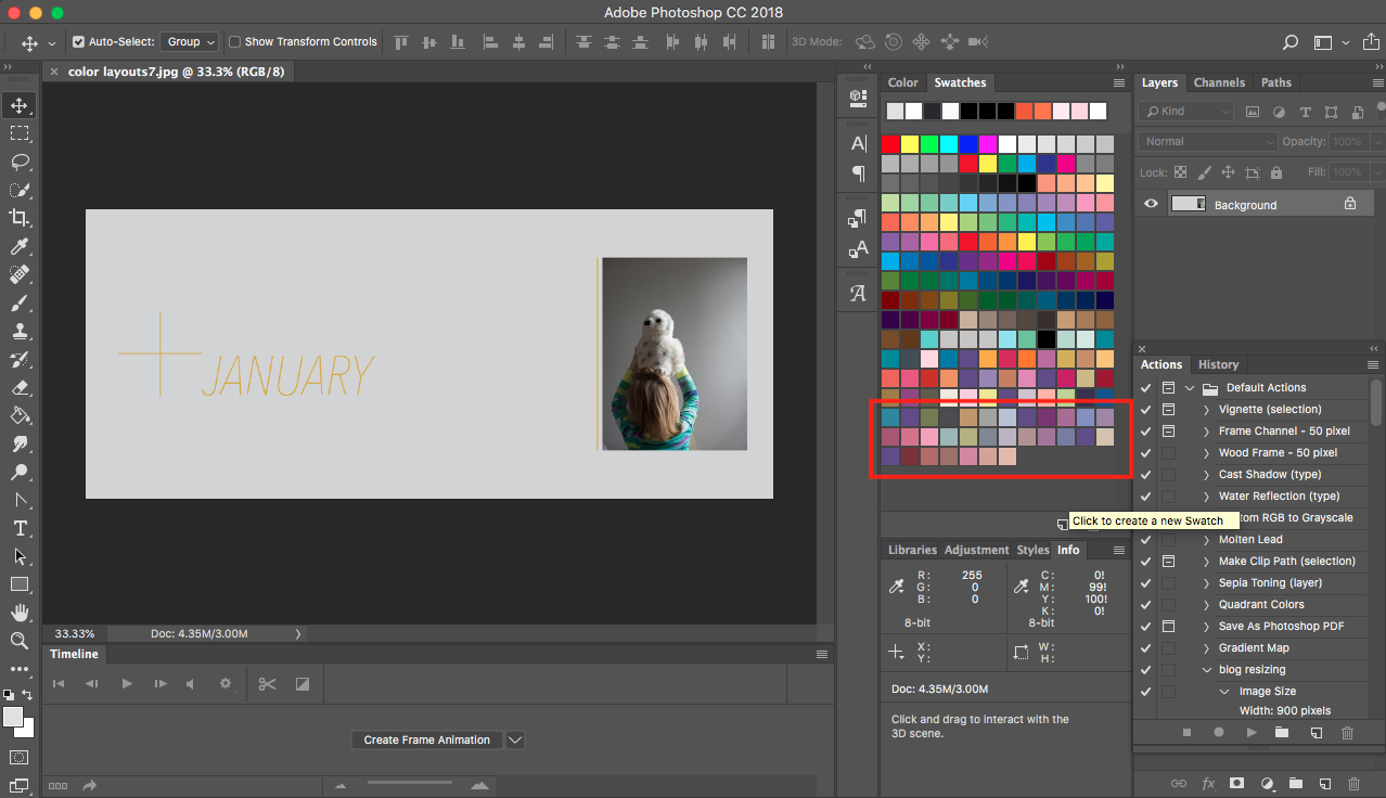
Now all of the swatches are loaded into Photoshop swatch panel and ready for you to use as a fill or outline in your photoshop file. 
 

InDesign

Now you can follow a similar process in InDesign to load ASE files. Using ASE files in InDesign is fantastic because you can orchestrate and design a full photo book within this program – start to finish. If you’re unfamiliar with how to fully use swatches in InDesign, make sure to check out my Advanced Photo Book Design Workshop. 

The first couple of steps are exactly the same as Photoshop. Open up the swatches panel. Click the three lines in the upper right to make the drop down menu appear. Click “Load Swatches” and finally find the ASE files. 
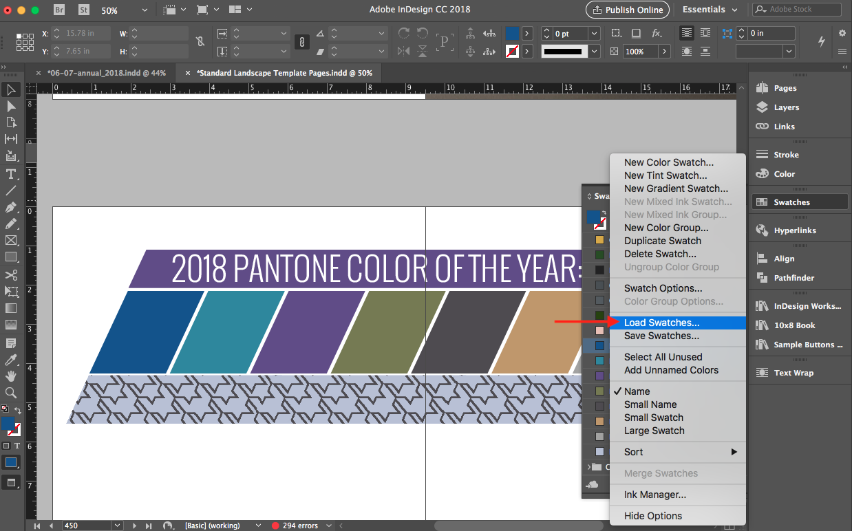
 

Here’s a great feature within InDesign that you can’t do within Photoshop. Select all of the swatches that were loaded in the ASE files. Right click and select “New Color Group”. Now all of the swatches you’ve downloaded and installed into InDesign are conveniently grouped together in one location. 


Once your color group has been created, I recommend you double click on the name of the color group and change the name to describe the group. 

This is a helpful tip for any swatches you’ve created on your own too. It’s a great way to keep them all together in one nice tidy location. 
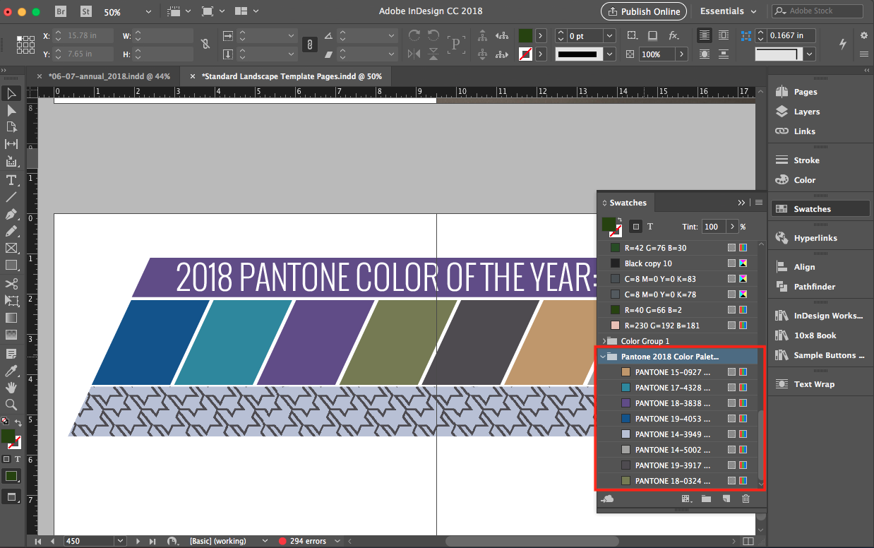
 

Now that you know how to install ASE files, I want to reiterate why you would want to use them. First of all, it’s a really fast way to have colors you love without having to mess with the sliders or come up with them on your own. 

If you’re anything like me, it can be hard to figure out the exact color you want. I can spend a good 15 minutes messing with the sliders trying to determine the perfect amount of CMYK (cyan, magenta, yellow, black) for each swatch. 

Using ASE files saves you time. And it provides a framework for you to use similar colors throughout your photo book – or several photo books. 

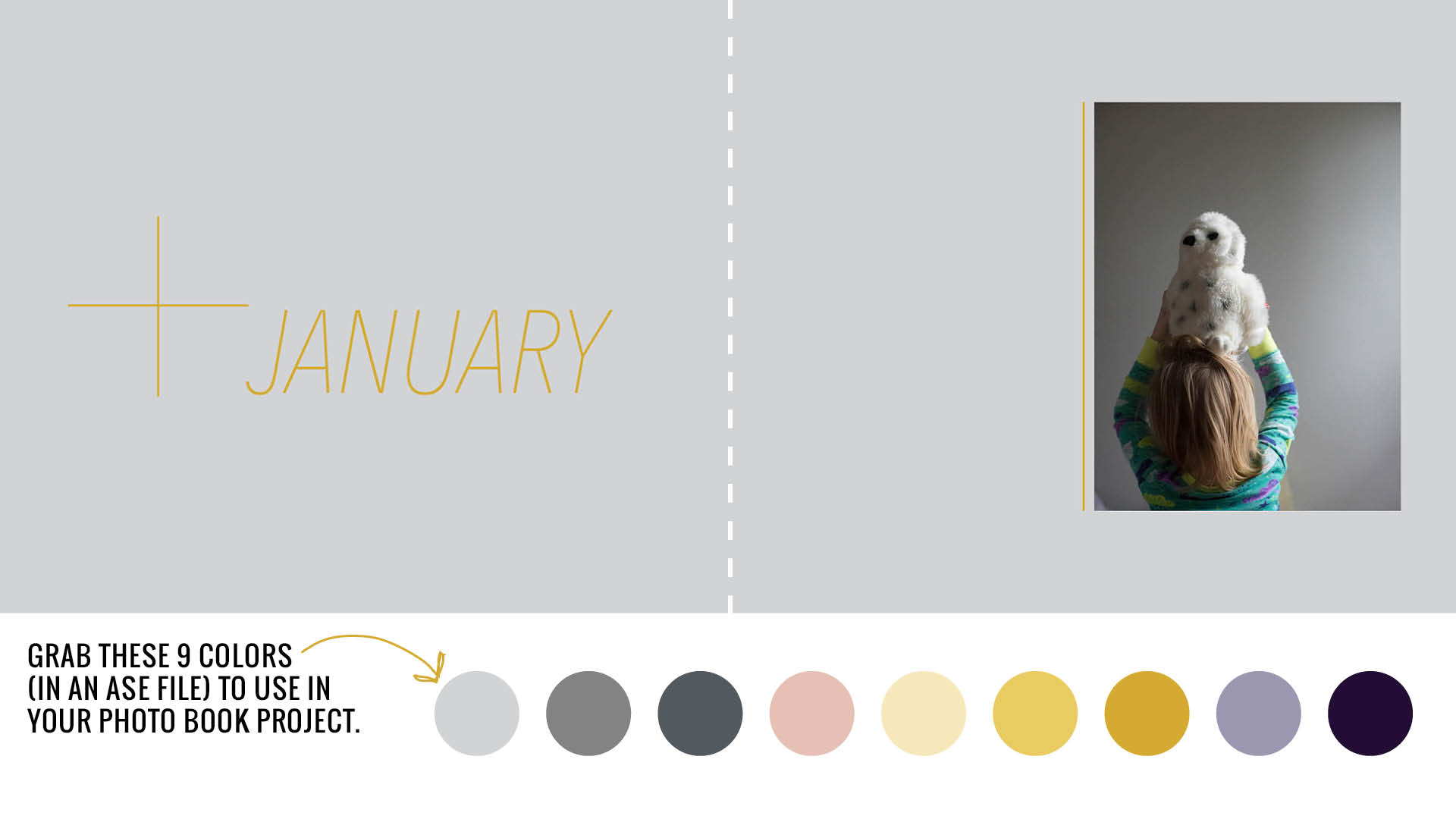
It’s time to practice! I’ve created 9 colors in an ASE file for you to download and practice using on your own. Simply add your name and email address to get these colors and stay on top of my favorite tutorials to make making a photo book a little easier and more fun!
 

My Summer Bucket List

My Summer Bucket List

Oh my goodness, it’s already the end of June!!! While June flew by, I did find the time to sit down with my kids and figure out what we wanted to accomplish this summer. While I’ve seen some summer bucket lists on pinterest with a lot of items, I decided to limit my Summer Bucket List to at least 10 activities.
We could always do more this summer….but I’m a fan of keeping things simple and doable. On our list, we selected some creative activities (like a painting), typical activities (reading a book) and activities that will require a bit more effort than a common weekend (visiting a national park). 

I love the idea of writing down how you and your family want to spend your time this summer. It makes the summer and weekends more intentional. And it provides a template of the photographs to take over the next few months which will ultimately make your photo book more interesting. 

Here’s the list of ten things we want to accomplish in our household this summer: 

What about you? Have you created a Summer Bucket List yet? If not, it’s not too late! Sit down with your kids and figure out at least ten things you want to accomplish this summer. At the very least, write them down and place it on your fridge (or in a visible place) and start marking them off. 

Or you can download my blank Summer Bucket List to fill out yourself. I’ve got a digital and printable form you can fill out. 

And don’t forget to share in the comments below one thing on your Summer Bucket List! 


Get my Summer Bucket List:

Using Color in your Photo Book.

Using Color in your Photo Book.

color in photo book

Lately, I’ve been in the mood to add color to my layouts. In my last blog post, I should 10 ways to add color to layouts. But those suggestions were more for you to pick and choose. In today’s blog post I want to share how you can add a color palette throughout one of your photo books. 

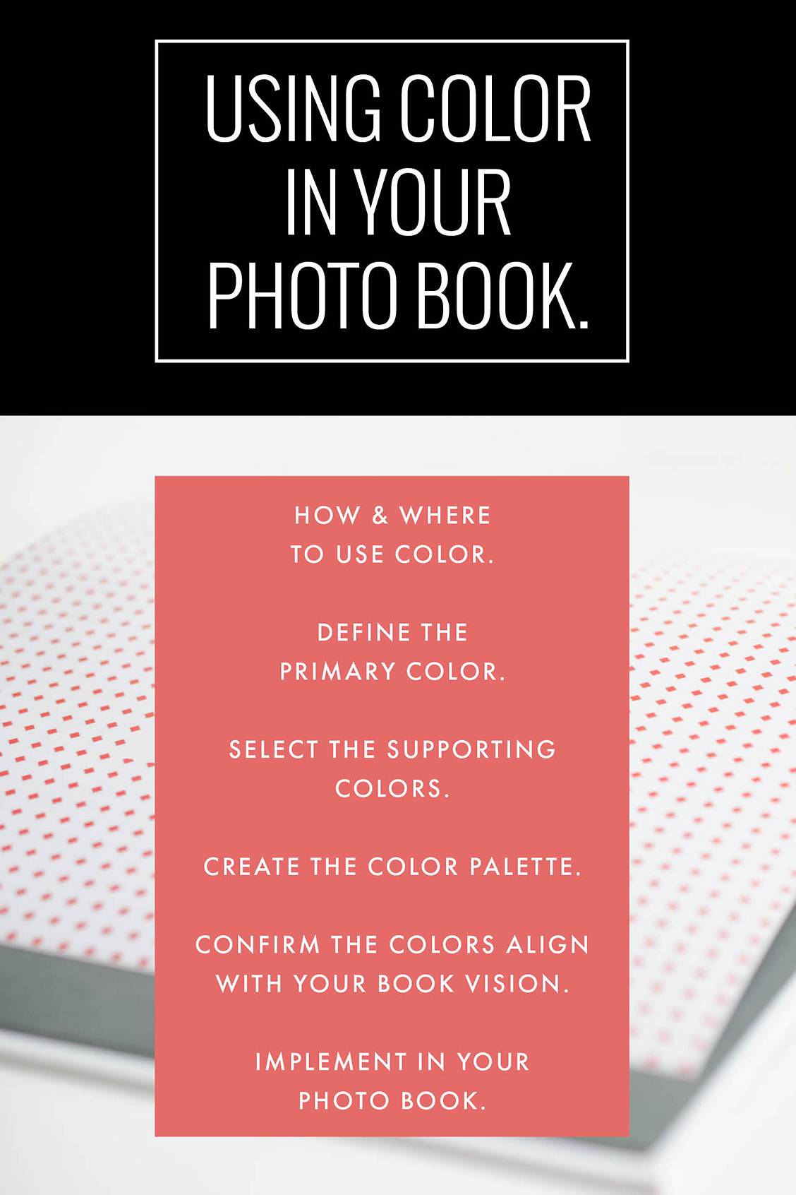
This step is something that you should consider the beginning of the design process, if possible. Here are my decision-making steps: 

-1-  Select how and where you want to use color. 

-2-  What is the primary or dominant color you want to use?  

-3-  What color(s) could support the main color, if any. 

-4-  Define the full color palette. 

-5-  Does this color palette support the overall vision you originally wanted? 

-6-  Implement in your photo book design. 


Now let’s see these steps in action. I’m going to use a typical annual photo book for this example. 

I want to use a color palette for section pages, page numbers and any titles on the page. I want to use the same color for all three places. But on the section page, I want to use two other colors to add design variety. 

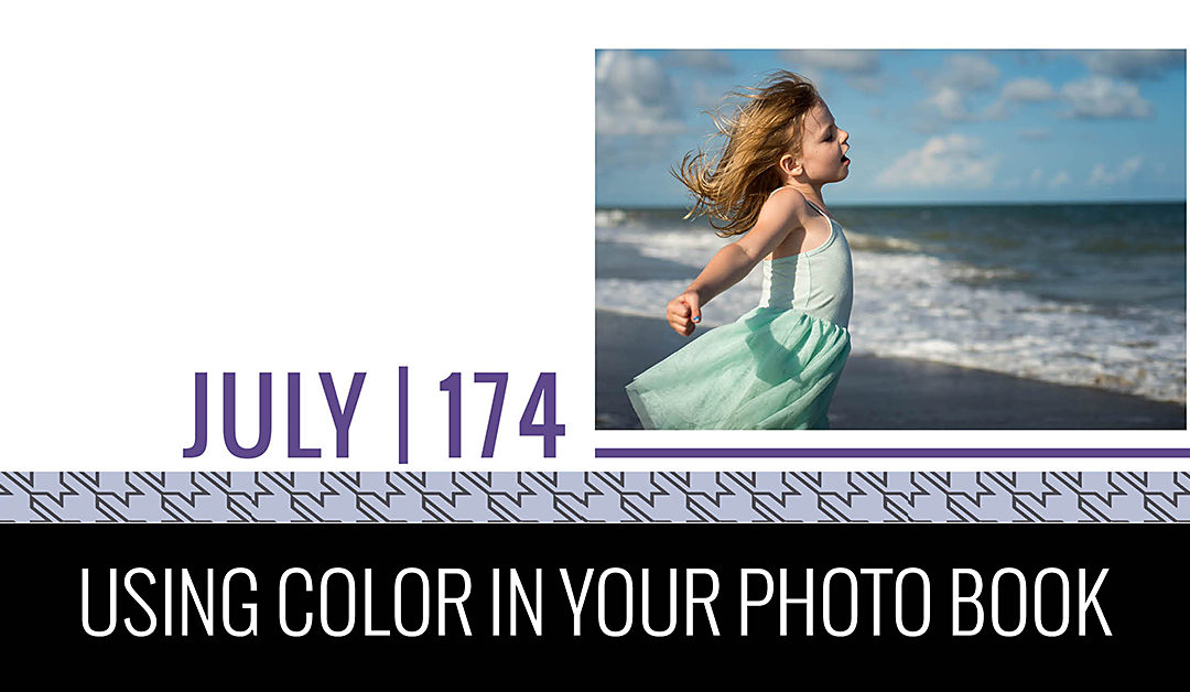
The dominant color will be the 2018 Pantone color: Ultra Violet.

The supporting colors should be more neutral to balance the purple color. On the Pantone website, they provide several different color combinations. I selected one that resonated with the balanced scheme I was looking for this particular photo book. 

Here is my color palette. 

color in photo book

This color palette matches my original vision because I wanted my family photo book to be fun yet classic. I want the design to have personality without being too bold. 

And here’s the result: 

Section Page:

color in photo book

Typical Page:

color in photo book

10 Easy Ways to Use Color in your Photo Book Layouts

10 Easy Ways to Use Color in your Photo Book Layouts

Once springtime arrives and flowers start blooming, I yearn for some vibrancy in my photo book layouts. Yes, there’s usually color in the photos, but I’m talking about a consistent and thoughtful use of color to make the photos pop or add a little something extra to the page. 

Today, I want to share 10 easy ways to add color to your photo book layouts. If you’ve wanted to add color but not sure how or if it never looks quite right on the page, this post is for you! Hopefully, you’ll walk away with easy strategies to incorporate into your photo book. 

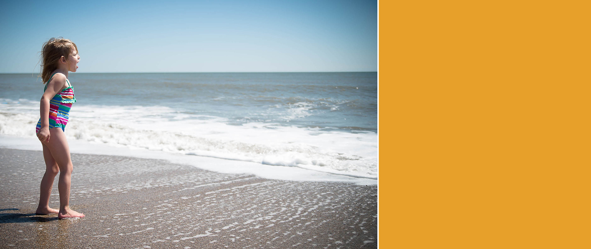
1. A BLOCK OF COLOR TO COMPLEMENT THE PHOTO.

Use a color to reinforce the spirit of the photo. In this example, I added a color block that is complementary to the range of blues in the photo but it also adds to the sense of vibrancy, sunshine and overall attitude of boldness found in the photo. 

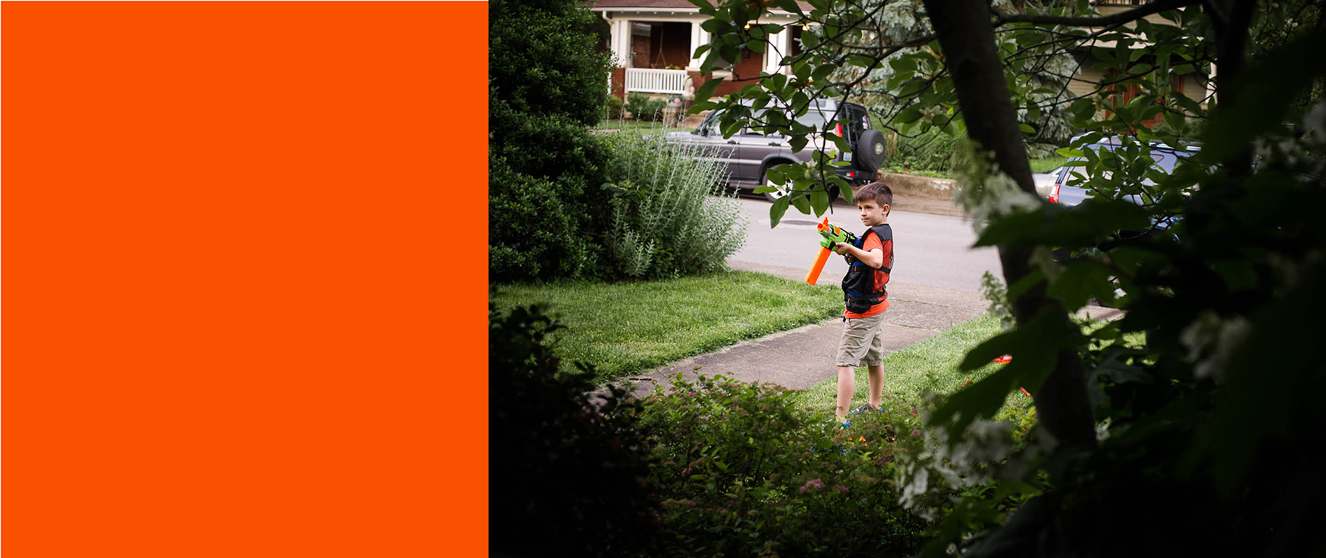
2. A BLOCK OF COLOR FOUND IN THE PHOTO.

Use a color that is found in the photo. Perhaps one of the easiest ways to use color is to use an eyedropper tool to pull out a color you want to reinforce. In this example, I could have selected a green color and that would have heightened the sense of peaking in on my son playing with his nerf gun. However, I chose to select a color similar to his shirt and nerf gun to highlight the center of the photo and the activity.

3. COLOR IN THE TITLE.

Use color in a title to describe the photo. This takes care of two things at once: color and a description of your photo. Here, I picked up the red trim from her bathing suit to make the title stand out among the waves. 

4. COLOR IN THE TEXT.

Use color for a specific selection of text you want to highlight. If you plan to use captions throughout your photo book, adding color to the main part of the sentence or paragraph helps to draw the eye to that specific group of words. This is great for people who are skimming through the book to pick up a few key points without having to read the whole caption. 

5. COLOR INDICATING THE MONTH.

Use a color block in a similar location on every page to indicate the month. You could use a different color for each month or keep it the same color and switch out the text indicating the month. The color block could be a rectangle or triangle at the corner of the layout or you could use a full width band of color at the edge as shown in this layout.

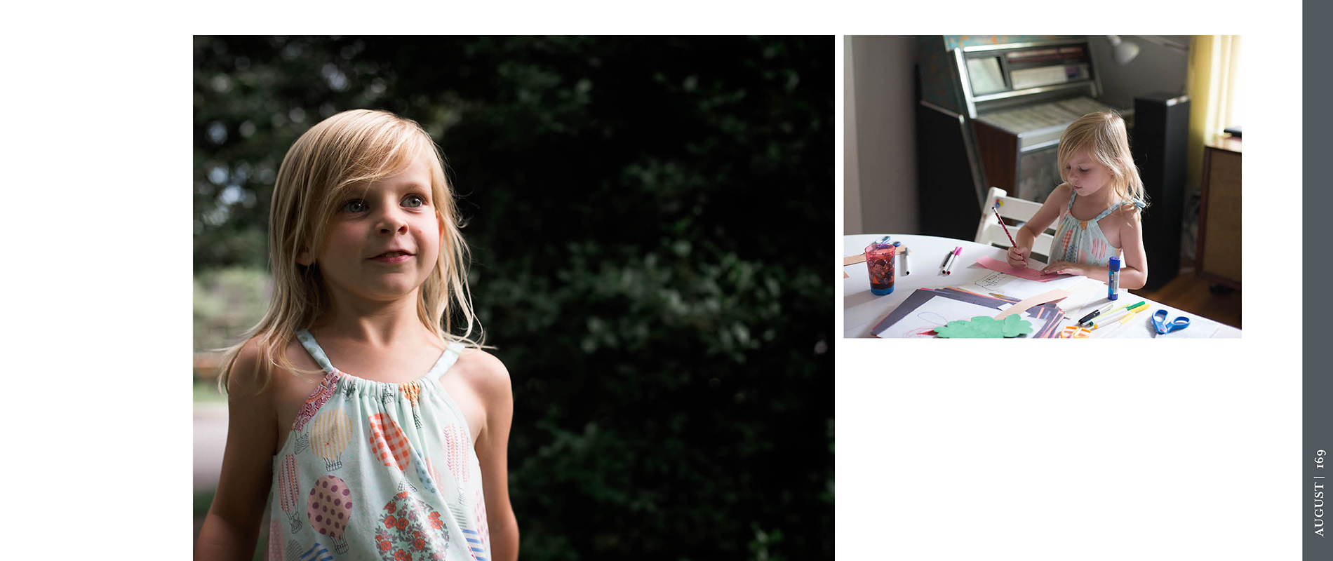
6. COLOR INDICATING THE PAGE NUMBER.

Use a color font for the page number. This is a very simple way to add color to the layout without it becoming overwhelming. And the great thing with color for the page numbers, is usually you only have to set it once and it repeats the color throughout your book. In this example, I added a small line underneath the page number to add a little extra color!

7. COLOR ON THE SECTION DIVIDER.

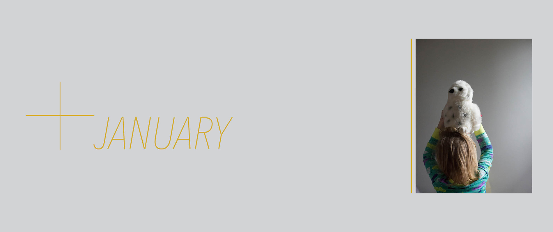
Use a color or color combination to specify the different sections of your photo book. In this layout, I’m using a soft gray color with a yellow font to announce each month. The full layout of a color, even a neutral color, makes it very clear when starting a new month in your photo book. 

8. COLOR AS A FRAME TO THE PHOTOS.

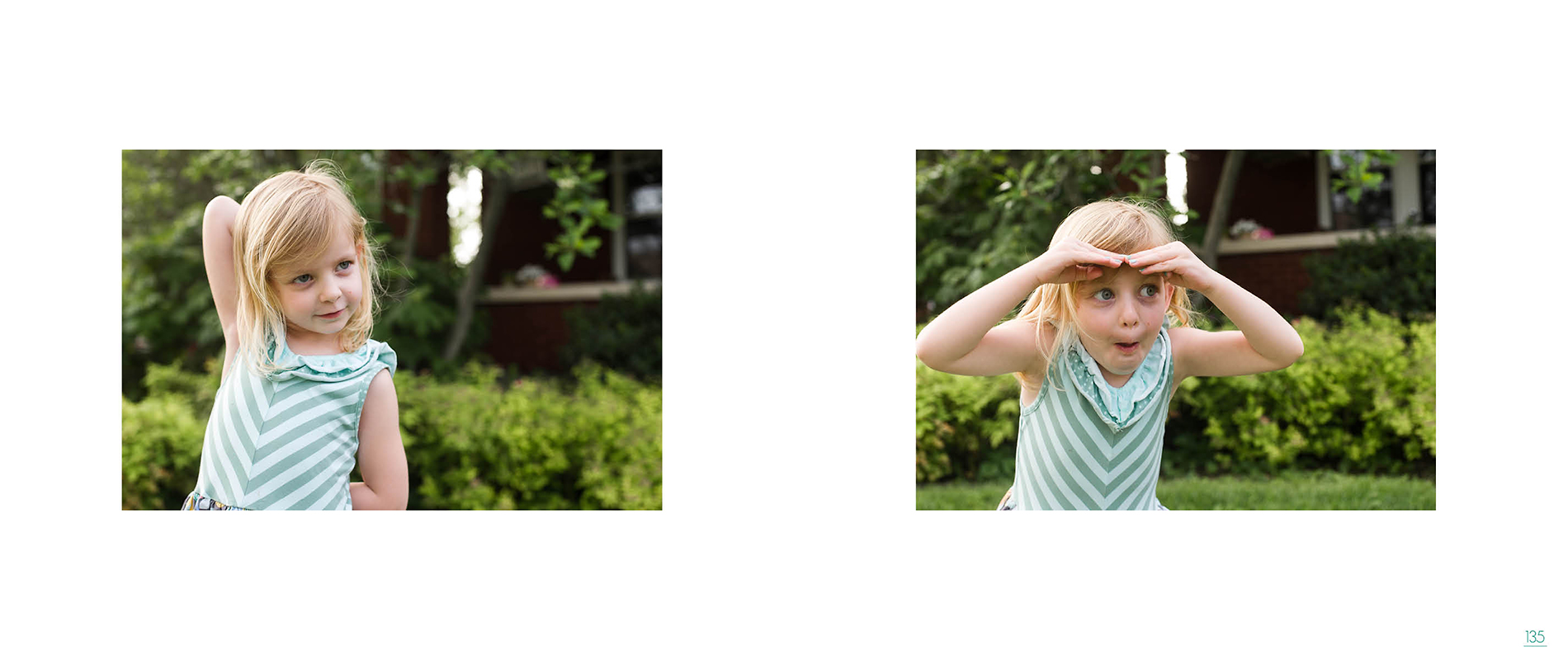
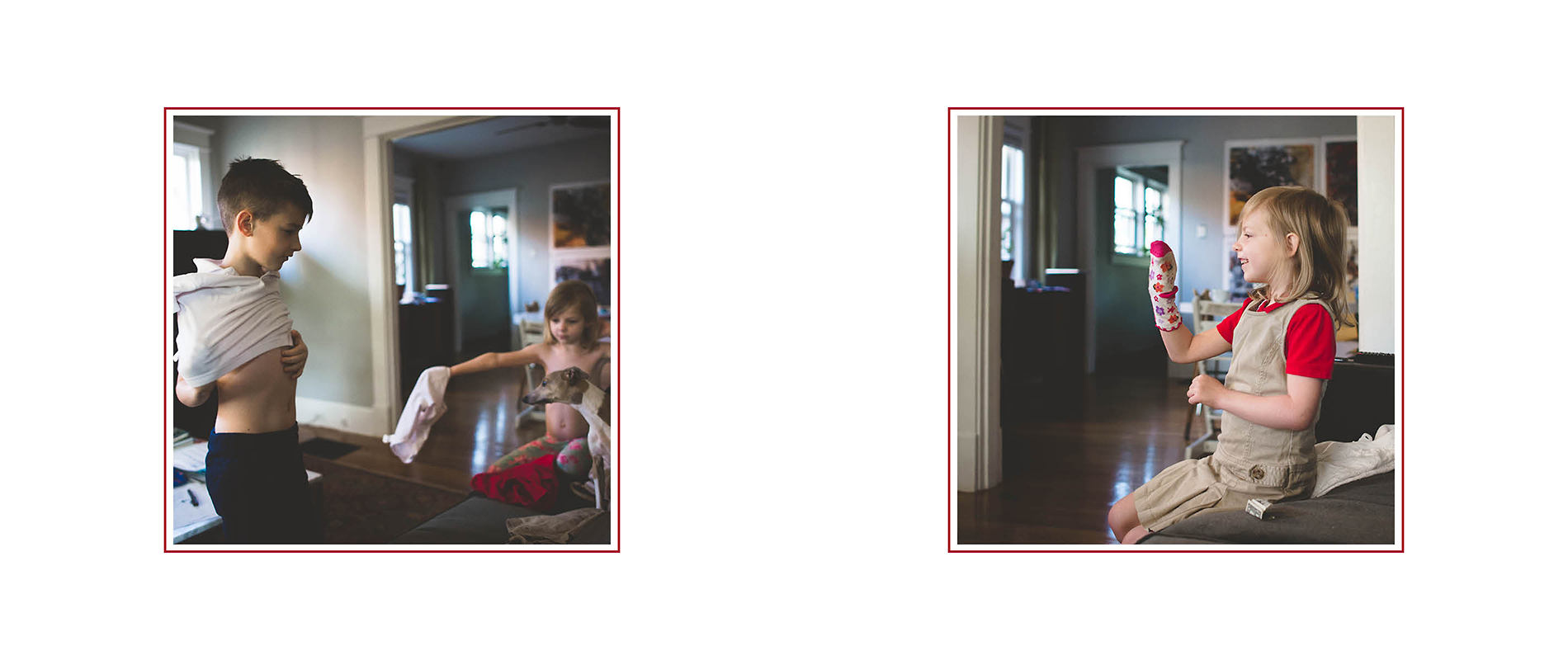
Use a color to frame the photos in your photo book. This suggestion may be harder to achieve depending on the type of software program you are using, however, adding a thin frame of color around your photos makes them stand out and provide a little more definition on the page. 

9. COLOR AS A LINE.

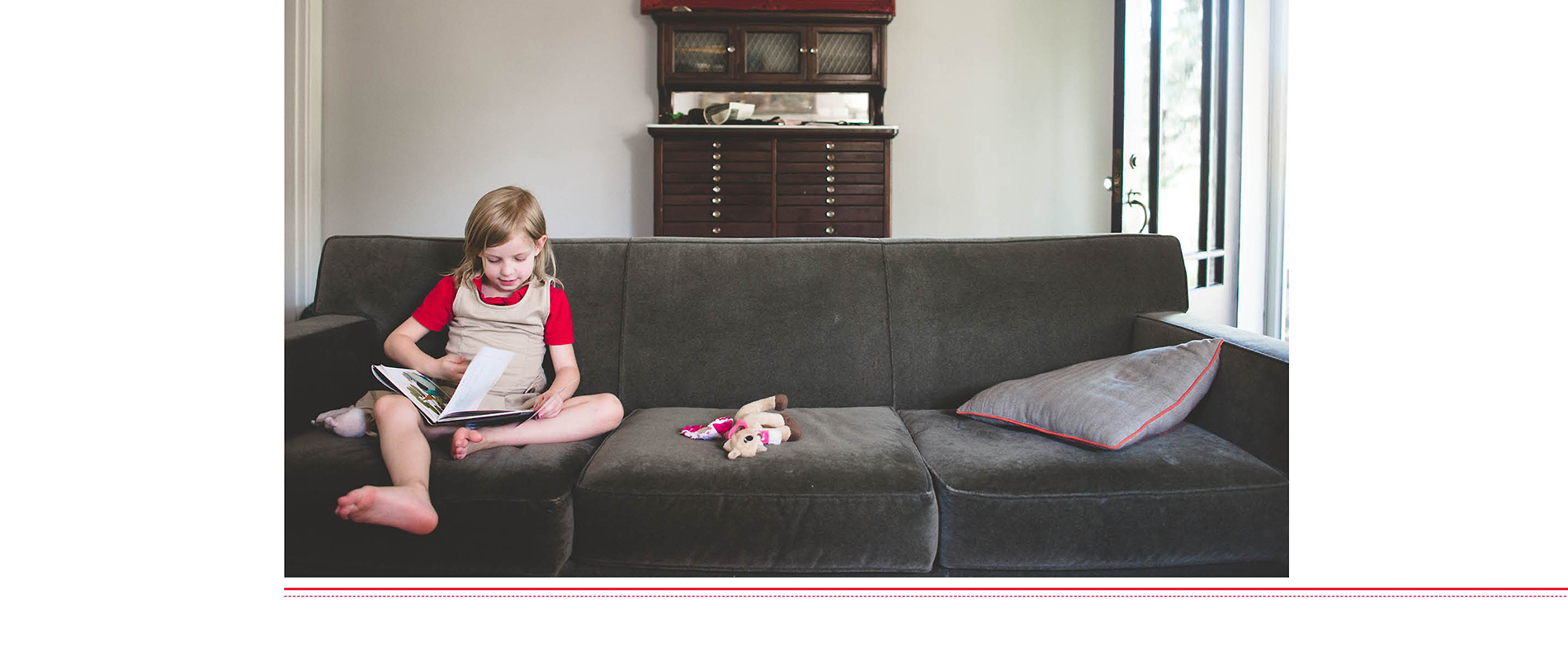
Use a line color in your layouts. Having a simple thin line graphic on the layout add a level of sophistication without a lot of effort. In this example, I created a double line – one thicker and the other dashed – for additional interest. I love how the line graphic in this layout immediately makes her shirt and the piping on the pillow at either end of the photo stand out.  

10. COLOR IN A GRAPHIC.

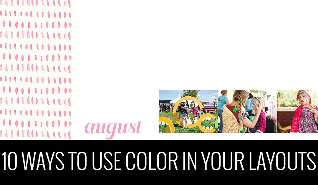
Use a color in graphic or pattern. If you make your own or have purchased your own, adding color to the pattern is a fantastic way to elevate your layouts. The graphic doesn’t have to extend on the whole page or spread. In this example, I’m using a simple line graphic on the left side to provide interest without taking over. A great way to use graphics are on section pages but you could also find ways to incorporate them on regular photo layout pages as well. 

So those are my 10 ways to add color to your layouts. Perhaps this sparked a few ideas or spin-off ideas for your own photo book. I’d love to hear in the comments below!

Too many Photo Book Ideas?

Too many Photo Book Ideas?

Keep All of Your Photo Book Project Ideas Organized

Tell me if you can relate to either of these?

You have a lot of motivation for a particular photo book. You get started by organizing your photos, editing and exporting a few, and find a few evenings to work on the design.  But then….life starts to get in the way. You can’t find the time to make progress on your photo book. Fast forward a few weeks, you have some time to get back to your book…..but you can’t remember where you left off.

Did you edit all of the photos? Where did you stop exporting photos? You can’t seem to remember how many pages you designed or if you started to implement some of the design features you wanted. You lose motivation to work on your project because you can’t easily jump back into the process.

-or-

You have the motivation to work on a photo book. But…..which one??? You have so many ideas swirling around in your head. Do you work on your annual book? Or your vacation book from last summer? Or finally get around to your oldest’s baby book, who now happens to be 10 years old?

You have project idea paralysis. You don’t know where to start because you’re not sure how much time you will have to finish it. Or you don’t fully want to commit to one project because you have the desire to work on a few projects at the same time yet have no way to keep yourself organized.


Either way, this video tutorial is for you! In this video, I’m sharing a free tool to keep all of your photo book projects organized. It allows you to list out all of the projects in your head and keep track of the progress so you always know where you left off when you have time to pick back up again.

Watch this video and create your own Photo Book Project Board today!

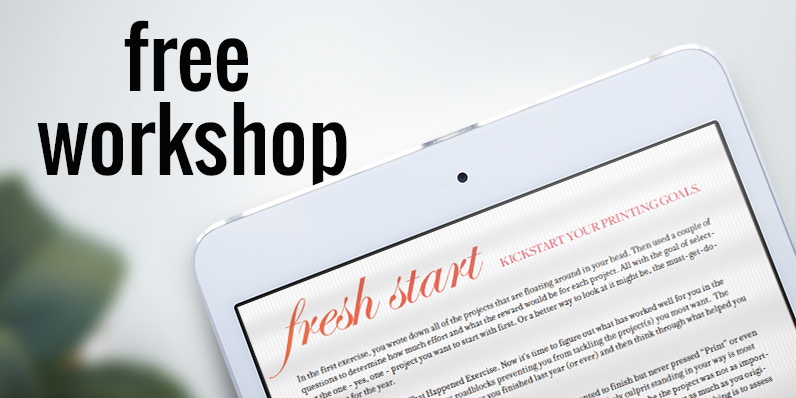
If you loved this idea and haven’t yet taken my free workshop, fresh start – a kickstart to starting your photo book project, sign up below.

From Photo Book Organization to a To-Do List

From Photo Book Organization to a To-Do List

In my last blog post, I shared how I’m organizing my family cookbook. It’s important to establish a structure to your photo book from the beginning to provide cohesion to your book. But it’s also a helpful tool to track your progress and become a To-Do List, if you set it up correctly.

I’m sharing how I start with an organization and use the structure to track my progress so I never lose sight of what I’ve accomplished and what I still have left to do.

Table of Contents

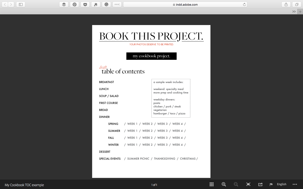
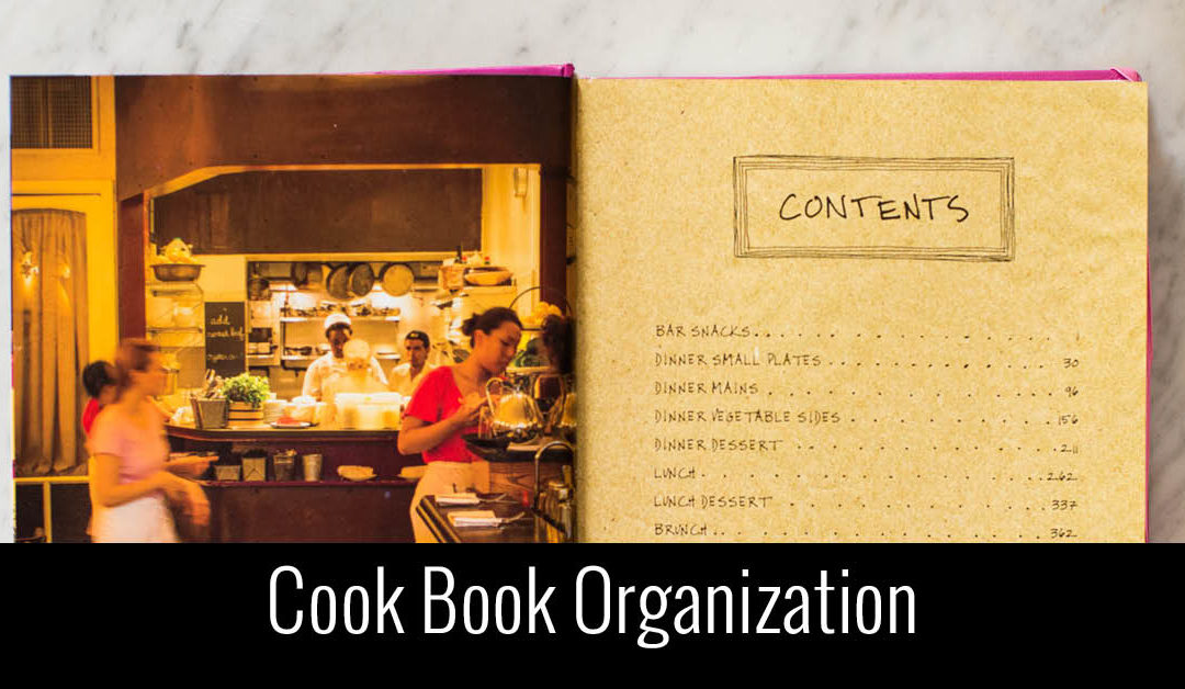
I started with a quick outline of my Table of Contents. This organizes the information I want to include and in what order it should be in. Click here to read about how I developed my Contents.

Google Drive

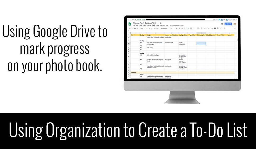
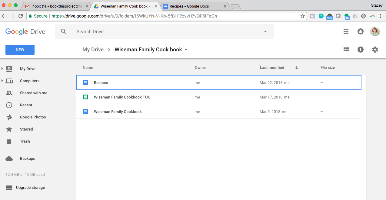
Once I have an organizational structure, I create a folder on my google drive. I’ve labeled it “Wiseman Family Cookbook”. In this folder, there is a spreadsheet and word file to help keep me organized and track my progress.

Google Spreadsheet

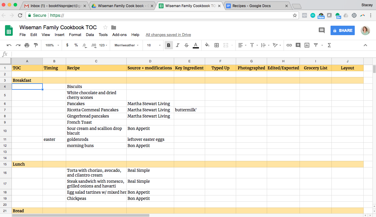
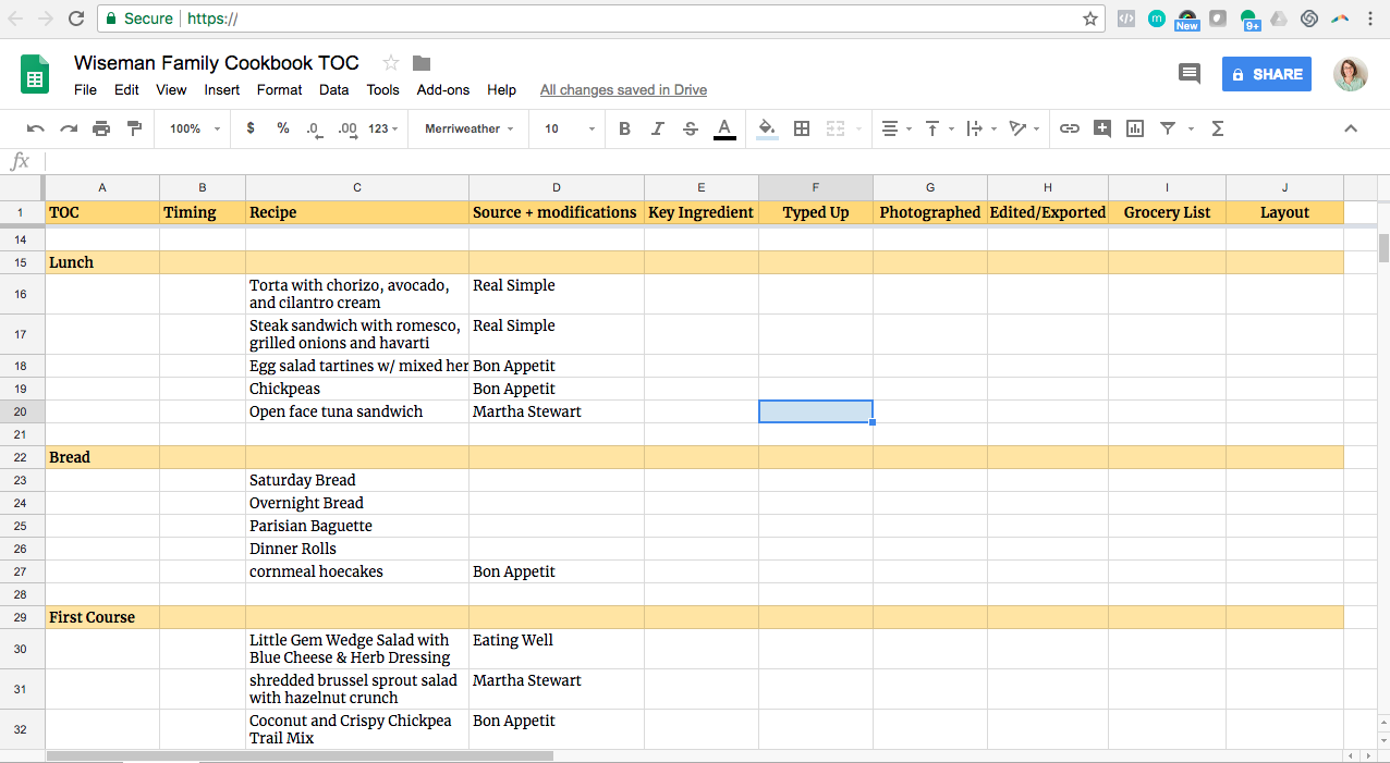
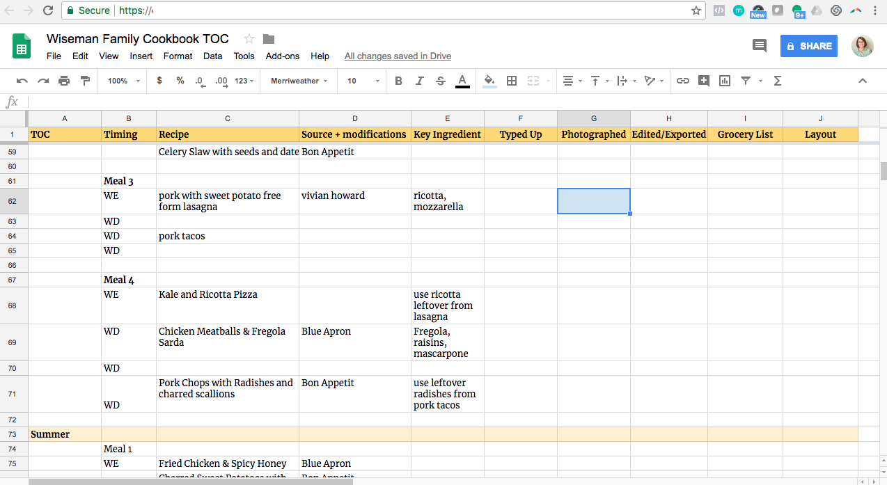
To translate my organizational structure into a To-Do List, I start with a google spreadsheet. This allows me to track my progress and flesh out the details of my cookbook. Starting with the categories listed in my draft contents, I expand each line to indicate all of the recipes I want to include.

Marking Progress

Next, I identified the tasks associated with each line item in the columns to the left: typing the recipe, photographing the recipe, and designing the layout. Once I’ve finished a portion, I fill the cell with a color.

In the above example, I’ve typed the recipe as the very first step. For other recipes, I may photograph the recipe before I’ve typed out the ingredients and process. Having the cells in a color is an easy way to see what I’ve accomplished and what I still have left to do. This is especially important for a project that may not be exactly linear in its approach.

Google Document

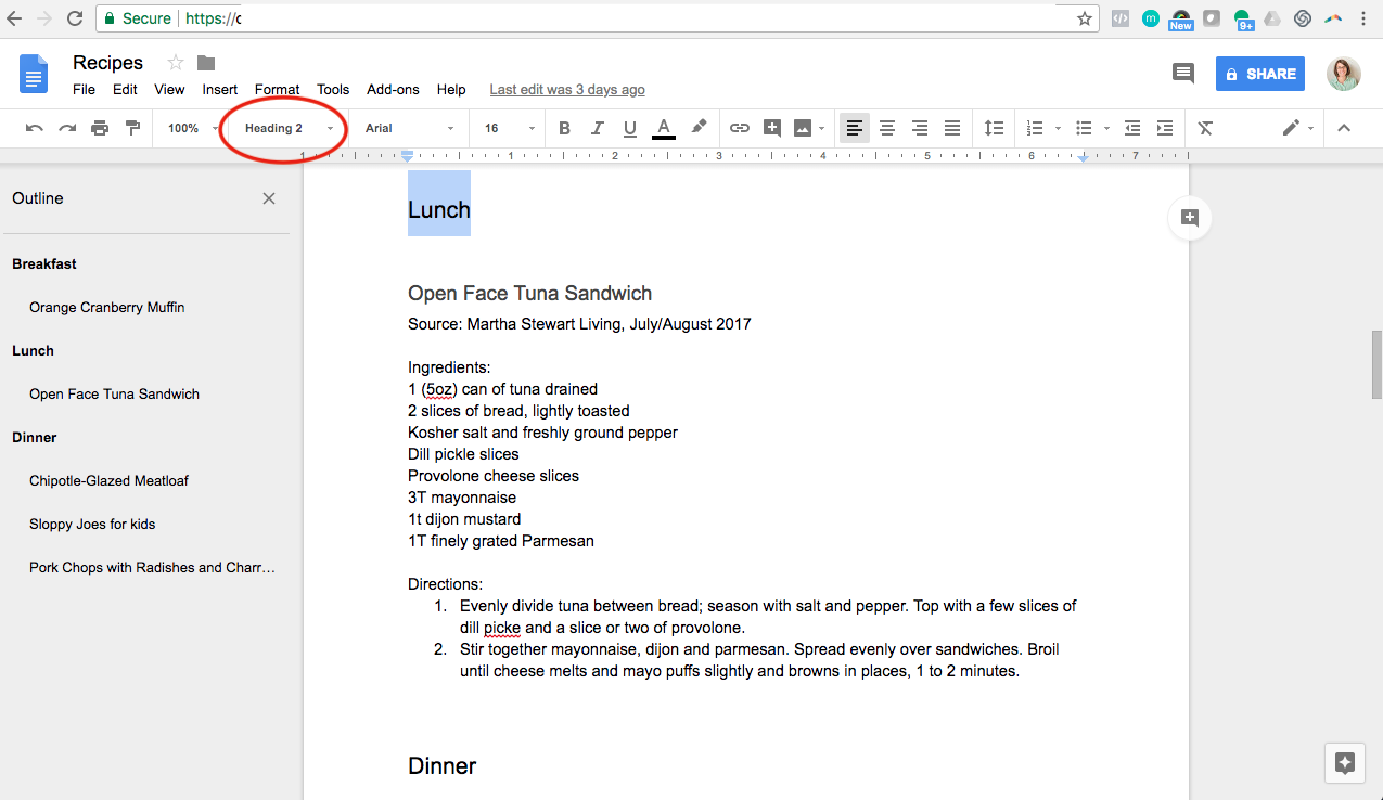
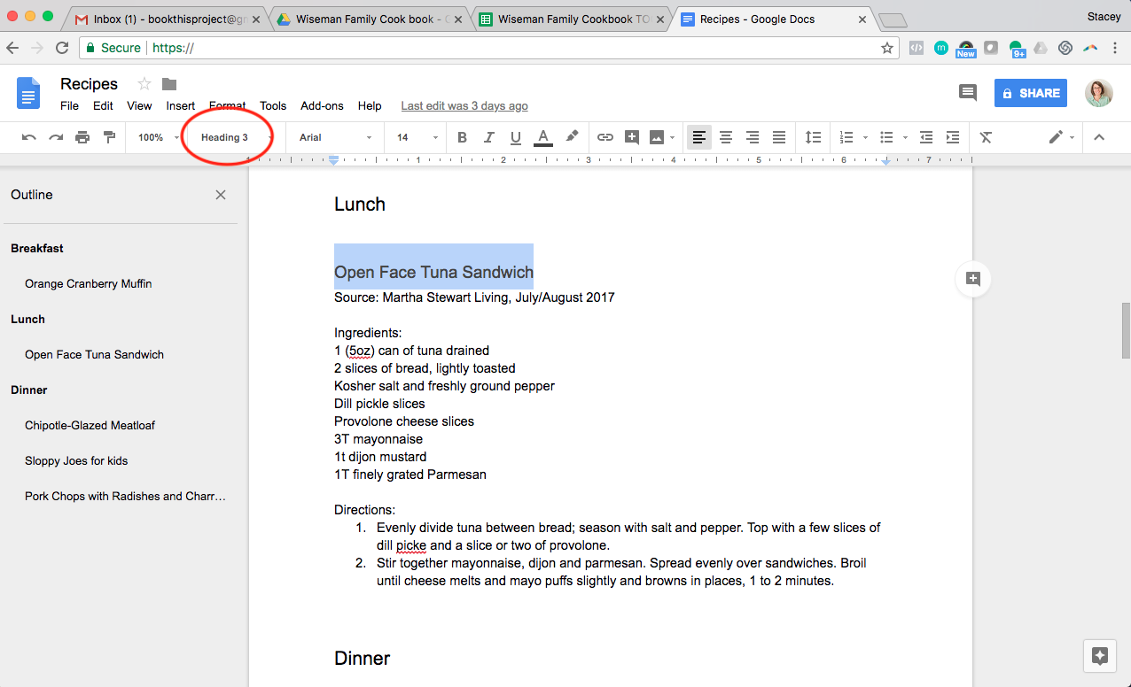
When it comes to typing up the recipes, this is also a google doc. All of the recipes are collected here first before being inserted into the actual design program. Make sure to use text styles to organize the recipes. For the main categories in my Table of Contents, I use the setting “Heading 2”.

This makes the main headings show up in bold on the left. Then each recipe title is established as “Heading 3”. This groups the recipes under the main heading. All of the ingredients and process is set to “Normal Text” in order to keep it off of the main organizational tab. I love this because I can easily navigate on the left to get to exact section needed to add a new recipe.

Video

Here’s a video to show you in detail how I’ve transformed my cookbook organization into a To-Do List charting my progress.

Family Cookbook Organization

Family Cookbook Organization

Photo Book Organization


When making a photo book, one of the first things to do is establish an organizational structure for your book. This helps when someone flips through the finished book and it also speeds up your workflow. It gives you a clear structure to help you select photos and to figure out where and how the photos fit into your book.

If you’re making an annual photo book, the structure is easy – you can organize it by month. For a vacation book, you can organize it by day or the events that happened during your vacation.

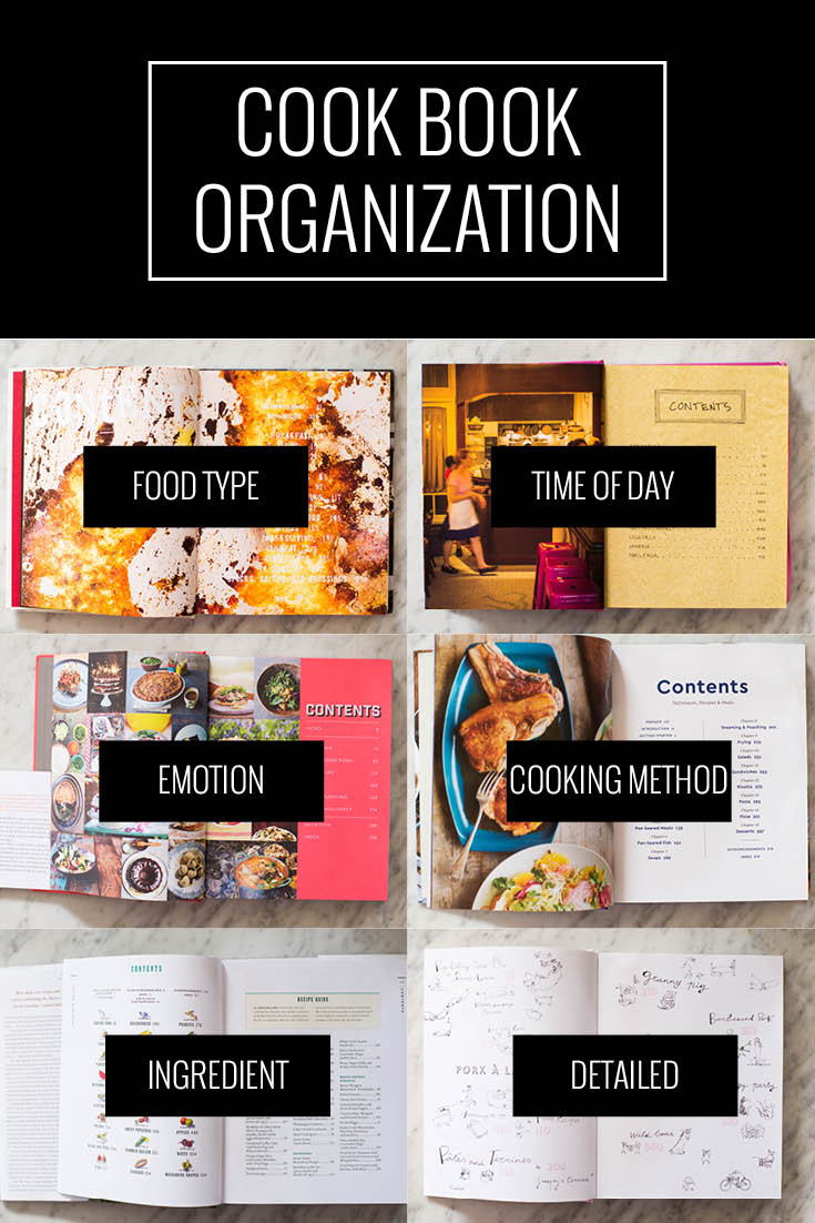
When it comes to making a cookbook, there are several options available for organization. It could be organized by the meal (breakfast, lunch, dinner), the ingredient, or the season to name a few. While it helps to have choices, often it makes the decision harder to make. And I don’t want you to get stuck so I’m starting a new design series tracking six cooksbooks I own that will help illustrate key design decisions.

In this blog post, I’m starting with the Table of Contents to help identify how other cookbooks have organized the recipes.


Cookbook Organization

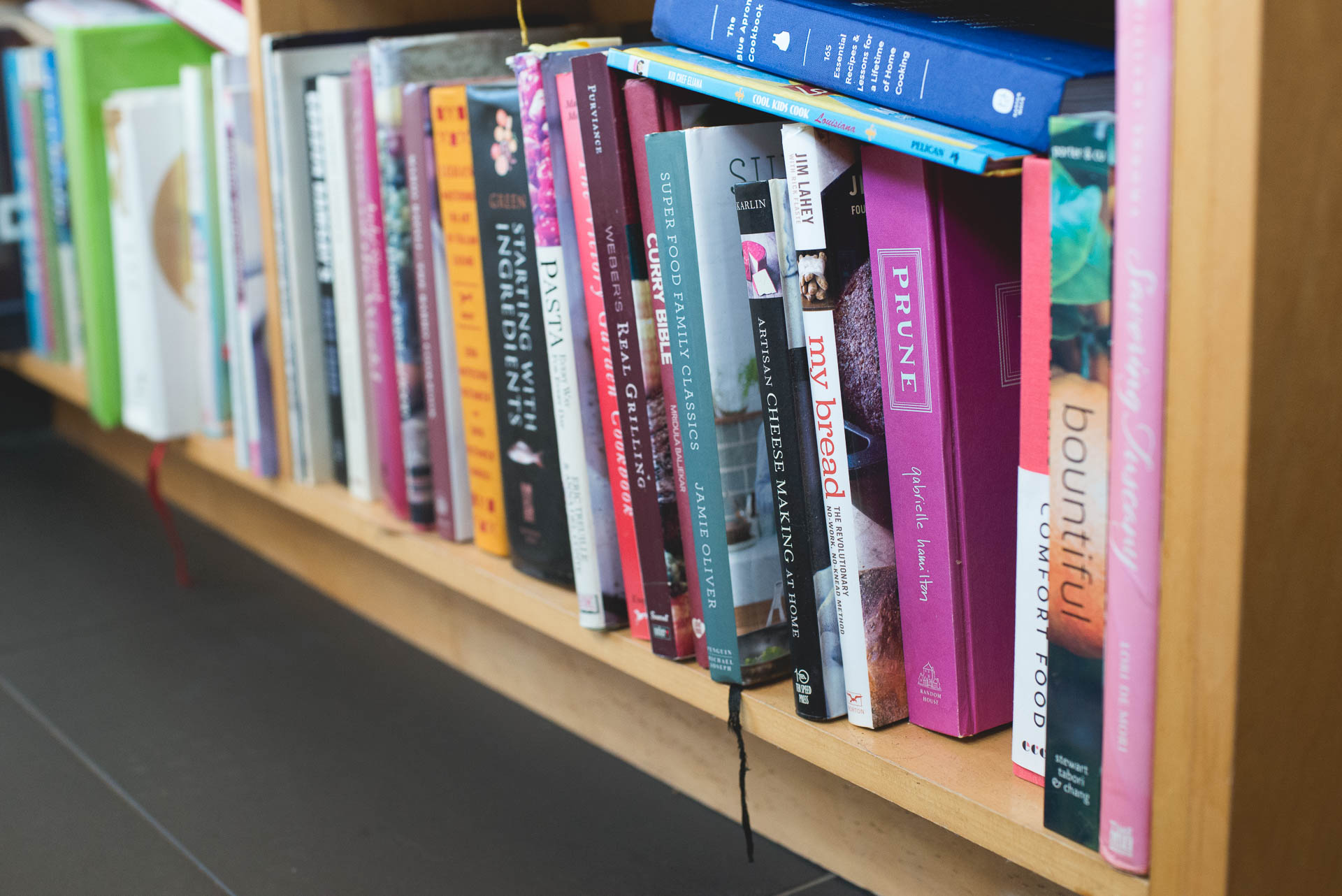
With each of the cookbooks I’m sharing, I’m including the basic organization, the title & author, and a few examples of the sections. Use this as inspiration to look in your own cookbook collection and see how some of your favorites have organized the recipes.

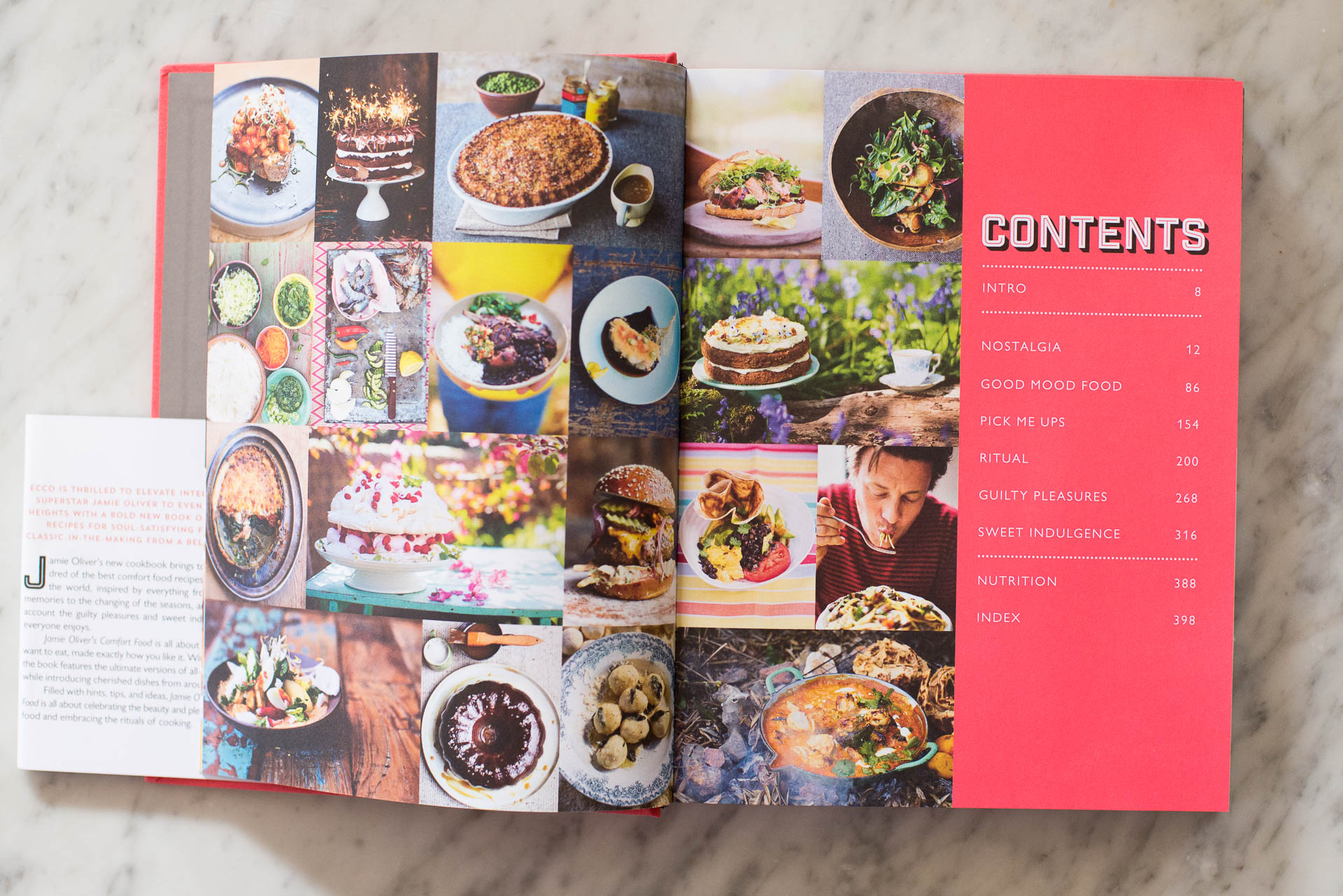
Food Type

Appetites: A Cookbook

Anthony Bourdain

  • Breakfast
  • Salads
  • Sandwiches 

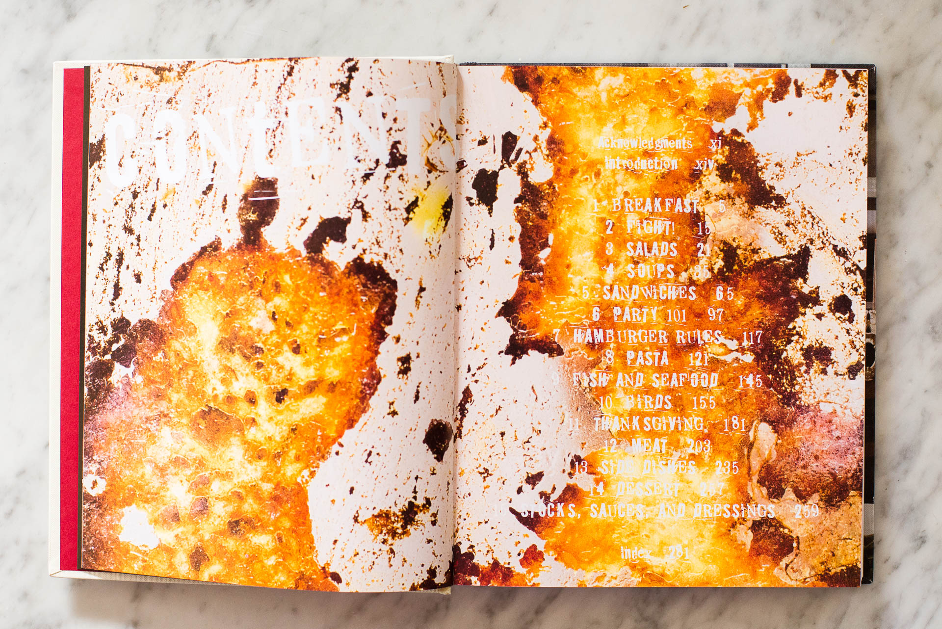
Time of Day

Prune

Gabrielle Hamilton


  • Lunch Dessert
  • Dinner Small Plates
  • Prep Daily/Weekly

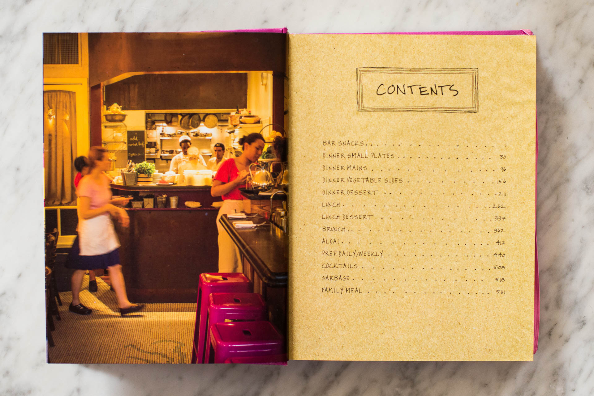
Emotion

Comfort Food

Jamie Oliver


  • Nostalgia
  • Good Mood Food
  • Pick Me Ups

Cooking Method

The Blue Apron Cookbook

The Blue Apron Culinary Team


  • Sunday Roasts
  • Braises
  • Pan-Seared Meats

Ingredient

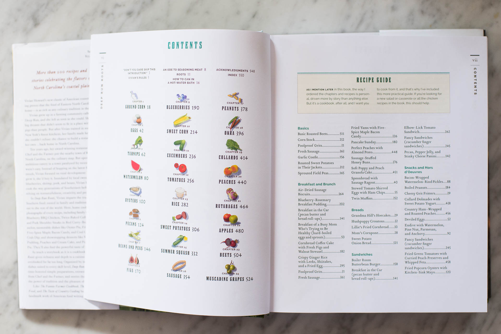
Deep Run Roots

Vivian Howard


  • Sweet Corn
  • Peaches
  • Eggs

Variations on One Ingredient

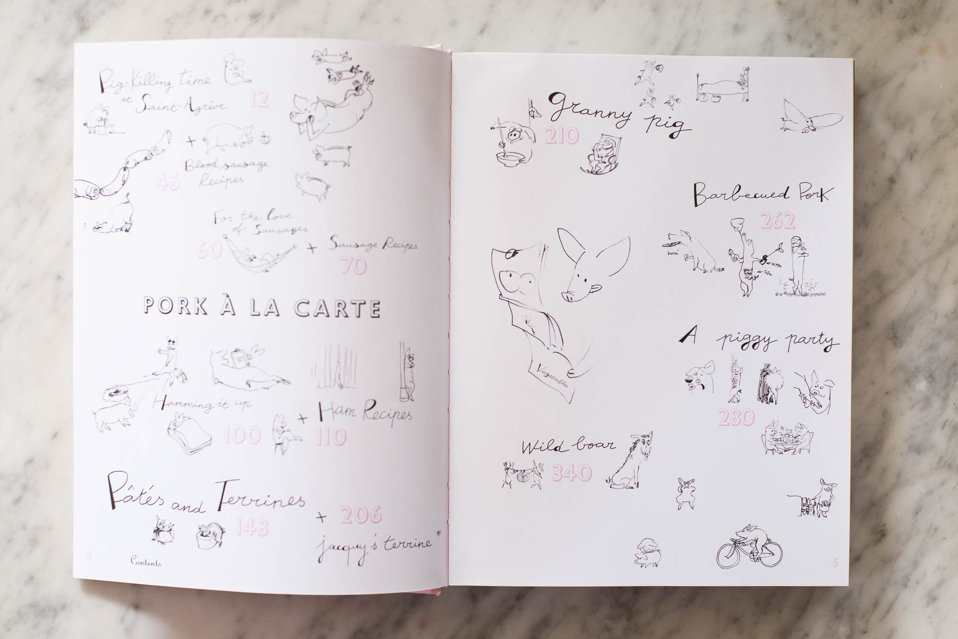
Pork & Sons

Stephane Reynaud


  • For the Love of Sausages
  • Hamming It Up
  • Barbecued Pork

Defining Your Cookbook Organization

So what is right for your cookbook?

Let’s walk through a few criteria to help you figure out how you want to organize your cookbook.


Gut Reaction.

Is there one type of organization that immediately stands out for you? Do you always love when you flip through a cook book with a certain organization? If so, start with that one.

Your next step is to list out sample sections and determine how well the recipes you want to include fits into those categories. If you are getting stuck – for example, don’t know how your recipes fit into these categories – go back and adjust your list. You may want to switch out the categories or organizational structure.

To illustrate this further, if you love cookbooks organized by Time of Day but realize you have few lunch recipes you want to include, switch the categories to something more like Food Type and see if that better fits your recipes.


Simplicity.

Making a cookbook is difficult and time consuming. There are a lot of steps that you’ll have to include. Testing and typing up the recipes. Making the food and photographing the finished product. Selecting and Editing the photos. Designing the layouts.

So you don’t want to overcomplicate the structure. While you may love the idea of organizing it by Emotion, you don’t want the structure to further complicate the process. You don’t want to spend too much time deciding on the right categories and how meals will fall into them.

For example, if you’ll spend hours trying to decide if your grandmother’s potato casserole should go into a Family Heirloom Recipes section or a Comfort Food section…select another organizational structure to avoid having to make those little decisions.


What’s Missing.

Another way to determine how to organize your cookbook is to ask yourself, what do you find missing from other cookbooks you have in your collection? You have a desire to make a family cookbook; ask yourself why. Your motivation is probably because something is missing from yuor existing cookbooks. Use this reason to structure your book.  

One example, you love all of your cookbooks but are missing a collection of your family receipes. This informs you to make a cookbook solely of family receipes. Maybe you want to organize it by family members who reminds of you particular dish.


My Cookbook.


For my cookbook, I’m following a combination of all three suggestions.

Gut Reaction + Simplicity:  Time of Day or Food Type is my initial preference for a simple organizational structure.

What’s Missing: For me, what’s missing from the cookbooks I own, is a collection of our standard go-to meals and how these favorites could be arranged in meal plan format. My goal is to organize our favorite meals into weekend meals that could lead into easy-to-prepare weekday meals.

For example, I want to connect how braised short ribs on Saturday could lead to short rib tacos on Monday night. This would also help link ingredients to different recipes. If I’m using dill for a weekend meal, what are other simple meals I could make over the next few days so I’m not wasting the ingredient.

This will take a little more planning upfront but will make my cookbook more useful and relevant for our family.


Now I’d love to hear from you. Have you seen a creative way structure a cookbook that wasn’t mentioned above?


Gathering Inspiration for your photo book

Gathering Inspiration for your photo book

Once you’ve set your photo book goal for the year, it’s time to start gathering inspiration to define the vision for your photo book. To help define your vision, you’ll want to look for layouts, covers, fonts, colors, and an overall tone for your book. 

There are several places I frequently turn to when I start my inspiration gathering for photo book projects. I’m sharing three of my favorite sources of inspiration with you plus an action step to get you started.

Pinterest is the first and most obvious place to go to for inspiration and to gather all of your favorite ideas in one place. 

Some of my favorite search terms for Pinterest when looking for photo book inspiration are:

  • photo book or photo book design
  • magazine layouts
  • editorial design
  • color palette
  • font or font combinations

To gather your ideas in one place, I want you to create a specific pin board for each photo book project. If you have 2-3 ideas you’re working through, you need a pin board for each one (unless you want to have a similar vision for all of the books). This will help consolidate your vision for one photo book instead of having to sift through and remember the ideas you originally had for your book. 

This also means you can go through pins you’ve already collected on your standard boards and collect the ideas that relate to your current specific project.

Flipping through magazines is one of my favorite ways to feel inspired and more importantly motivated to get working on my photo book. Often when I go through magazines, it’s not about seeing a specific layout but more about seeing the design come together that makes me want to see my own photos come together on the page. 

Another way magazines inspire my photo book vision is to see how more avant garde design comes together. Now, I realize magazine design is not the most experimental form of editorial design. However, it is the most accessible form I come across on a daily basis. This helps push some of the design concepts and things I want to try. 

Two of my favorite magazines I go to for inspiration are Bon Appetit and Living

Finally, I love visiting websites to feel inspired by design principles. While the composition of the elements are slightly different in web versus printed form, I glean a lot of ideas from seeing how the various fonts, colors, and blocks of photos come together on websites. 

Here are a few items I pay attention to when visiting websites for inpsiration:

  • What is the color palette and how are the colors used? 
  • How are titles incorporated on the page? 
  • What are the text style heirarchies established and how were they used? 
  • Are there design elements that make design more interesting? 
  • How does the organization help you move through the site? 
  • What is the overall feeling you experience when visisting the website?
  • What design elements contributed to that feeling? 

Now it’s your turn. Find your inspiration and gather them in a specific pin board on pinterest. This will collect all of your potential ideas and things that inspire you – all in one place. 

Now, it’s important to title your board with your specific book project idea. You don’t want to use this board for any and every photo book idea. 

Instead, you want to specifically gather ideas from pinterest, magazine and websites that speak directly to what you may want to use for your 2018 book project. 

In the end, you may not use everything, however, it’s important to have a good place to start from. So create your board today and find at least 10 ideas to pin to your board to get started.

Want to follow along with my board? Click here to sign up. 

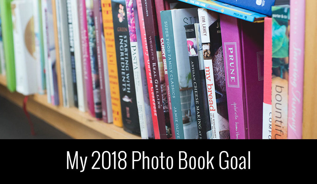
My 2018 Photo Book Goal

My 2018 Photo Book Goal

Ah, it’s that time of year again. Time to look at the fresh new year with rejuvenated eyes and optimistic goals. As I’ve written before, goals are great to make but you need to make them specific and actionable in order to make your goal a reality.

Why are goals important? Because they establish something concrete for you to work toward. Otherwise, you aimlessly go through the year with only a vague idea of what you want.

Why do goals fail? Because often they aren’t tied to a specific plan of action and capitalizing on a relevant and pressing desire.

Now, I’m sharing some ways below on how I can help….but before we get there, I want to share my photo book goal.

It’s a goal that I’ve been eager to start for months but wanted to clear some current goals off my plate to make room for this one because it will take work, organization, thoughtful planning and some practice.

In 2018, I want to make a Family Cookbook.

It’s important to say right off that bat, I’m not a cook. I don’t regularly cook our family meals. My role up to this point has been primarily in charge of bread and breakfast. Which I admit, this isn’t nothing. However, it’s definitely fair to say I have my work cut out of me to cook all of the meals I want to go in our family cookbook.

And I’m not a food photographer. Probably because I don’t cook, I rarely photograph food. However, I’m photographing my kids less and less; so I’m looking for another subject matter to photograph. Similar to cooking, it will take learning and practice but I’m totally enthused by the idea.

As I set out to embark on this new photo book goal, I’ve noticed that there are four key reasons that will make this goal my focus throughout the year.

|1| Connect with your Passion.

Right now, I’m really excited about planning, preparing, attempting and photographing meals. I can’t fully explain where this is coming from. All I know, is that I’m energized by the thought of sorting through recipes, trying them out, and photographing them. But at this point, it doesn’t matter why. I’m embracing this desire and making sure it translates into a photography and photo book project.


|2| Fill in a gap.

For this point, it means that your photo book goal should fulfill something that is missing in your life that you really want or need. It could be an annual photo book from a previous year that you have yet to finish. Or a special vaction, to Disney perhaps, that will make a perfect photo book. For my particular goal this year, I’m looking to design a book to combine our favorite recipes from cookbooks and family recipes that I want to collect in one easy location. I also want to create a cookbook that works for our family; something that lays out our go-to recipes to help us save time.

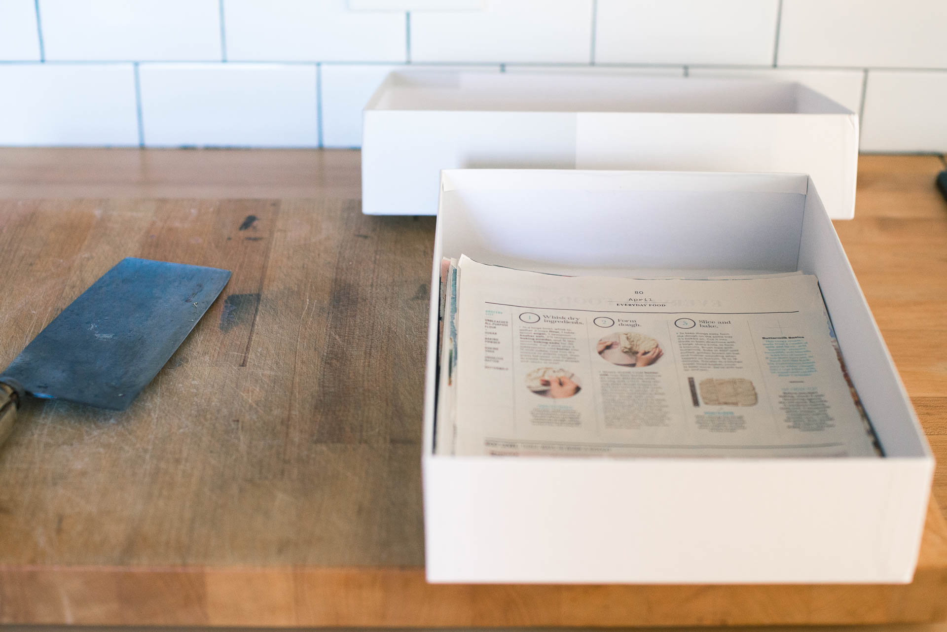
Plus, after years of getting Living and Bon Appetit magazines, I’ve collected recipes in this box that I’m saving to try later. However, it’s to easy to forget which recipes I’ve placed here and when they would be appropriate. By taking on this project, I want to go through the recipes I’ve collected, try the ones that could really work for us and if it’s good, take photos and place it in our book. Then I can purge all of these magazine (and internet) clippings.

|3| Come up with a creative design.

My theory is if you are excited about the design possibilities, the more likely you are to want to work on your photo book. And cookbooks have a wide variety of options when it comes to including creative design elements. With cookbooks, there are ways to develop creative responses for the table of contents, the organization, the section pages, the text for the recipe, the photography, the page numbers, and any graphics. The design possibilities excite me. For your photo book goal, find a way, no matter how small, to inject a design element that will make you eager to see the final product.

|4| Create a family heirloom.

In the end, what really matters is that you are energized by creating a family heirloom. When you recognize the larger goal or purpose, this maintains the priority and focus of the goal. For my cookbook, I know that working on this cookbook at this time, will memorialize the recipes that mean a lot to our family and will be something interesting for our kids to have when they are older. This provides added motivation to keep me working on this photo book throughout the year.

Now that you know my goal, it’s time to define your goal. And I wanted to share 6 ways I’m here to help you achieve your goals this year.

FREE

Join the free BTP Photo Book Club facebook group. You’ll be connected with other women documenting their family lives in a photo book. 

If you’ve failed at sticking to your photo book goals in the past, you need this workshop to get started on the right foot and meet your goals.

UNDER $50

With the Catalog Collection, you’ll start with my favorite go-to layouts plus designed pages to showcase your photos in  magazine-style layouts.

Every month you’ll receive a downloadable PDF Lesson (appr 20 pages) helping and inspiring you to complete an annual photo book this year.

ABOVE $50

After filling out a qustionnaire, I’ll prepare suggestions for our one-hour screen sharing call to help you achieve your photo book vision.

Never find time to complete your family photo book? Let me design it for you! All you have to do is upload your photos and I’ll handle the rest.  

In One Hundred Pages Workshop Review

In One Hundred Pages Workshop Review

All month, we’ve been working on organizing our photo library. It started with getting them all in one location. This meant one folder or catalog for all of your photos. This includes all of your DSLR, mirrorless, film, underwater, and/or smart phone photos. Getting them in one location helps you realize your starting point.

The next step was to go through and delete your unwanted photos. The goal was at least 10% of your total library. Decluttering your library now makes it easier to go through the photos that actually matter.

Finally, it was time to show your photos some love and rate your photos. If you don’t have a rating system in place, now is the time to get one. Most programs have one – even the free ones. So discover your preferred method and start rating the photos you love. If you already have a rating system, it’s time to get caught up and rate photos you may have missed throughout the year.

If you’ve found this helpful, you’ll love my photo book design workshop: In One Hundred Pages.

In this workshop, we’ll go even deeper together to organize your library, select the right photos for a photo book and design pages faster than you’ve ever done. My exact process is broken down into clearly organized action steps to help you succeed. The results: a beautiful photo book you’ll treasure forever.

Sometimes it takes hearing from past participants to know if this workshop will work for you. I want to share a casual conversation I had with an In 100 Pages participant last year who finished her photo book according to the challenges laid out in the workshop. If you can relate to her story in anyway, I know you’ll benefit from this workshop and would love to have you join us.


If you’re ready to print your photos with ease, click here to get started.