by Stacey Wiseman | Mar 14, 2013 | Family Photographs, Photo Book Design Layout, Podcast

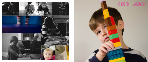
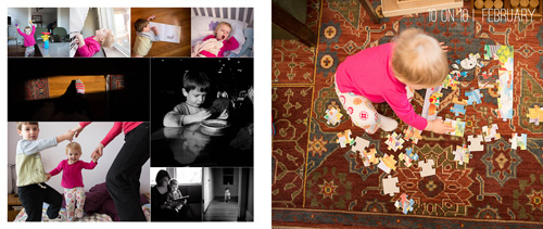
In this month’s podcast, I’m showing you how I design my family photo book, step by step. For this video, I’m illustrating how I designed my January and February 10 photos in 10 hours challenge.
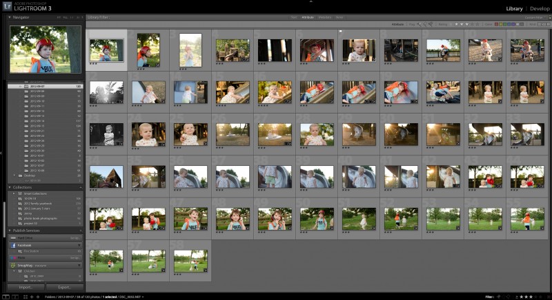
Even if you are not participating in this challenge, it will show you how I export and select my photos for a layout.
If you are designing your own photo book, I hope you’ll follow along with me as I design my 2013 book. And if you’re interested in having me design your photo book, this will provide some insight and tools into what I can do for your photographs!

If you have any questions or comments, make sure to leave them in the comments below!
by Stacey Wiseman | Feb 21, 2013 | Photo Book Design Layout, Q&A

Selecting photos is one of the first steps to photo book design. The photographs are what really provide the story, backbone and purpose for your photo book. And selecting photographs can be one of the first stumbling blocks to actually completing your photo book. That is the focus of this month’s Q&A!
 How do you select photos for a photo book?
[divider]
 1. Select photos that you immediately love.
You should select photos that you melt your heart when you see them. They could be technically great photos, with tremendous clarity or use of light. Perhaps they have an artistic creativity in its composition or content that immediately draw you in. Or, they can be photos that you perfectly capture the essence of your loved one or a moment that you want you want to freeze in time forever.
Of course, a particular photo addresses all three of these qualities, you will want to feature this photo as large as you can in your photo book.
2. Select photos that tell the story.
If your photos document a specific event or story, use an editorial eye to select the minimum number of photos you need to really tell the story. An example, if you want to include two pages in your photo book to feature a trip you took with your family to an amusement park, what are the necessary photos you need to tell the story of the day? I’m assuming you will have a lot of photos from the day. Maybe getting your tickets, riding roller coasters, driving bumper cars, eating lunch, watching a performance, and indulging in an afternoon snack. It’s important to think about what you want to describe from the day and what photos you need to really tell the story.
You may have a series about riding the roller coaster. Select 3-5 photos from this set. You may have four photos that you want to use to describe the morning (arrival), late morning, lunch, and afternoon. Finally, you may have a photo that you want to feature as a 5×7 somewhere throughout the spread. For this select your favorite aspect of the day; then the favorite photo to show that moment. It could be a portrait with a great smile and a toy that they received while at the park.
3. Select photos for their orientation.
When selecting photos, it is important to keep in mind the orientation of the photos you are selecting. Picking 3 horizontal photos and 1 vertical photo forces a very different layout from 4 horizontal photos that can all go in a square. Nothing is off-limits, it just helps to understand the concept of orientation early on. Often times, I like to layout photos in a square (all horizontal or all vertical) in groups of 4 (2 rows of 2) or 9 (3 rows of 3). This sets the orientation and the quantity so you know right away what you are looking for when your picking out photos.
4. Select photos for their processing.
Another preference I have, is to select photos with similar processing styles on a spread together. This means, all color photos on one spread and black and white on another. If you have three photos from a day that are black and white, stick with those 3. Now all you have to determine are the sizes.
5. Select photos for the quantity.
Similar to number 3, determining the quantity of the photos you want to capture an event or tell a story is a crucial first step to selecting your photos. This helps to define and limit what you are choosing. For some days, you may really only love 1 photograph. Other days, you may 300 photos. You could do 9 small photos on one page and 4 medium sized photos on another. This way, you will use the quantity of 13 to select the very best photos to include.
All of these tips will help guide you as you are looking through your catalog or folder of photos to determine what photos you should use in your photo book.
Let me know in the comment below, what quality makes you immediately love a photo!
by Stacey Wiseman | Feb 15, 2013 | Cover Series, Family Photographs
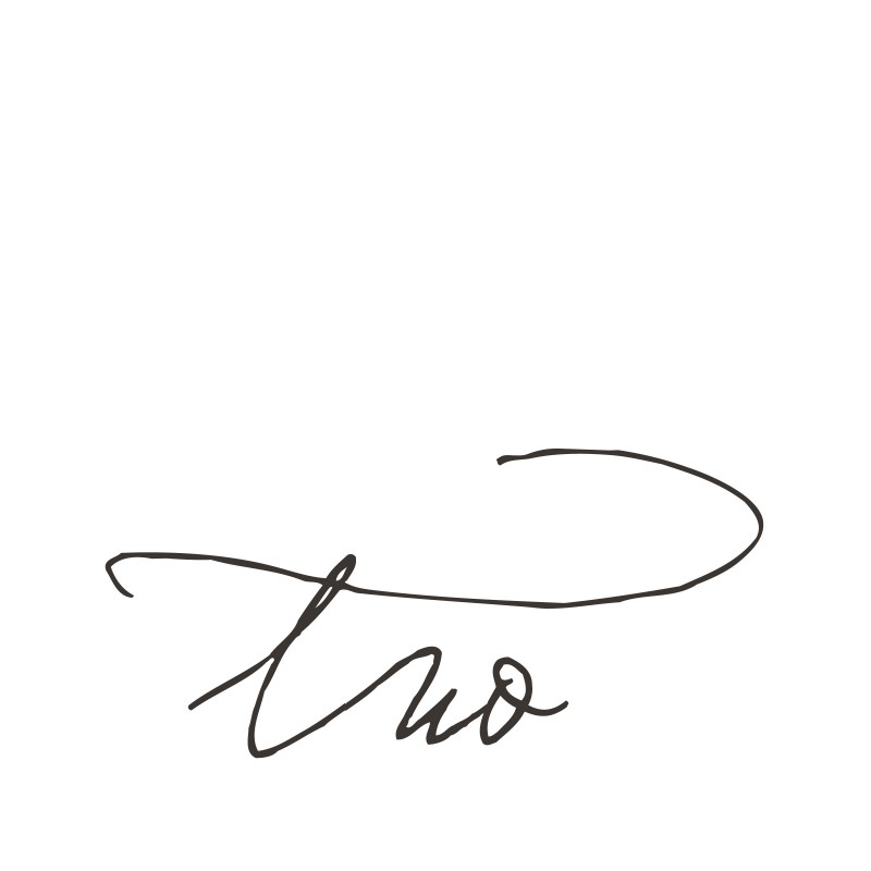
Recently, I designed a small book for my daughter’s second birthday. It was a really quick design that incorporated 20 photos in 20 pages. For my cover, I wanted to replicate the simple layout. The front cover features a script font with the simple “two” centered on the front. The back is a little more expressive because I featured a photo of her from her actual birthday party in a circle shape. This was easily made in Photoshop using a shape and clipping masks.


by Stacey Wiseman | Feb 1, 2013 | Cover Series, Photo Book Design Layout
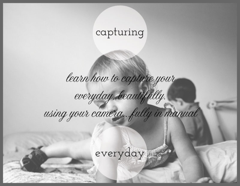
For today’s photo book cover, I’m featuring something I’m working on for my brother and sister-in-law. They just had a baby and want to know some basics of their camera. So I created a little pamphlet and this is my cover.
I know I have a limb chop with my daughter’s hand, but there is something that really speaks to me about this image – especially when discussing everyday photos in my home. I used a circle graphic with a slight transparency to bring the background in.
And I’m using two different types of fonts – serif + cursive – to distinguish the Main Title from the Sub-Title.
One final think, I added a gray border to give a sense of enclosure and framing. It also highlights the two different shapes going on – the square and the circle!

by Stacey Wiseman | Jan 31, 2013 | FREE!

Each month this year, I would like to attempt a graphic to help my son learn to read, add, subtract, rhyme, color, and perhaps write. I’m just creating things for my children and I thought I would share them with you as well.
The first book, is the humorous book “I Want My Hat Back” by Jon Klassen.
We have enjoyed reading this book over the past month and now it is time to get creative with it.
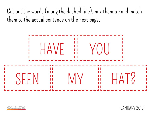
To follow along, get out your copy (or purchase the book if you don’t already own it) and print out this practice sheets pdf.
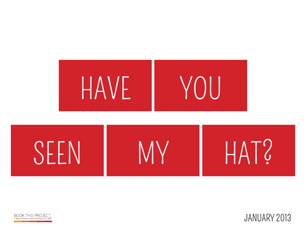
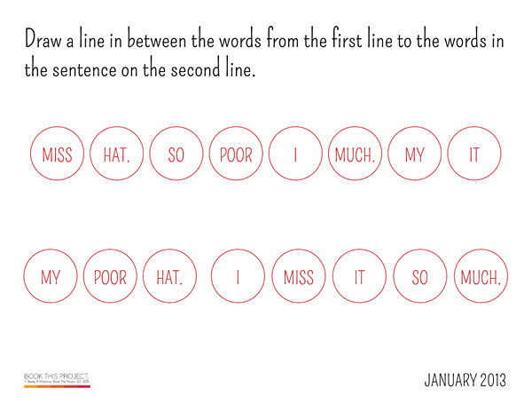
Here are some sample pages. (The pdf is 8 pages, 8-1/2″x11″, landscape.)


If you want it customized with your child’s name, click here and I’ll send it to you with 1-2 days!
Let me know what you think about the downloads in the comments below. And as always, get your camera out and snap some pics of your kids reading, drawing and playing. I’d love a link!

