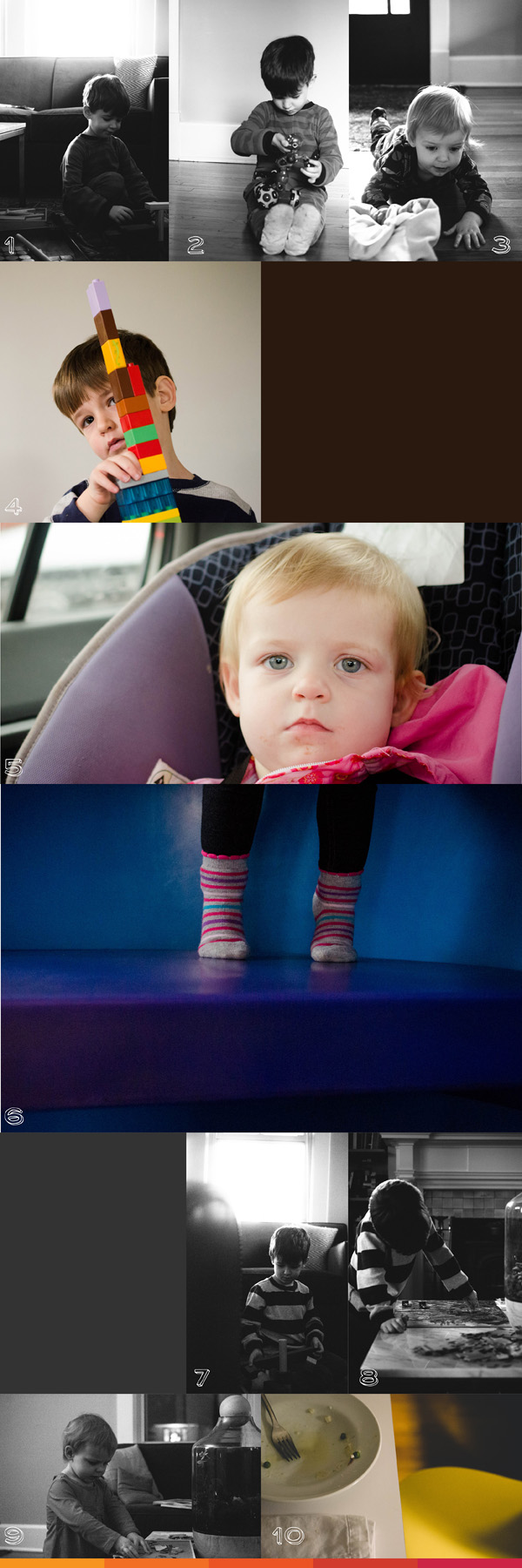
January 2013 10 photos in 10 hours
I have decided to attempt another 10 photos in 10 hours once a month (second Saturday) each month for 2013. It love how it captures a day in our life. It also shows how the kids grow up and how events change throughout the year!
Last year, I featured a variety of layouts you could do for your photo book. Or you can create a separate book for only this project!
Here is what our January looked like! A lot of kids turning away from the light while they played – Ha!
2013 Photo Book Cover Design Series
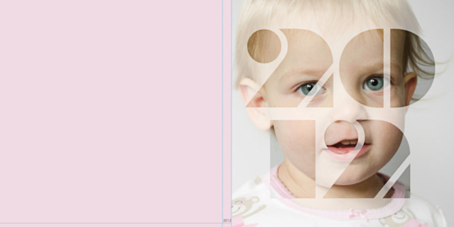
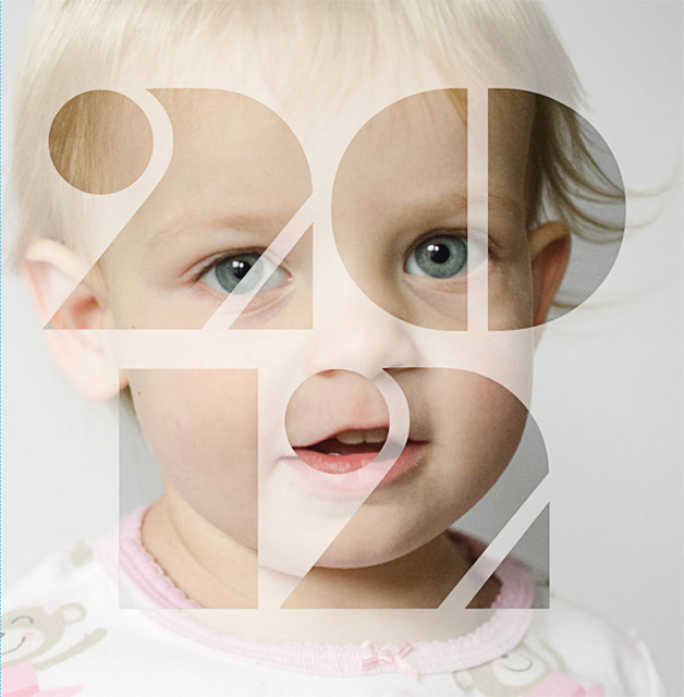
Today’s photo book cover design is for a Large Square photo book but could be easily adapted for other book types. The inspiration for this book cover was a cover design for Murakami’s 1Q84 novel. I’m not sure about the font that I ended up using for this example, but it was fun to try. For those curious, I created this in InDesign with the font Braggadocio.
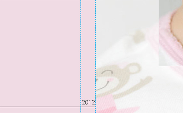
Here is the back – spine – front.
The entire front cover.
And a detail…
Enjoy your weekend!
Q & A: Photo Organization
January is the perfect time to get organized for the new year. This includes backing up all of your photos from 2012, as well as, creating an organizational system for your 2013 photos.
I hope you have found – or will find – a way to block out time in your busy schedule to back up and get ready for all of your 2013 photos.
 Q: How do you organize your photos?
 A: Oh how I love to organize! Of course, if you ask my husband, he will ask how my organizational systems are helping the mess in our basement. 😉 Hmmmmm…no answer for that one! But creating an organizational system is key for your photos on your hard drive…and is the one I’m more excited about tackling! It’s great to know where they are in your computer and how to reference certain pictures you may be looking for.
You may already have your own specific system…If so, perfect! But if you don’t, I thought I would share with you some tips for organizing your photos.
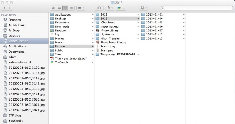
1. Import by date.
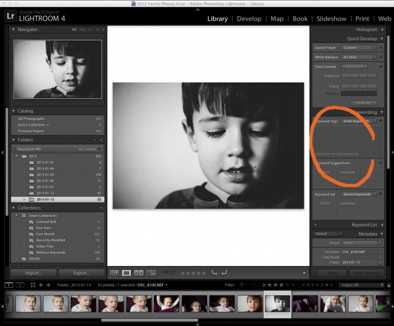
All of my photos are imported and organized by Lightroom with the file name set up as the date. I love it because it is all automatic. You can select this in Lightroom and you can establish it on most cameras.
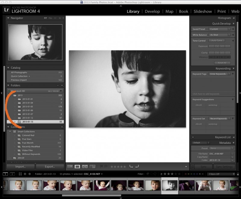
At the start of every year, I create a new Lightroom catalog to organize my annual photos.
2. Delete, Delete, Delete!
Delete photos right away that you don’t need. The key to this is to do it immediately, otherwise you forget and photos pile up on your hard drive. I often take several photos to get the 1 or 2 I really want. If I don’t delete the practice pics upon import, they sit and take up unnecessary space on my hard drive.
3. Rank your photos.
Star photos that you love and want to come back to – either to edit, put on facebook, or export to go into a photo book. I start with 3 stars for the photos I want to edit or upload. When I go back though all of my 3 stars
4. Keywords.
Create keywords, either in Lightroom, iPhoto, or on the folder on your desktop. If your photos were taken during a vacation, you can label the folder, “2013-01-16_Vacation”. This is helpful when you may be looking for a particular photo a couple months from now. With keywords, you can be as specific as you like but I recommend to keep things short and sweet!
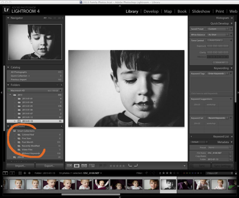
5. Smart Collections/Albums.
Create a Smart Collection for photos that I want to be in consideration for my photo book. I love Smart Collections! This can be done in Lightroom but also in iPhoto!
So here is my summary:
1 – Import with date.
2 – Delete unwanted photos.
3 – Star photos I really like.
4 – Edit or upload photos I really like.
5 – Revise rating. If I really love the photo/edit, I change it to a 5. Not so much, goes to a 1.
6 – Mark it with a keyword.
7 – Upload it to my blog or smugmug.
8 – Ensure photos I want for my photo book are marked to go in my Smart Collection.
9 – Export all photos at the end of the month for my photo book.
10 – Back-up.
What keeps you organized? Leave a tip for us in the comments below.
Do you have a question you want answered? Let me know!
2013 January Podcast | End of the Year Movie Tutorial
January is the perfect time to assess the year that just passed and look forward to the upcoming year. Even with my family photos, I think it is important to review my photographs in order to figure out what I want to accomplish next year. (skin tones + consistent editing!)
I love seeing all of my photos in one place. It’s one of the main reasons I love photo books!
A little backstory. In May, the band The Walkmen released their latest album, Heaven. I immediately fell in love with the video of their title track. I loved the blend of music + family, stills + video.
I really wanted to capture this spirit for my own family.
I decided to implement this inspiration into my end-of-the-year video. It combines some of my favorite ‘mommy’ photos and videos. It’s not perfect. Some are out of focus. Some crazy skin tones. But I don’t care. I still love it. It is a perfect encapsulation of 2012.
I would LOVE for you to check it out.
2012 End of the Year from Stacey Wiseman on Vimeo.
Now! I would LOVE for you to make one of your own. In this month’s podcast, I take you behind the scenes to show you how I made this video. I provide all of the steps to re-create this on your own.
Here is your Game Plan.
2 – Print the PDF.
3 – Schedule about 4-6 hours to make one for yourself.
4 – Create your End of the Year Movie.
5 – Post and Share! I would love to see your video.
This is completely do-able!
Let me know your favorite part of the video or the best tip in the comments below!
Download
I’m trying out a new method for delivering the files. I’m working on unlocking the file right now. If you’re having problems, check back tomorrow! Thanks 😉
11:30pm Low Light Photography
Last week, there was a great post on Clickinmoms about low light photography by the talented photographer, Megan Dill. I can definitely relate to what Megan wrote. I also work outside of the home and during winter time it becomes very challenging to photograph because most of the light is gone by the time I get to see my kids.
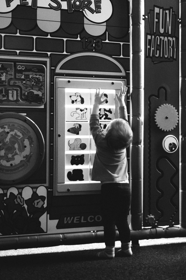
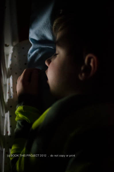
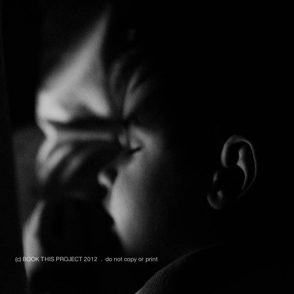
But I decided to take her post as inspiration and try a similar type shot she included in the post. Deciding against a self-portrait (for now…), I went with one of my son. I used a flashlight app from my iPad, manual focus, and the quiet mode on my D7000 camera. These were taken at 11:30pm!!!
The top photo I left in color and for this one I converted it to a black and white.
Make sure you check out this article and try out some of Megan’s tips. January is the perfect time.
What are you favorite low light photographs? Leave a blog link below – I love to leave some love!!!
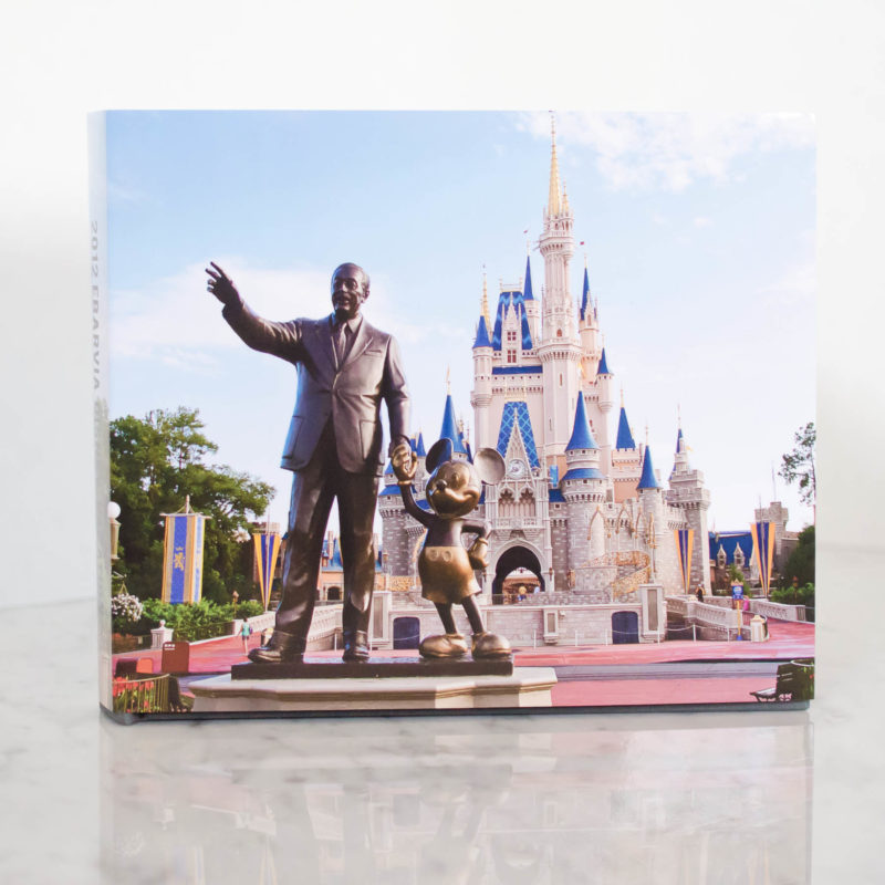
Design Series: Disney Vacation Photobook Cover
It is time to start the next Design Series! Every Friday, I like to post a different photo book cover design to inspire you for your photo book. This year, I may start to include design layouts, as well.
This cover comes from a recent family vacation book I completed. I will blog about this book later this month…but I love the cover. I thought this photo was perfect for the cover, so much so, that words were not required. The only text occurs on the spine of the book.
Photos copyright Tricia Ebarvia. All rights reserved. No reproduction of photographs permitted without expressed consent from photographer.
What is custom photo book design?
And why should I consider it for my family photo book?
These are two very good questions!
I think printing a photo book, especially once a year, is so important. But let’s face it. Sometimes time runs out and you just don’t have the time at the end of the night or on the weekend to design your own family photo book.
I have an alternative for you! I will design your photo book tailored to your tastes. It is the easiest way for you to finally get those photos off your hard drive and printed all in one place.
I’m trained and practice as an architect and have a very modern, sophisticated design sensibility when it comes to design. But what does that mean?
Let me explain some of my design principles and why I think it is beneficial for you to consider my custom design services. All of the books below are examples of books I designed for others (including myself!)
1. I can match your preferred font.
This client wanted to match the font from her blog where she showcases her lovely Project 52 photos. With a bit of research, we found the font and I used it in the title of each page for her book. Now there is continuity between her blog and her photo book!

All photographs in this layout are copyright to Tamra Yandow. All rights reserved.
2. I can organize your book to your photos.
For this client’s book, she wanted to use her child’s artwork for sections. And she didn’t have a lot of photos each month, so she wanted her photo book divided into seasons, not months. I easily organized her book to match the amount of photos she had.

All photographs in this layout are copyright to the Shumaker family, 2011.
3. Custom design does not mean design, patterns, colors, lines, and font everywhere.
Sophisticated design relies on simplicity in order to elevate the photos on the page.
For this Project 365 book, I matched the color in her photo to expand it to a full spread layout. Now there are no distracting elements (even if white space) competing for your attention. Only her photograph!

This photograph in this layout is copyright to Suzie Mauro, Zo-mak Photography. All rights reserved.
4. I can design to a specific idea.
I had another client was curious how implementing circles would look in her vacation photo book. This approach is very difficult to achieve with the free design programs, however, very simple for me! (I’m still in the process of finalizing her book, so this is a sneak peek from her draft!)

Photos copyright Tricia Ebarvia. All rights reserved. No reproduction of photographs permitted without expressed consent from photographer.
5. I can include basic information, such as capture dates for photographs.
I like for all of the pages in my photo books to include a date when the photos were taken. This becomes very tedious when you design a book on your own. I love to go into this kind of detail for you!

6. I can match design inspiration from pinterest.
See a design you like? Pin it and I can use it as inspiration for your book. This is a sample of something I found. See how the first number tucks behind the photo and the second number is in front! This could make for a gorgeous section divider. It is simple yet has the design sophistication that shows thought and intent.

7. I don’t have to shy away from color or pattern.
Sometimes the careful use of colors or patterns add just the right touch for your photographs. For my family vacation book, I wanted just a bit of color and pattern to pop the photos a bit. This is not on every page. Only a few where I think it really works.

8. I can design special inserts or elements into your book.
For my 2012 photo book, I am going to provide specifically designed pages for the monthly projects I participated in. This is an example of how I will incorporate food – family meals, baking, recipes, etc. – into each month of my photo book. Every time I have one of these pages, it will follow a similar layout to keep consistency throughout the book.

Now you see what I can do! Whatever your book project idea – I would love to design it for you! Think of the stress and hours I can save you with absolutely beautiful results.
If interested, sign up to become a 2013 BTP Subscriber. For a monthly fee, you upload your photos each month and I will take care of the rest. Or for a book from any year, I have a family photo book option.
Right now, I am giving away one free hard cover book + custom design service to one lucky reader on my newsletter. To enter, make sure you are on my list by December 14, 2012! For more details, check out this thread.
If you want to learn my design techniques to implement yourself, sign up to find out when I’m offering my next Intro to Photo Book Design Workshop!
recent film | photo book design layout
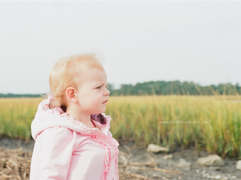
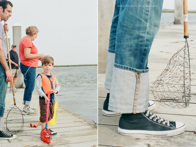
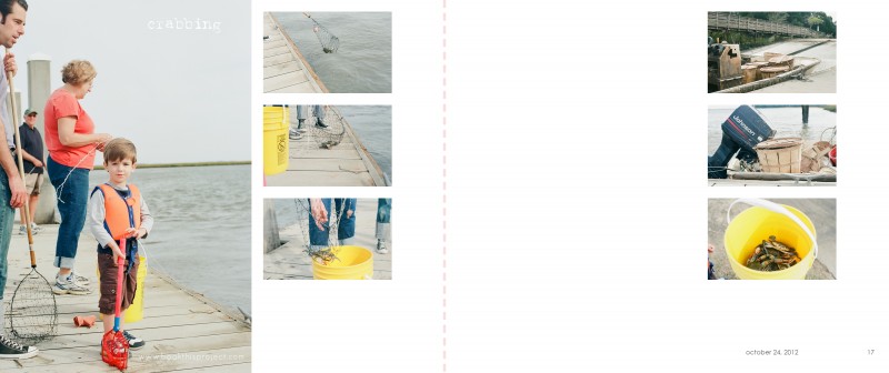
This year we took a family vacation to South Carolina. At the end of October. Not exactly beach season. But the weather was fantastic for us. Comfortable, clear blue sky, not too hot, but definitely sunnier than the place we left. One morning of our trip we decided to go fishing for crabs. I decided to be brave and only take my 35mm film camera loaded with Ektar 100 film.
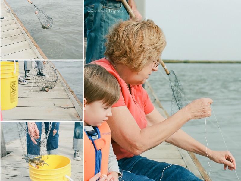
My mother-in-law ended up catching two crabs. Not a lot…but better than I expected. Even though my son sat around and watched for most of our time on the dock, he still felt part of the action and really enjoyed it. While we were waiting for the crabs to bite, a seasoned fisherman pulled up with his baskets and baskets of crabs.
Here are some of my favorite from the trip.
Now, how will all of these photographs translate into 2 pages (left and right) of a photo book? I wanted a layout that is simple and focuses on the actual act of fishing for crabs. I wanted a subtle caption of “crabbing” to describe the day. And, like all of my layouts, I wanted to include the date of when the photographs were taken. So here is what I came up with!
Leave a comment below and let me know what you think of the film photos or my layouts! I definitely need more practice…but I get so excited when I see my film experiments!
2012 Cover Series | photo book design

If you love this example or if it gives you some ideas for your photo book, pin it!

