by Stacey Wiseman | Oct 5, 2012 | Cover Series, Photo Book Design Layout
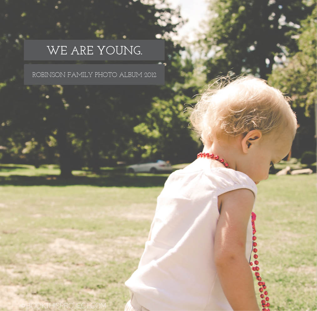
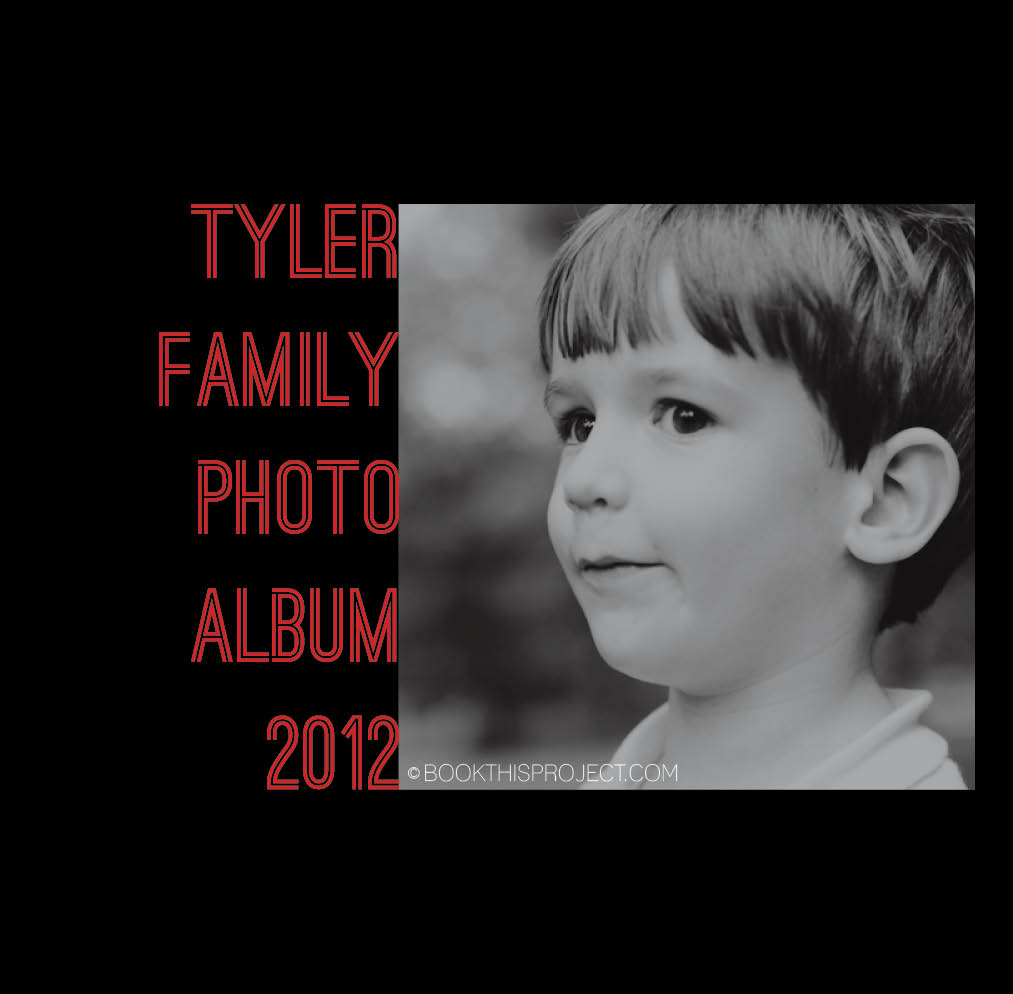
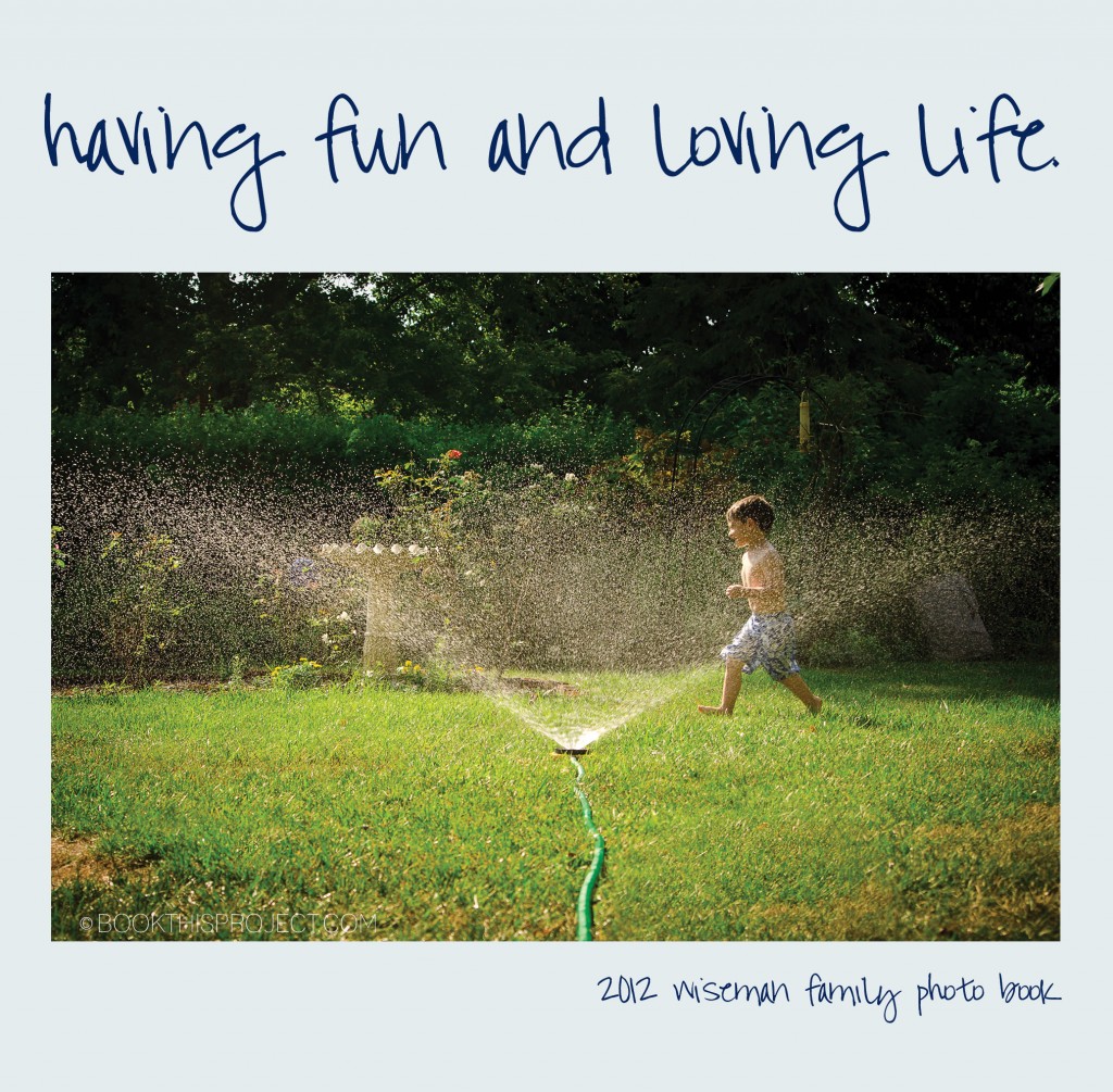
I love this photo book cover!!! Inspired by an image I found on pinterest, I selected a photograph to fill the entire cover and then place the title of the book in a gray box using a classic looking font. Another gray box indicates the family name of the year of the annual family photo book. This photo book cover is extremely classy and sophisticated.

If you love this example or if it gives you some ideas for your photo book, pin it!
[divider]Make sure you sign up for the Book This Project weekly newsletter. I have a free download when you sign up!
[divider]
by Stacey Wiseman | Oct 4, 2012 | Family Photographs, Photography Tip
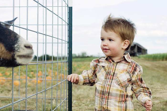
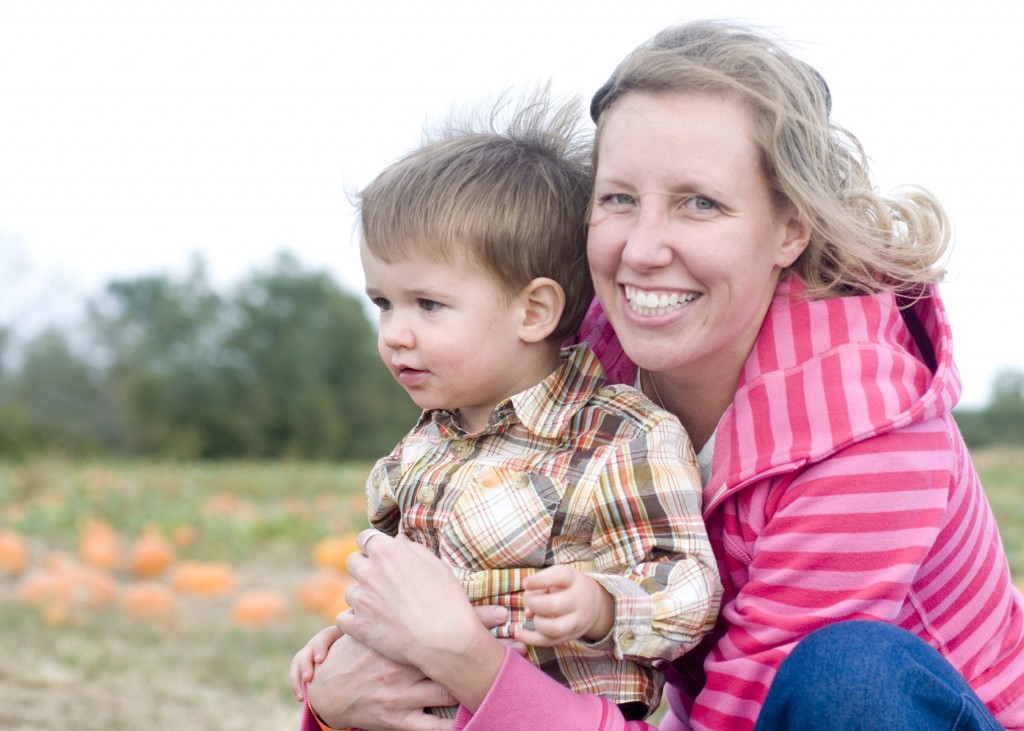
Fall is here! Do you feel it yet? Do you see it yet? Every fall, I love to take my kids to a local farm / pumpkin patch for an afternoon of fun. This is a great time to take photos of your little ones.
Here are my top three tips for taking farm photos this year!
1. Capture the landscape. In other words, go wide with your shots. If you have a zoom lens, look to use around the 24mm side of your lens.
2. Capture pumpkins, corn maze, hay ride, animals, face painting, and any other fun activity that you do during the day.
3. Do not get frustrated if you don’t get eye contact or static poses. Document the action.
4. Do not get frustrated if you do get harsh shadows or color casts. Document the experience.
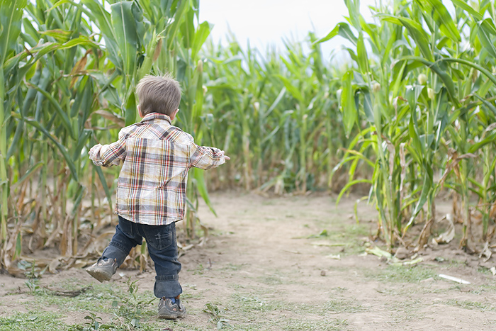
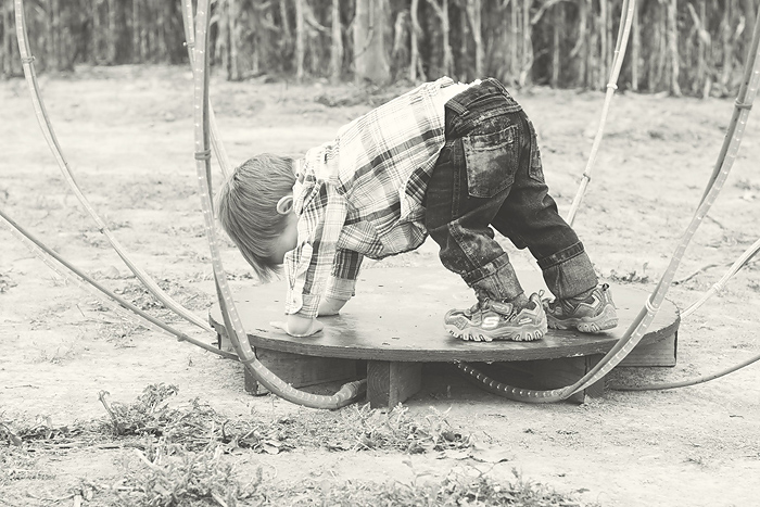
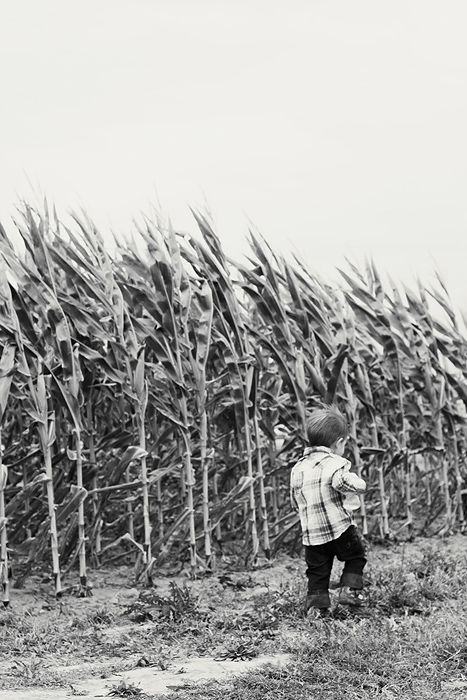
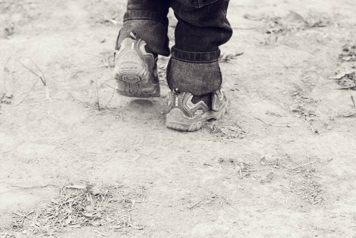
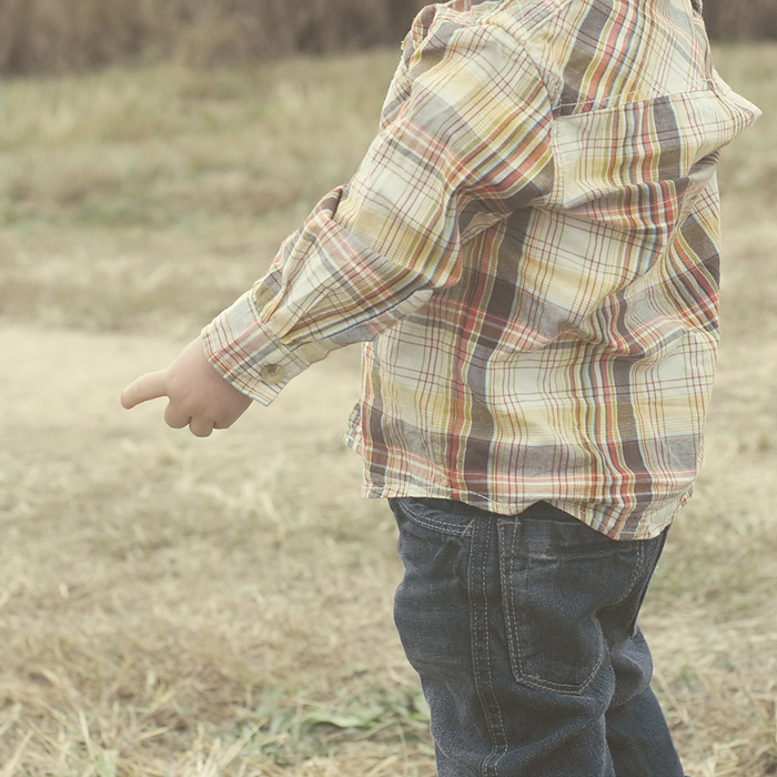
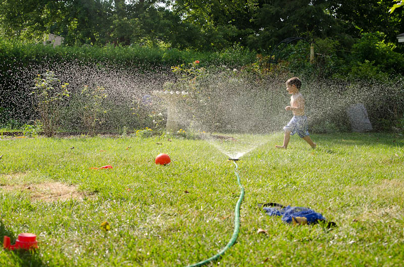
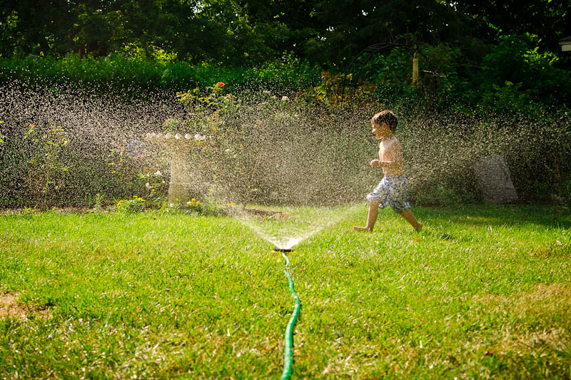
These are some of my favorite photos from 2009. It was my son’s first pumpkin patch and I think these photographs capture his sense of exploration, how dusty and windy it was that day, and his trepidation of the animals.
Let me know in the comments below your tip for taking pics at the farm this fall!
[divider]


by Stacey Wiseman | Sep 28, 2012 | Cover Series, Photo Book Design Layout
This cover design is similar to last week’s design, yet in this case, the font is bold and bright. You don’t have to go with a black background to get a cover like this, but I suggest selecting two contrasting colors for the background and the font color. You want there to be a difference in order to make the font really stand out.

If you love this example or if it gives you some ideas for your photo book, pin it!
[divider]Make sure you sign up for the Book This Project weekly newsletter. I have a free download when you sign up!
by Stacey Wiseman | Sep 25, 2012 | Family Photographs, Photography Tip
I thought you would be interested to see how I edit a photograph for my photo book! I use Lightroom for most of my edits. And although I prefer to keep my edits simple, straightforward and quick, there are very few photographs that I don’t edit…even if it is just a little tweak.
Stay tuned for an upcoming post about specific tips for editing photos that are going to go in your photo book.
On to the edit! You may remember this photo from my August “How I view…” series. It took a couple of edits to get the version captured with my camera to the version I am going to use in my photo book.
Before

[divider] After

[divider] And here is how I got there!
[divider]I want to hear from you! Leave a comment below letting me know if you typically edit your photos and what program do you use?
And if you enjoyed this post, make sure you sign up for my Thursday email!!!
[divider]
by Stacey Wiseman | Sep 21, 2012 | Cover Series, Photo Book Design Layout
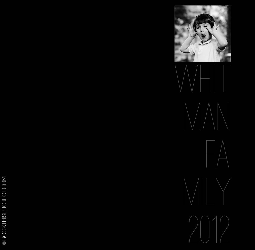
This cover is serious and silly at the same time. A silly black and white photo is paired with a stark black background and a thin gray text. The font happily takes a backset in this design…and that is the point. Nothing over-done. It is very simple…and in its simplicity, it makes you want to pick it up and view the pages inside.
 The inspiration for this cover is on my pinterest board “Layouts.” Are you following me yet?
If you love this example or if it gives you some ideas for your photo book, pin it!
[divider]Make sure you sign up for the Book This Project weekly newsletter. I have a free download when you sign up!
by Stacey Wiseman | Sep 20, 2012 | Description, Photo Book Design Layout, Product Feature
Do you have a family member or loved one who has been diagnosed with Alzheimer’s Disease?
Are you looking for a way to review treasured family photos with your loved one during visits?
Would love one place to have your favorite photos documenting a beautiful life span?
Then let Book This Project transform your photographs into a custom one-of-a-kind photo book.
My father was diagnosed with Alzheimer’s Disease in 2005. Throughout his disease progression, many aspects of his life may have deteriorated but our bond and relationship grew. We spent many afternoons together going over old family photos. Not only did this spark wonderful memories that we could share together but it always gave us something familiar to talk about. We were never for a loss of words or loving glances when we could look at photographs. My father passed away in August of 2012 but his life, memory and love is preserved in a beautiful heirloom.
As the founder of Book This Project, I started this company because I realized how important it is to have your favorite photos all in one place. Today, we are all so busy, it is hard to print photos or share everyday moments with loved ones. This product is the stress-free solution to accomplish an unbelievably gorgeous, professional photo book.
As creative director, I will personally design your book – each page – to maximize your photographs.
Here is a brief video to show the impact of owning a specially designed photo book.
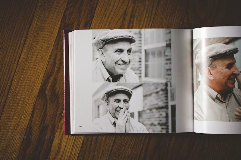
If you are curious to see a full example, here is the book I created for my dad.
benefits
- A custom design for your entire book. A concept design is created for your personal photographs to achieve beautiful individual pages as well as a collective book that makes sense as a whole. Each design features an organizing principle that factors the content, orientation, proportion, and color of your photographs into each page layout.
- Sophisticated, modern designs. A variety of styles, colors, fonts and layouts are possible. Have a specific look in mind? Send me an image and I will let you know if I can replicate the style for your photo book.
- Design professional. As a professional, I utilize my years as a designer and my love of researching new ideas into each and every book I design.
- Tremendous customer service experience. Incorporating your family photographs into a photo book is an extremely personal process and I treat each customer with an immense amount of respect, care and love.

features
- Customized design based on your photographs.
- Book organized by events.
- Table of contents (by events).
- Creative cover design.
- $100 of your order is donated to an organization of your choice in honor of your loved one.


by Stacey Wiseman | Sep 18, 2012 | Photo Book Design Layout
Two weeks ago, I had a post about my daughter’s new (and slightly too big) dress (here). In this post, I am going to share with you how proportion factor into photo book layout design. If you have ever had to print the same photo as a 4″x6″ and a 5″x7″ or 8″x10″, you realize that each of those show a little bit different crop of the photograph.
What works as a 4″x6″ does not always work (or work as great) as an 8″x10″ photograph. This is true for photo book design as well. You may love an image and want to feature it large in your book, but it may not work.
The concept of proportions is most easily described through photographs, so let me demonstrate.
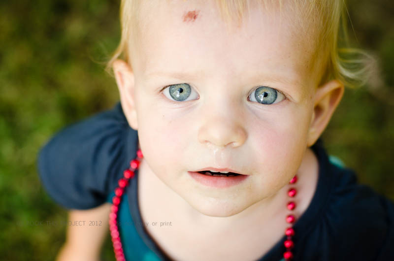
I loved this photograph of my daughter.

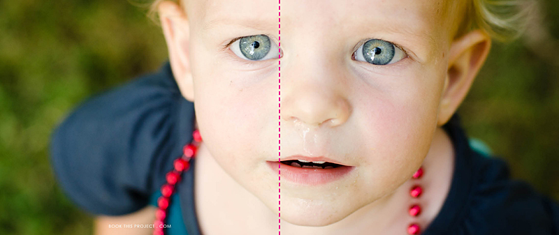
And as you know, I also love to feature my favorite photographs as a full spread (image on both the left and right hand side of the page). But this photograph is not the right size for a full spread.

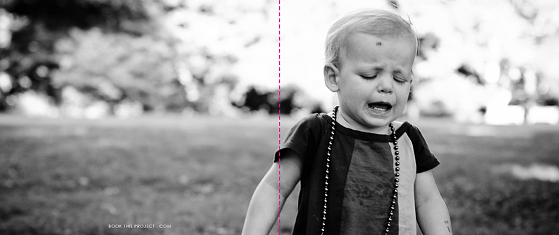
The pink dashed line indicates the center of the book, or spine. See how the pink line goes right through her eye. Not good! The layout design is taking away from the best part of the photo.
Plus, do you notice how her boo boo is now missing? This is because the proportion (the width in relation to the height) of the photograph is different as a 4″x6″ photo than when it is put in a photo book which is 8″x20″.
To clarify a little more, we doubled the height (from 4″ to 8″) but we more than tripled the width (from 6″ to 20″). If you wanted to keep everything in the 4″x6″ photo, you would need a 8″x12″ photo box in your layout. Does that make sense?
Here is a an improved example.
Photo:

Layout:

In this example, the action, or main focus of the image is occurring primarily on the right side. It is true that her arm is located in the spine of the book, but this does not take away from the purpose of the image…which happens to be her frustration!
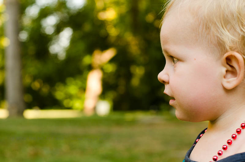
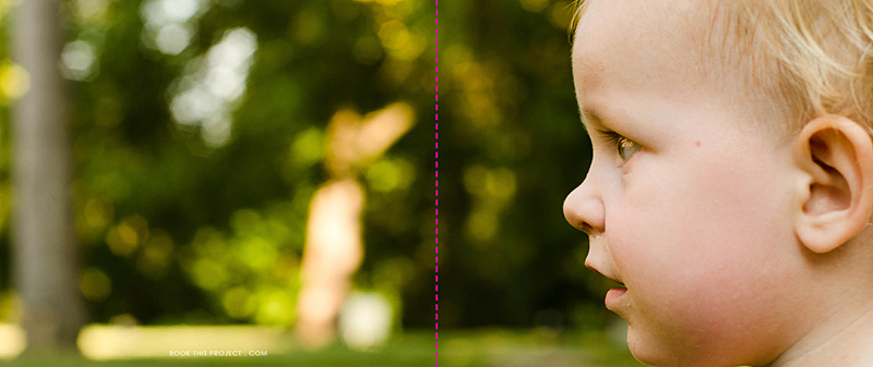
For the final example, I think this photograph lends itself really well to a full spread layout.
Photo:

Layout:

As you can see, selecting each photo and how it is shown on the page takes more than just selecting your favorite photograph. Key to any great photo book design is knowing how to design the layout that best suits the photos.
Let me know in the comments below, did this inspire how you will design your personal photo book?
by Stacey Wiseman | Sep 14, 2012 | Cover Series, Family Photographs
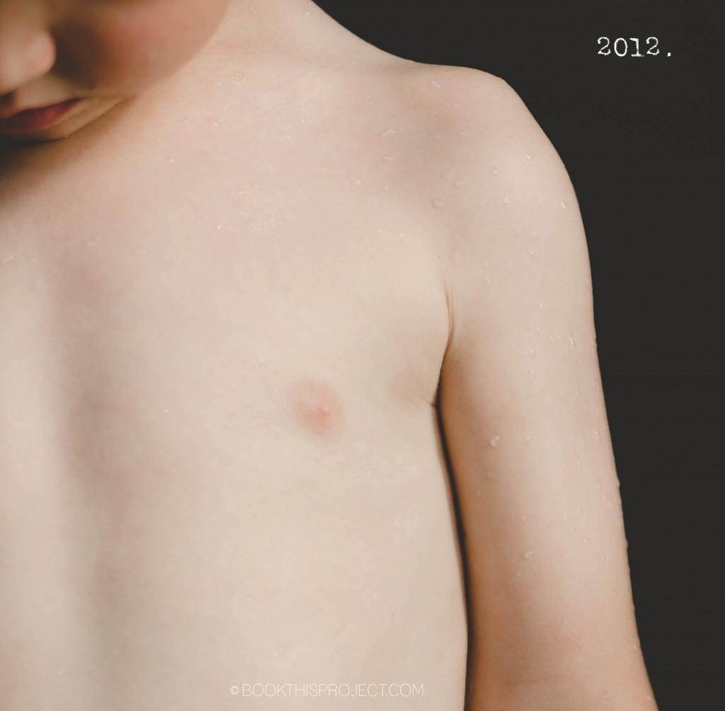
I love the simplicity of this photo book cover design. The photograph is simple and concentrated. A minimal “2012” is in the negative space of the photograph to indicate the year. And that is it! Voila!
[divider]

If you love this example or if it gives you some ideas for your photo book, pin it!
[divider]Make sure you sign up for the Book This Project weekly newsletter. I have a free download when you sign up!
by Stacey Wiseman | Sep 7, 2012 | Cover Series, Family Photographs
This is a fantastic cover to pair with the handwritten photo book design. It seems personal, casual, yet real. Provide a fun title, select a photo to match and you have created a cover that showcases your family’s personality. Underneath the photo, I created a sub-title to indicate the year and your family name. One final note, you will see that I have a faint color to the background. This would extend on the back and the side flaps for consistency. This is a nice option to include if you want something a little different from the typical white background.

[divider]If you love this example or if it gives you some ideas for your photo book, pin it!
[divider]Make sure you sign up for the Book This Project weekly newsletter. I have a free download when you sign up!
by Stacey Wiseman | Sep 3, 2012 | Family Photographs, Photo Book Design Layout, Photograph
My family knows I am not big on shopping. Rarely do I buy clothing for my kids (even more rarely do I purchase clothes for myself) but recently I met a wonderful woman in Lexington who owns a maternity and children’s clothing store in Lexington. Blossom is the store and anyone located in Lexington should definitely check them out. I realize most of the back-to-school shopping has passed, but if you need clothing for the fall, going to Keeneland, a special occasion, or a Christmas gift, I suggest you head there first.
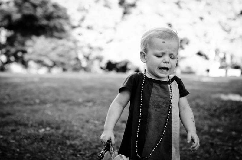
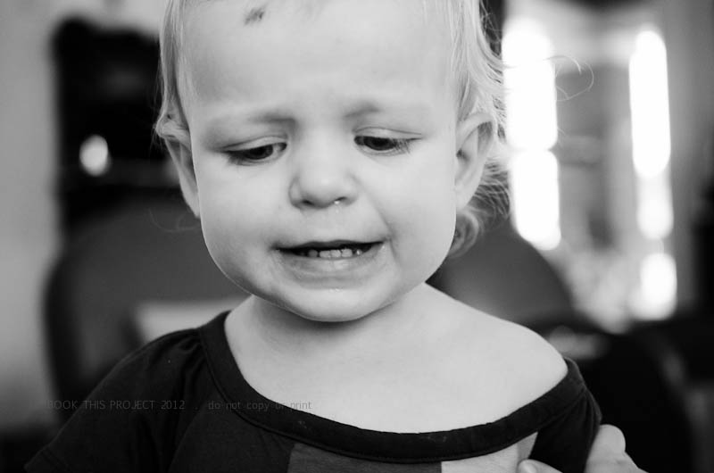
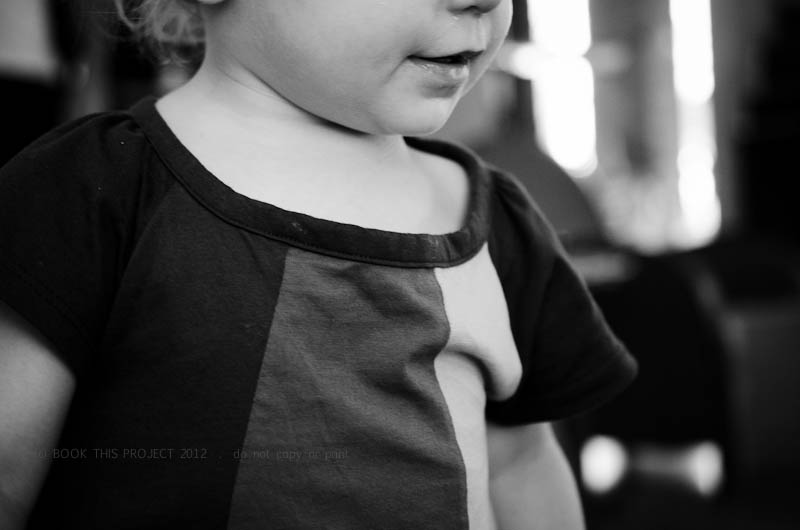
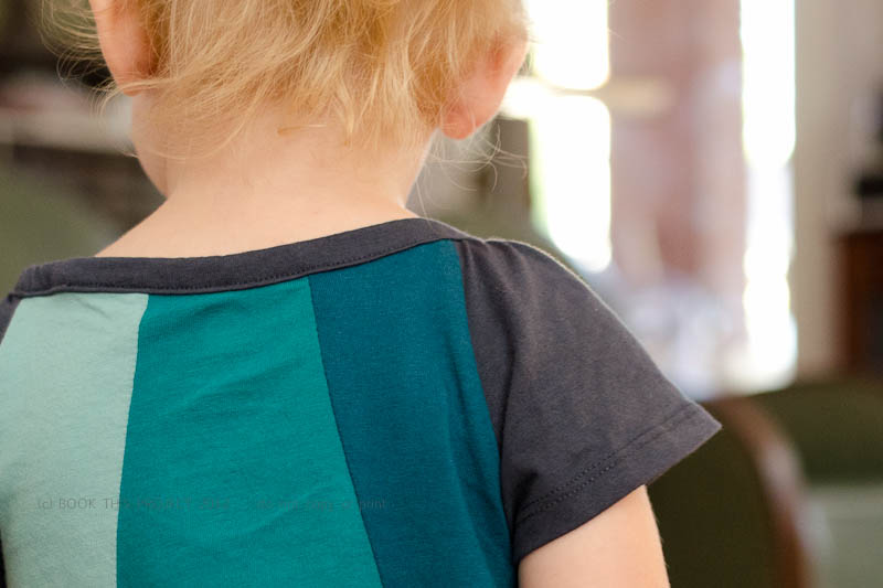
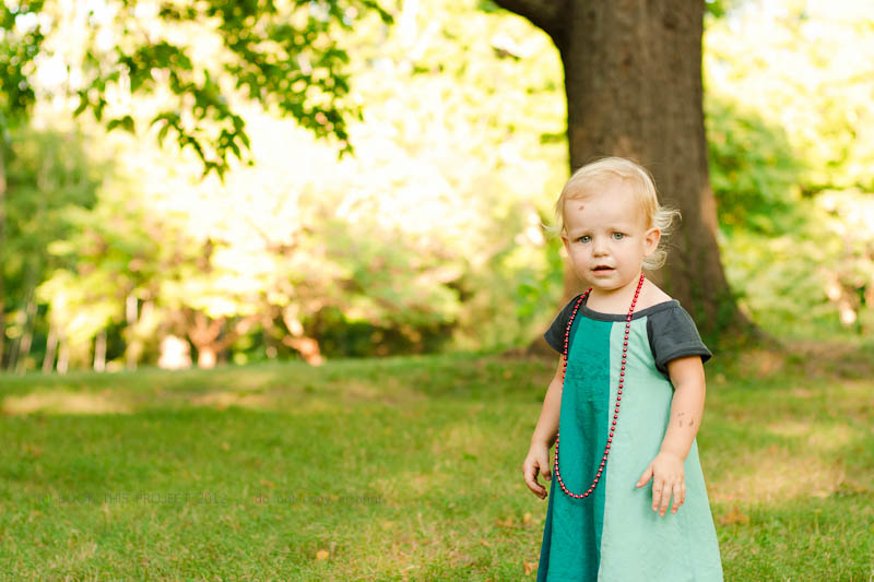
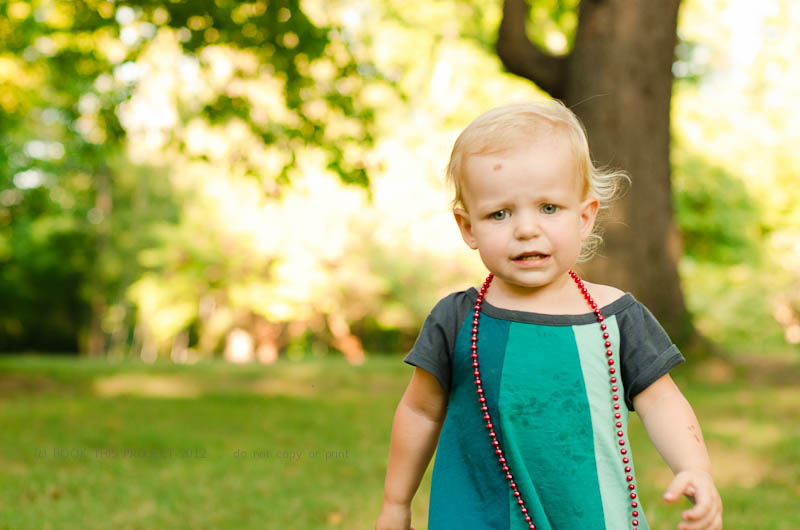
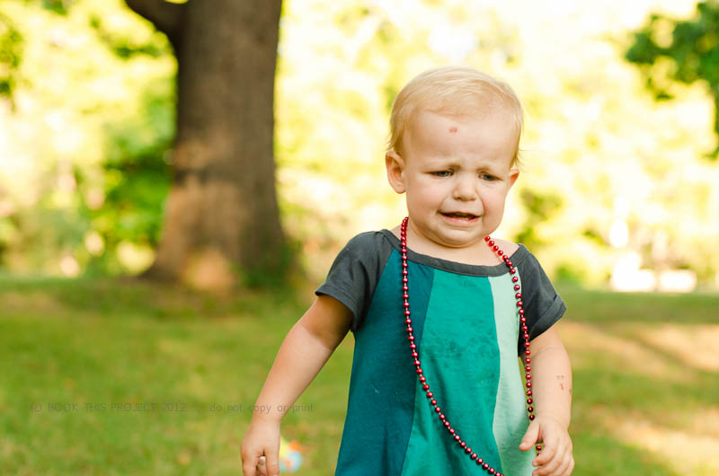
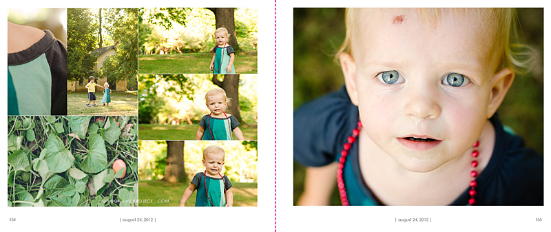
I still have to get my boy out in his new shirt, but I spent an afternoon photographing my little girl in her dress. It is a little big on her…but this will give her plenty of time to wear it! I really love the colors of the dress. Of course she added the beads. She did get a little messy during dinner but I made sure to soak it water at the end of the evening and all it good!
[divider]


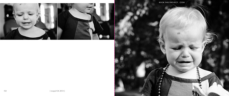
[divider]I thought you would enjoy seeing how these photographs translated into the pages for my annual family photo book. I love her smiles and her cries. Whenever I photograph her, I always work with her running away or looking away from the camera. We kept playing this game where I would get her looking toward setting sun and then I would run a couple of steps in front of her, turn quickly and then try to capture her as she was running back towards me.
Since I adore several of the photographs, I decided to dedicated four pages – or – two spreads to this set. The first page features the black and white photographs and the second page features a variety of photo at different scales, features and colors. Each pages features a page number and the date. The pink dashed line represents the fold of the pages and will not be included in the actual book.


[divider]Let me know what you think of her dress, the photographs and the layouts in the comments below!
If you love this example or if it gives you some ideas for your photo book, pin it!
[divider]Make sure you sign up for my weekly newsletter. I have a free download of 50 things to shoot for your photo book when you sign up! (click the image below)
