by Stacey Wiseman | Aug 24, 2012 | Cover Series, Family Photographs
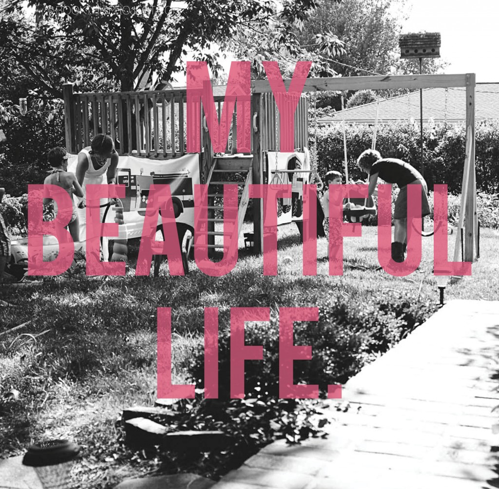
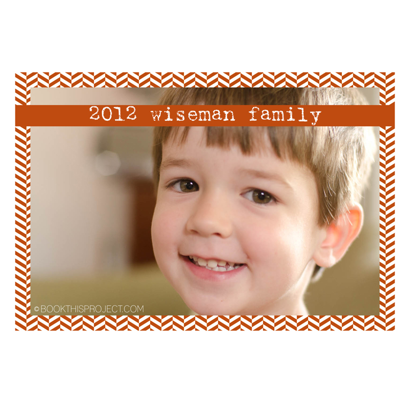
There is not a better way to describe the love you have for your family, than selecting an everyday full of life photograph and making a bold statement on the cover. The text on this photograph is slightly transparent to reveal a bit of the photograph. This cover is easy to complete. Select a familyphotograph and a statement or quote. Imagine how beautiful this would be on your coffee table?

[divider]If you love this example or if it gives you some ideas for your photo book, make sure you pin it!
[divider]Plus, sign up for the Book This Project weekly newsletter. I have a free download of 50 things to photograph this year when you sign up!
by Stacey Wiseman | Aug 17, 2012 | Cover Series, Family Photographs
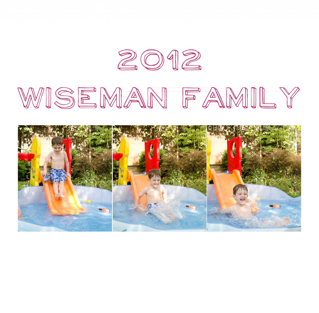
This photo book cover design features a light-hearted font, a fun color, and three photographs full of energy. This cover design announces to the family member or friend who picks up this book that it is going to be entertaining and a joy to flip through.

[divider]If you love this example or if it gives you some ideas for your photo book, make sure you pin it!
[divider]Plus, sign up for the Book This Project weekly newsletter. I have a free download of 50 things to photograph this year when you sign up!
by Stacey Wiseman | Aug 10, 2012 | Cover Series, Family Photographs
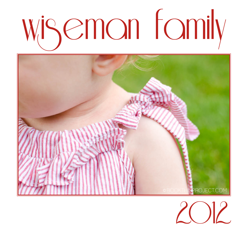
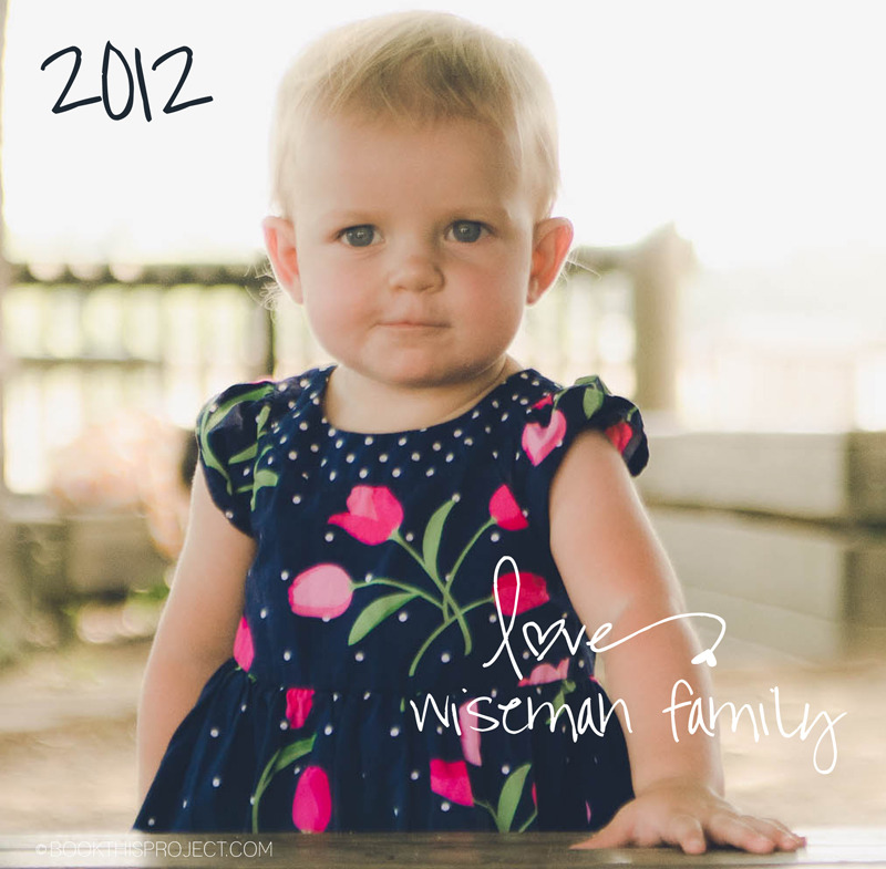
Oh, I love this one! The detail of her outfit, the color, the font, the spacing. It all really comes together in this simple photo book cover. Imagine a detail that really captures your family life. Maybe it is a favorite outfit. Or a detail of a favorite activity. With this as your cover, you could imagine starting each month off with a detail encapsulating the activities.

[divider]If you love this example or if it gives you some ideas for your photo book, pin it!
[divider]Make sure you sign up for the Book This Project weekly newsletter. I have a free download when you sign up!
by Stacey Wiseman | Aug 9, 2012 | Description, Photo Book Design Layout, Podcast
It is time for another video podcast! In this month’s podcast, I translate the outline from the previous video (see this link here to watch that video!) into an actual photo book structure. Using Adobe InDesign and the free software program from Blurb, I take you step by step as we create stand-in pages for the entire book. Once the structure is in, you will have a framework – or a to-do list – to begin filling in the pages.
And speaking of starting to fill in the pages with photos…stay tuned for next month’s podcast where I start that process. Looking for the easiest way to know when this podcast is released…sign up for my free weekly email!
by Stacey Wiseman | Aug 3, 2012 | Cover Series, Description
Let’s kick August off with a bold photo book cover design! This cover design features a vibrant solid red color, with the year outlined along the bottom. Simple, yet striking, this cover definitely makes a statement and when it is sitting on your coffee table, it will be hard not to pick it up and browse through your photos again and again!

[divider] If you love this example or if it gives you some ideas for your photo book, pin it!
[divider]Make sure you sign up for the Book This Project weekly newsletter. I have a free download when you sign up!
by Stacey Wiseman | Jul 27, 2012 | Cover Series, Description, Family Photographs
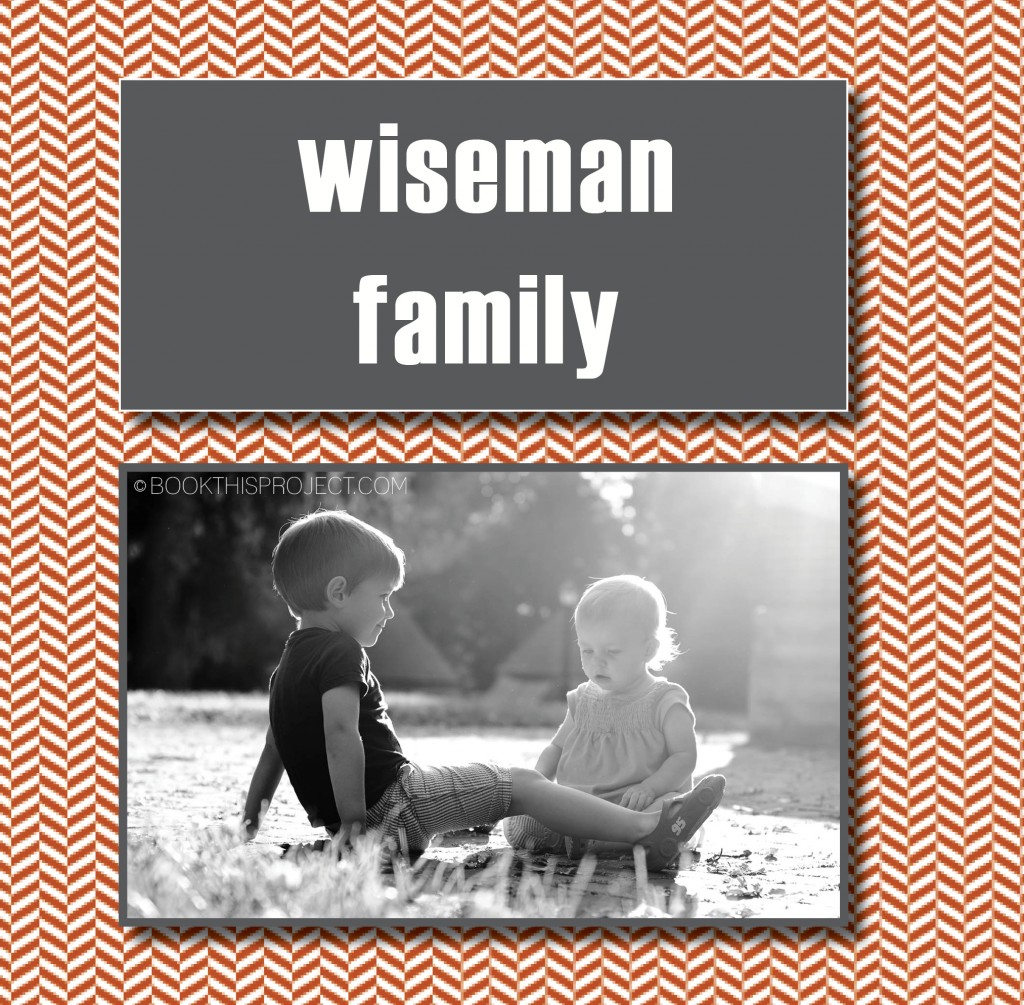
For this example of a family photo book cover, I use a vibrant background graphic to provide some visual interest and then float two boxes in the center. The top box announces the family name or the title of the book in a bold font to stand out. The lower box features a black and white photograph of my two kids together. This combination provides a great way to provide a little more visual punch without becoming too busy. Plus it is one simple way to show a singular family photograph without it taking the entire cover or floating in a sea of white space.

[divider] If you love this example or if it gives you some ideas for your photo book, pin it!
[divider]Make sure you sign up for the Book This Project weekly newsletter. I have a free download when you sign up!
by Stacey Wiseman | Jul 20, 2012 | Cover Series, Description, Family Photographs

[divider] If you love this example or if it gives you some ideas for your photo book, pin it!
[divider]Make sure you sign up for the Book This Project weekly newsletter. I have a free download when you sign up!

by Stacey Wiseman | Jul 19, 2012 | Description, Q&A
 How do you define your photo book design style?
[divider]
Simply put: To showcase each photograph and to reflect your family.
I believe in clean, refined layouts and love to inspire the everyday moments that make your family unique. I love to focus on the photographs themselves. That means, I try to make as many photographs full page or full spread as possible while keeping in mind the total number of pages and photographs you want for your book.
As you saw in my most recent podcast, organization and having a structured book is really important to me. Every book I design and deliver has an organizing principle behind it. This is what pulls it all together! My goal is to make sure each page makes perfect sense for the photographs and the entire books makes sense to define your year.
And if I had to chose three words to describe what I strive for with each design: modern, sophisticated, and refined.
[divider]Do you have a question about photography, photo books, or Book This Project? Leave a comment below with your question!
by Stacey Wiseman | Jul 13, 2012 | Cover Series, Description

[divider] If you love this example or if it gives you some ideas for your photo book, pin it!
[divider]Make sure you sign up for the Book This Project weekly newsletter. I have a free download when you sign up!
by Stacey Wiseman | Jul 12, 2012 | Photo Book Design Layout, Podcast
Check out the latest podcast to find out the easiest way to transform your photo book into a professional book.
To receive your free excel spreadsheet guide, click here!
Share with everybody your biggest a-ha moment you learned from this podcast in the comments below.

