by Stacey Wiseman | Jul 6, 2012 | Cover Series, Description
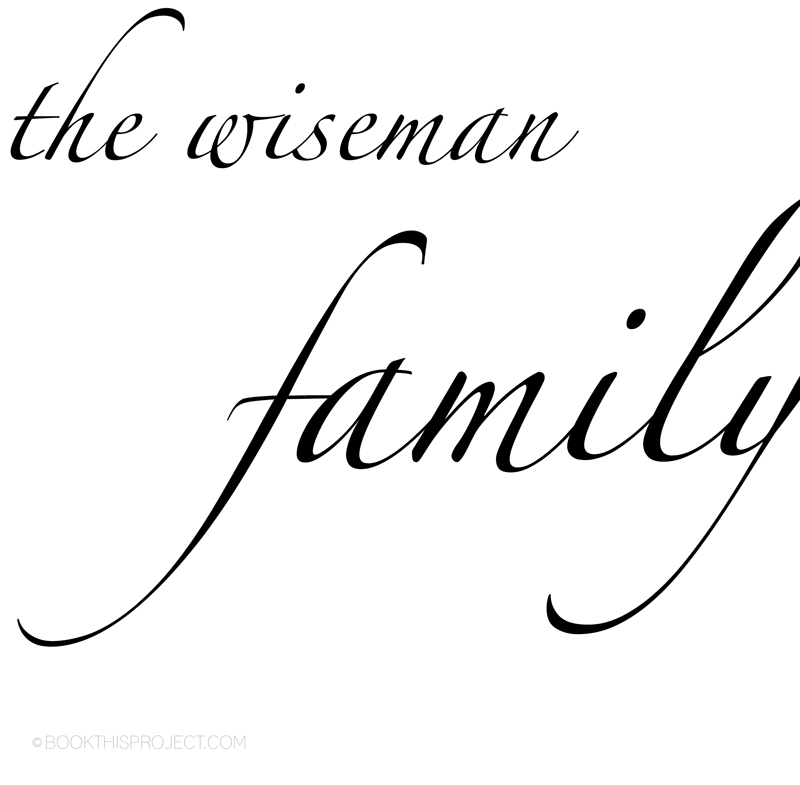
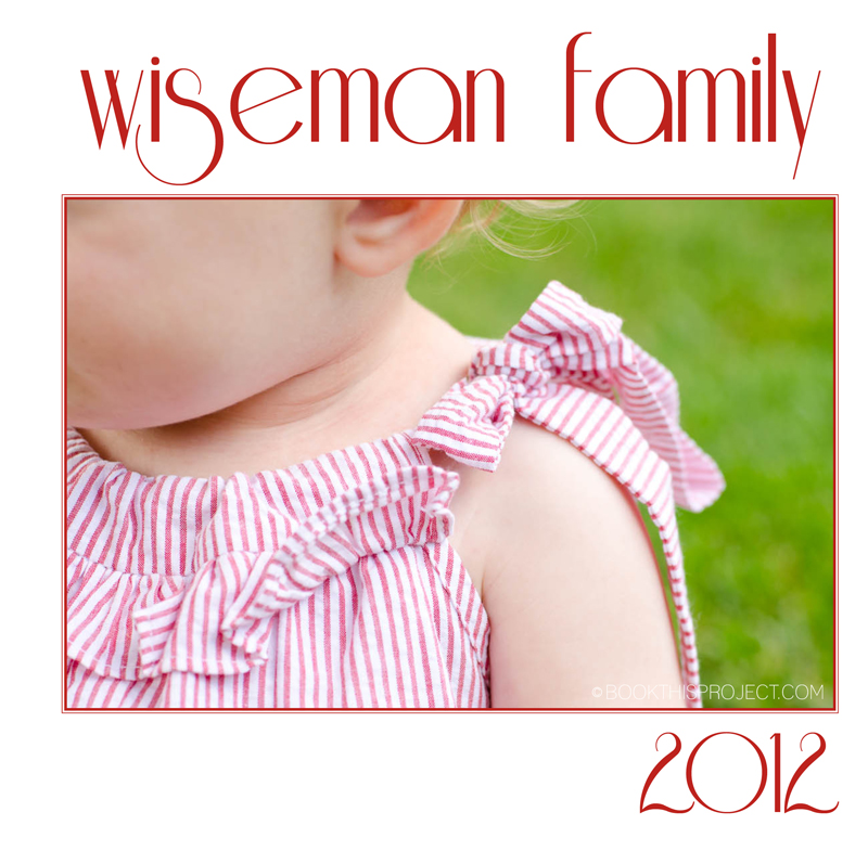
As I described last week, with photo book covers, you don’t always have to place a photo on the cover. Here is an example of a photo book cover featuring a specialty font. This cover is elegant and simple.

[divider] If you love this example or if it gives you some ideas for your photo book, pin it!
[divider]Make sure you sign up for the Book This Project weekly newsletter. I have a free download when you sign up!
by Stacey Wiseman | Jul 4, 2012 | Family Photographs, Photo Book Design Layout
I hope everyone is having a fantastic fourth! Usually the Fourth of July is a busy holiday for us. They have an annual road race with the route right next to our house. So we wake up early and watch the runners…with our coffees! And for dinner we had to my in-laws for a grilled feast.
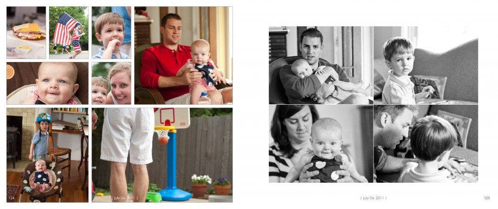
I thought I would share my spread from the 4th in my 2011 photo book. The layout was prepared in Adobe InDesign. Because there were so many events that occurred, I wanted a layout that allowed a lot of photos in one spread.

I want to hear from you in the comments below. What is one thing you will definitely do on the Fourth of July? Picnic? Pool? Movie? What are your traditions?
by Stacey Wiseman | Jul 2, 2012 | Family Photographs, Inspiration, Photo Book Design Layout
Last week, I wrote about my daughter’s favorite blanket. But let’s be honest, sleeping – even waking up photos – are adorable and a must every year for your kids. I took several photos, maybe 30 and selected my favorites to include in my annual family photo book.
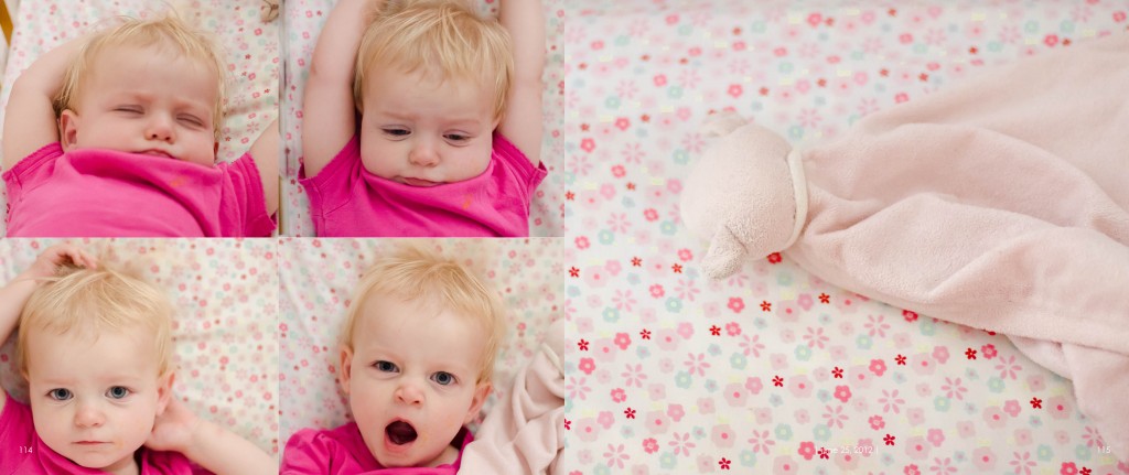
To make it easier to select which photos, I had my layout in mind. I knew I wanted four photos on the left hand side of the layout and one photo on the right.
For the left page, I wanted four different facial expressions of my daughter waking up.
For the right page, a detail of the blanket would keep the layout simple and to the point. About my daughter – her sleeping, waking up, and her blanket.
This layout was prepared in Adobe InDesign and has the signature design elements of my photo book, page numbers and a date to document when these photos were taken.

by Stacey Wiseman | Jun 29, 2012 | Cover Series, Description
When you are considering the cover for your photo book, if you have more than one kid it can get a bit tricky. As I have shown in previous examples, I advise, when possible, to have similar looking photographs of your kids for the cover. Or of course, it could be a great one of the two (or however many kids you have) of them. But is you are a bit indecisive…you can always keep a very simple cover. Throughout the year, I will showcase some covers that have no photographs to them at all. And I am really drawn to this idea. It keeps it simple, understated and almost a surprise to what is inside. This is a solid color cover with a simple year in the bottom right corner. It is possible to have the same color every year. That way, you will always know where to find your family photo books. Or you could do a variety of colors or various shades each year. Start light and the covers keep getting darker and darker as the years go by. Think about how fantastic that will look on your shelf! Here is a quick example and keep checking out our Cover Series every Friday for more inspiration!

[divider] If you love this example or if it gives you some ideas for your photo book, pin it!
[divider]Make sure you sign up for the Book This Project weekly newsletter. I have a free download when you sign up!
by Stacey Wiseman | Jun 28, 2012 | Description, Family Photographs, Inspiration, Photography Tip
One of the essential categories to photograph every year are favorites. Since this can change every year (maybe even every month or week!), I love the idea of photographing your child’s favorite objects in life. Perhaps for most kids, their favorite of their favorites deals with sleeping. This could be their favorite blanket or stuffed animal. This is the thing you are scared to lose…even scared to wash. For any night trip away, you have to make sure you have included their favorite blankey, softie, or whatever terms of affection it goes by in your household.
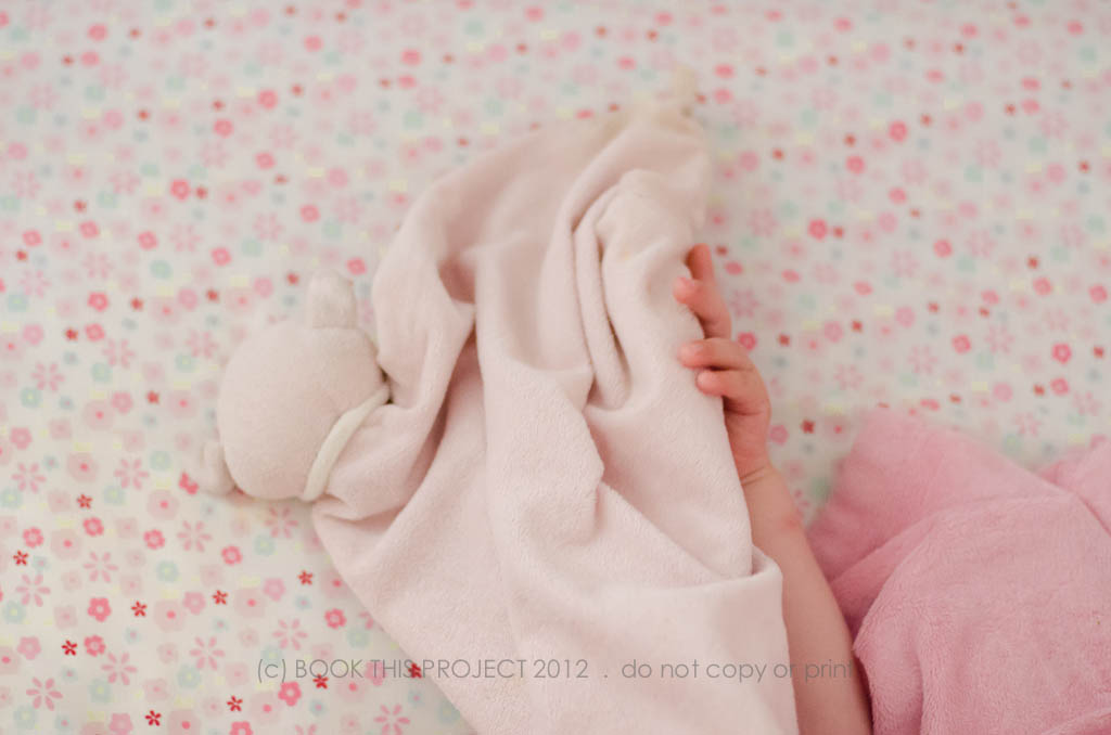
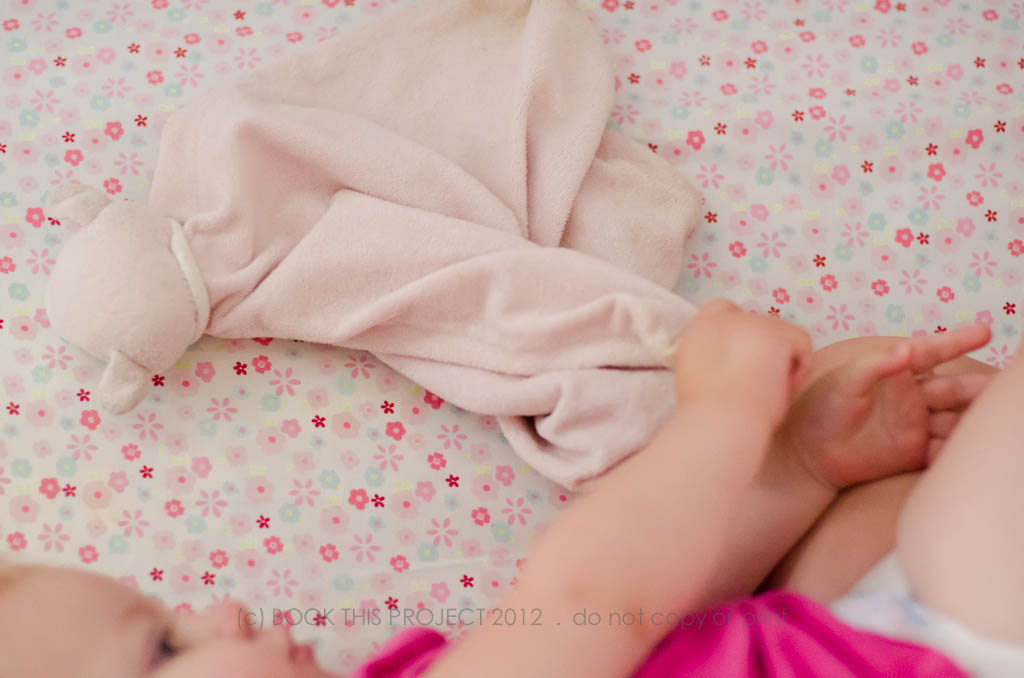
For my oldest, he never really had one of these objects. The closest thing was a stuffed pillow-like dog that he like to curl up with. But if it happened to not be in the bed, he usually didn’t notice. My youngest on the other hand, has a small softie that she looks for every time. And you can trick her with something that looks and feels like it…she knows which one is hers. This small, pink blanket gets extremely dirty. She loves to chew on the corners and keep it close to her cheek. So it is really important to make sure it is always near by for any nap or bed time!
I wanted to photograph her with her blanket one day during her nap time.
Here are some simple tips for photographing sleeping children:
1. Set my camera to quiet mode (yes! my camera has one of these!).
2. Got my settings close to what I thought would be necessary for a slightly dark room.
3. Snuck in close to the time I thought she would be waking up.
I was hoping to get some of her sleeping but she woke up as soon as I opened the door. How it goes sometimes! Even though I couldn’t capture sleepy, closed-eye photos, this is the perfect time to capture an awesome yawn! Plus her favorite sleep blanket.


Take action! Capture your child’s favorite toy, object, or stuffed animal sometime this weekend. Have a goal, to photograph them while they are interacting with it. But…if not, you can always isolate the object. Your child will love having a photograph of their favorite thing!
Check out the blog on Monday to see how I transform these photos into a design layout!
And with this post, I have marked off two items on my 50 Essential Ways to Photograph your Family in a year. Do you have your copy yet? If not, make sure to sign up for the newsletter by clicking this image:


by Stacey Wiseman | Jun 26, 2012 | Q&A
 Q: Can BOOK THIS PROJECT create a photo book from my blog?
 A: Yes!
Every book order includes page titles either indicating the date of the
photographs and/or the activity presented on the page.
If you wish to include longer captions, narrative descriptions or text from your blog,
all you have to do is send us an email with your text requirements. We will provide
an estimate to incorporate the text you provide to us or the text from your blog.
This includes the position of the text associated with the photographs to accurately
reflect your blog post.
[social_icon title=”facebook” url=”http://www.facebook.com/bookthisproject” profile_type=”facebook” icon_url=”https://www.bookthisproject.com/wp-content/uploads/2011/10/facebook.png” window=”yes”] [social_icon title=”twitter” url=”http://www.twitter.com/bookthisproject” profile_type=”twitter” icon_url=”https://www.bookthisproject.com/wp-content/uploads/2011/10/twitter.png” window=”yes”] [social_icon title=”you tube” url=”http://www.youtube.com/bookthisproject” profile_type=”youtube” icon_url=”https://www.bookthisproject.com/wp-content/uploads/2011/10/youtube.png” window=”yes”] [social_icon title=”flickr” url=”http://www.flickr.com/photos/bookthisproject” profile_type=”flickr” icon_url=”https://www.bookthisproject.com/wp-content/uploads/2011/10/flickr.png” window=”yes”] [social_icon title=”vimeo” url=”http://www.vimeo.com/bookthisproject” profile_type=”rss” icon_url=”https://www.bookthisproject.com/wp-content/uploads/2011/10/vimeo.png” window=”yes”] [social_icon title=”digg” url=”http://www.digg.com” profile_type=”rss” icon_url=”https://www.bookthisproject.com/wp-content/uploads/2011/10/digg.png” window=”yes”] [social_icon title=”delicious” url=”http://www.delicious.com” profile_type=”delicious” icon_url=”https://www.bookthisproject.com/wp-content/uploads/2011/10/delicious.png” window=”yes”]
[tweetmeme style=”compact” link=”http://www.twitter.com/bookthisproject” source=”book this project”]
[fblike style=”button_count” showfaces=”false” width=”450″ verb=”like” font=”arial”]
by Stacey Wiseman | Jun 22, 2012 | Description, Family Photographs, Inspiration, Photo Book Design Layout
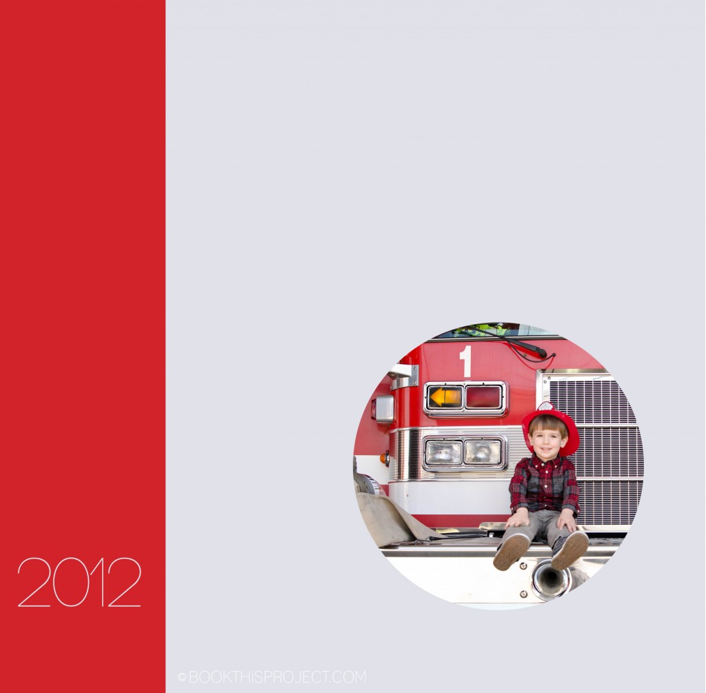
My intention for this book cover idea is to have the red bar wrap around the spine and the back. The front cover has a photograph of my son; the back cover features my daughter. These photographs speak more to their adventures as a kids and so I have titled this example: “Adventures in 2012.”

[divider] If you love this example or if it gives you some ideas for your photo book, pin it!
by Stacey Wiseman | Jun 20, 2012 | Cover Series, Description, Family Photographs

by Stacey Wiseman | Jun 15, 2012 | Description, Family Photographs, Inspiration, Photo Book Design Layout
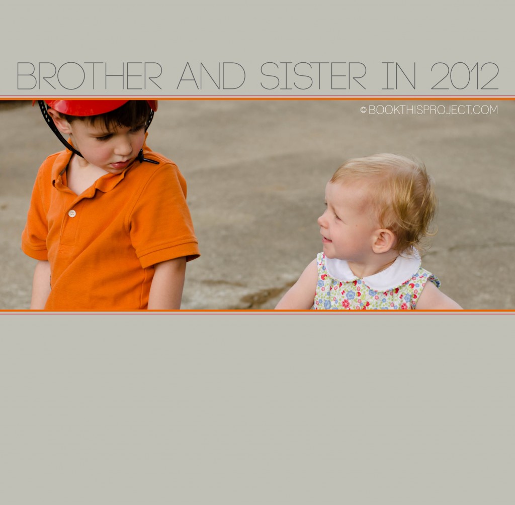
Today’s 2012 Cover Series highlights the interaction between my two children. I have cropped it tight to focus on their glances and I used two small lines at the top and bottom of the photograph to symbolize my two kids. The title is simple and points out the focus of the photograph selected for the cover. Plus it gives some indication that in my family book, I am going to focus on them – brother and sister!

[divider] If you love this example or if it gives you some ideas for your photo book, pin it!
by Stacey Wiseman | Jun 14, 2012 | Family Photographs, Inspiration, Photograph
Now that it is June, it is time to start thinking about and taking summer photos. To me, that means picnics, barbecues, and nothing says summer quite like a pool photograph. I love Lynne Rigby and I love Lynne Rigby’s photographs. She is amazingly talented – both with her camera and teaching. Truly inspiring lady. But…today…I want to focus on her pool photographs. I loved so many of them last year and already a little giddy for her photographs this summer.
Her photographs highlight the sun sparkle, the waves of the pool, and her kids in and out of the water. Here is a great photograph to get you inspired for your pool photographs this summer. And just warning you…there may be more. Seriously love her!
I want to see your summer photographs! I have started a flickr set that you can link your photograph to. Or you can always leave a comment below with a link to your blog post, Facebook page or flickr set. Love to see each other’s work!!!
