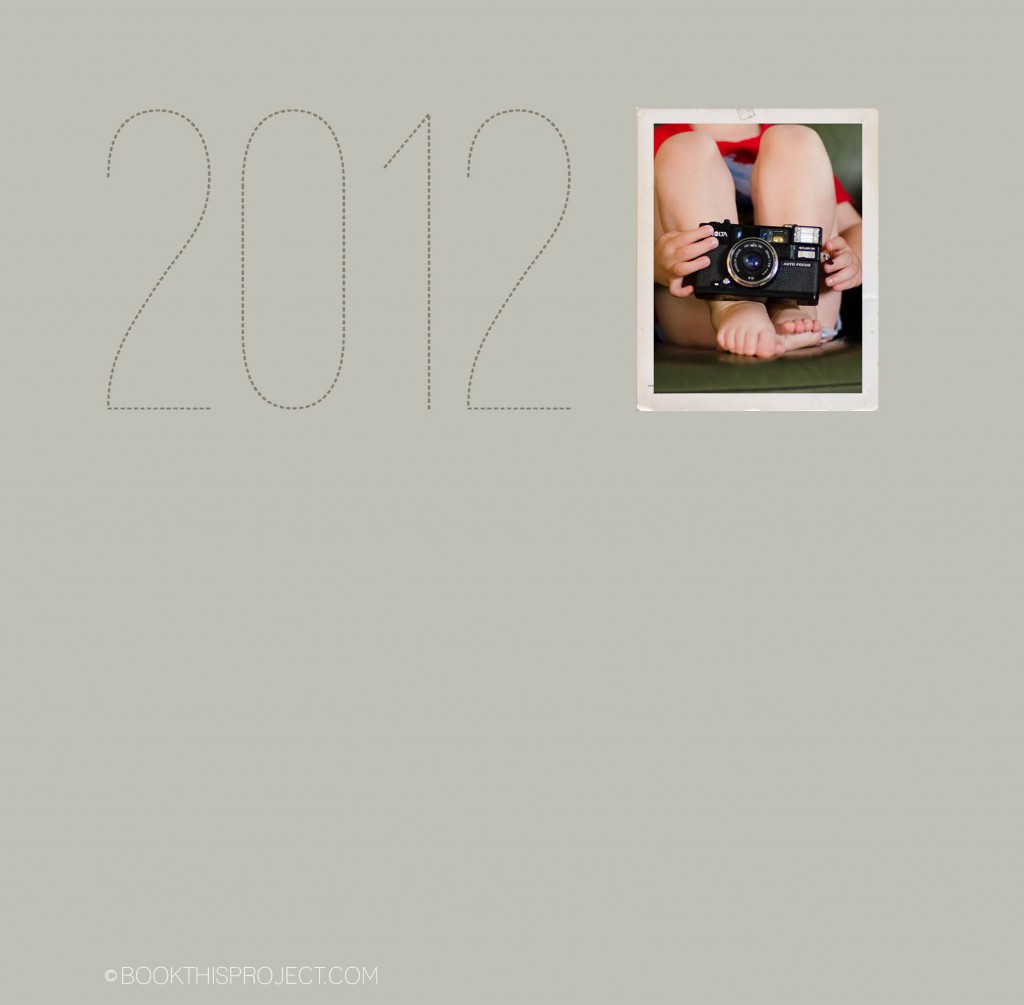
2012 Cover Series | custom photo book
Here is the next entry in the Book This Project 2012 cover design series.
 [divider] Make sure you pin it!
Here is the next entry in the Book This Project 2012 cover design series.
 [divider] Make sure you pin it!
2012 cover design series: make sure you pin it!
COLOR! It is so important in design and can add so much to your photo book layouts. I have decided to start a new monthly series that examines the impact color has on layouts. I will take a photograph – or a group of photographs – and run through a series of different design layouts – exploring color, type, size, orientation, and proportion.
First, to start off this series, I want to mention the beautiful and inspiring site: Design Seeds. If you are not familiar with them, I hope you will check out their site, facebook page or pin boards. This site examines the rich color groups found within evocative photographs. If you are ever in a color rut or looking for color inspiration, you should check out their work!
Photo
[divider] Layouts
[divider]Get a free download listing the colors used in this series (RGB and CMYK) – here!
[divider] Would you like one of your photographs featured in this series? Email me your photograph and I will let you know when your photo will appear.
I hope this gets your creative juices flowing!
And if you love any of these, share this post on your facebook page or pin your favorite(s)!
Here is another entry in the 2012 cover design series. Make sure you pin it!
The following is an example of my April page for the One Word Challenge. For this layout, the photo is a full book spread bleed. In order to do this, I had to crop the image but I think it still works and will have a big impact in my family book.
I have decided to start a little series on 2012 family photo book covers. All of these will be featured on this blog + pinterest board…so make sure you follow it!
For the first issue, I based the cover design on this email I received from J.Crew. I loved the two variations of the same color: light and dark.
[divider]Here is the cover:
I hope to inspire you this weekend to take some photographs of your family! It has been a while since I have posted my favorite photograph of the week…but I have a good one for you!
I have two different sets of photographs: interior and exterior by the Australian photographer: Toni Raper.
First: an interior series of photographs. All you need is a bedroom with a bedroom window. That is easy, right? Look how gorgeous it can turn out. Her daughter’s personality oozes in these photographs.
Second: get your kids outdoors. Green and brown. Animals. Sun. The fence. The smile! Try to find a place near your home to take photographs outside. It could be a park or a local farm. One aspect I love about this series, is the wide open space of the land. Plus, she lets her daughter explore.
What are you guys planning on photographing this weekend? Any specific plans? I would love to hear about them in the comments below!
Following up on my last inspiration post where I translated the cover of an Anthropologie catalog into a layout, this example features a cover of a non-fiction book. It is simple, elegant, and stately.[divider] Inspiration:
Eating Architecture edited by Jamie Horwitz and Paulette Singley
[divider]Photograph:
[divider] Iterations:
And here are five iterations.
[divider] Do you have a favorite?
All of these are on my pinboard “Inspiration and Iterations.” Pin your favorite now!
Hey everyone, time for our next interview! You will love Rhonda McMaster. She is a photographer located in Ottawa and mother to three absolutely beautiful children. I mean, seriously beautiful children. Rhonda’s photographs have amazing color, clarity and light but perhaps what I love the most about her photos is the way she frames an image. She finds a way to make the surroundings tie into and perfectly frame the subject. A perfect example was when she stayed a couple of steps behind her kids going down an empty escalator. The rail of the escalator led perfectly to her children and she got their reflection in the glass sides.
We did not coordinate this in advance…but my favorite photograph of hers is exactly the photograph she selected for #9! I was so happy she included this photograph in the interview. This photograph not only captures light in an amazing way…but the interaction between brother and sister is real and genuine. I feel cold but warmth at the same time. It seems casual but perfectly executed. I long to one day capture an emotion similar to this in my photographs. Right now we are still in the “be gentle, brother” phase; but one day!
To see more of her photography, check out her website and make sure you like her facebook page.
On her website, she has this really cool feature highlighting photographic collages (click the tab “collages” to view). My favorite collage is “girly girl.” What mother of daughters would not love something like this!
[divider]1 | me and my camera:
Hi! My name is Rhonda. I’m a photographer, mother, teacher and life-lover. I shoot with a Canon 5D Mark II and the 50 mm 1.2L and 24-105 mm 4.0L.
[divider]2 | my family:
This is my busy, young family. 🙂
[divider]3 | my current photography challenge:
My challenge is to let go of expectations. The images I get are not always the ones I *think* I want to get, but like this one, when I saw it, I knew it was the one I was *meant* to get….
[divider]4 | what I have time for now:
Chasing children.
[divider]5 | what I don’t have time for now:
Afternoon naps. Long ago (it’s hard to remember when) afternoon naps turned into afternoon plays.
[divider]6 | my favorite photography subject:
My children (any of them!). I have never met a mother who doesn’t love a photo of her babies.
[divider]7 | my favorite place to photograph inside my home:
I love taking advantage of the beautiful, natural light that pours in through the largest window in my living room.
[divider]8 | my favorite time to photograph:
It’s not the easiest time to photograph and I shoot more frames, but learning how to embrace the midday sun has made me a better photographer. The way the sun lights up my daughter’s already-vibrant hair makes me smile.
[divider]9 | my favorite blog post (or photograph) right now:
My favourite photograph is usually my newest one, but I keep going back to this image from this past winter, which is perfectly imperfect to me, and shows true sibling love.
[divider]10 | what tip, trick or info helped your family photographs the most:
Contrast in an image makes a beautiful black and white. Also, there are many beautiful locations to take a photograph, but wherever you are, when you see something beautiful or inspiring, take a picture. (This image was taken from the front seat of my van on our way to skiing lessons.)
[divider]All photographs are copyright to Rhonda McMaster, Rhonda McMaster Photography. Do not copy, print, or distribute.
Saturday was actually a really stressful day. My daughter wasn’t feeling well (getting over another ear infection) and my son…well, he is three. He was okay most of the day until a major tantrum around 7. But we survived and here are the photos from the day! And a couple more than 10 :)…
[divider] 8am
[divider] 9am
[divider] 10am
[divider] 11am
[divider] 12pm
[divider] 1pm
[divider] 2pm
[divider] 3pm
[divider] 4pm
[divider] 5pm
[divider] 6pm
[divider] 7pm