by Stacey Wiseman | Apr 13, 2012 | Description, Family Photographs, Photo Book Design Layout, Photograph, Podcast
The March/April podcast is finally here! It took me a while but I was finally able to pull it all together!
In this podcast, I take a simple photo book concept from beginning to end. There is a FREE companion download to this podcast. I hope you check it out and I would love to hear how it helped your photo book. Also, I would love to see any photographs or layouts you come up with! Add a comment with a link below!
Thanks and Enjoy!!!
by Stacey Wiseman | Apr 9, 2012 | Description, Family Photographs, Inspiration, Photo Book Design Layout, Photograph
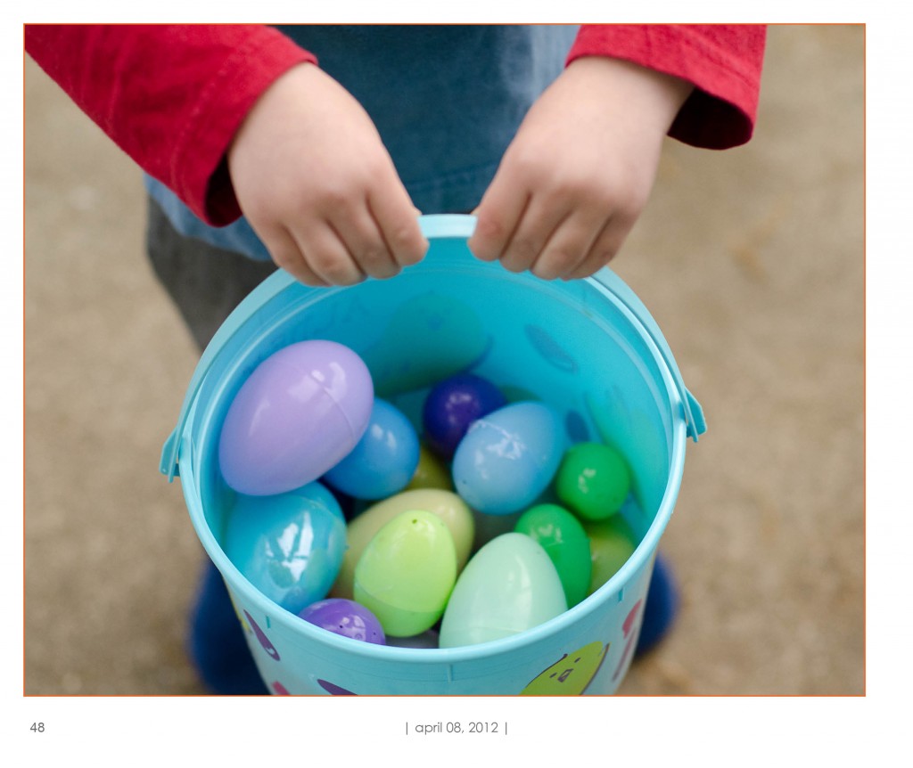
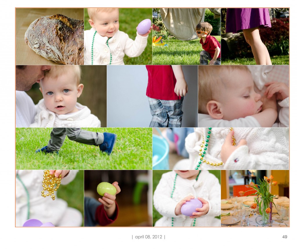
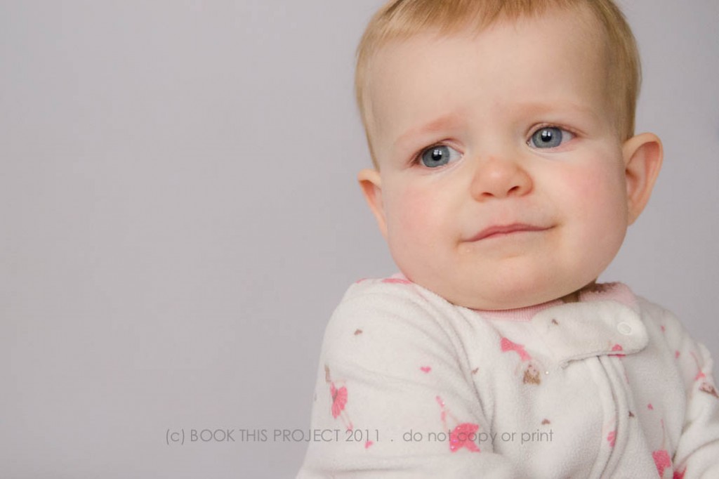
I hope everyone had a great Easter! We kept extremely busy. Breakfast, egg hunt, convert crib into big boy bed, lunch, laundry, nap, clean up, Easter dinner at my in-laws and bed. My son is really starting to get the concept of holidays and gets so excited. I love seeing his smile on these days. And my girl had some fun too!
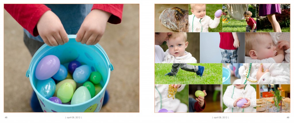
For my family photo book layout, I designed a spread with one large photo on the left and a photo collage on the right page. This is a great way to combine a lot of photos into only two pages. For inspiration, take ideas from collage boards. Samples are everywhere…but I pinned an example from a wedding inspiration board.
[divider] Left:

[divider] Right:

[divider] Spread:

by Stacey Wiseman | Mar 30, 2012 | Family Photographs, Inspiration, Interview, Photograph
Finally, the second interview is up and ready..and it is a good one! Introducing Monika Eisenbart! She is a photographer in the Hudson Valley area in New York. Her new website is Monika Photography (updated link). If you live in or around New York City, you should definitely look her up for a session. Not only is her work for clients absolutely amazing…but she also has an great eye for capturing her son and family life. She documents everyday life, like celebrating a snow fall or being sick as beautifully as big moments like visiting her family in Poland.
This Poland trip includes one her favorite sessions, listed in number 9 below…but I can not post this interview without listing some of her other work that has really stuck with me.
An Engagement Session. (also apart of her Poland trip last summer…)
Before First Communion and First Communion. There was just something about this session…it really has stayed with me.
And my dream family portrait right now would be very close to this session she photographed.
Oh, and while I was going back through her work, I remembered this post…loved the light and location in these!
Gorgeous, right!
(Some of the links may not longer work due to recent web updates. Make sure you check out her latest work here.)
So here is a little more about Monika:
1 | me and my camera:
Hi,
My name is Monika. I’m a photographer, wife and mother.
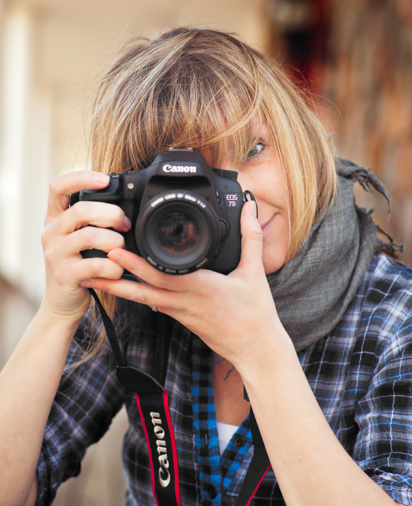
I’m a conon girl and shoot with Canon 7d. I have few lenses:
35mm 1.4L – my favorite one, stays on my camera most of the time
50mm 1.4
85mm 1.8
24-70mm 2.8L
2 | my family:
I live with my family just outside NYC. Like me, my husband Peter comes from Poland. Our son Kacper was born here just two years ago.
3 | my current photography challenge:
I think at the moment my biggest challenge is to define my own style and commit to it. I’m searching for the perfect fit and who knows if I ever find it.
4 | what I have time for now:
Well at the moment everything in my life is about photography. I dream and think about it most of the time; that is when my family is not around.
5 | what I don’t have time for now:
Reading novels and other books not photography related. I wish I could go to the movies more often too.
6 | my favorite photography subject:
Besides my son, I love photographing everyone who is willing to share their story.
7 | my favorite place to photograph inside my home:
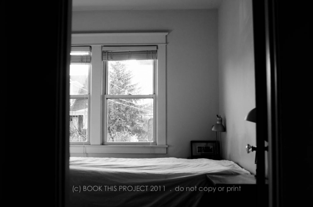
That would be my bedroom, which offers two huge windows and neutral wall colors.
8 | my favorite time to photograph:
Love the sunset shoots and would love to try sunrise too. And this kind of shoot is on my list this summer.
9 | my favorite blog post (or photograph) right now:
It’s so hard to choose, because I love them all. But most of the time I go back to my grandmothers shoot I did last summer while visiting my family in Poland. It’s so real and raw, every image has so much emotions.
For more from her Poland trip, because it was that fantastic:
here,
here,
here, and
here.
10 | what tip, trick or info helped your family photographs the most:
I think general knowledge of photography helped me take better pictures, including my own family.
All photographs are copyright to Monika Eisenbart, me photographia. Do not copy, print, or distribute.
Thanks again for sharing! I love your work!!!
Are you interested in being featured? Contact me at info[at]bookthisproject.com
by Stacey Wiseman | Mar 27, 2012 | Description, Family Photographs, Inspiration, Photo Book Design Layout
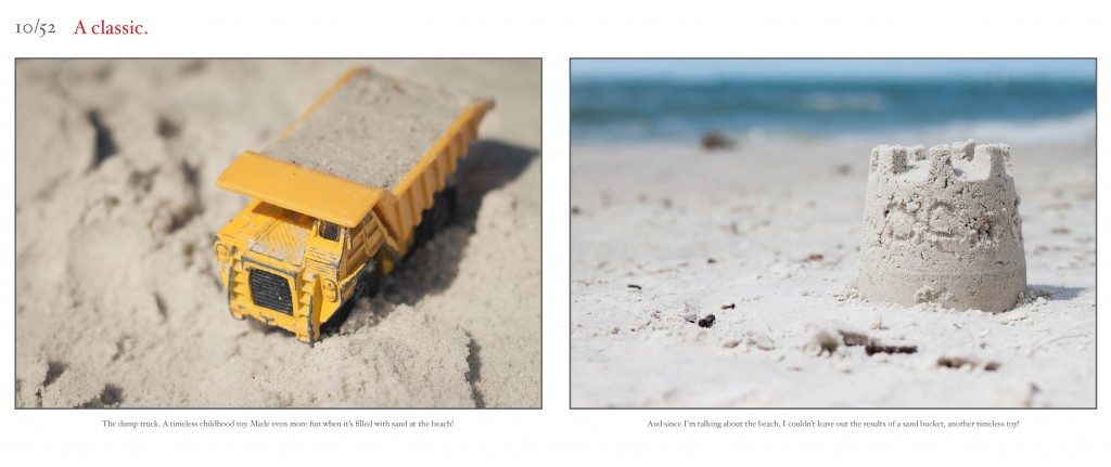
I had the great pleasure of designing a beautiful Project 52 book. This book is a collection of photographs she took every week for an entire year. I love how her photographs tell a story! One fantastic feature of this book, I was quite easily able to adapt to the design of the book to her photography blog. For a comparison, check out her blog here!
All photographs in this post are copyright protected by Tamra Yandow. Do not copy, print or distribute.
Here are a few of the design layouts:


[divider]
Here are the specs of the book:
Design: Outline
Book Type & Size: Hardcover / Landscape (10”wide x 8”tall) / Professional Grade Paper
Number of Photographs: 146 photographs
Number of pages: 100 pages
Organized by: Week
All photographs are copyright of the Book This Project client.
All page layouts are design of Book This Project, LLC. All rights reserved.
For a limited time only, here is a preview of the book.
by Stacey Wiseman | Mar 8, 2012 | Family Photographs, Inspiration, Motivation, Photo Book Design Layout
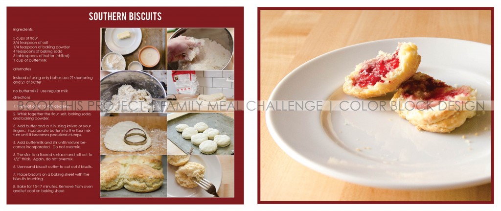
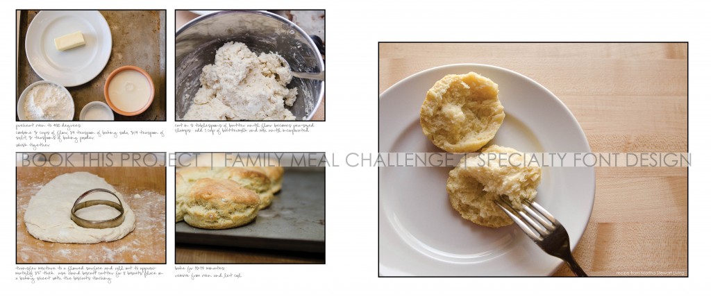
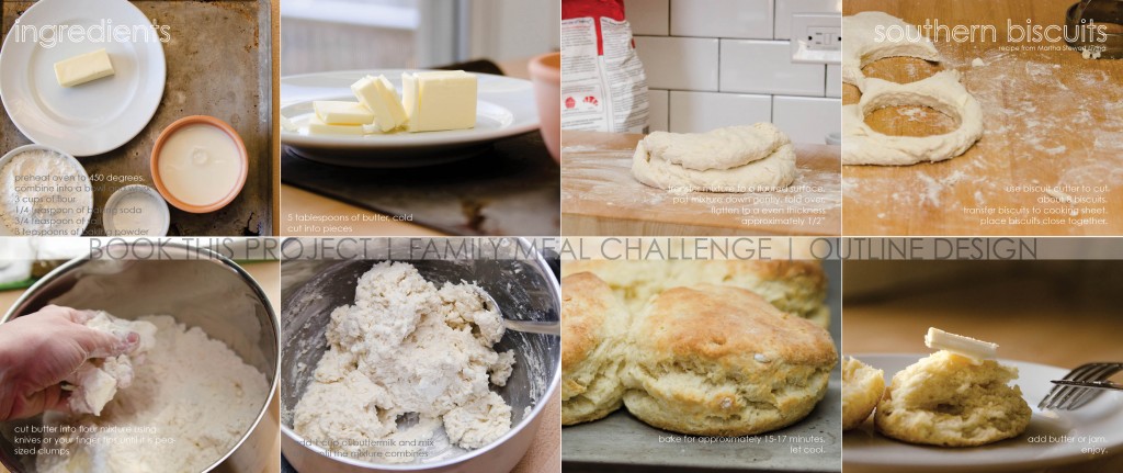
On Tuesday, I posted some photographs from our family Saturday morning biscuit baking!
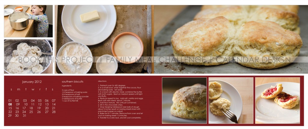
I want to show some examples of how this can be translated to a photo book layout. I hope this inspires you to document your family meal and incorporate the photographs into your photo book.


[divider] And if you need additional inspiration, a more in-depth example of family meal photo book layouts will be in the upcoming podcast!
by Stacey Wiseman | Mar 6, 2012 | Family Photographs, Motivation
I love homemade, flaky, hot-from-the-oven Southern Biscuits. I think I have shared this before, but I am not much of a cook. A couple of months after my husband and I got married, I tried to make dinner. Not only did I screw up the ingredients making the food absolutely inedible; I also broke one of our new dishes (gift from our registry) by putting it on the stove. After that experience, my husband suggested that he would make dinner from now on. And he is a fabulous cook…so it all worked out for me!
But, I can bake. Or at least I haven’t screwed up to much with baking. I make a mean carrot cake. Love baking the no-knead bread. And am fabulous with scones and biscuits.
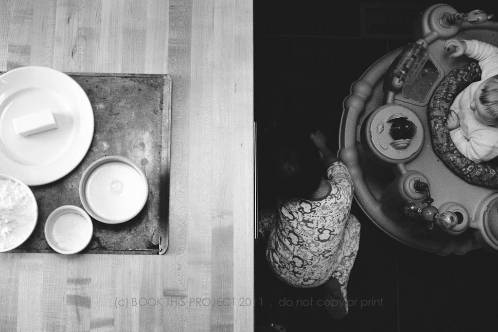
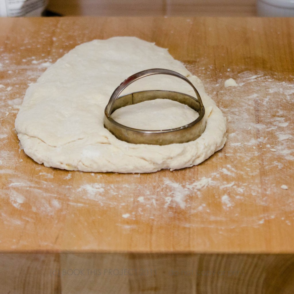
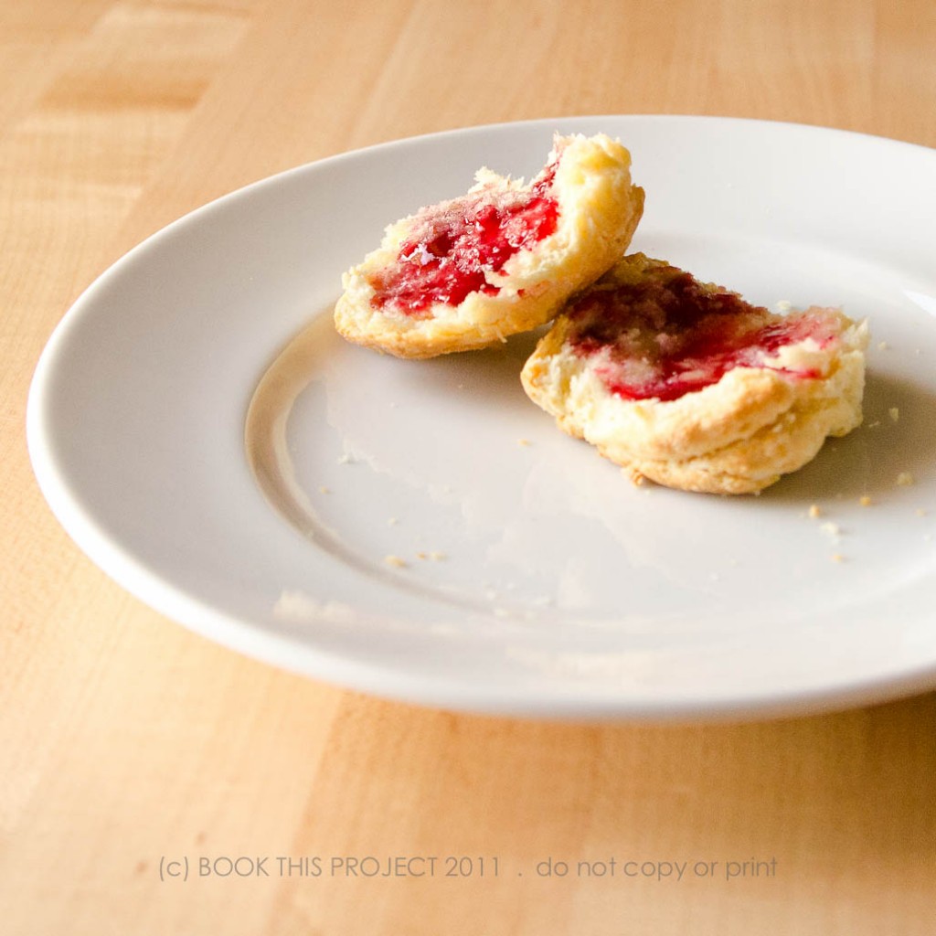
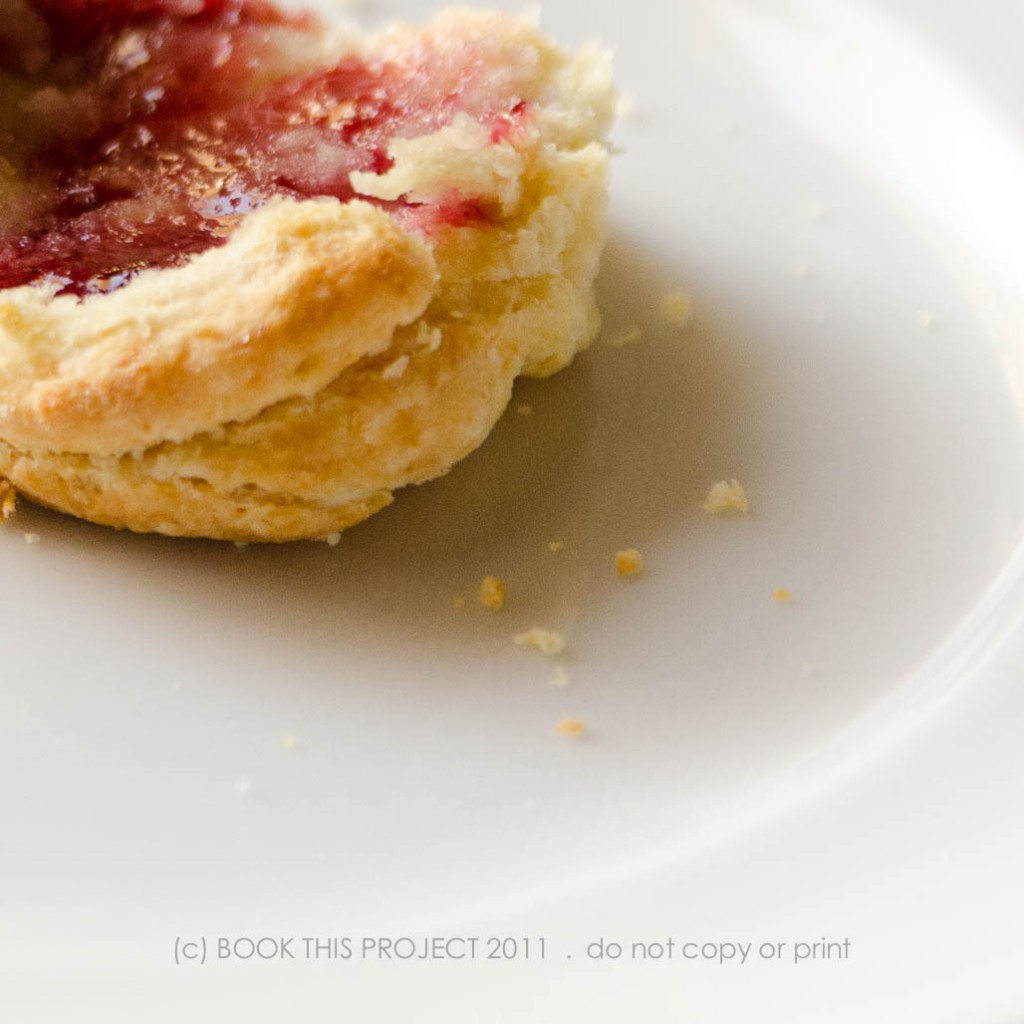
So for the February Family Meal Challenge for my Family Photo Book, I prepared biscuits. It does not make for exciting photographs because all of the ingredients are a variation of white: flour, butter, milk. The key to great biscuits: keep your ingredients cold, flex your finger muscles when cutting in the butter and minimize the amount of mixing.
Here are some of the photographs from a quiet Saturday morning. I will include the recipe and book design layouts on Thursday!


by Stacey Wiseman | Feb 28, 2012 | Photo Book Design Layout, Photograph
I am still working on my February food challenge post…(can’t believe tomorrow is the last day of February…and we even have an extra day) but until then, here are a couple of photos of my 2011 Family Photo Book. All 300 pages!!!


by Stacey Wiseman | Feb 6, 2012 | Motivation, Photo Book Design Layout, Tutorial
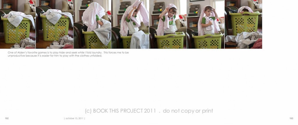
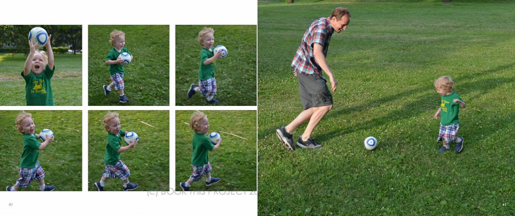
Have you ever tried to capture motion? Every step of an activity? These provide for really fun design layouts in a photo book. I want to show you a couple of examples of photographs in a series in order to document the movement and energy of a task.
First, the photographs.
Burst mode:
Be prepared to take several photographs in quick succession. Some cameras have a burst mode. You press and hold the shutter and the camera takes photographs in a row until you release. Although I typically recommend shooting in RAW, when I use my point and shoot, RAW photographs took too long for my camera to process. If you find this is the case, switch to jpeg in order to get several photos in a row.
Subject matter:
Subject matter is key. Make sure the activity documents the event in a series of steps. It could be a sport – kicking a soccer ball – or – it could be the expressions within a given moment. The point of the photographs shows a beginning, middle, end in a very succinct moment.
The frame:
Consider the frame. In a successful series, the subject in the frame should be consistent in order to keep the focus on the activity itself and not the subject moving around the frame.
Second, the layouts.
In a line:
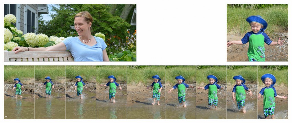
The key to the photo book design layouts, in most cases, is linear. To fully appreciate the action, it is best to see the photographs in a line. My preference is to keep a simple layout with the photo boxes the same size and same orientation (vertical or horizontal).

In a square:
Even though a series looks fantastic in a line, don’t think it always has to follow this format. Consider arranging your photographs into a square format.


Above photographs copyright of Shumaker Family 2011.
Notice the spine:
Take note of the spine. The hardest part of arranging photos in a linear fashion across an entire book spread is the middle photograph; the photo on the spine of the book. A majority of the photograph in the center will be invisible in a book where the pages do not lay flat. In order to keep the subject matter visible in the book, increase the size of the photo book in order to position the subject within the visible guides. In the layout below, all photographs are the same size except for the photo in the middle. The width is increased in order to keep the subject visible on the page.
 Above photographs copyright of Shumaker Family 2011.
Tell the story:
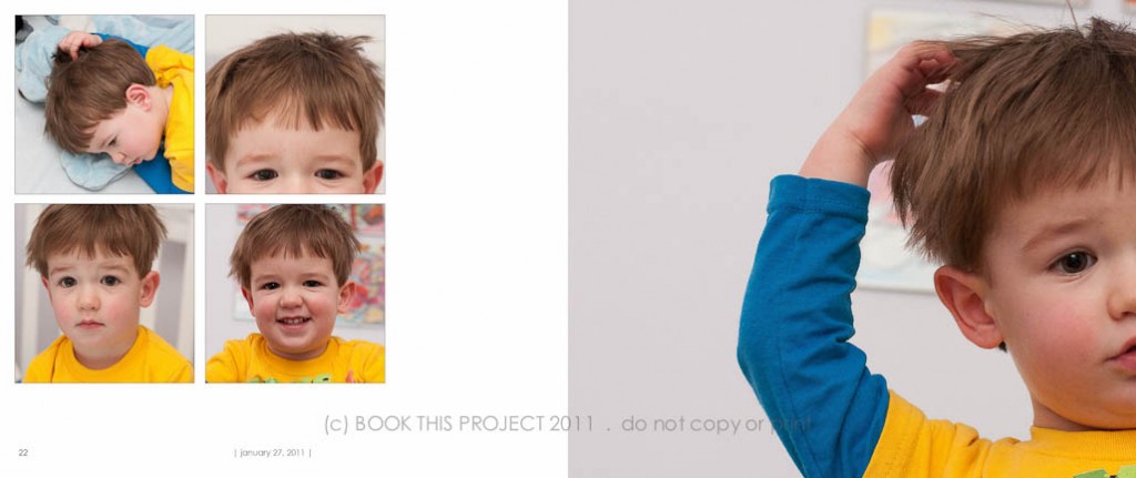
If your photographs tell a story but the subject is not consistent within the frame, make is apart of the layout. The example below illustrates my son waking up from his nap. His perfectly round face and puffy eyes are exhibited on the left. The unusual crop on the right focuses on his habit of twisting his hair when he wakes (or when he falls asleep)! This layout would not make sense as a line because it captures all different aspects of waking up. Preparing the layout in a square allows the viewer to pay attention to the moment, the story, rather than the sequence.

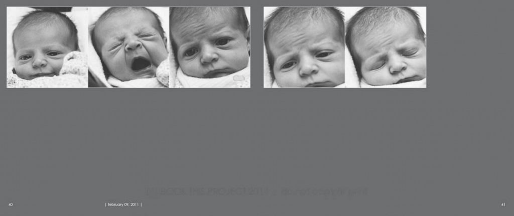
My original intention of these photographs was not to display in a line; however, I loved the raw documentation of sleep. The yawn! With consistent black and white processing, the photographs read as one to convey this moment. Even though the my daughter’s face occupies the frame at different scales, placing these photos in a line highlights the sense of time elapsing.

[divider]
Be unique:
This final example approaches a series in a slightly different way. First of all, only two photographs are included. A full bleed is utilized to maximize the content. This series played with scale more prominently than action. My daughter loves to lean completely over while sitting cross legged. The photo on the left informs the photo on the right.

[divider] What activities have you shot in a series?
If you have an example, I would love to see a link to your blog post!
by Stacey Wiseman | Jan 31, 2012 | Description, Interview, Photograph, Photography Tip
As mentioned in this blog post, each month I want to conduct interviews with moms (and dads) who document their everyday lives with photographs. The main goal of each interview is to learn more about who, why and how we photograph our families. I loved the idea of using photographs to illustrate the answers.
For the first interview, I put myself to the challenge.
10 photographs to describe… Stacey R Wiseman
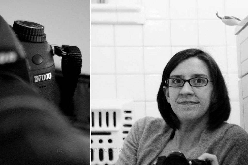
[divider] 1 | me and my camera:
Nikon D7000 and lately my 24-75mm f2.8 lens; 
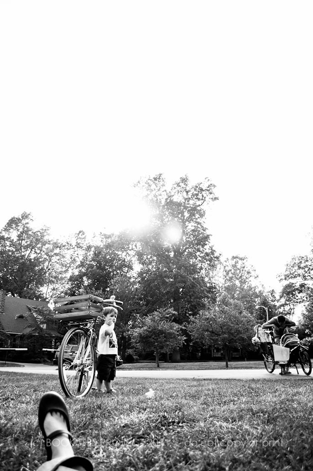
[divider] 2 | my family:
Even if partially…we are all in the frame!

[divider] 3 | my current photography challenge:
I am trying to find interesting interior light and creative compositions to document potty training.

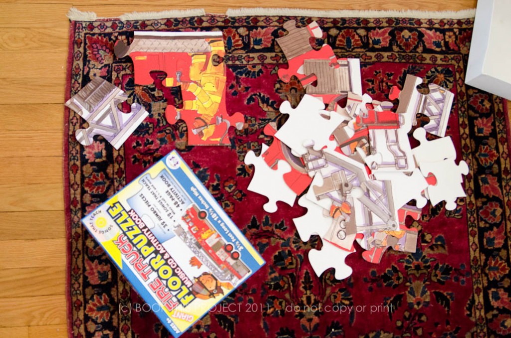
[divider] 4 | what I have time for now:
Puzzles!

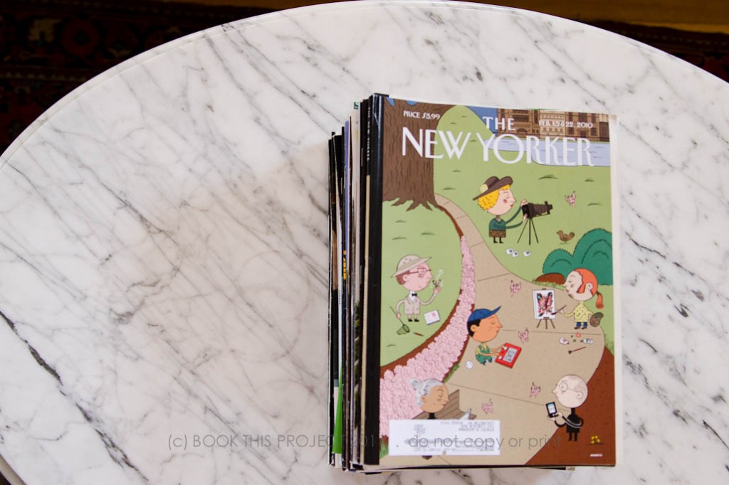
[divider] 5 | what I don’t have time for now:
Reading The New Yorker.

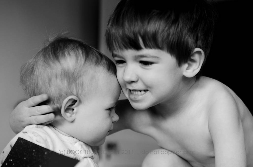
[divider] 6 | my favorite photography subject:
The interaction between my two kids.

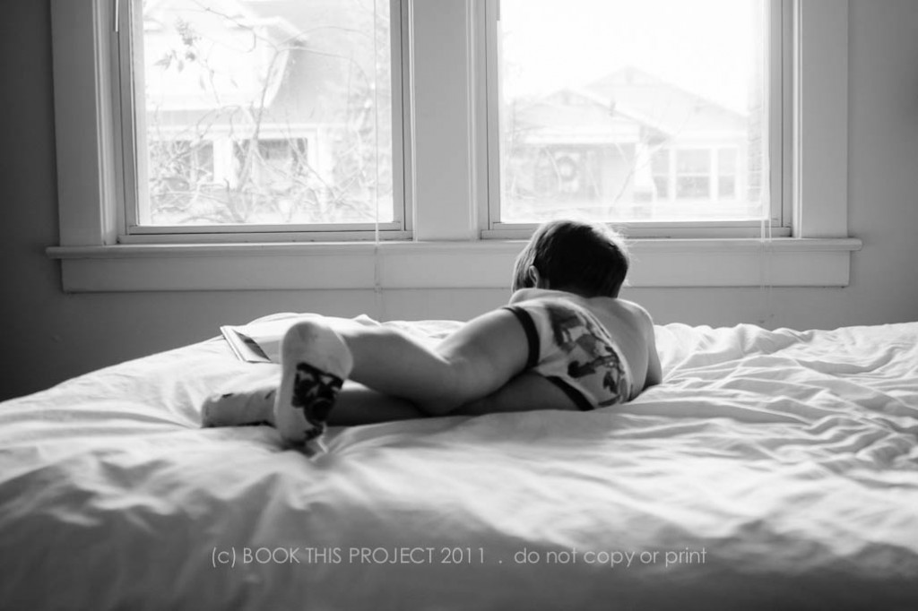
[divider] 7 | my favorite place to photograph inside my home:
My bedroom.

[divider] 8 | my favorite time to photograph:
After-work walks in the park.

[divider] 9 | my favorite blog post (or photo) right now:
Baking chocolate chocolate chip cookies.

[divider] 10 | what tip, trick or info helped your family photographs the most:
Besides setting your custom white balance (which can even be done with point and shoot cameras!), I would say, facing subjects towards the light to get catchlights in the eyes. Of course I understood windows = light, but I never maximized the light in my kids’ eyes. As mentioned above, I am still learning about how to use interior light…but I have definitely improved!
2009 Photo

[divider] 2012 Photo

[divider] Are you interested in being featured?
Send me an email at info[at]bookthisproject.com and include your blog link, if you have one. Let me know how long it will take you to photograph your answers. Feel free to be as creative as you like! I will respond with the details!
by Stacey Wiseman | Jan 7, 2012 | Podcast

