fbq('track', 'PageView');
Our First Week of School

Our First Week of School

We’ve already had our first week of school! Since I wrote about gearing up for the first day of school, I thought it would be fun to check back in and let you know how it went….

We had a great first week of school. My kindergartner, the shy one of the two, made two friends on the very first day of school!!! Knowing that completely put me at ease. They bonded over what I’m sure most girls do: fashion. For my kindergartner who has to wear a uniform everyday, it was the really cool backpack that broke the ice. 😉

For us, school starts on a Wednesday and we were so thankful for a three-day week to start off our new routine. Getting two up and out the door takes a little bit more work but it’s so nice that they are finally at one school and we can streamline the drop-off / pick-up process.

Since I shared some of my first day photos from past year’s, I thought it was only appropriate to share some from this year. It’s a little more hectic but still fun to capture my little girl finally getting her turn to head off to kindergarten.
And I can’t forget about the pick-up. Even though they were exhausted, they were all smiles when I finally picked them up after a long first day of school.

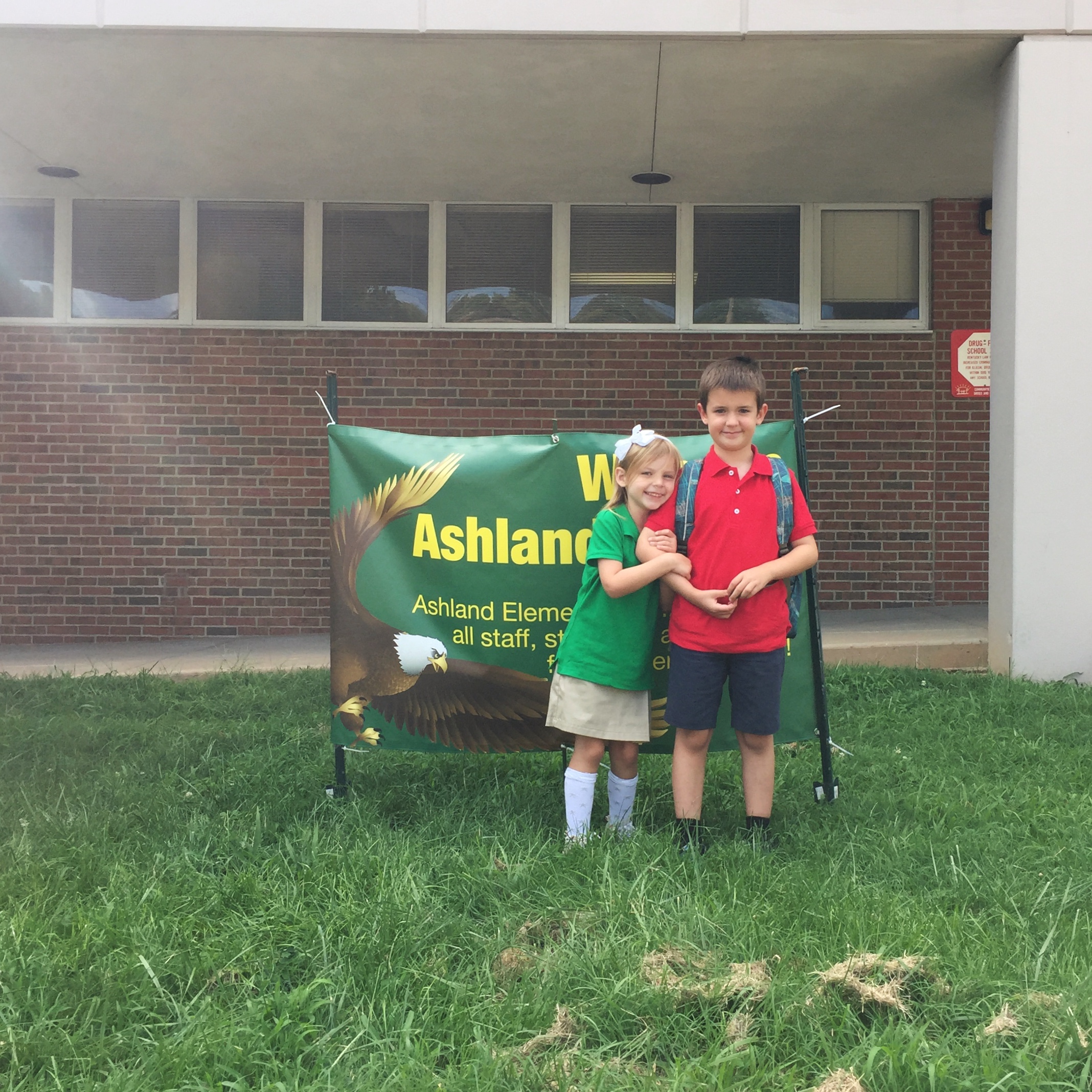
I love this picture so much. The smiles, the knee socks, and the willingness for them both to actually stand close for a photo. <3
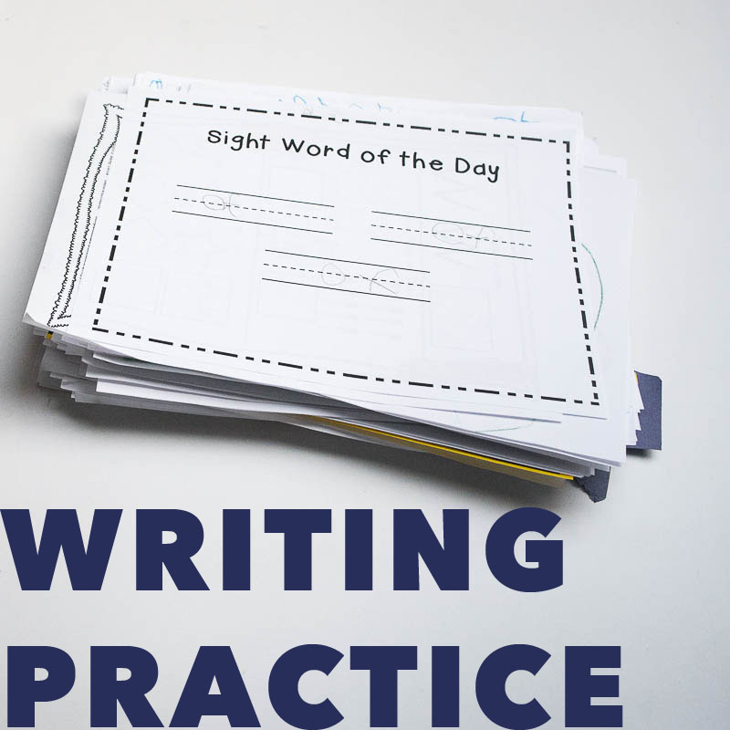
Access free practice writing sheets for your young kids to work on their sight words.

Back to School!

Back to School!

This week, my youngest, my little girl, starts kindergarten!

Two years ago, my oldest started kindergarten. As I’ve written before, it was a transition that I wasn’t too concerned with. As a baby and toddler, he always dealt with transitions like a champ. Kindergarten was a different scenario. We had a bit of a rocky start but after the first few months, he finally got the hang of navigating a larger school and making new friends. Eventually, he began to really love – and thrive – in school.

So with my youngest – I’m ready! For the last couple of weeks, we’ve been talking about school more. We’ve walked through what will happen on the first day. We spent more time in her classroom on orientation day so she could be familiar with the room. Hopefully, all of this will help her have a great first month of kindergarten!

With the start of every school year, it’s time for First Day photos. As I’m sure you’ve also heard me mention before: I’m not great with first day and last day of school photos. I completely buckle under pressure, never have a sign and always capture awkward poses.

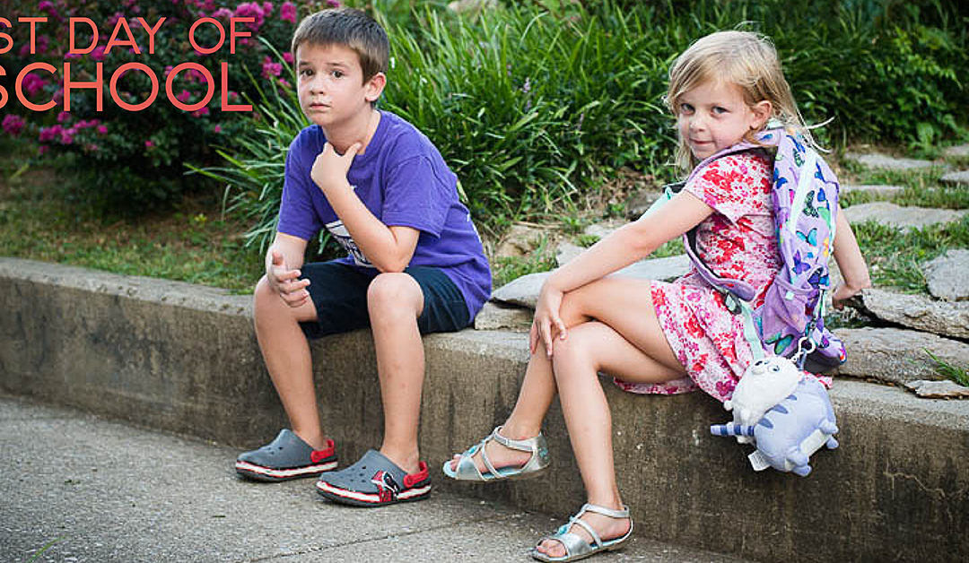
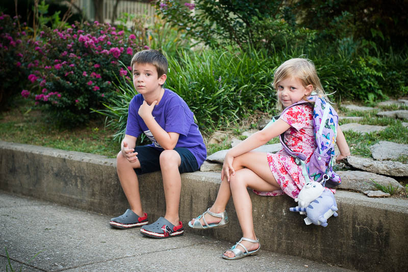
A couple of days ago, I took this photo during our evening walk. My daughter had to wear her backpack for practice. 😉 And even though this is not technically on the first day of school, this photo acts as my back to school photo.

Look at them. I love how this photo captures each of their personalities. My son is completely not interested and my daughter is willing to strike a pose at any moment. –ha!

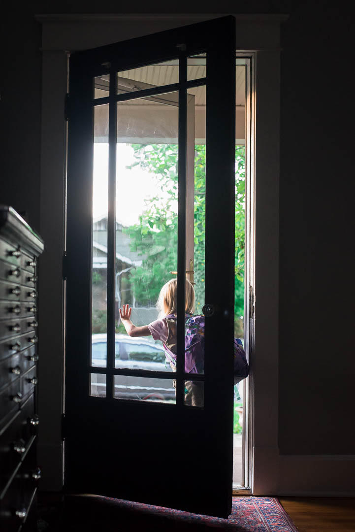
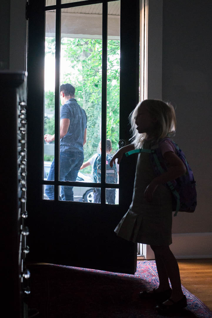
In addition to the traditional back to school photo, I try to take a more symbolic photo capturing the emotion or feeling of the day. When my son started kindergarten, this photo of my daughter watching him leave was priceless.

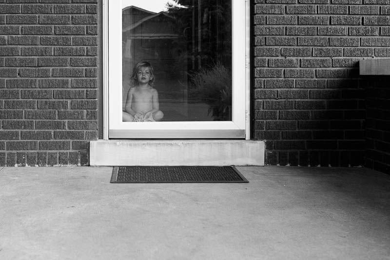
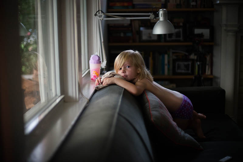
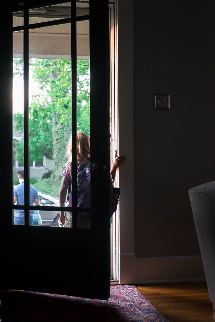
A year later, when he left for first grade, she gazed from the sofa.

I love how even though these were taken a year apart, they both represent a similar vibe. Bittersweet and longing.

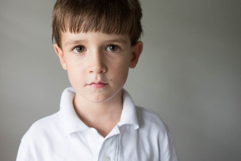
And of course, there is the obligatory portrait. I love portraits! Here are both of my kids right before they started kindergarten. Do you see any resemblance?

This year, our story will be a little different. This time, both of my kids will be heading off to elementary school together. It’s a new transition to make. I’m not sure what my first day of school photo will look like….but I’ll be there to capture it.

And all photos – traditional, symbolic and portraits – will go in my annual photo book.

I love having a record of these milestones in my kids’ lives. I love capturing cheesy photos and photos that have more emotional weight. I love being able to design a book that combines both types of photos in one place.

If you’re interested in designing a photo book that speaks directly to your photographic style – a design that enhances the photos you have and improves the photos you take – my Intro to Photo Book Design Workshop is now open.

Once your kids head off to school, your routine shifts back to a more ‘regular’ normal. It’s the perfect time to accomplish printing your photos in a book. I’d love to work directly with you this fall, to accomplish your photo book goal.

And if you have a kid(s) heading off to school this year – I hope they have a great year!

Are you looking for inspiration to print your photos? Sign up for my free mini-workshop to receive 4 lessons and insights on why you should print your photos and how you can make it a reality.
100 Days of Summer Photo Book

100 Days of Summer Photo Book

ARE YOU DOCUMENTING YOUR SUMMER?

Here we are, halfway through summer! It’s hard to believe!!!

Whether you are participating in the 100 Days of Summer (taking a photo everyday this summer) or are capturing the fun activities you are doing with your kids while they are out of school, it’s always a great idea to print your photos.

Printing your summer photos in a photo book is a fantastic and manageable project to describe your summer in a way you’ll always remember.

If you own Lightroom but have never used the LR Book Module, check out this video tutorial to find out how easy it can be to make a Blurb photo book.

The steps are simple:

  1. Tag your summer photos – use something like “100DAYS” or “2016summer”.
  2. Create a smart collection using this tag.
  3. Add any captions describing the photos.
  4. With the smart collection selected, move into the Book Module.
  5. Autofill the pages with a layout you want for a majority of the pages.
  6. Edit layouts as needed to fit the content of the photos.
  7. Add captions to the photos.
  8. Review and print.

Now watch it all come together:


Questions? Leave in the comments below!

Here’s to printing your summer photos!!!

My Mother’s Day

My Mother’s Day

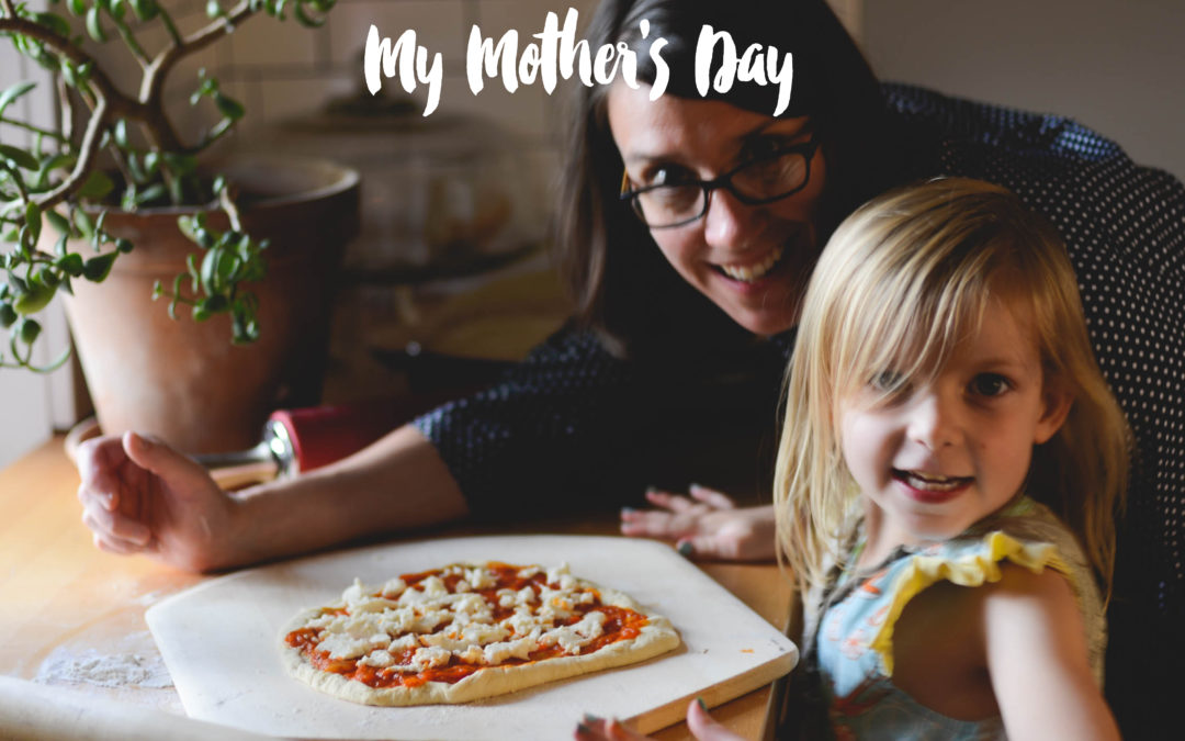
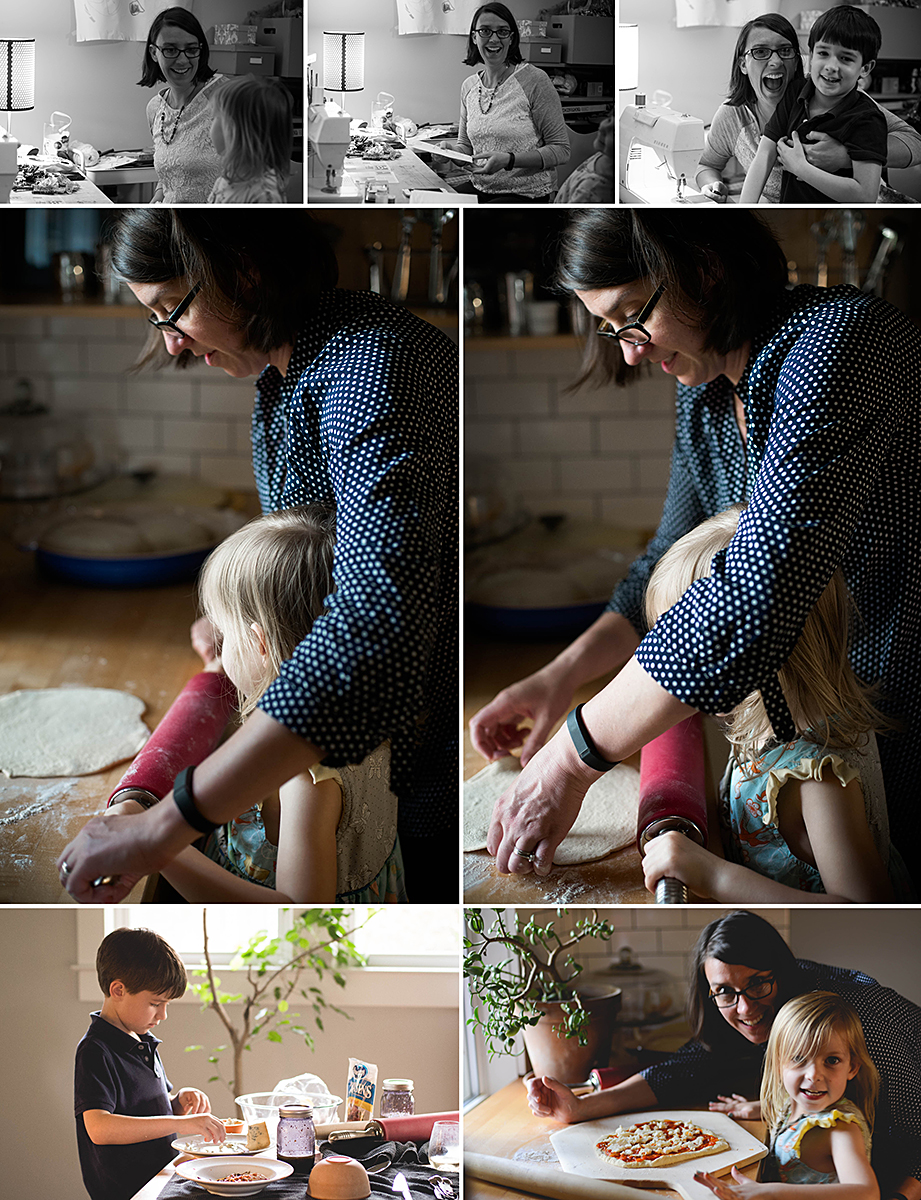
One of my goals for Mother’s Day, was to get in front of the camera. This is something that I often overlook. I’m so focused on taking the photos it’s hard to find time and make the effort to actually get myself in the photos. But this weekend, I made sure to set up my tripod, get out my remote and take some photos with my kids. I also handed my camera over to my husband to take some much needed photos. After all, it’s important that I make an appearance in the photo book as well.

The reason I design photo books is to record to precious moments of our everyday life so my kids remember what it was like to grow up. And they won’t get the full picture unless I’m in some of the photos too!

So while these are not perfect, I’ll take them. And most of these will wind up in my annual photo book. 😉

Mother’s Day Sale!

Mother’s Day Sale!

HAPPY MOTHER'S DAY.

A little birdie has already whispered a couple of hints about my Mother’s Day present this weekend. I know it involves a flower – but I don’t know what color. There will also most likely be a necklace, bracelet or ankle bracelet. I may have hinted that I’d prefer a necklace or bracelet over an ankle bracelet and I think my daughter got the message. 😉 And yes, I’m sure there will be a card. Several cards.

All of it will be adorable. Most of all, I’m looking forward to spending time with my kids and I’m sure I’ll get an extra couple of hugs, which is always great.

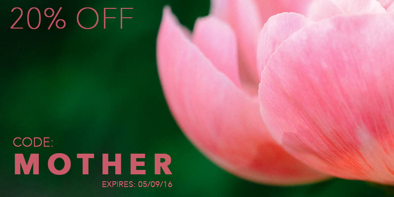
I want to share my Mother’s Day appreciation with you! If you’ve been meaning to print your photos in a photo book, I’m sharing a 20% off three of my favorite products for you. Whether you want to create a book yourself or have me design a book for you – take this opportunity to treat yourself!

Happy Mother’s Day!!!

PHOTO BOOK TEMPLATE

A BookWright photo book template to give you a head start with your own stylish photo book.

PHOTO BOOK CLUB

Join my private Facebook group to help keep you motivated with printing your photos. Plus receive a PDF and customized video each month.

CUSTOM PHOTO BOOK DESIGN

Never seem to find time to design your own book? No problem – I’ll do it for you! As a subscriber, you’ll pay a monthly fee.

If you’ve been waiting to sign up for one of my products or services, I hope you’ll take me up on this opportunity to get a little extra savings to help mark something off your to-do list.
Here’s your chance to mark something off your to do list and finally do something with the meaningful photos you’ve taken this year.
Happy Mother’s Day!!!

Selecting a Font to Match your Photo Book Vision

Selecting a Font to Match your Photo Book Vision

Last week was the season premiere of Game of Thrones on HBO. Whenever I heard people talk about the show, I was not that interested in it. Didn’t seem like my type of show. But….last year when my husband and I had watched all of our shows in our queue and looking for something new, we thought we’d give it a try. I wasn’t expecting much. Just a show to have on while I worked in the evening.

Turned out, I got sucked in. While I don’t follow all of the details, I’ve been surprisingly gripped by the storylines and beyond gorgeous scenery. To celebrate the start of Season 6, I wanted to examine how this show, and others on HBO, align the font characteristics in the title to the vision and style of the show.

Let’s look at the following shows:

  1. Game of Thrones
  2. This Week with John Oliver
  3. Veep
  4. Girls
  5. Togetherness
  6. The Jinx

They all have a very different style and way of showing the title at the beginning of the show.

1) The Game of Thrones title appears after the long initial sequence. The font itself is a relatively simple serif font. The “G” and “T” are slightly larger and the “T” is asymmetrical top bar, as the right side extends the entire length of the word. The “O” adds the uniqueness to the font style and gives the font a more historical feel.

2) Last Week Tonight with John Oliver is a perfect example of a clean and modern font. The sans serif, centered font has all of the letters in black against a white background except for his name which is in a muted yet bright red color. To make the title a little more interesting, “Week” is written backwards to express a little bit of attitude and the desire to flip the news stories of the week by telling it from a different perspective – with humor from a Brit.

3) The hilarious show Veep uses a traditional serif font very similar to Times New Roman. The designer used a star instead of the space in the middle of the “P” to provide a nod to the political nature of the show without it being too bombastic.

4) With the show Girls, the title always appears after a couple of scenes in the beginning and then full screen a black background with the title all in caps and displaying a different color every week. I love the typeface of the title. It has a early to mid-century modern feel to it. The fact that it’s all caps, a bold color and takes up most of the screen mimics the show’s ability to unabashedly portray twenty-somethings in New York City as they sort through employment, relationships, and trying to find themselves.

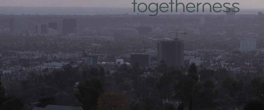
5) The vibe of Togetherness is more understated than a lot of other dramatic shows which is evident by how the title is displayed over a scene. In this particular example, the color of the font is so similar to those in the scene there is complete unity. Here’s another example of a sans serif font but the letters are more rounded than the letters found in “Last Week” or “Girls”.

6) Oh, The Jinx! What a show. As seen in this electrifying still, the title of the show is featured prominently over a scene in the opening sequence. The title design features a common element to make “The” smaller and set in from the main word of the title. Also, the two words appear to have a slight transparency to them. This design tweak adds to the sense of confusion ever present throughout this documentary.

Now, how does this translate to your photo book design? Well, as you probably already know, defining your vision is super important for me and a huge first step in making a photo book. It helps you stay focused in your photo selection and gives you a direction for establishing design parameters for your book. This is also true of the graphics, color and fonts you decide to implement. In this blog post, I’m sharing how to select a font style to match your design vision.

First, you should already have a clearly articulated vision. To help keep you focused, decide on three essential words to define your vision.

Second, find examples on pinterest or in magazines the align your vision. Make sure you pay attention to the particular font style used. You are looking for examples where the font matches the overall feel or vibe of the image/graphic. Ask yourself, why?

  • Is it a traditional or modern typeface? 
  • Is it bold or understated?
  • Does it involve color? 
  • What about the text makes it feel cohesive?

Third, search through your font directory (for example, on apple computers use the Font Book application) and use the arrow keys to find a style that suits your vision.

If none of the font styles seem to fit, try looking at font directory sites like font squirrel or dafont for more ideas. They usually have categories that make it easier to narrow your selection.

Finally, determine if there is a small element or graphic twist you can use in your text. This can either be assigning a color to a specific letter or word in your text, adding a glyph (special character), or inserting your text in an unusual way.

To get you started, I’ve assemble some common photo book design themes and paired a title and body font style to match. Of course, there are many different directions you could go, but hopefully this helps you see how I begin to pair fonts with a particular vision.


Get a PDF download with the links to the fonts shown above + find out my go-to favorite serif, sans serif and handwritten fonts: Simply add your name and email here:

And of course, I’d love to hear from you! What three words define your vision for a recent book design and what is the font style you selected? Leave a comment below.

Photo Book Layout Ideas: Zaha Hadid

Photo Book Layout Ideas: Zaha Hadid

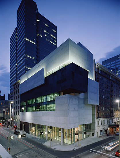
It’s been over a week since the announcement of Zaha Hadid’s unexpected death and I wanted to take some time to share how Zaha’s work has inspired me, both as an architect and a designer. In 1997, I visited her first built work, Vitra Fire Station soon after it was built. Then in 2003, while I was living in New York, I made a special trip down to Cincinnati, my hometown (big) city, for the opening of the Cincinnati Art Museum.

As the first female architect to ever win the famed architectural award, Pritzker Architecture Prize as well as the RIBA Gold Medal earlier this year. Since it took 25 years since the inception of Pritzker Prize before a female was awarded, it shows how difficult it is to receive recognition as a female architect. I was always drawn to her visionary, painterly approach. And while there was criticism surrounding her work, she made a significant impact on architecture – in her built and unbuilt work – by creating striking new forms and pushing the boundaries of how we conceive of architecture.

Each art progresses at its own speed, and Hadid accelerated her development by taking architecture to what appeared to be unbuildable extremes in drawing and painting.

Joseph Giovanni on Zaha Hadid’s work in “In the Nature of Deign Materials: The Instruments of Zaha Hadid’s Vision”

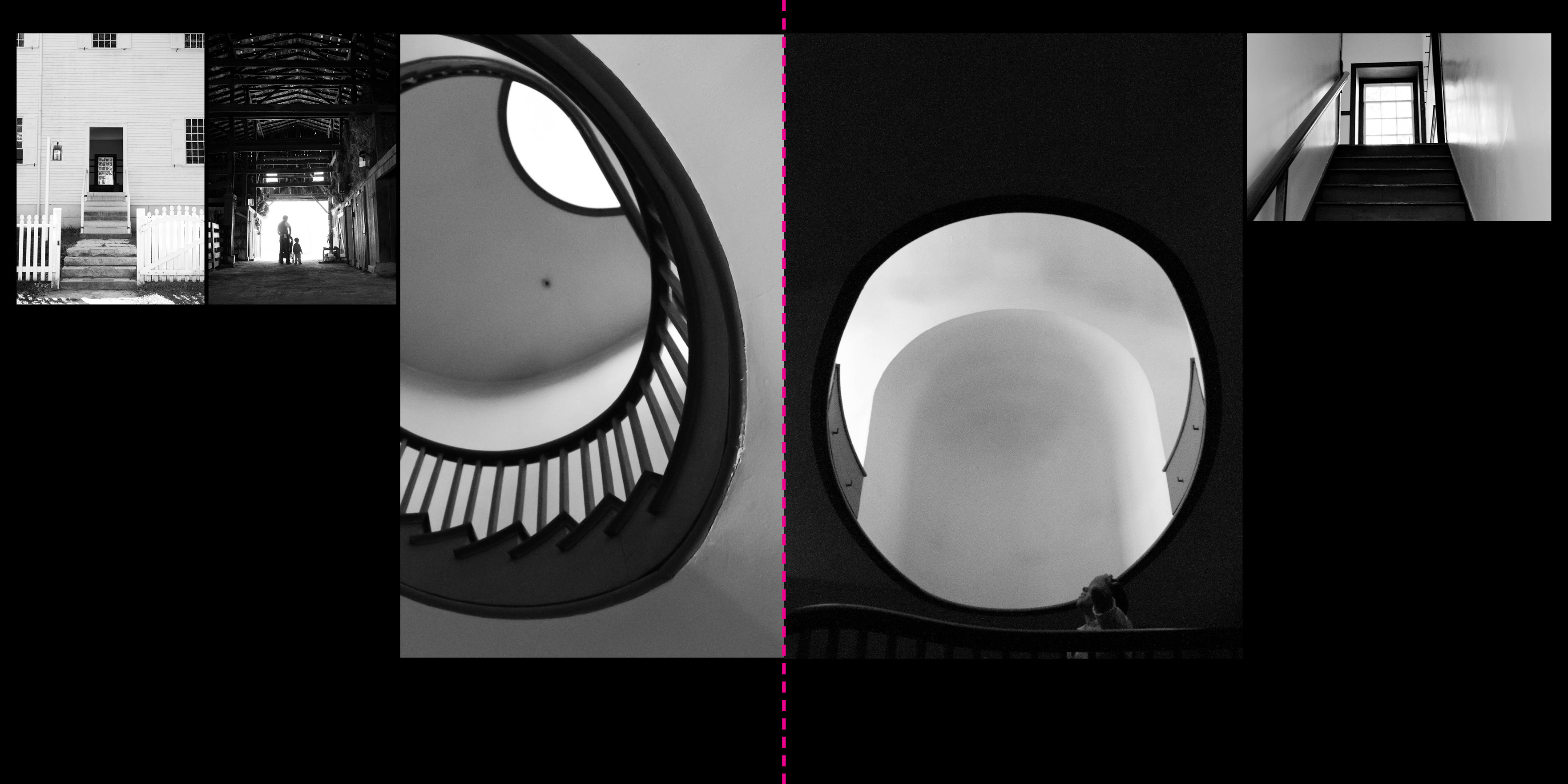
Just two weeks ago, I shared one of my favorite books for design inspiration in my recent Intro to Photo Book Design Workshop: Zaha Hadid. This book features Zaha’s work in a compelling way. To mark Zaha Hadid’s legendary impact on creative thought, architecture and design, I wanted to share my insights on this book. While it doesn’t get into her work, the book design is a compelling nod to her work: simple, stark contrast and visionary.


As I mentioned in the introduction to this workshop, I’m educated and registered as an architect. So, I have lots of architecture books lying around the house.  As you can imagine, they are heavy on the photographs (and drawings), so their layouts can be easily applied to photo books as well.

I received the Zaha Hadid book as a Christmas gift one year.  It is a compilation of the work (built, drawings, models, etc.) of Zaha Hadid, a female architect based in London.  This is a beautiful book and one I want to feature to you because a) it is a square format and b) it features a black background.  I’m trying to cover all the bases with my photo book inspirations!

A simple cover conveys the form and heavy reliance on the black color throughout the book.  The cover is very indicative of the look and feel of the entire book.  The content of the book is organized into 3 basic parts: a text description of the firm and the project (printed on white paper), projects (black paper) and credits (back to white paper).

A unique feature of this book is that each page is actually a folded-over page, so there are no images on the backside of the paper.  Obviously this is a custom feature, but one I wanted to point out!

I love how the captions are handled in this book.  It may not be appropriate for your family book but it is a sophisticated way to give more information about the photos.  Each photograph is numbered 01, 02, etc., above, and at the bottom of the page is a more detailed explanation of the photo.

The specs:

  • Square Size (9.5″w x 9.5″h)
  • Soft cover
  • 197 pages

The layouts below are inspired by a few of the layouts from this book. Even though this book is 9.5″ x 9.5″, I adjusted the layouts to fit a 12″x12″ square size book.

Want to get jpegs to help you re-create these layouts for your own photo book? I’ve got a great free download for you!

Unlikely Inspiration for Color in your Photo Book

Unlikely Inspiration for Color in your Photo Book

Last week was Dr. Seuss’s birthday and both of my kids had to dress up all week. It involved pajamas, stripes, hats and wockets. One day my son had to wear crazy socks and I realized, he didn’t have much to pick from.


While I have some colorful, fun socks, he only has black and white socks. Boring! To remedy the situation, I had him pick out a pair of my socks to wear. (And surprisingly they fit!)
This whole exchange was a strange coincidence because fun socks happen to be the theme of my video tutorial for you. Finding inspiration in the most unlikely places: Socks. Yep, it’s true. I’ve found inspiration in socks (mine….not my sons).
I’ve started to notice how socks have become more of a designed accessory lately; so I decided to channel this influence into my book design.

Want to see exactly how socks transformed my design process? Check out this video:

For a free download of these colors plus two patterns to use in your photo book, sign up below.