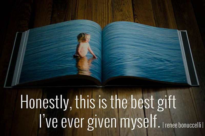
by Stacey Wiseman | Mar 12, 2015 | Family Photographs, Photo Book Design Layout, Photograph
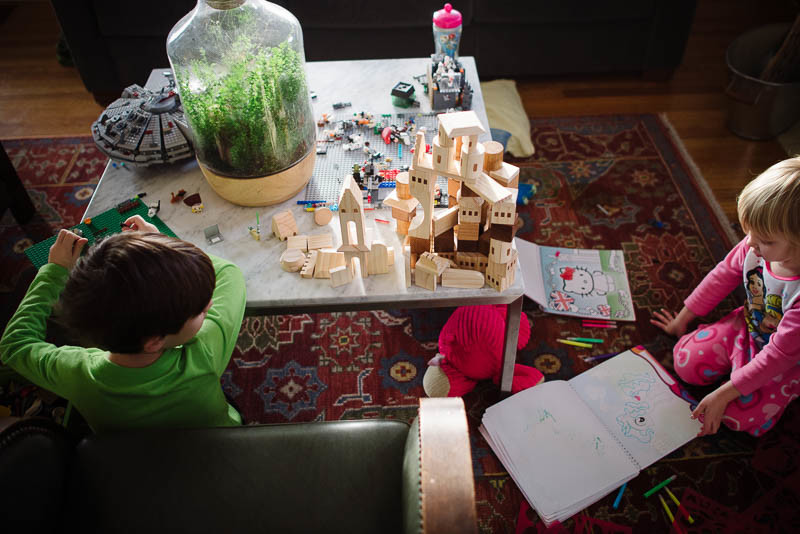
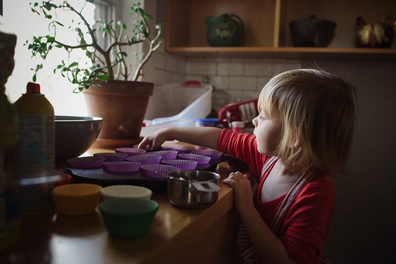
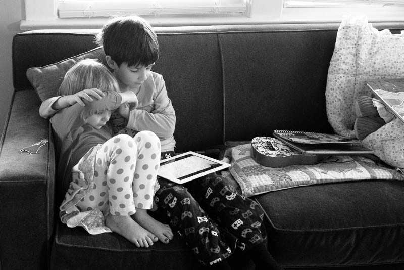
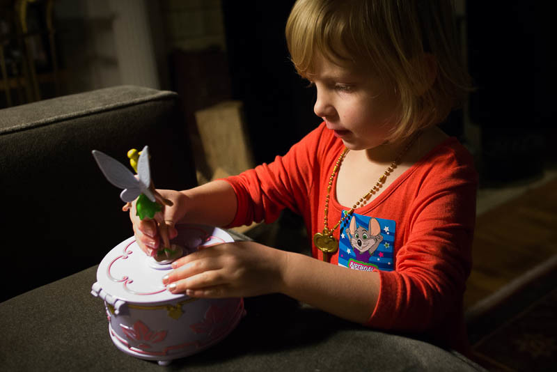
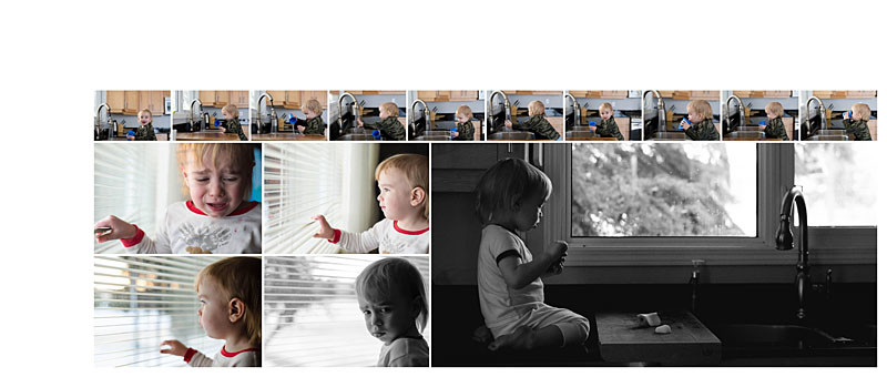
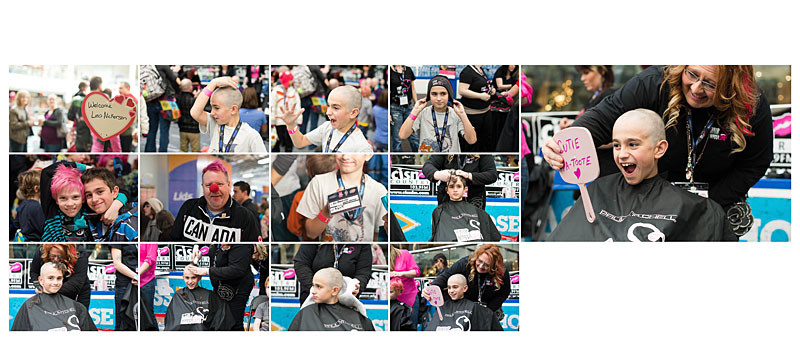
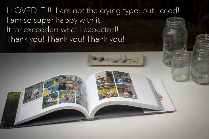
I finally had a chance to pull together my February Morning, Noon, and Night photos. For an added bonus, I even found time to place these photos into my photo book! We had a large snowfall last week that kept us indoors for most of the weekend. It was the perfect opportunity to get caught up with my photos.
In February, we had a relaxing morning. My husband was drawing which led to my daughter wanting to follow suit. After lunch, my son had a birthday pool party to go to. It’s been about 6 months since we’ve been swimming so this was a lot of fun. The evening included a little silliness, my kids playing with my iPhone.
Morning


Noon


Night

Book Layouts


Are you participating in my monthly challenge? Leave a comment with a link so I can check it out!

by Stacey Wiseman | Feb 27, 2015 | Description, Promotions, Uncategorized
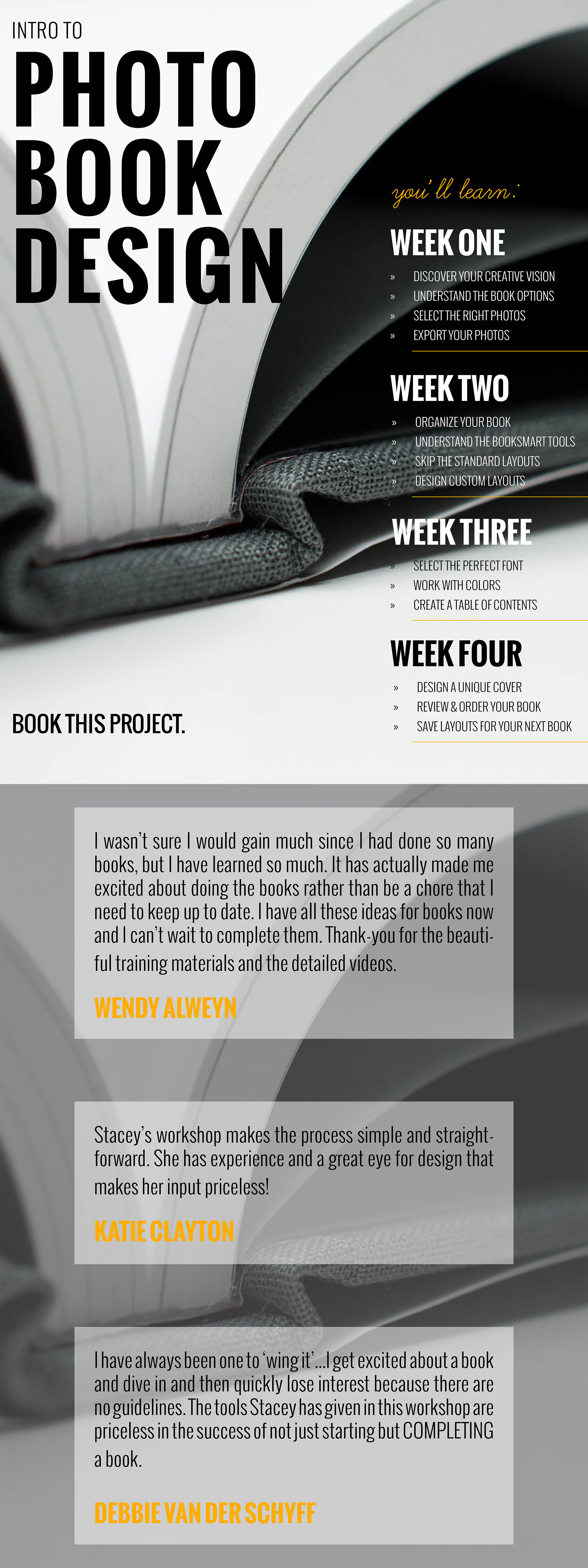
This week, I released my Photo Book Design Workshop pre-lesson and everyone is diving in and defining their vision.
This Monday, the workshop kicks off and I want to make sure you don’t miss out.
So, how do you know if this workshop is right for you?
I’ve got 10 great reasons below.
1. Sequence
I’ve organized all of my insights, advice and recommendations into a tested and specific order so you know what to do and when to do it. I’m not just telling you how you make a photo book, I’m outlining a process, an efficient workflow, that you can apply to any book project.
2. Results
With every workshop, I create an encouraging environment for you to make progress, and hopefully finish your photo book.
3. Convenience
You don’t have to endlessly search on the internet for advice or inspiration. I’ve packaged all of the pertinent information in one convenient location.
4. Overwhelm
Making a photo book can be overwhelming. With my guidance, I’ll provide clear strategies so you can be decisive and feel empowered (not overwhelmed) by the process.
5. Missing Pieces
Sometimes you don’t even know what to ask. Or what exactly you’re looking for. I promise to share insights and tools that will help you save time and improve your book. Yes, even for people who have made plenty of photo books before… they still walked away with valuable insights.
6. Accountability
By participating in a workshop, you’re making a commitment to yourself to learn and accomplish something you’ve previously struggled with. There are 4 ways my workshop holds you accountable: my actionable lessons, being motivated by your fellow participants, the ability to ask me any questions and receiving feedback on your work.
7. Me
This one is a little weird for me to share, but it’s true – participating in my workshop provides you with unprecedented access to my thought process and workflow. You’ll see how I work plus get views of entire photo books I’ve designed.
8. PDF Design
I don’t just type out the lessons and add photos. I spend a lot of time focusing on the design of my material and love to make small tweaks every year to make sure the lesson is easy to read, organized and beautiful.
9. Facebook Group
After participating in the workshop, you’ll have access to my Mastermind Group, which includes a private Facebook group of others working on their books. Participating in this group will help you stay focused and finish your book project….or start a new one!
10. Upcoming Projects
Every summer, I like to come up with a fun project to stretch your creativity – with your photos and designing a photo book. However, these projects are not instructional. To participate in this project, you’ll want to already know how to make a book using the BookSmart (or BookWright) software.
Plus, as of right now, this is my only scheduled 2016 run of the Photo Book Design Workshop – so now is your chance to learn!

It’s also important to know if this workshop is not for you. This Photo Book Design Workshop is probably not right for you if…
You take less than 500 photos a year.
You prefer to print your photos as 4×6 prints.
You have absolutely no extra time to devote to learning a new task.
You are completely satisfied in your ability to design photo books.
You have an efficient workflow to stay on top of your culling, editing, and designing.
You love the standard layouts or designs in these photo books.
You’d rather have me design your photo books for you.
You already use InDesign to design your photo books.
I’ve got more information here but if you’re ready to sign up you can head over here.
The workshop kicks off this Monday, March 20, 2017!
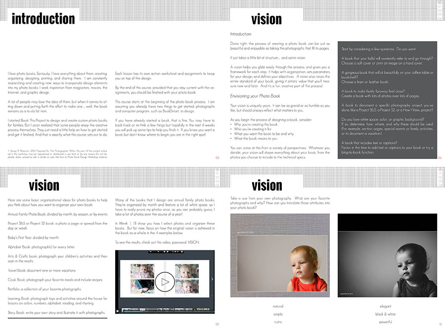
Here’s a preview of the Pre-Workshop Lesson that has already been posted.

by Stacey Wiseman | Jan 27, 2015 | Photo Book Design Layout, Product Feature

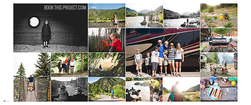
An ancillary benefit to designing photo books is to live vicariously through my client’s lives. And the C Family in Indiana is no exception. I have to admit my jealousy over the travels this family took in 2013. Last summer, they loaded up in a RV and traveled across the country. It looked like an absolute blast.

Working on her family photo book reminded me of one of my favorite trips out west as a child. Many years ago, my sister, brother, and I were marooned in the back of a station wagon for what seemed like days. But the agony of being cramped and hot was worth it once we finally arrived at Yellowstone.

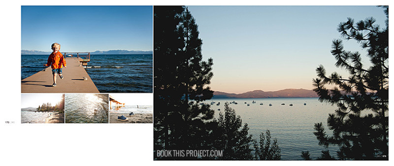
I love that I’m helping to preserve these memories of their 2013 trip by placing them in a photo book. Of course, that was only one part of their year. The entire book actually documents a Project 365 – a photograph taken every single day of 2013.

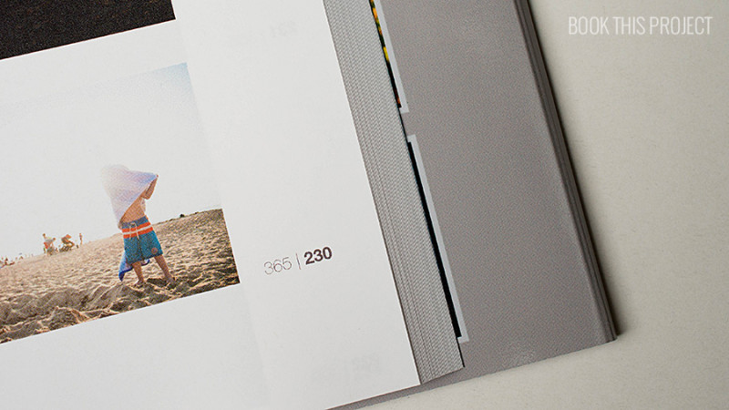
Using the Day # / 365 was an important detail I included in the design. It was the only caption or title throughout the entire book. I did not designate the months, places, or events. Only the day the photo was taken.

This was a monumental project and one that I know my client will treasure years from now. The simple, elegant design of this photo book allows her photos to shine.

11×8
270 pages
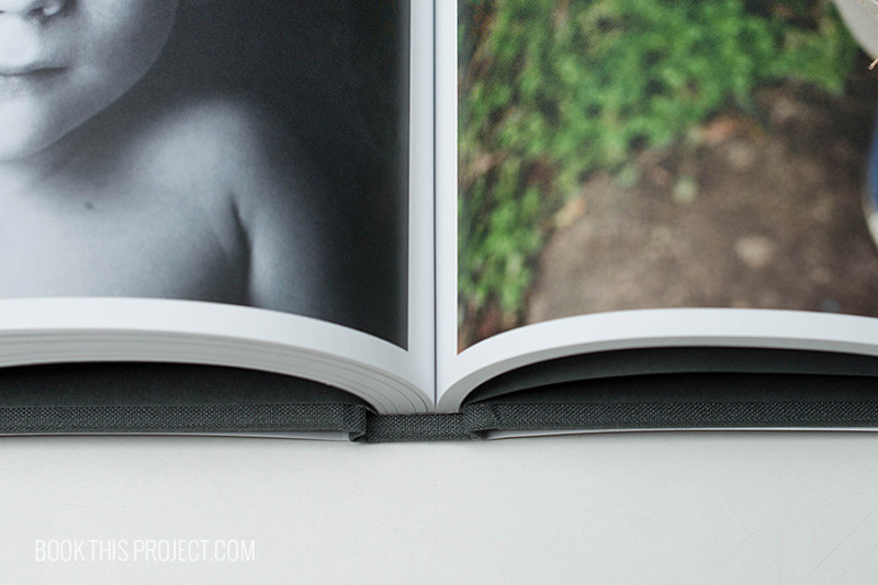
Hardcover Linen with Dust Jacket

by Stacey Wiseman | Jan 22, 2015 | Description, Family Photographs, Photo Book Design Layout, Promotions, Uncategorized
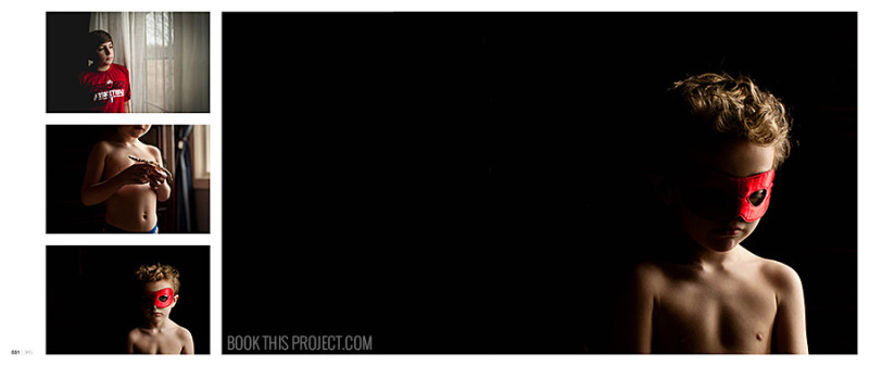
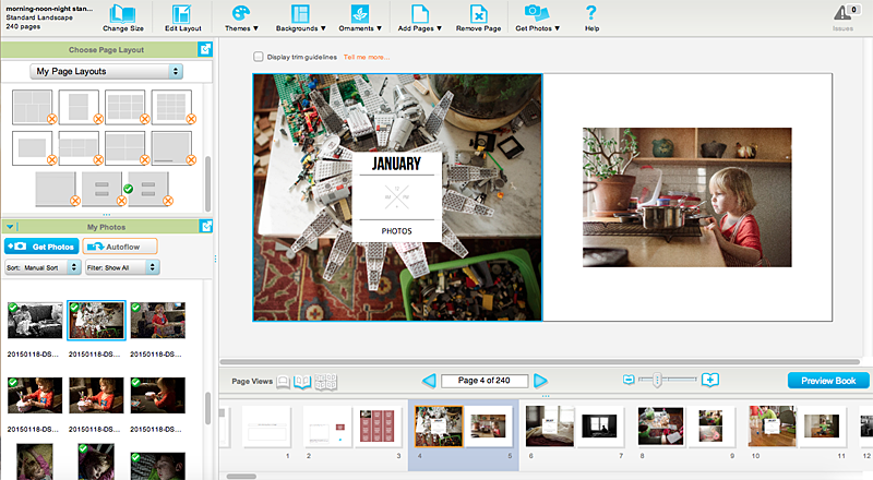
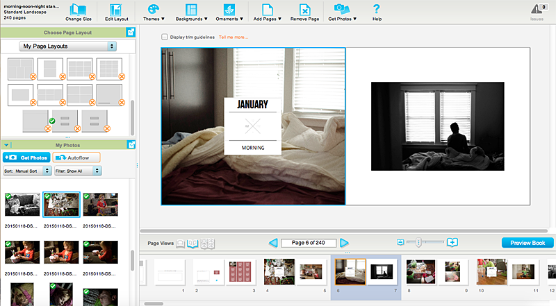
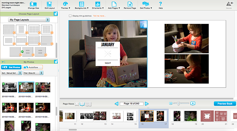
Last weekend, I photographed my morning, noon and night. It’s so great to capture the everyday moments to see how they remain the same and how they change. It’s an easy way to document your life without the huge commitment of taking photos every hour.
This removes the overwhelm from the selection, editing and design process. In fact, for my January submission, I shot 162 photos and selected 29 to edit. I ended up using 24 of those photos. With that simple process, I’m well on my way to design an annual book.
Of course, this book may not include all of the details (chances are….I’m going to design that book too!), but if this is the only photo book you think you’ll make all year, it’s a great one to touch on the details that make up your life.
Morning


Noon


Night


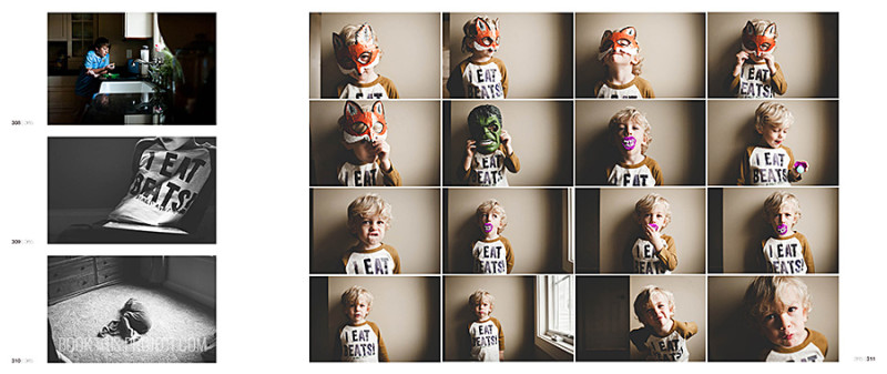
The best part is, I’m working on my book each month as I shoot. Here are a few of my pages.


Want to join along?

by Stacey Wiseman | Jan 20, 2015 | Description, Family Photographs, Photo Book Design Layout

There’s something so magical about being able to design a family’s photo book year after year. This past year, I finished my second photo book for the B Family in Canada and I’m getting ready to start their third book. I’ve documented birthdays, amazing family vacations and even the birth of the fourth child.

The bond of this family is truly remarkable. They’re active, funny, kind-hearted and loving. And yes, I can tell all of this by her photos. I’ve seen silly antics, scattered legos, messy artwork and hockey games. I’ve also seen charity events and immense brotherly love.

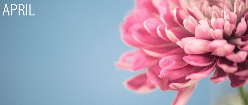
One of the reasons I love working on their photo books, my client includes photos of their daily life but also abstract, macro and flower photography as well. This provides a tremendous amount of flexibility to the layouts and ultimately the flow of the book. In their 2013 book, I used these photographs as a full spread bleed layout. Using these layouts, I’m able to make a big impact to the start of each month with bright, vibrant photos.

I’m so thrilled to design her photo books! Beyond my love of designing, I know how much her family appreciates these family heirlooms – which adds to my excitement to design her next book!

All book photos in this post are copyright protected by Renee Bonuccelli, 2014. All Rights Reserved.

by Stacey Wiseman | Jan 15, 2015 | Photo Book Design Layout, Product Feature

Custom Cover Design
Often when I’m designing photo books, I prefer a clean, simple yet sophisticated design to let the photos (and the moments captured in the photos) standout. While this sounds good, I realize it can be difficult to understand what that truly means.
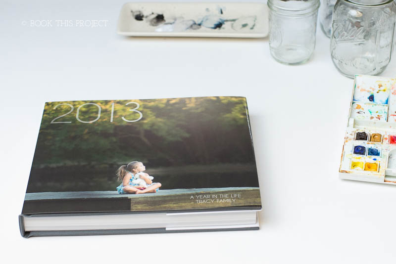
The best way I can explain it, is to show an example. My design for the T_Family, located in South Carolina, is a perfect example. There is simplicity to the layouts because there is order, alignment, and hierarchy. All of the photos are organized on the page in a logical way. The alignment, margins and spacing between photos are consistent throughout. White space is used to provide the eye breathing room to dwell on particular photos. Hierarchy is employed by placing larger images next to smaller ones.
All of these decisions are deliberate. It shows my ability to choose from the photos my client provided to show them in the best possible way on the page. It reveals how I can tell a story of a year, over the course of a book.
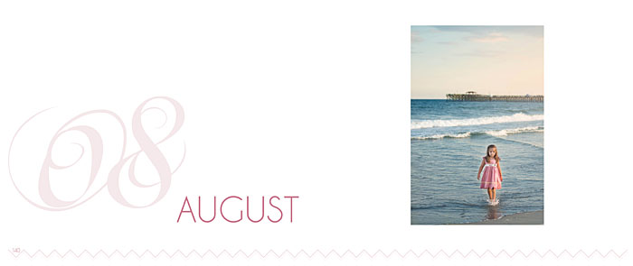
Having said that, it’s also important for me to show a design sophistication in the details. For this photo book, I selected an ornate font, soft color palette and graphic that appears on each month section page and page numbers. Since a majority of this photo book documents the life of their daughter, I wanted to present a sophisticated feminine approach. I used two shades of a muted pink as opposed to a brighter more vibrant pink to emphasize the daughter interest in dance.

Section Divider Page
I was elated to learn that my client absolutely loved her photo book. Currently, I’m designing her 2014 photo book – we’re going to change a few elements but the core concept of a sophisticated and modern book design will be the constant driving factor.

11×8
240 pages
Hardcover Linen with Dust Jacket
Would you love for me to design your family photo book? Let me know!

by Stacey Wiseman | Dec 30, 2014 | Photography Tip, Product Feature
It’s the end of the year. Seriously.
I’m sure I say it every year. I’m sure you say it every year. It goes by so quickly. It seems like just yesterday, I was getting ready for my son to start kindergarten. Yet here we are. Another calendar year to be preserved to memory.
Of course, I love creating photo books to document the year. But to add a little fun, I also love making a video of our year using photos and videos.
Here’s what I look for when making my end of the year video:
1. Horizontal photos.
2. Photos in a series – even if some are slightly out of focus.
3. Photos with funny and differing expressions.
4. Photos featuring family members.
5. Not necessarily my favorites (those are for my photo book) but photos and videos that represent our year.
Of course, I could spend way more time editing each photo in the video – but then I would never finish!!! My goal is not to have a perfect product but to finish something that my family can watch together for years to come. This is the third year in a row I’ve made one of these videos. It’s now a tradition!
Here is my 2014 video.
I know….there are a lot of photos! And they go by really quickly. But what I try to do for these videos is show several photos that are very similar with slight adjustments. It’s a lot of mini-stop motion photos spliced together to convey our life. It helps to show the variety in our year.
For this video, I worked really hard with the pacing of the photos. I tied to match the changing of photos with the beat of the music. To help make the connection, I selected a song with a pronounced beat. While the photos are chronological, I did not label the months, like I did in my 2013 video.
If you want to follow what I’ve done, I’ve prepared my strategy and screen capture video of working in Apple’s iMovie to create a similar video for your family. I reveal the organizational and program shortcuts I use to save time.
Check out the tutorial!

by Stacey Wiseman | Dec 5, 2014 | Design Series, Photo Book Design Layout
Once you have the photos into a specified layout, what to do! One way to elevate a layout is to add details or elements of design. Revise the page to include a color or add text to document the event.
Color is one way to add personality or style to the page. You can add a neutral color, like a tan or gray, or you can add a bold color that complements the photograph. As for the text, this can be anything from a title, a quote, a descriptive caption or a lengthy journal entry.
Not sure how to use color or text in Blurb’s BookSmart? Check out this video:
Want to catch up with the previous videos in the series? Check them out here.

by Stacey Wiseman | Nov 10, 2014 | 50 Children's Book Design Tips, Design Series
This is an old-school book but it’s still a great one! My son was hanging on every word to find out what happened at the end. Would Mike and Mary Ann be able to complete the foundational hole in time?
Even my daughter was glued.
Mike Mulligan and his Steam Shovel by Virginia Lee Burton


by Stacey Wiseman | Nov 1, 2014 | Cover Series, Design Series
If you’re struggling to find that one perfect photo for your photo book cover, I get it! It can be pretty stressful to determine which one photo should define your entire book.
Here’s one example of how to incorporate a variety of photos for your cover. I’ve included one photo for each month, yet instead of composing it in a grid, the photos are in a line. The other distinguishing factor for this cover is the scale. The photos are at a smaller scale in order to emphasize white space. This is a good option if you design books with a lot of space on the page.
A side effect from the cover design, is how the text stands out. Even though the size is small, the color adds the punch it needs.

