by Stacey Wiseman | Oct 28, 2014 | 50 Children's Book Design Tips, Design Series
I can not express my love for the Pigeon series of books by Mo Willems. These books are so fun and interactive for the kids. They love talking and answering the book as I read it out loud.
The illustrations are simple but specific. It’s crisp and dynamic without using bold colors.
Plus, the book designer really knows how to space out the pages with the illustrations and text. It doesn’t feel crowded or forced. Everything is exactly where it needs to be to deliver the content. It’s really a fantastic book, not only to read, but also to learn some design principles.
Don’t Let the Pigeon Drive the Bus by Mo Willems.


by Stacey Wiseman | Oct 22, 2014 | 50 Children's Book Design Tips, Design Series


This adorable book illustrates what farm animals do once the kids head back to school.
In this book, you’ll see a captioned a group of photos, which is a great way to incorporate a small amount of text under your photos.
Plus, it has a great play on words with a joke at the very end! I’d love to hear if you got a chuckle from your kids on this one.

by Stacey Wiseman | Oct 17, 2014 | Design Series, Photo Book Design Layout
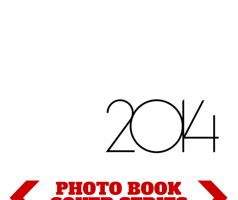
This photo book cover is so simple yet so powerful. If you decide to use a text only cover, you want to make sure you study font options and select the right style that goes with your photo book.
For this photo book cover example, I used the font Marlowe which is thin and modern. But it’s a little more great gatsby than bauhuas.
Each number in the year is a separate text box so I could control the spacing of the numbers and overlap them exactly as I wanted. The numbers are all connected and that satisfies my vision.


by Stacey Wiseman | Oct 13, 2014 | 50 Children's Book Design Tips, Design Series
I love books that build up with each page. Mr. Grumpy goes out for a boat ride and children + animals ask to join along one by one. Then as the boat fills up (spoiler alert), it topples over and all of the animals and children fall out. Oh…and Mr. Grumpy too. 😉
I love the illustrations. Ink inspired, it’s not as cartoon-y as some other illustrations.
As for the tip, the double page spread was really the climax of the book and the only double page spread on the book. As the only one, it shows the importance of the scene. Check it out and let me know what you think.
by Stacey Wiseman | Oct 10, 2014 | Product Feature
I’m really excited to announce my very special upcoming project:
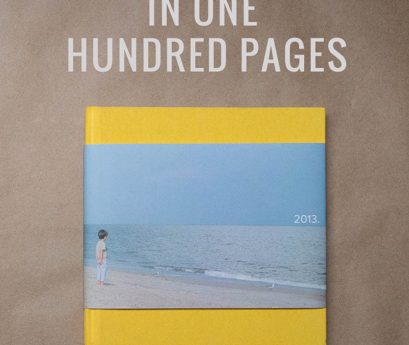
In One Hundred Pages
This is a dedicated book project to motivate you to design a book in time for the Holidays.
I hear from people all the time that say they want to make a photo book but don’t know where to start or get overwhelmed by how many photos they have.
Here is the secret:
Clarity.
That’s why I named this project In One Hundred Pages. It starts to define your project – your goal. But it takes more than defining the number of pages to avoid photo book overwhelm.
So, I’m offering free training to get you started. To gain access to my training, simply sign up for my free photo book club. Or check out my In One Hundred Pages website and sign up there!
Then in November, I’ll open up a mini-workshop where I’ll map out the entire book design process in a format that is:
- easy to digest (won’t take hours to read),
- very informative (outlines exactly what you need to know), and
- extremely fun (with conversation, sharing, contests, and discounts).
I hope you’ll join me!!! I can’t wait to see your finished photo book!

by Stacey Wiseman | Oct 6, 2014 | 50 Children's Book Design Tips, Design Series
Being totally honest here…this was not one of my favorite books so far…but my daughter loved it. She had so much fun going through each page and assessing the happy, sad, angry, grumpy faces. It’s a clever, if not a little odd, concept to shape fruit and vegetables into personalities.
Check it out and let me know what you ( or your child) think!
How are you Peeling? by Saxton Freymann and Joost Elffers.


by Stacey Wiseman | Sep 29, 2014 | 50 Children's Book Design Tips, Design Series
Oh Olivia. Olivia!
Olivia books are a definite favorite in our house. We have the original, losing a toy, goes to Venice, etc. It goes on and on yet they never disappoint. And have you seen they have an Olivia show on Amazon Prime. You can watch for free!!! It is a hoot.
The Olivia books are marvelously crafted, from the writing, wit, and illustration. If you don’t have one of these books in your library…start today!
Today’s Photo Book Design Tip comes from:
Olivia by Ian Falconer.


by Stacey Wiseman | Sep 22, 2014 | 50 Children's Book Design Tips, Design Series, Photo Book Design Layout
Oh, this was a great one!


Miss Nelson Is Missing! Written by Harry G Allard Jr and illustrated by James Marshall.
My son understood the trick Ms. Nelson played on her class before the end of the book. I just love seeing little kids’ minds work as a book is being read. This part-detective, part-mind-the-rules book was a definitely a favorite. We’ll be reading more in this series!


by Stacey Wiseman | Sep 19, 2014 | Cover Series, Design Series, Family Photographs, Photo Book Design Layout
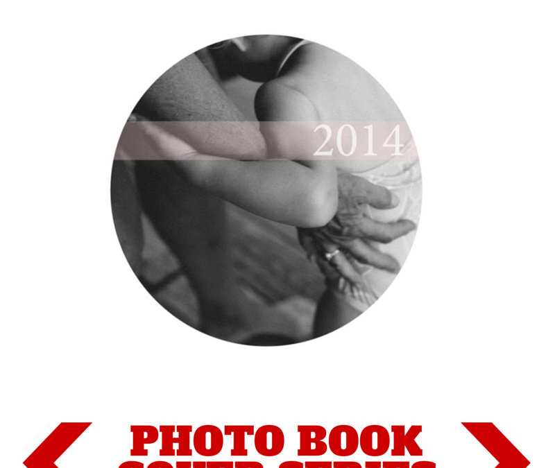
There is something so seductive in a form, shape, color, or font that makes a suggestion. In this cover design, I left a lot of white space on the page. I used a circle photo box, which I find becomes a dominant shape on the page, and then I used the subtle, translucent suggestion of a pale color bar with a white font to indicate the title of the book.


by Stacey Wiseman | Sep 18, 2014 | Description, FREE!
As a mom of a kindergartner, one of the things I’ve been completely surprised with is the amount of papers! When I read this recent article in Apartment Therapy, I could completely relate.
Every night, we are getting 5-10 pieces of paper. Some are results of his school practice. Some include important school information. And some are program announcements, book offers, and general advice.
Already, we’ve accumulated a huge stack of paperwork.

There is a definite need to separate out the parent action items with his practice papers to keep and then recycle the rest.
But…what to do with all of his school papers that I keep?
A photo book, of course.
I’ve decided to photograph 10-12 papers each month and will photograph them and place them in my photo book.
Scanning is one option or you can set up a space on your table or a wall to photograph them in order to get a jpeg for your book.

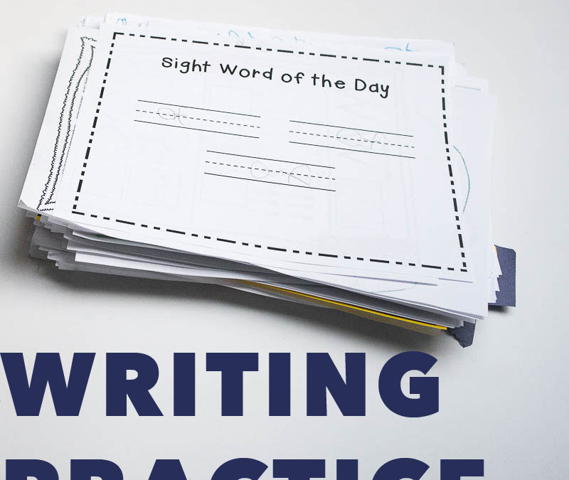
One thing I noticed with his schoolwork is the need to practice writing. As a new writer, he is struggling with how to use the lines to create his letters.
So I created a guide with the kindergarten sight words that fade out so he can practice.
If you want the 10 page practice guide for your child, click here.

And if you enjoyed my strategy for weeding out school paperwork, you’ll love my tips on how to narrow down your family photos. That’s coming soon!
