by Stacey Wiseman | Mar 7, 2014 | Cover Series, Family Photographs
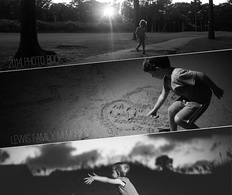
For this photo book cover design example, I decided to shift the rectangular photo boxes to create a dynamic and unusual photo book. This design creates a strong diagonal to the cover. I used this line to rotate the text to follow the line created by the photo boxes. With three photos, there is a variety of photos on the cover – but they are all black and white and strong linear photographs to pull the cover together.

by Stacey Wiseman | Feb 28, 2014 | Cover Series, Photo Book Design Layout
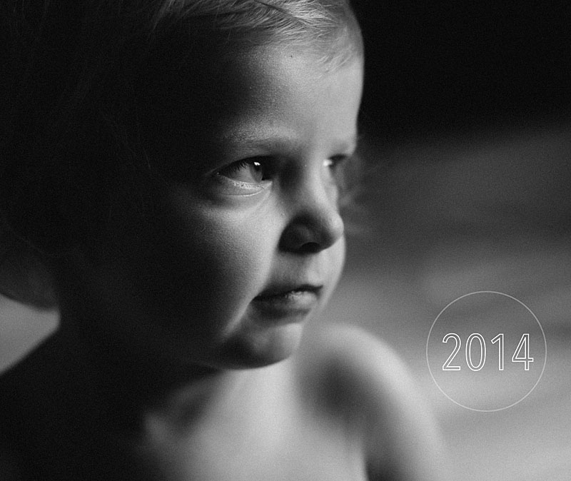
For today’s photo book cover design, I feature one of my favorite photos from one the cover and keep the font simple with a stylish edge.

by Stacey Wiseman | Feb 21, 2014 | Cover Series, Design Series, Photo Book Design Layout
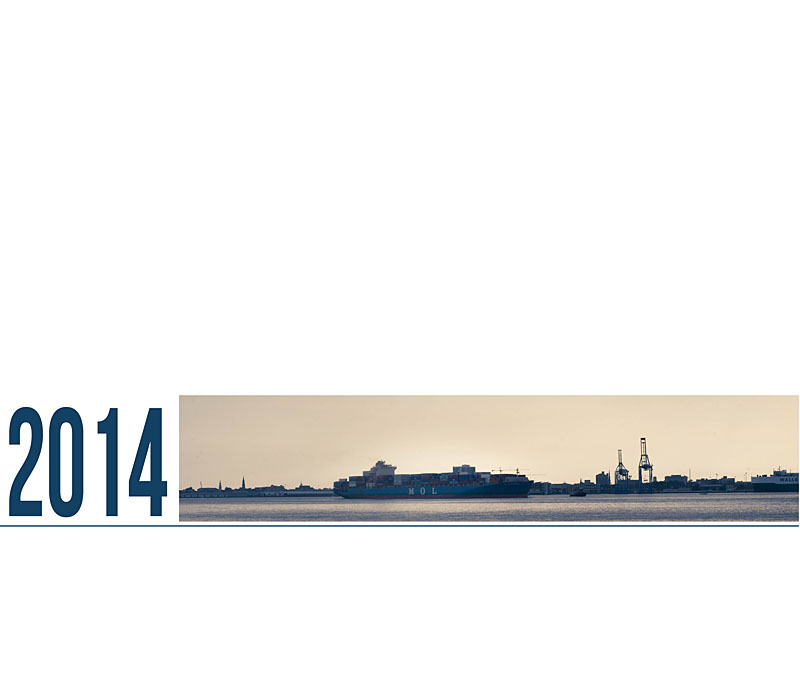
This very simple photo book cover design takes a photo documenting a cargo boat slowly moving freight into a very linear photo. The proportions of the photo have been adjusted to capture the horizon. In this example, the year title fills in the gap to complete the band across the lower half of the cover. A thin blue line underneath the title and the photo really connects the two. It’s simple yet bold.

by Stacey Wiseman | Feb 14, 2014 | Cover Series, Photo Book Design Layout
Happy Valentine’s Day!
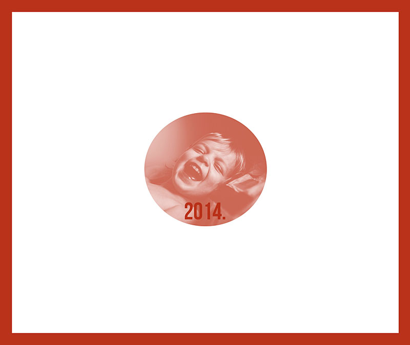
This photo book cover design is all about red and love. Well, because I love this photo of my daughter!
Here I’ve outlined the edge of the cover with a bold red color. Then I used the same color value to create a color fill layer in Photoshop over the photo. I adjusted the layer to “Screen” mode and saved. There you have it. A simple red-inspired photo book cover for Valentine’s Day!

by Stacey Wiseman | Feb 7, 2014 | Cover Series, Design Series
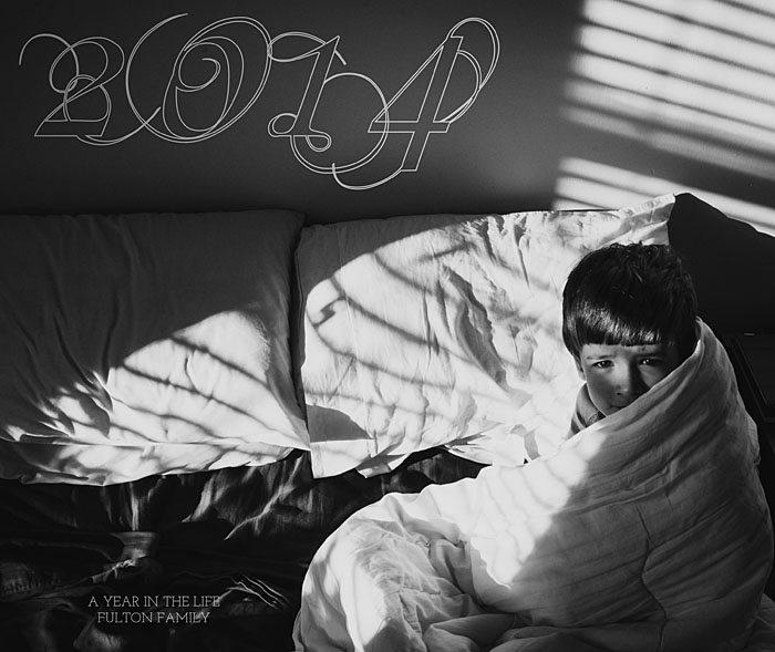
For this week’s photo book cover design, I took a highly ornate, script font and turned it into an outline. This minimizes it’s presence on the cover, yet still provides some visual interest in the negative space of the photo.
Since the subject is on the right of the photo, the title occupies the left side of the cover. In the upper corner, there is the year. In the lower corner, a short description and family further defines the book.
This example shows how to take advantage of a very dynamic photo and use the empty spaces in the photo to place the text. If you’re stuck on what photo to use for a cover, look for one with a large space for text.

by Stacey Wiseman | Jan 31, 2014 | Cover Series, Design Series, Photo Book Design Layout
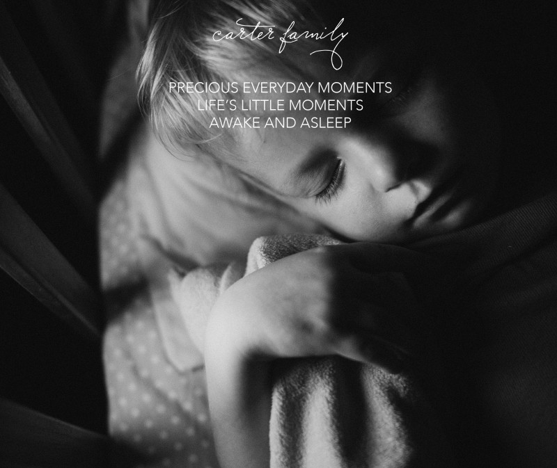
I love sleeping photos of children. It’s so calming to watch your children sleep. I wanted to take this delicate photo and use it for a cover on a photo book. This was actually a vertical orientation photo that I used in a landscape cover. I had enough space at the top and bottom of the photo to make it work.
I started with this…

[divider] But soon realized, I wanted a little bit more to this cover. Something a little un-orthodox. So I applied a dual color gradient and reduced the opacity for a subtle effect.

[divider] Which one do you prefer?
by Stacey Wiseman | Jan 17, 2014 | Cover Series, Photo Book Design Layout
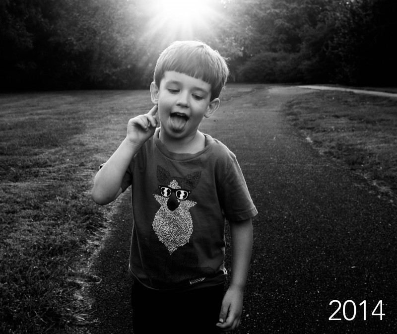
Today’s photo book cover design takes a prominent photo and stretches it over the entire cover. Because the sun was prominently placed at the upper edge, I wanted the year to occur along the bottom edge.

[divider] I started with this image above. Which I liked…but I thought the white was almost too bright for this photo. The “2014” was a (very) slight distraction in the lower right corner, pulling me away from the sun and my son’s face.
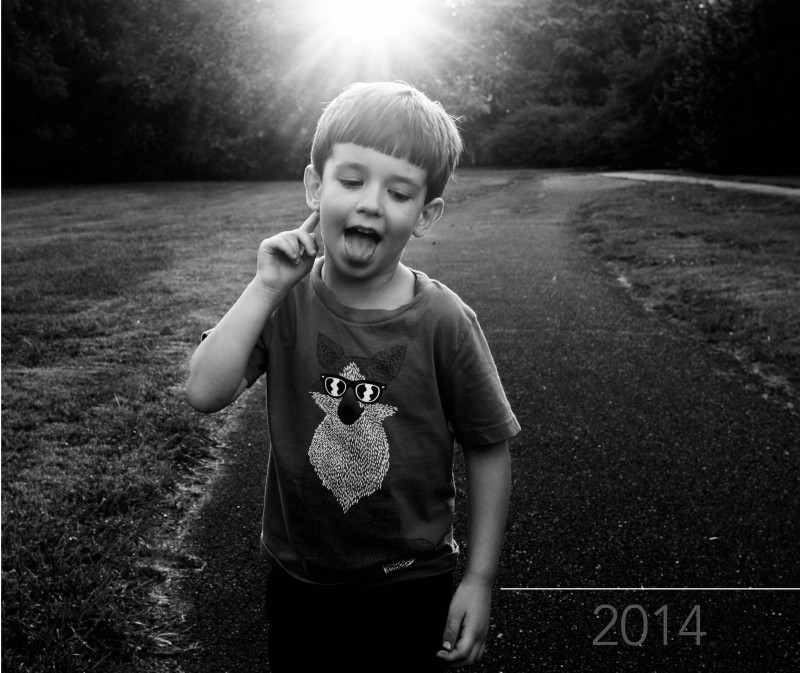
So in the version below, I changed the opacity of the date. This allowed it to fade into the background.

[divider] Of course there is no right or wrong answer. To me, the first version, the year is prominently displayed. If it’s important to have that announcement, it makes sense that this would be a white text (and could maybe increase in size). If you wanted a cover that is more about the photo and less about the book title or year, the second version is the one to go with. In this example, you have to almost discover the title of the book.
In this final photo, I wanted to demonstrate that the text of the year, is centered between my son’s hand and the edge of the book. To make sure, I used a line tool to map out the entire distance. Then I centered the text and aligned the center of the text box with the center of the line. You could always create a text box that is the full dimension you want, then center the text…the line just helps to illustrate the point!

[divider] Pin your favorite version and share with your friends!
by Stacey Wiseman | Jan 10, 2014 | Cover Series
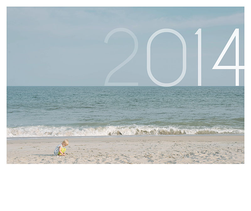
This photo book cover places the text announcing the year, right at the horizon line. The text becomes more and more opaque as it gets to the last digit. If you wanted to be even bolder, you could make the transparency/opacity even greater or use a gradient tool in Photoshop or InDesign to achieve a more seamless look.
The cover title in this case, balances out the subject who is in the lower left corner of the photos. Plus it really draws attention to the horizon line – which I find so appealing in beach photos.

by Stacey Wiseman | Jan 3, 2014 | Cover Series, Family Photographs
It’s time to bring back the weekly photo book cover designs!!!
In 2014, every Friday I’ll be featuring a cover design for a photo book. Some may have a tutorial associated with it…sometimes it will just be the cover. Always feel free to pin it and share it on Facebook.
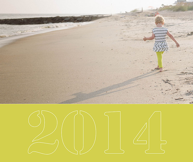
I’m starting the year off with a simple cover. In this example the photo occupies the top two-thirds of the cover and then a bold color forms the base. I use a stencil-type font style to write out ‘2014.’ In this case, I wanted the font to be light because the photos and the color are so bold. To achieve this, I created an outline for the text.

by Stacey Wiseman | Apr 12, 2013 | Cover Series
I prepared a special little design project for all of my photo book subscribers and clients. I wanted a cover design that had one descriptive photo on the front cover and the back provided three sample photographs. The vertical text is a thin font style which contrasts the bold font in the lower right corner.
