by Stacey Wiseman | Mar 22, 2013 | Cover Series, Family Photographs, Photo Book Design Layout
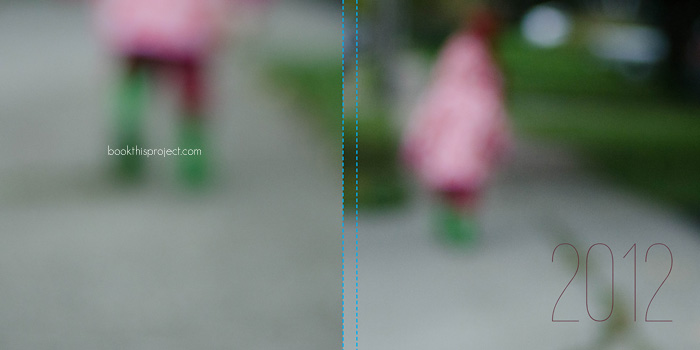
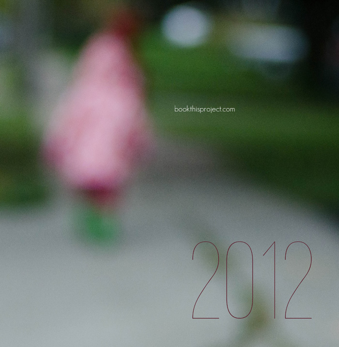
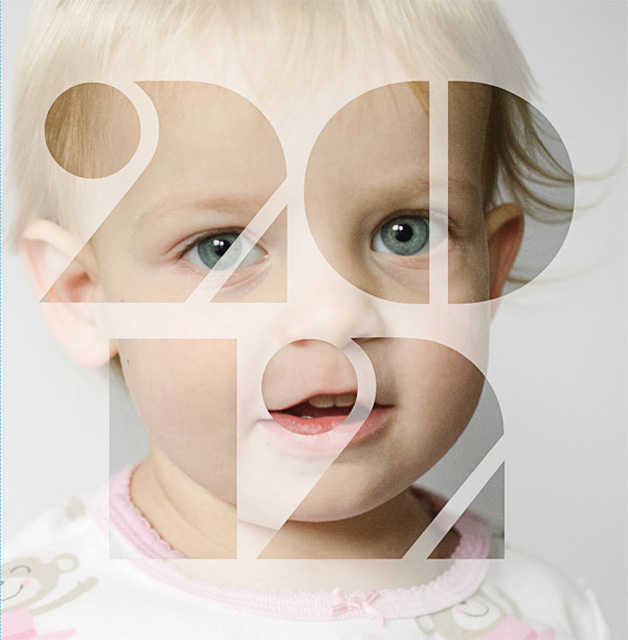
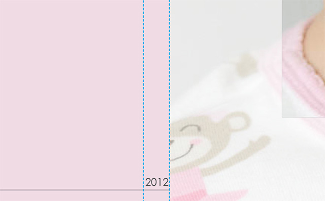
For this photo book cover, I wanted to use an out of focus photo to create a more abstract image for the cover. While this may not be the best photograph to use, it does point out if you like this concept for your cover to shoot with intention throughout the year. Every time you have a potential contender, give it a keyword like “cover” in Lightroom or iPhoto. Then at the end of the year, you can look through all of the options and decide which one works the best!
Here is the full image wrap cover for a square photo book.

Here is the front cover.

by Stacey Wiseman | Feb 15, 2013 | Cover Series, Family Photographs
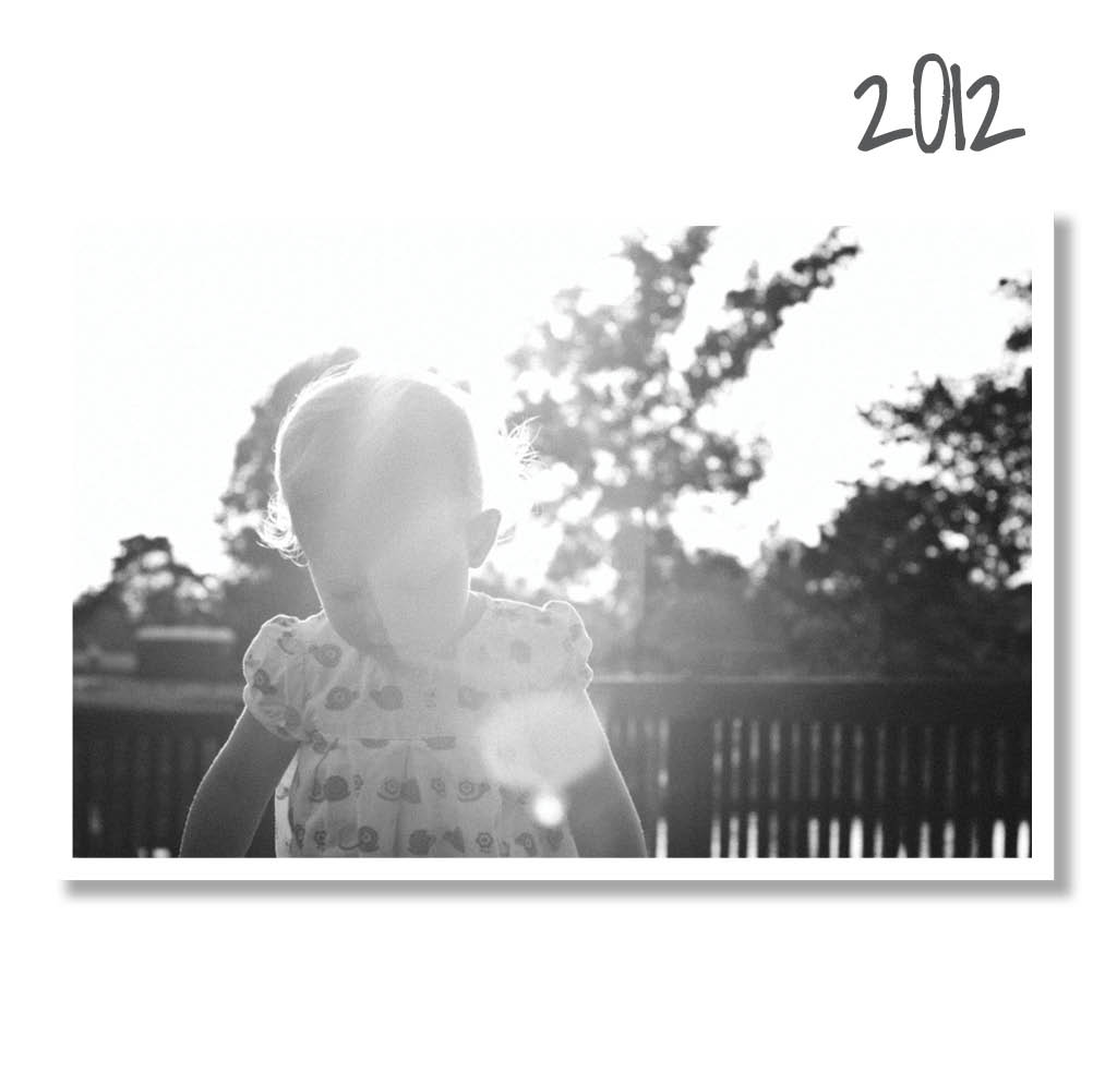
Recently, I designed a small book for my daughter’s second birthday. It was a really quick design that incorporated 20 photos in 20 pages. For my cover, I wanted to replicate the simple layout. The front cover features a script font with the simple “two” centered on the front. The back is a little more expressive because I featured a photo of her from her actual birthday party in a circle shape. This was easily made in Photoshop using a shape and clipping masks.


by Stacey Wiseman | Feb 1, 2013 | Cover Series, Photo Book Design Layout
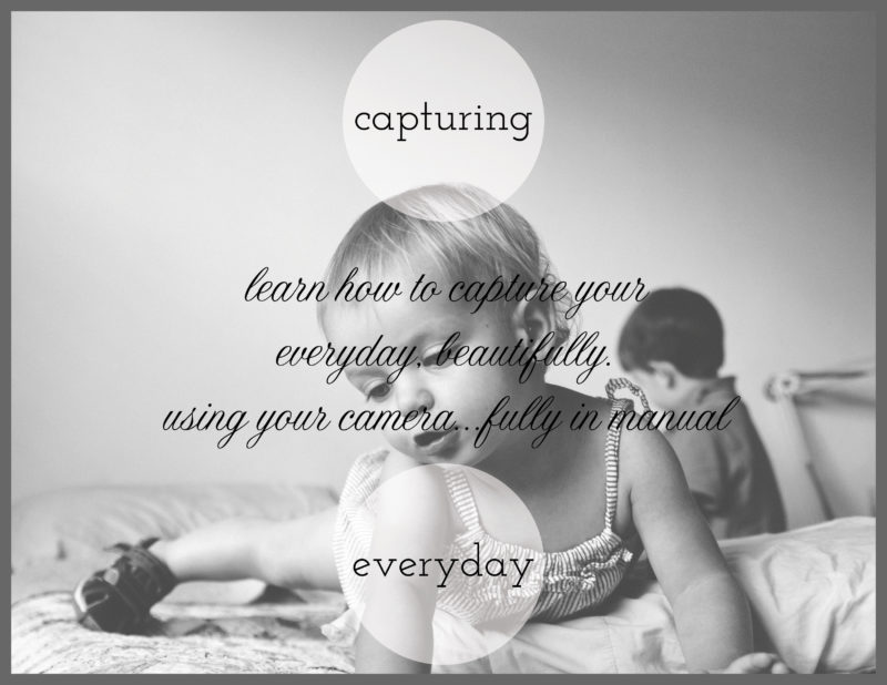
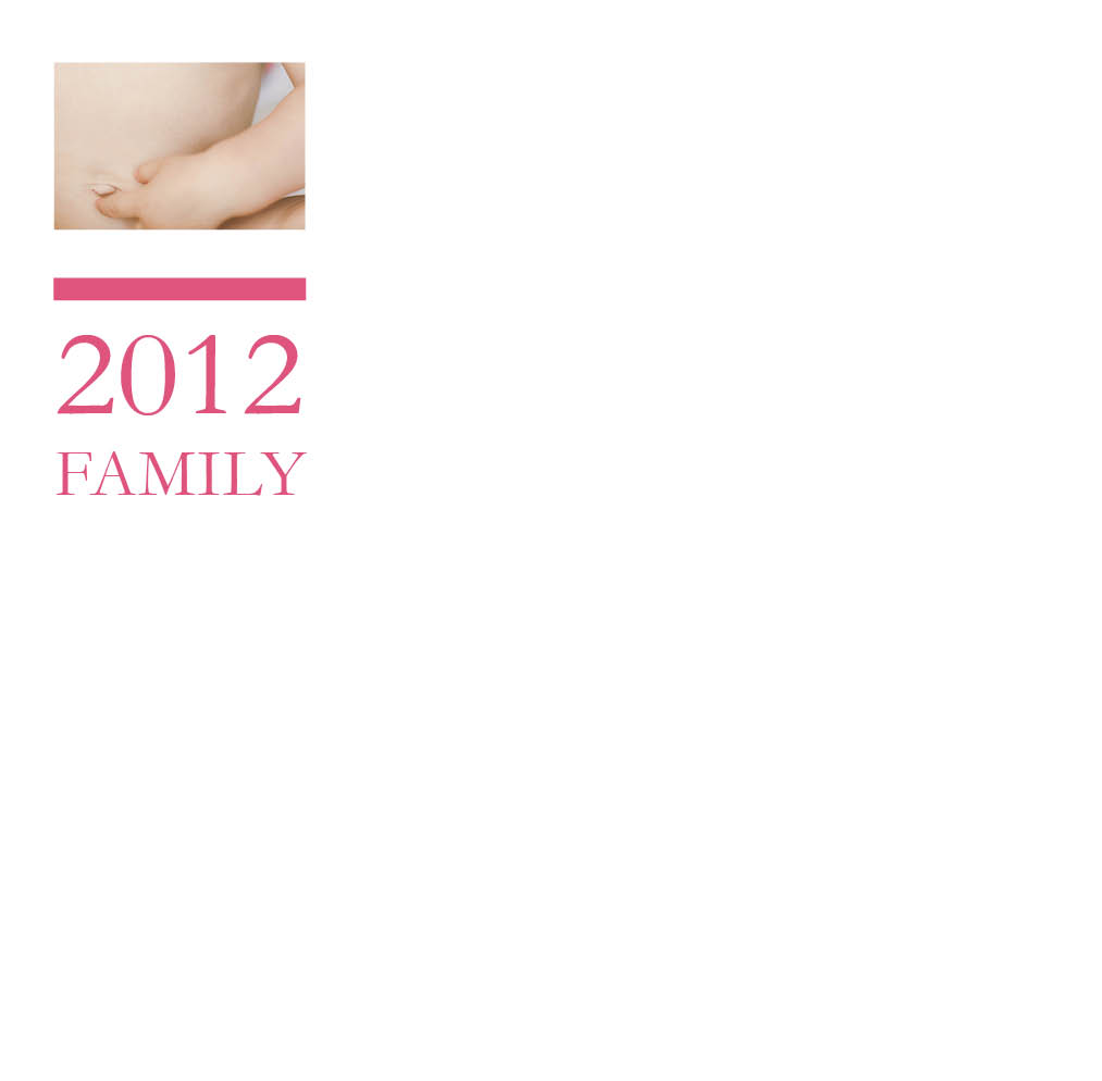
For today’s photo book cover, I’m featuring something I’m working on for my brother and sister-in-law. They just had a baby and want to know some basics of their camera. So I created a little pamphlet and this is my cover.
I know I have a limb chop with my daughter’s hand, but there is something that really speaks to me about this image – especially when discussing everyday photos in my home. I used a circle graphic with a slight transparency to bring the background in.
And I’m using two different types of fonts – serif + cursive – to distinguish the Main Title from the Sub-Title.
One final think, I added a gray border to give a sense of enclosure and framing. It also highlights the two different shapes going on – the square and the circle!

by Stacey Wiseman | Jan 18, 2013 | Cover Series
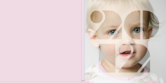
Today’s photo book cover design is for a Large Square photo book but could be easily adapted for other book types. The inspiration for this book cover was a cover design for Murakami’s 1Q84 novel. I’m not sure about the font that I ended up using for this example, but it was fun to try. For those curious, I created this in InDesign with the font Braggadocio.
Here is the back – spine – front.

The entire front cover.

And a detail…

Enjoy your weekend!
by Stacey Wiseman | Nov 16, 2012 | Cover Series, Photo Book Design Layout

If you love this example or if it gives you some ideas for your photo book, pin it!
[divider]Make sure you sign up for the Book This Project weekly newsletter. I have a free download when you sign up!
by Stacey Wiseman | Nov 9, 2012 | Cover Series, Photo Book Design Layout
Description

If you love this example or if it gives you some ideas for your photo book, pin it!
[divider]Make sure you sign up for the Book This Project weekly newsletter. I have a free download when you sign up!
by Stacey Wiseman | Nov 2, 2012 | Cover Series, Photo Book Design Layout
Description

If you love this example or if it gives you some ideas for your photo book, pin it!
[divider]Make sure you sign up for the Book This Project weekly newsletter. I have a free download when you sign up!
by Stacey Wiseman | Oct 26, 2012 | Cover Series, Photo Book Design Layout
Description

If you love this example or if it gives you some ideas for your photo book, pin it!
[divider]Make sure you sign up for the Book This Project weekly newsletter. I have a free download when you sign up!
by Stacey Wiseman | Oct 19, 2012 | Cover Series, Photo Book Design Layout
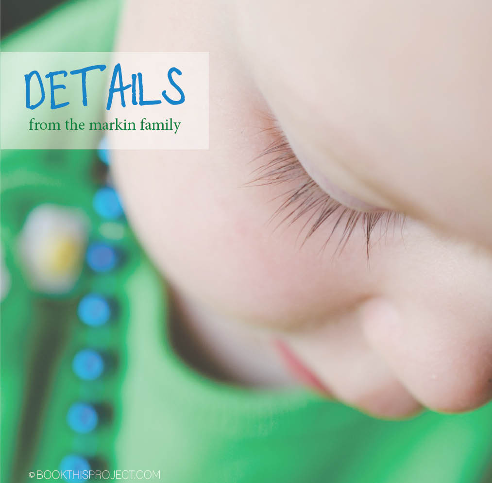
Have you captured details of your family life? Of your kids growing up? Put this detail on the cover and immediately capture an adorable and endearing way to feature your photo book.

If you love this example or if it gives you some ideas for your photo book, pin it!
[divider]Make sure you sign up for the Book This Project weekly newsletter. I have a free download when you sign up!
by Stacey Wiseman | Oct 12, 2012 | Cover Series, Photo Book Design Layout
 Description
If you love this example or if it gives you some ideas for your photo book, pin it!
[divider]Make sure you sign up for the Book This Project weekly newsletter. I have a free download when you sign up!

