by Stacey Wiseman | Oct 5, 2012 | Cover Series, Photo Book Design Layout
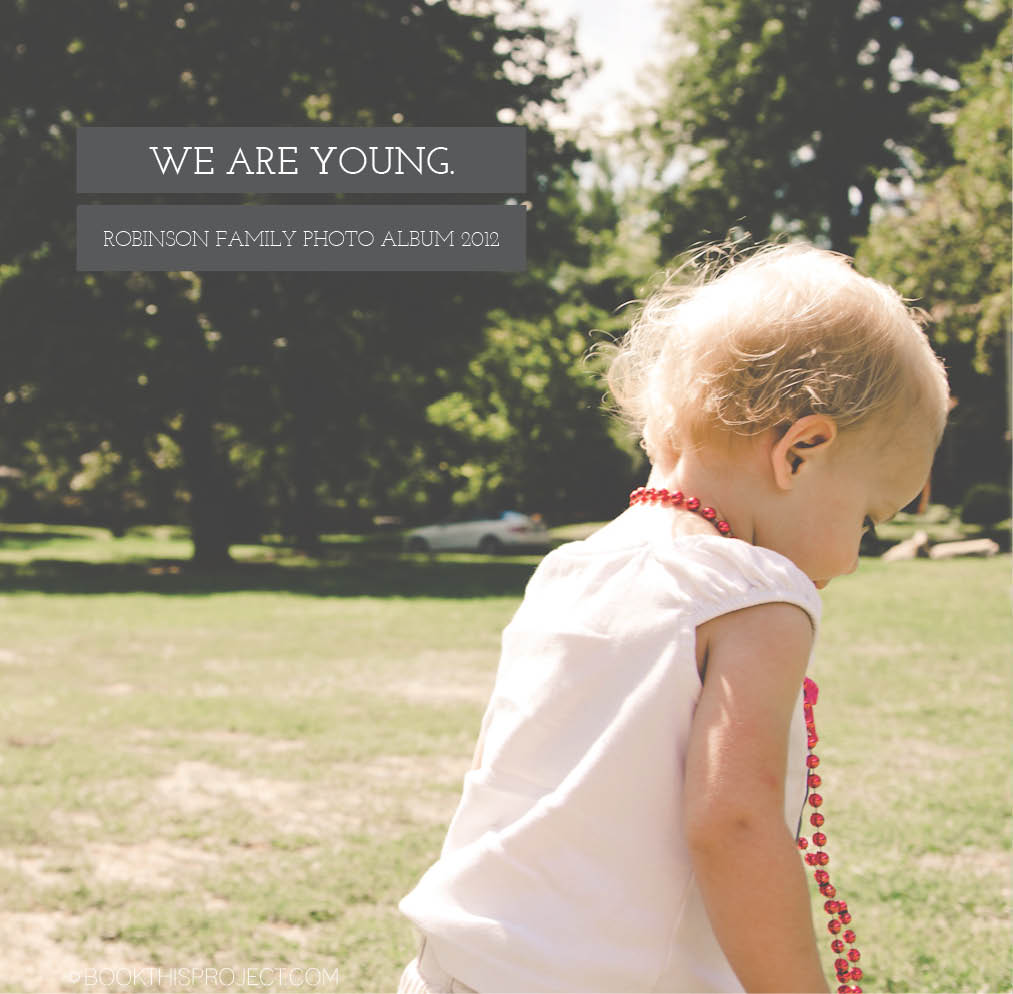
I love this photo book cover!!! Inspired by an image I found on pinterest, I selected a photograph to fill the entire cover and then place the title of the book in a gray box using a classic looking font. Another gray box indicates the family name of the year of the annual family photo book. This photo book cover is extremely classy and sophisticated.

If you love this example or if it gives you some ideas for your photo book, pin it!
[divider]Make sure you sign up for the Book This Project weekly newsletter. I have a free download when you sign up!
[divider]
by Stacey Wiseman | Sep 28, 2012 | Cover Series, Photo Book Design Layout
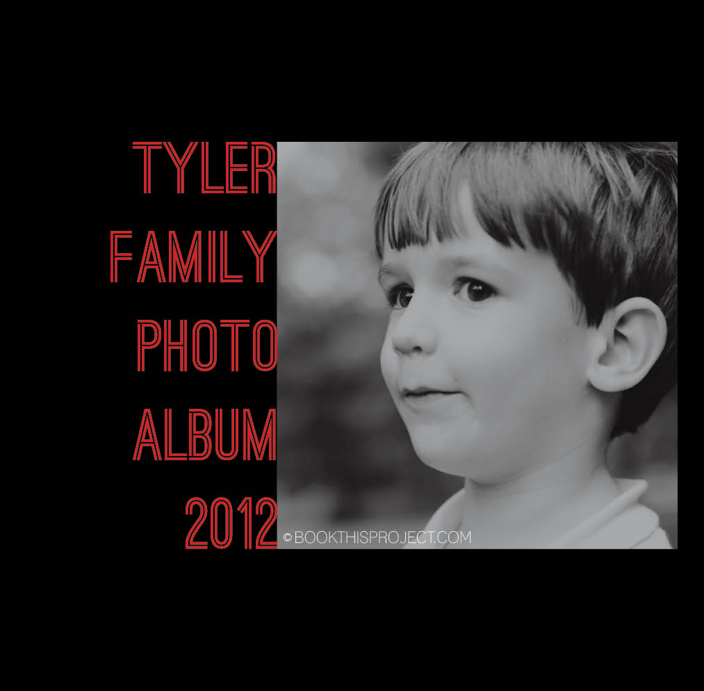
This cover design is similar to last week’s design, yet in this case, the font is bold and bright. You don’t have to go with a black background to get a cover like this, but I suggest selecting two contrasting colors for the background and the font color. You want there to be a difference in order to make the font really stand out.

If you love this example or if it gives you some ideas for your photo book, pin it!
[divider]Make sure you sign up for the Book This Project weekly newsletter. I have a free download when you sign up!
by Stacey Wiseman | Sep 21, 2012 | Cover Series, Photo Book Design Layout
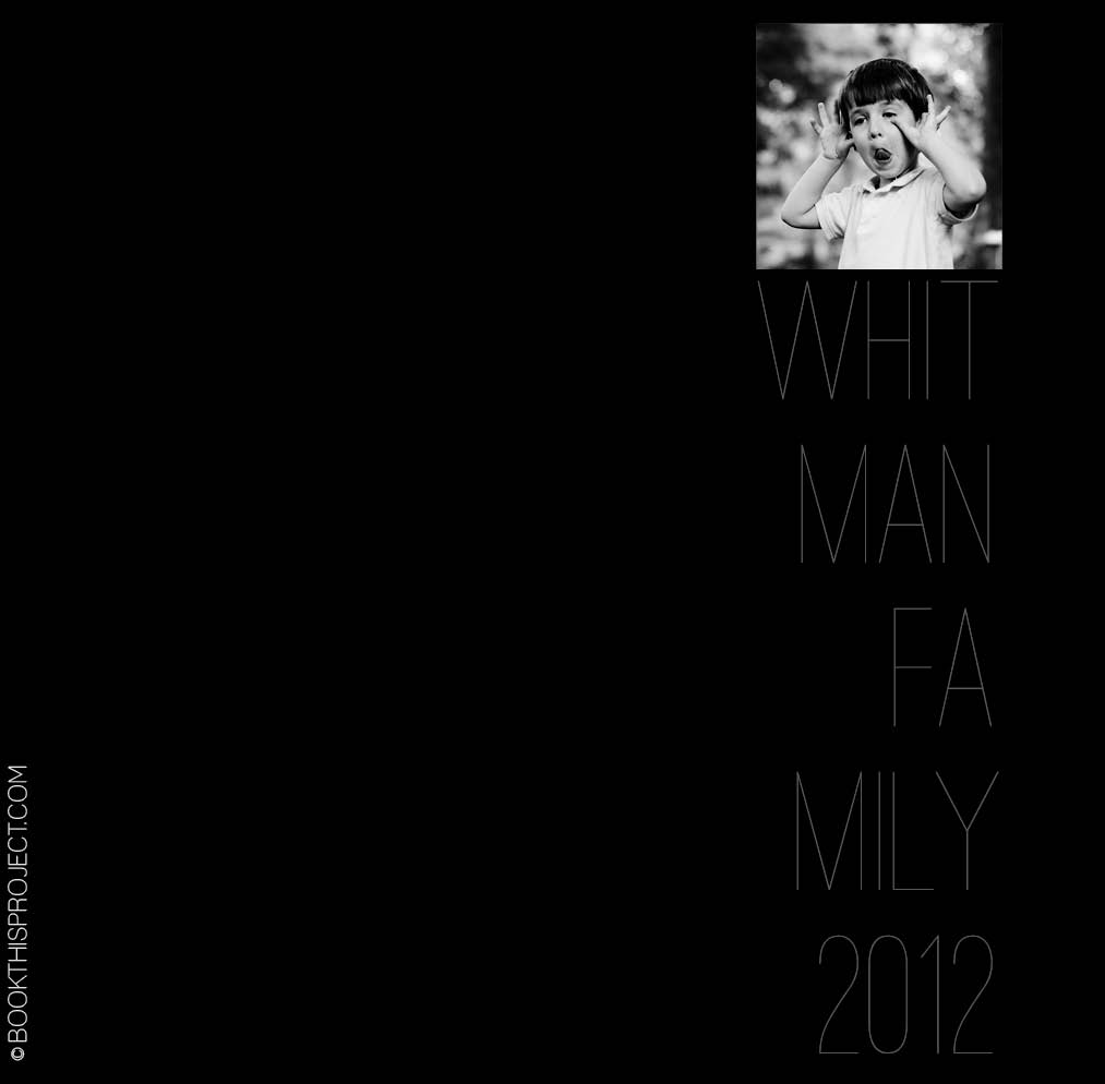
This cover is serious and silly at the same time. A silly black and white photo is paired with a stark black background and a thin gray text. The font happily takes a backset in this design…and that is the point. Nothing over-done. It is very simple…and in its simplicity, it makes you want to pick it up and view the pages inside.
 The inspiration for this cover is on my pinterest board “Layouts.” Are you following me yet?
If you love this example or if it gives you some ideas for your photo book, pin it!
[divider]Make sure you sign up for the Book This Project weekly newsletter. I have a free download when you sign up!
by Stacey Wiseman | Sep 14, 2012 | Cover Series, Family Photographs
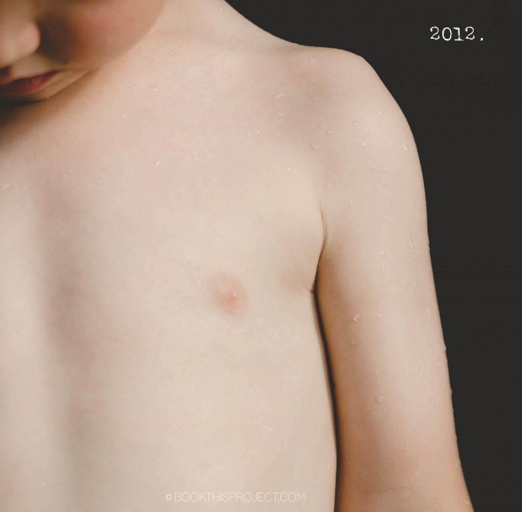
I love the simplicity of this photo book cover design. The photograph is simple and concentrated. A minimal “2012” is in the negative space of the photograph to indicate the year. And that is it! Voila!
[divider]

If you love this example or if it gives you some ideas for your photo book, pin it!
[divider]Make sure you sign up for the Book This Project weekly newsletter. I have a free download when you sign up!
by Stacey Wiseman | Sep 7, 2012 | Cover Series, Family Photographs
This is a fantastic cover to pair with the handwritten photo book design. It seems personal, casual, yet real. Provide a fun title, select a photo to match and you have created a cover that showcases your family’s personality. Underneath the photo, I created a sub-title to indicate the year and your family name. One final note, you will see that I have a faint color to the background. This would extend on the back and the side flaps for consistency. This is a nice option to include if you want something a little different from the typical white background.

[divider]If you love this example or if it gives you some ideas for your photo book, pin it!
[divider]Make sure you sign up for the Book This Project weekly newsletter. I have a free download when you sign up!
by Stacey Wiseman | Aug 24, 2012 | Cover Series, Family Photographs
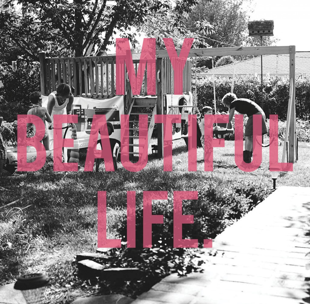
There is not a better way to describe the love you have for your family, than selecting an everyday full of life photograph and making a bold statement on the cover. The text on this photograph is slightly transparent to reveal a bit of the photograph. This cover is easy to complete. Select a familyphotograph and a statement or quote. Imagine how beautiful this would be on your coffee table?

[divider]If you love this example or if it gives you some ideas for your photo book, make sure you pin it!
[divider]Plus, sign up for the Book This Project weekly newsletter. I have a free download of 50 things to photograph this year when you sign up!
by Stacey Wiseman | Aug 17, 2012 | Cover Series, Family Photographs
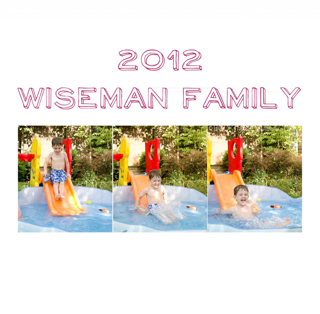
This photo book cover design features a light-hearted font, a fun color, and three photographs full of energy. This cover design announces to the family member or friend who picks up this book that it is going to be entertaining and a joy to flip through.

[divider]If you love this example or if it gives you some ideas for your photo book, make sure you pin it!
[divider]Plus, sign up for the Book This Project weekly newsletter. I have a free download of 50 things to photograph this year when you sign up!
by Stacey Wiseman | Aug 10, 2012 | Cover Series, Family Photographs
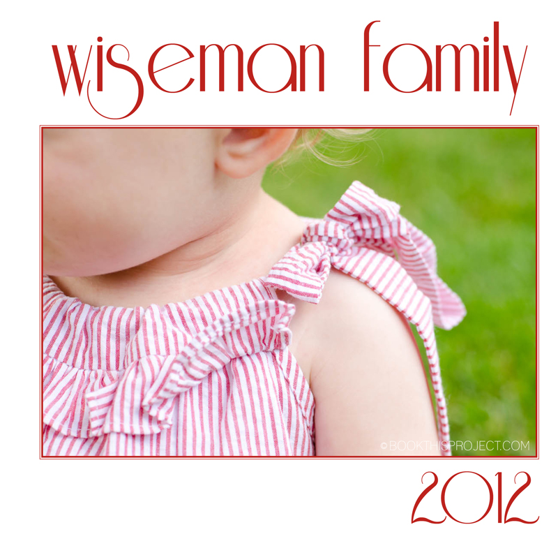
Oh, I love this one! The detail of her outfit, the color, the font, the spacing. It all really comes together in this simple photo book cover. Imagine a detail that really captures your family life. Maybe it is a favorite outfit. Or a detail of a favorite activity. With this as your cover, you could imagine starting each month off with a detail encapsulating the activities.

[divider]If you love this example or if it gives you some ideas for your photo book, pin it!
[divider]Make sure you sign up for the Book This Project weekly newsletter. I have a free download when you sign up!
by Stacey Wiseman | Aug 3, 2012 | Cover Series, Description
Let’s kick August off with a bold photo book cover design! This cover design features a vibrant solid red color, with the year outlined along the bottom. Simple, yet striking, this cover definitely makes a statement and when it is sitting on your coffee table, it will be hard not to pick it up and browse through your photos again and again!

[divider] If you love this example or if it gives you some ideas for your photo book, pin it!
[divider]Make sure you sign up for the Book This Project weekly newsletter. I have a free download when you sign up!
by Stacey Wiseman | Jul 27, 2012 | Cover Series, Description, Family Photographs
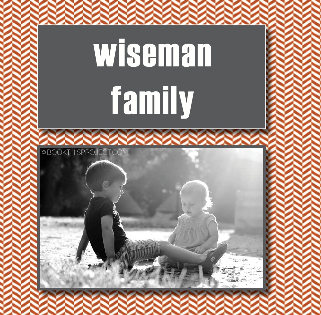
For this example of a family photo book cover, I use a vibrant background graphic to provide some visual interest and then float two boxes in the center. The top box announces the family name or the title of the book in a bold font to stand out. The lower box features a black and white photograph of my two kids together. This combination provides a great way to provide a little more visual punch without becoming too busy. Plus it is one simple way to show a singular family photograph without it taking the entire cover or floating in a sea of white space.

[divider] If you love this example or if it gives you some ideas for your photo book, pin it!
[divider]Make sure you sign up for the Book This Project weekly newsletter. I have a free download when you sign up!
