by Stacey Wiseman | Sep 7, 2014 | 50 Children's Book Design Tips, Design Series
My design tip for today comes from Suzanne Bloom’s A Splendid Friend, Indeed.


This book is a great one for young kids who are very sleepy before bed but want to read one quick story before the lights go out.
I like reading this book to my kids for it’s design simplicity and use of strong colors. But today’s tip, deals with how to isolate your subject when using a photo in a spread.


by Stacey Wiseman | Sep 1, 2014 | 50 Children's Book Design Tips, Design Series
This week’s design tip from a children’s book is a little more complicated unless you use InDesign (or a whiz with Photoshop or Illustrator). But….I’m guessing there are a few online programs that make this tip possible.
The next children’s book all kindergartner’s should read is In the Small, Small Pond by Denise Fleming.


And here’s the design tip!


by Stacey Wiseman | Aug 25, 2014 | Design Series, Inspiration
Our next book in the Children’s Book Design Tip Series is:
Bark, George by Jules Feiffer.


This cute little book is a quick and even though it seems a little too silly, my kids got a genuine chuckle at what the vet found in George’s belly!
As for the design, I love how the pages alternate a bright, pastel color as the background for the story.
Check it out!


by Stacey Wiseman | Aug 24, 2014 | Cover Series, Design Series, Family Photographs
Hello 2014!
I’ve got a fun photo book cover design today! And it starts with the photo. We all know it’s common for children to have their moments of screaming and crying. Here’s your opportunity to photograph this moment and turn it into something creative for your photo book cover.
I broke up the photograph using triangular shapes via the pen tool in InDesign. This added more interest to the photo but definitely not necessary. The photo in a rectangular box can stand on it’s own too.
Pairing this photo with a bold font for the year and a small, classic font in a stand-out color (yellow) helps to make this dynamic cover design down to each detail.
Let me know in the comments below what you think!


by Stacey Wiseman | Aug 18, 2014 | 50 Children's Book Design Tips, Design Series, Inspiration
Today’s Children’s Book Design Tip is from the book: Cloudy with a Chance of Meatballs by Judi Barrett and Ronald Barrett.
I know this became a popular movie (actually, 2 movies) but it started as a great book to read to your kids. A little warning: This book does have more text than most children’s books….so it takes a little more time to read!


by Stacey Wiseman | Aug 11, 2014 | 50 Children's Book Design Tips, Design Series, Inspiration
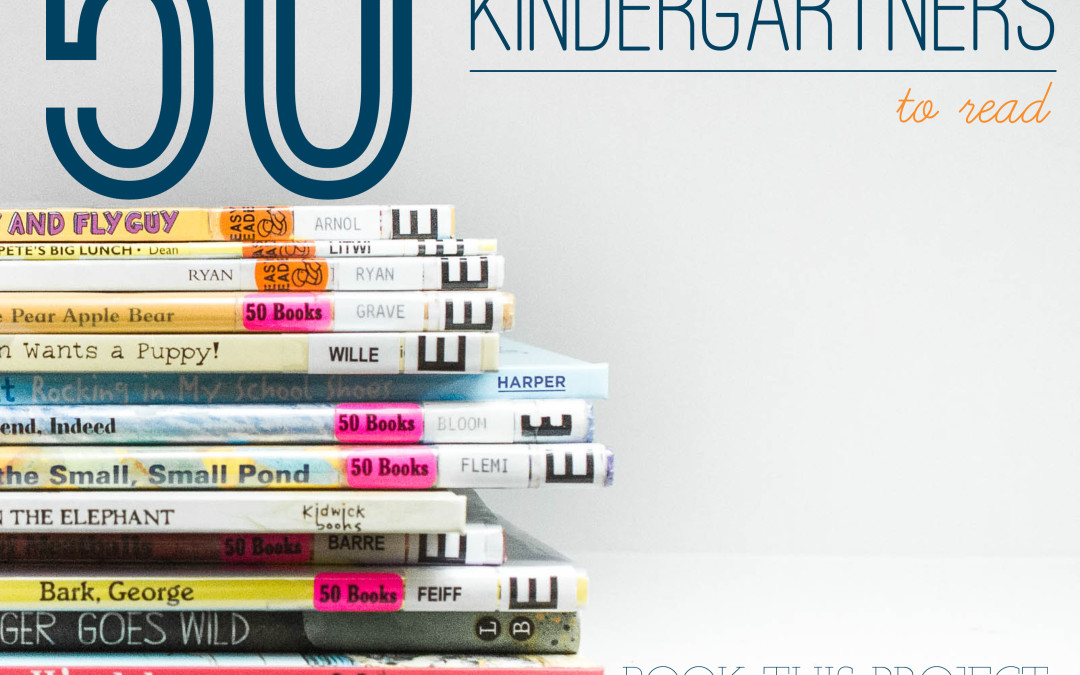
In honor of my son’s first year at school (yay for kindergarten!), I’m going to share a quick design tip for 50 Books to Read in Kindergarten list recommended by our public library.
Every Monday, make sure you check out my blog and Facebook page for a tip for your photo book.
Today’s book: Orange Pear Apple Bear by Emily Gravett.


(The 50 Books to Read in Kindergarten includes an affiliate link. I’m reading them to my kids and would love for you to check them out too!)

by Stacey Wiseman | Jul 9, 2014 | Design Series, Tutorial
One of the biggest struggles I hear from my readers is the photo selection process. We are all connected to the photos we take. So connected in fact that it’s hard to choose one photo over another. However, photo selection is a crucial component of a photo book. Too many photos in a book creates an almost overwhelming aspect to your photo book and in the end, it can take away from the photos themselves.
I’m in the process of developing something to tackle this issue but for now I have a video that I hope will help. This is the 2nd of 5 videos on the photo book process.
If you remember the first video, I showed you how I photograph my kids on a casual Saturday afternoon.
Today, I’m going to show you my unedited, unculled photos – specifically so I can show you how I narrow photos of my kids for a photo book.
My white balance was crazy – especially in the first couple of photos. But that’s fixable. As you see next month!
Plus one thing to keep in mind, the funky white balance, under/over-exposed photos may not be the photos you want to include for your book. So you don’t always have to obsess over the details. Especially at this stage.
Check this video out and share this post with your friends!

by Stacey Wiseman | Jun 8, 2014 | Design Series, Family Photographs, Tutorial
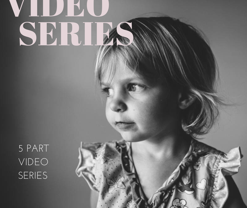
I’m so excited to kick off a new video tutorial series. Throughout 5 videos, I’m going to take you behind-the-scenes of how I pull together a photo book. With this series I’m going to focus specifically on taking photographs in a very familiar location within my home.
This spot is my go-to place for photos of my kids. I’m comfortable with the light, the framing, and the background. I’m using one of my favorite locations to illustrate how, from beginning to end, you can shoot with a photo book in mind.
Here are the topics I’ll cover in this series:
Part 1: Taking the Photographs
Part 2: Selecting the Photographs
Part 3: Editing the Photographs
Part 4: Designing the Layouts
Part 5: Adding Design Elements
For today’s video tutorial, I’m sharing how I take the photographs. My goal is to take a portrait of one – or both – of my kids. We’ll see what I get!
Plus, with this video, you’ll find out my 10 Tips for Attempting Portraits of my Kids.
Now, before you watch this video, I had to use two different cameras because I ran out of memory in my first one. I apologize for the difference in coloring, focal length and quality. Also, I recorded this on a Saturday morning. I’m not fancy or dressed up – this is as accurate as you can get to how I really shoot in my home. 😉
I’d love to hear from you. When you take photos of your kids, does it look like this? Do your kids act crazy? Run away? Fall down? Evade the camera? What are your tricks?!? Tell me your experience in the comments below! <3
I’ll see you next month when I show you my photos!

by Stacey Wiseman | Jun 7, 2014 | Cover Series, Design Series
Earlier I announced on this blog Blurb’s contest for people to design a photo book for their favorite person. There were several different categories plus several ways to win.
I could not let this contest pass without submitting an entry. Soon, I’ll be sharing more insights, pages, and takeaways from this really fun and very specific book. But until then, I want to share my photo book cover.
This book is in honor of my favorite sweetheart: my husband. I knew I wanted a cover that is simple, very modern, lots of white space and geometric. Here’s the result!
Full cover:

Front cover:


by Stacey Wiseman | Apr 26, 2014 | Cover Series, Design Series, Family Photographs
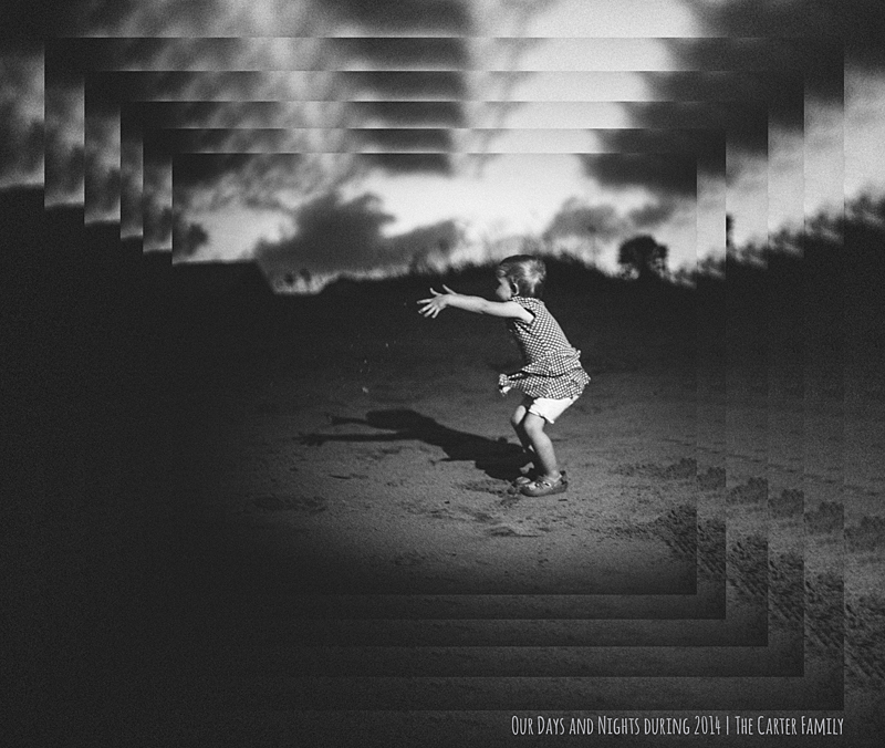
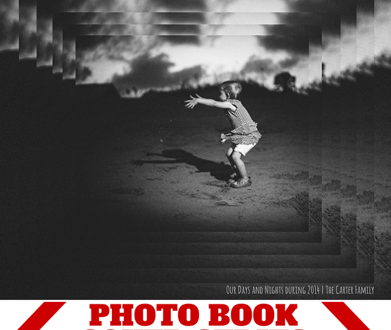
Inspired by a graphic design pin on pinterest, I created this photo book cover design. It features the same image repeated at 90% until I got the final size I wanted to display the entire photo. This cascading pattern stays vertically and horizontally centered as it scales down providing a very dramatic cover.
The key to this photo book cover design is to select a dramatic photo.
Finally, use a small title for your book that doesn’t compete with the photo. In this case, the title is a clever play on the photo – “Our Days and Nights during 2014.”
Make sure you pin this graphic if it inspires your cover or a page in your book!
