by Stacey Wiseman | Apr 11, 2014 | Cover Series, Design Series
I hear from so many people who are a little behind on making their family photo books. Like….several years behind. And that’s okay. Any time is a good time to start.
It can actually be a luxury.
And here’s why. You have the opportunity to think about your photo books as a set. Designing the cover is the perfect way to execute a shared vision over several books – or several years.
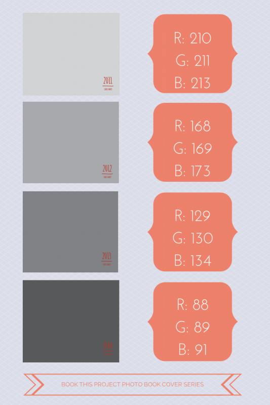
Now there are many ways to approach this. For this example, I’m using various shades of gray to signify the different years. The text is very simple and remains the same for all of the covers.
The key here is to think about how many years you want to design photo books and adjust your shades accordingly. Of course, you could always keep the shades in groups of 3 or 4. But if you are looking for subtle changes, variations of gray over 4 years is very different than variations over 18 years.
So think ahead and decide if this could work for you!


Here is a great graphic for you to pin!


by Stacey Wiseman | Apr 9, 2014 | Design Series, Podcast, Tutorial
This month’s photo book video tutorial is a special behind-the-scenes on how I approach design – specifically when designing a photo book cover.
Covers are the outward face of your book and are really the place where you can be the most expressive! Because of this, it can sometimes be a little daunting to create.
Lucky for you, every Friday, I provide a photo book cover design for you to pin or to inspire your own creation.
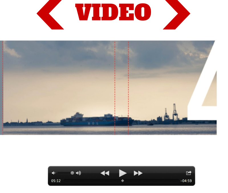
In this video, I’m going to show you the 8 steps I took to create last week’s cover example.
I would love to hear from you! What other design aspect can I go behind-the-scenes and show you? What are you yearning to learn how to do? Let me know in the comments below – or – if you have 3 minutes, fill out my brief survey.

by Stacey Wiseman | Mar 28, 2014 | Cover Series, Design Series, Family Photographs
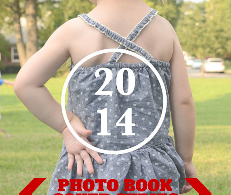
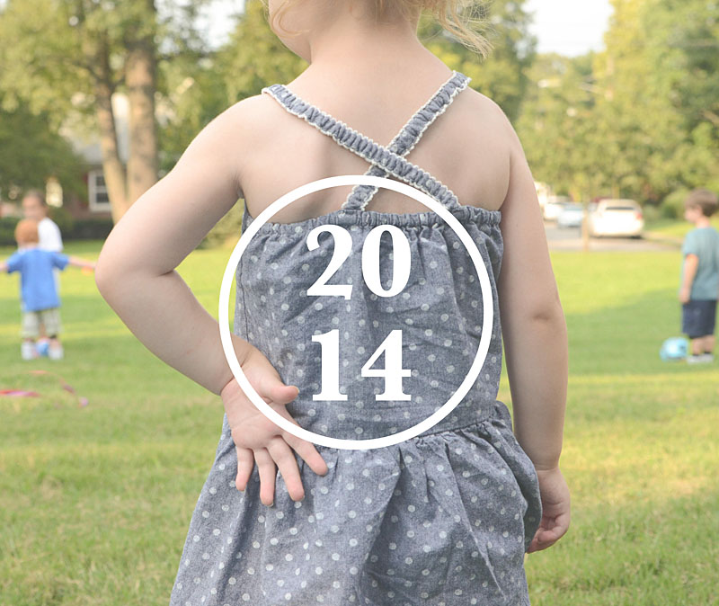
Sometimes it takes an unusual perspective in a portrait to turn a photo book cover into something a little abstract and very interesting.
Try out an unexpected yet defining portrait for your photo book cover. Pair it with a simple title and a straight line graphic – or a circle graphic as shown below.
This is an elegant way to achieve an cover that doesn’t put the focus on the face, the smile, the eyes.

by Stacey Wiseman | Feb 21, 2014 | Cover Series, Design Series, Photo Book Design Layout
This very simple photo book cover design takes a photo documenting a cargo boat slowly moving freight into a very linear photo. The proportions of the photo have been adjusted to capture the horizon. In this example, the year title fills in the gap to complete the band across the lower half of the cover. A thin blue line underneath the title and the photo really connects the two. It’s simple yet bold.

by Stacey Wiseman | Feb 7, 2014 | Cover Series, Design Series
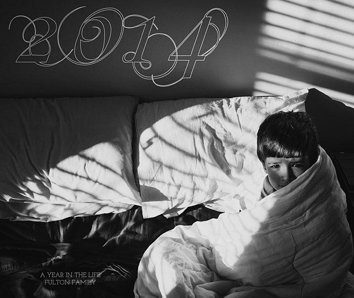
For this week’s photo book cover design, I took a highly ornate, script font and turned it into an outline. This minimizes it’s presence on the cover, yet still provides some visual interest in the negative space of the photo.
Since the subject is on the right of the photo, the title occupies the left side of the cover. In the upper corner, there is the year. In the lower corner, a short description and family further defines the book.
This example shows how to take advantage of a very dynamic photo and use the empty spaces in the photo to place the text. If you’re stuck on what photo to use for a cover, look for one with a large space for text.

by Stacey Wiseman | Jan 31, 2014 | Cover Series, Design Series, Photo Book Design Layout
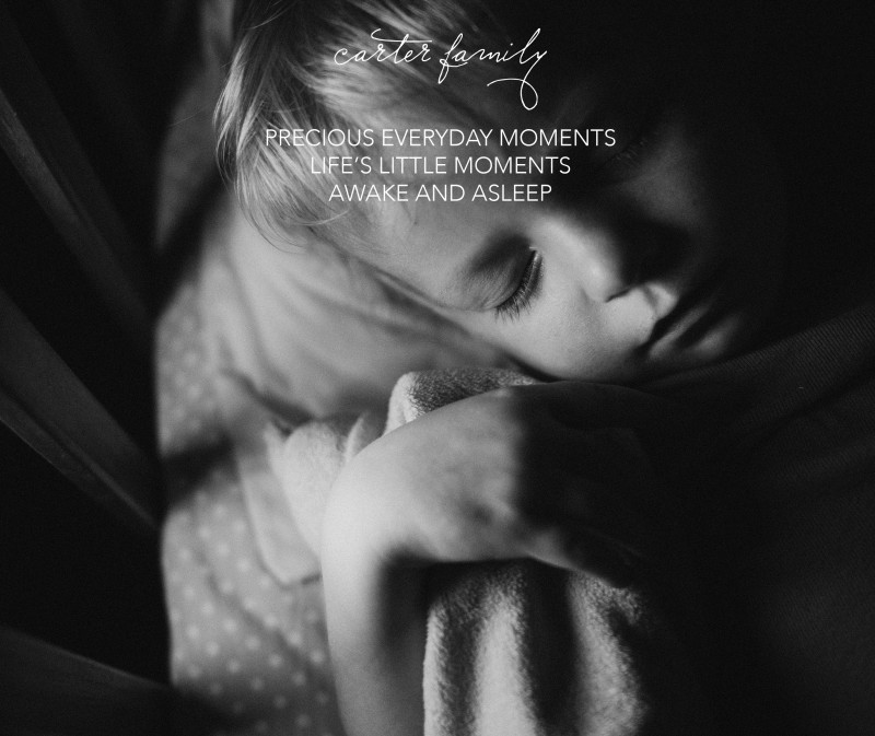
I love sleeping photos of children. It’s so calming to watch your children sleep. I wanted to take this delicate photo and use it for a cover on a photo book. This was actually a vertical orientation photo that I used in a landscape cover. I had enough space at the top and bottom of the photo to make it work.
I started with this…

[divider] But soon realized, I wanted a little bit more to this cover. Something a little un-orthodox. So I applied a dual color gradient and reduced the opacity for a subtle effect.

[divider] Which one do you prefer?
by Stacey Wiseman | Nov 19, 2013 | Design Series, Photo Book Design Layout
This is the third and final tutorial in this series about one photo per page.
First, I described the various layout options available with only one photo box on the page.
Second, I showed how to add color to these layouts.
Today, I’m going to show how to add text to the layouts.
Let’s look at four ways to add text:
(and don’t forget to pin any layouts you enjoy to your pin board!)
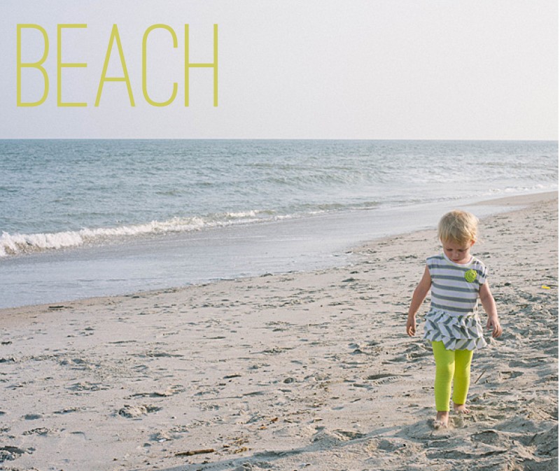
1. Title
For this title, I used a slim font and the color in her pants. The yellowish color does stand out from the blue of the ocean to make a nice contrast on the page. It’s simple, descriptive, to the point.

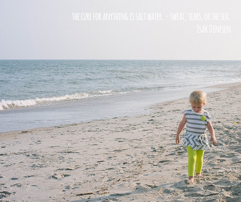
2. Quote
The quote is in a white font, so it does not detract from the overall image. Although I will agree that the color choice could be a little more dramatic, maybe a light gray, to make the quote stand out a little more. Quotes can be a fun way to describe the event without having to come up with a lot of words.

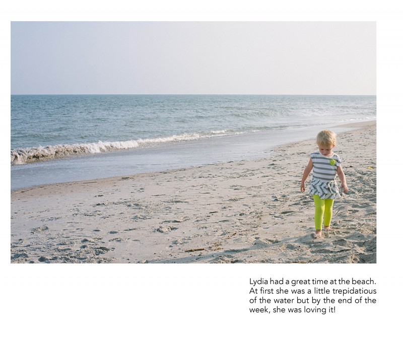
3. Caption
This example uses a right aligned text box directly under the subject. There is definitely more weight to the right side of the page but I think the ocean is enough to act as a backdrop and it really takes your attention to the subject.

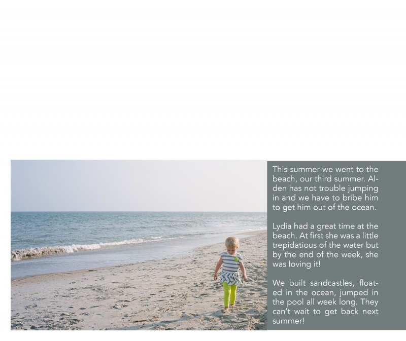
4. Text
Including a little bit longer of a text or description can work really well for your photo book too! In this example, I placed the text in a color bar so it reads as a seamless bar running along the bottom of the page. There is a lightness from the negative space at the top of the page, yet it is still informative and colorful. I used a simple font in white to contrast against the dark background.

Leave a comment below with your favorite way to incorporate text in your photo book!
[divider]
by Stacey Wiseman | Jan 4, 2013 | Design Series, Photo Book Design Layout
It is time to start the next Design Series! Every Friday, I like to post a different photo book cover design to inspire you for your photo book. This year, I may start to include design layouts, as well.
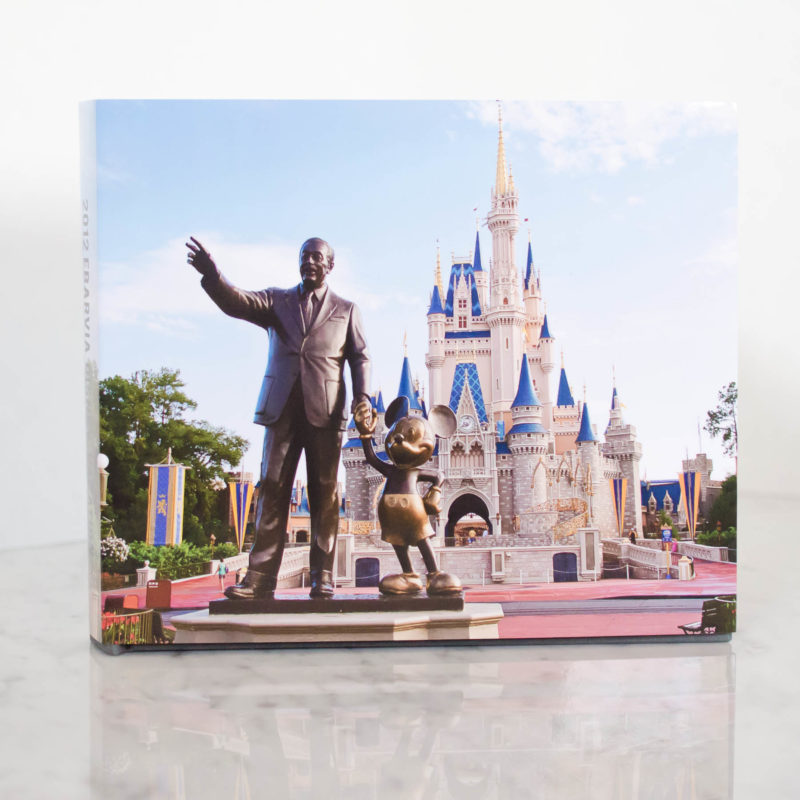
This cover comes from a recent family vacation book I completed. I will blog about this book later this month…but I love the cover. I thought this photo was perfect for the cover, so much so, that words were not required. The only text occurs on the spine of the book.


Photos copyright Tricia Ebarvia. All rights reserved. No reproduction of photographs permitted without expressed consent from photographer.
