by Stacey Wiseman | Feb 20, 2016 | Family Photographs, Inspiration, Photography Tip
Last year, I watched Modern Storytelling with Kirsten Lewis on CreativeLive (affiliate link) and loved seeing the way she captured families everyday life. I was aware of this type of photography but this workshop really opened my eyes to the art of making pictures that were real, humorous, emotional, and true in great light (when you can get it) and beautiful composition.
I purchased this workshop and re-watch it whenever I need to be re-inspired or reminded of how to look for those moments in my everyday life.
When I learned that she was going to be back on CreativeLive, this time teaching a workshop Photojournalism in the Home (affiliate link), I couldn’t wait. A lot of the content in this workshop builds on the lessons she taught in the first workshop. And while I really only able to watch some of the the first day, I’m catching the free replay while it’s on today.
My takeaways from Photojournalism in the Home are:
- To stay with a moment, an activity, a composition a lot longer than you think. Be patient. And take a lot of photos to get what you want. As Kirsten says, shoot past the moment. Even when you think you have a good shot, keep shooting.
- Don’t adjust the scene or prompt your subject. Again, be patient. Document the moment exactly as it is and make subtle movements in where you (as the photographer) are positioned instead of moving a sippy cup out of the way. Wait for action or moment you want without having to ask for it.
- Shoot with the crop in mind. Always square up and get as close (or far) as you need to get the crop you want while shooting. Minimal cropping can occur in post processing but her advice for photojournalism in the home is to capture the moment as you see it, crop included.
All three of those are something that I need to work on. I’ll often pick up things that I don’t want in the frame or ask my kids to repeat what they just did because I missed the shot. And I love to crop in Lightroom.
Here’s the thing. These tips are not ‘general’ photography tips. They are for shooting your everyday life as a photojournalist. That may not be what you want. I’m attracted to Kirsten’s style of shooting and her lessons because it’s about capturing life as it is….hopefully with a few photographic principles in mind.
I’m no where near her skill level but I love the challenge! As a professional photographer, the skill to define the moment is an extremely difficult task to achieve. Seeing how to bring light, color, composition, layers, and depth of meaning to a moment is an art. But for me and my desire to photography my family, it can actually be quite freeing to let go the idea of perfecting an environment and focus on capturing the moment as best as I possibly can.
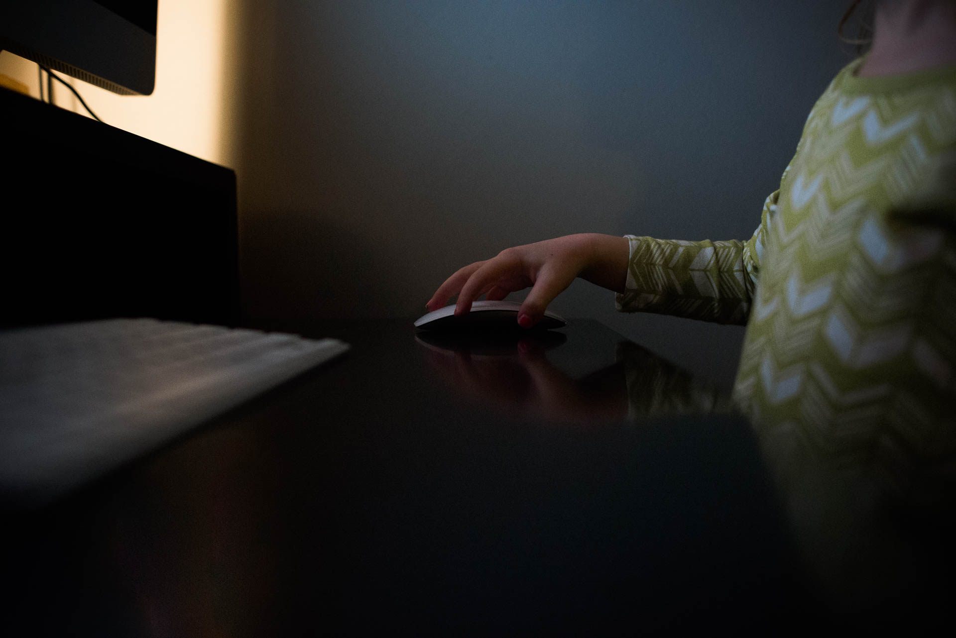
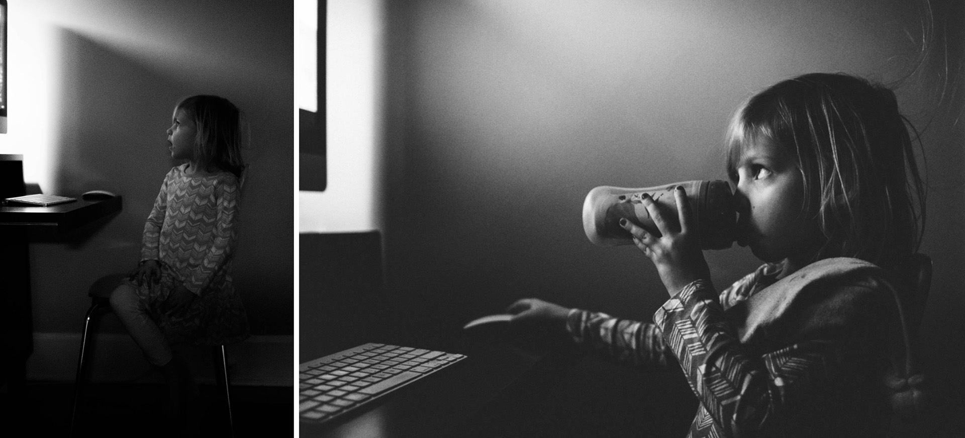
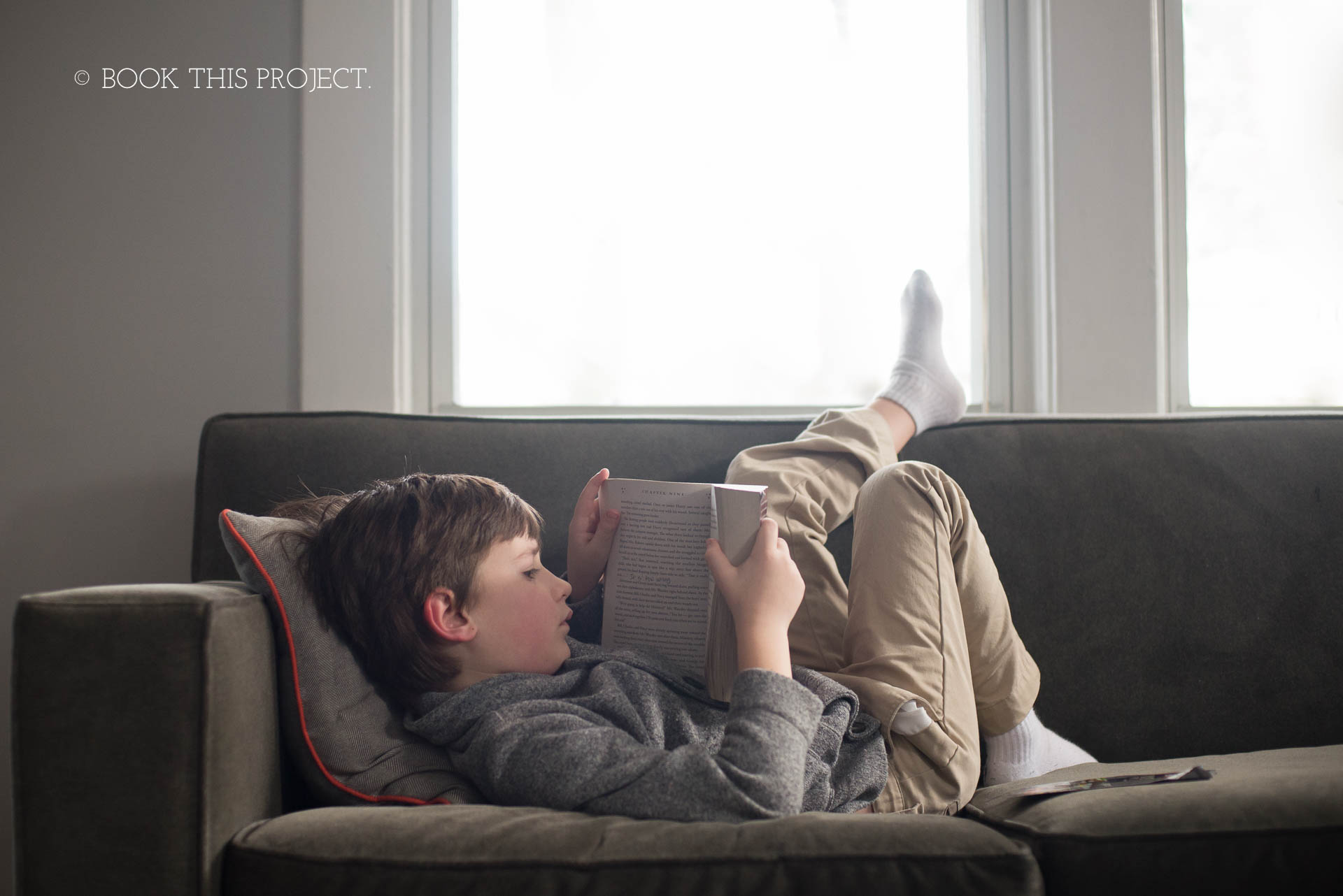
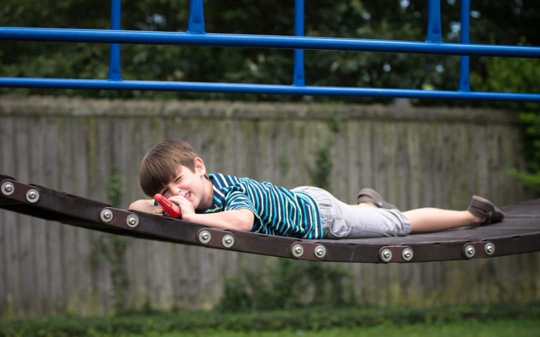
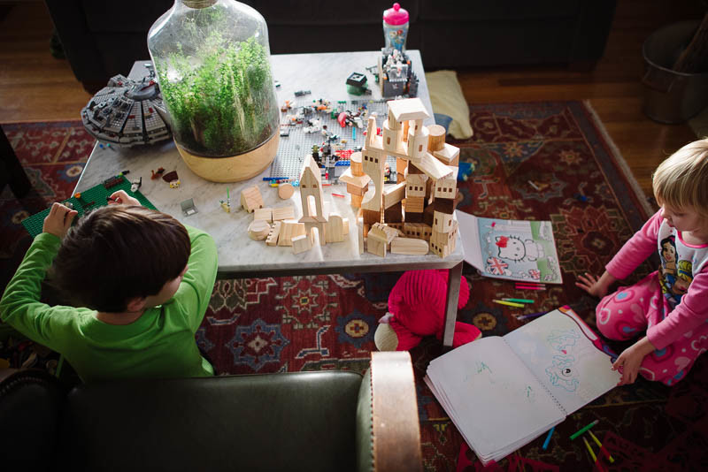
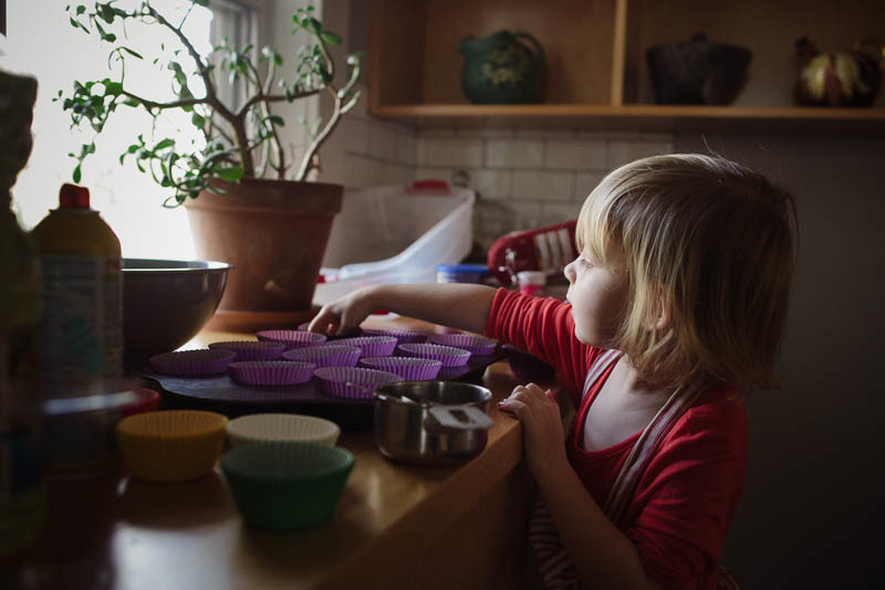
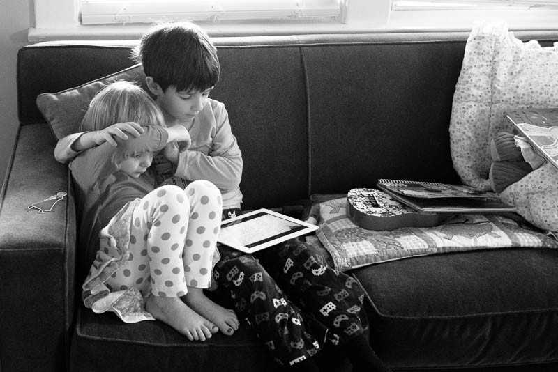
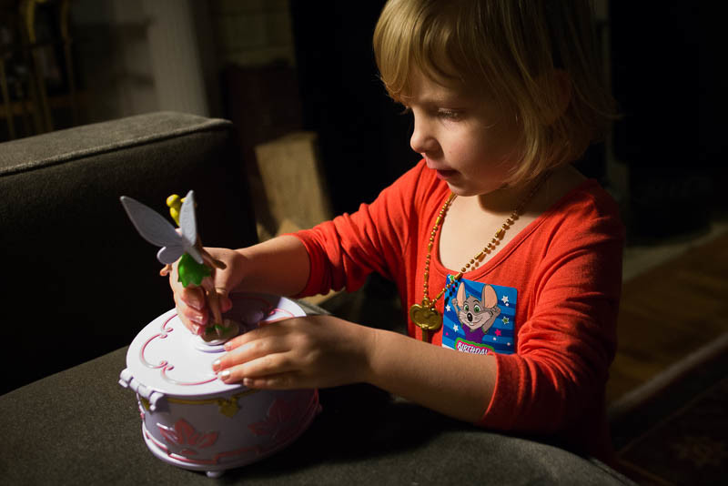
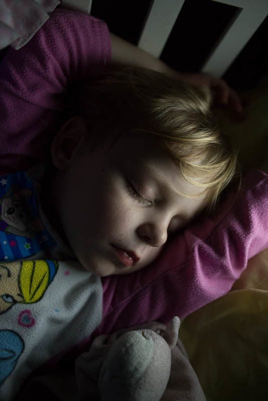
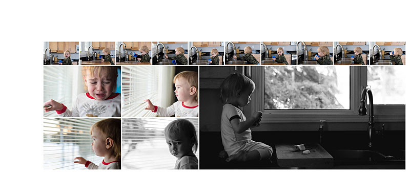
After the first day of her live workshop, I decided to attempt to take photos inspired by her lessons. Our photography theme in my mastermind this month is technology. I shot these photos with this intention – capture technology, stay with the moment, no prompting, and do my best to crop in camera (still working on this one ;)).


Not perfect but a fun attempt!
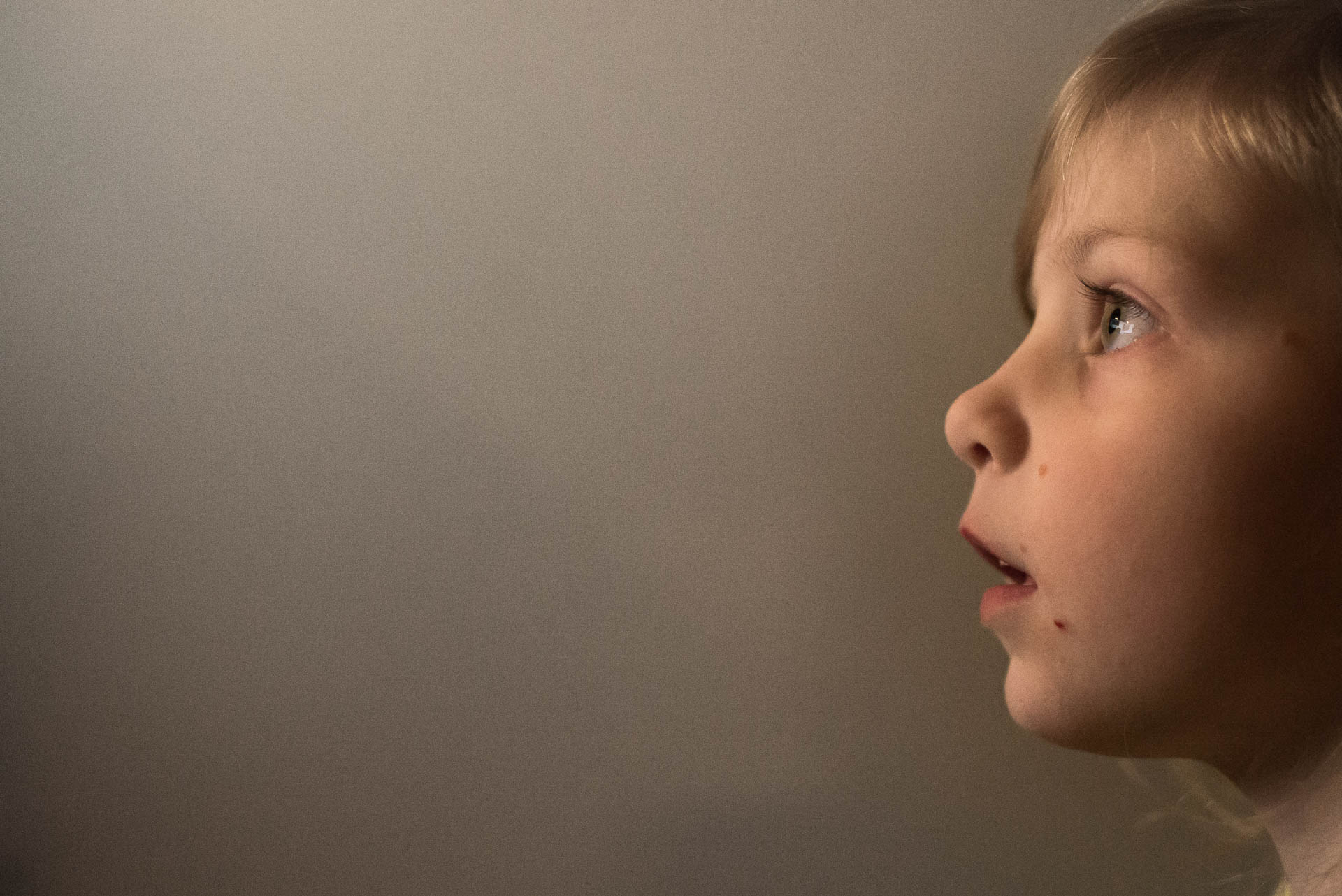
With this last photo, if you watched Kirsten shooting in a family’s home, she mentioned how difficult it was to photograph kids while watching TV because they have zombie face. So this last photo, it was my attempt to capture zombie face. Ha! Of course, I didn’t capture even a corner of the TV/computer but because you know I’m shooting for technology, it’s implied. This photo probably wouldn’t make sense on it’s own….but it’s another example of how I can compose and define context when I include it in a photo book layout.
This post contains affiliate links. I could receive a commission for any CreativeLive purchases you make after clicking on my link. I only provide affiliate links for products that I highly recommend.

by Stacey Wiseman | Jan 1, 2016 | Family Photographs, Inspiration, Motivation, Uncategorized
Happy New Year!!!
I hope you had an amazing 2015 and are looking forward to the new year.
As I’m sure you’ve read in SO many blog posts, now is the time to set goals and intentions for the new year. It’s something that I mention in my In One Hundred Pages workshop. One of the benefits of making an annual book is to see what you accomplished in the previous year in order to set goals for the upcoming year.
But even if you didn’t make a 2015, you can still gather up your absolute favorite photos of the year. Then make an assessment about what you shot and what was missing from your documentation. Use this as a guide to set what you would like to accomplish in 2016.
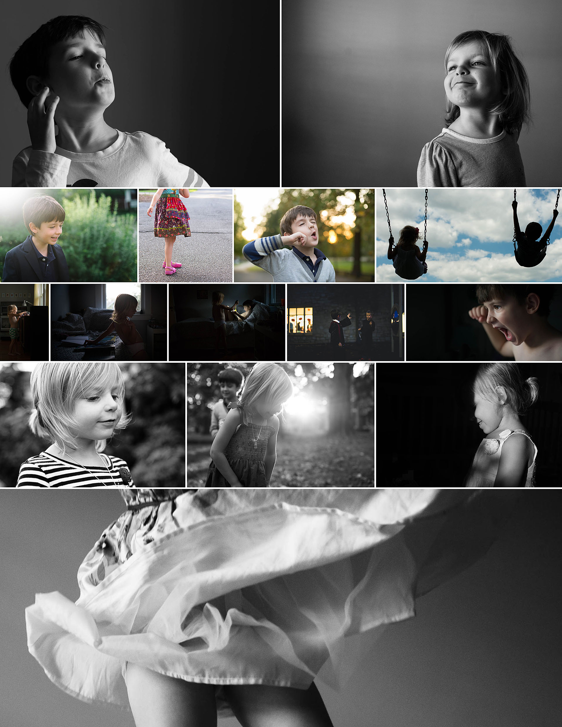
Here are my 15 favorite photos from 2015:
Besides my 2015 In One Hundred Pages photo book, I also make an End of Year Video capturing our snapshots and videos from the year. Check out my 2015 Video:
After reviewing these images, my video and my 2015 photo book, I want to take more everyday photos that tell a story through the composition and content. My go-to photos are portraits (of one kind or another) – which I obviously love – but I want to branch out and take more photos that document our everyday more beautifully.
So I’ve set my goal! What’s your 2016 goal? State your goal in the comments below.
Want to stay accountable with your photography and photo book 2016 goals? Sign up for my emails to get the details about my 2016 Mastermind Group.

by Stacey Wiseman | Aug 20, 2015 | Family Photographs, Inspiration, Photo Book Design Layout, Uncategorized
It’s Back-To-School Time!!!!!
Of course, you’re well aware if you have a kid starting school….or have opened up your facebook feed lately.
My oldest started first grade last week. And since I’ve already given advice to moms with their oldest heading off to kindergarten, I thought I’d share how moms with kids of any age can turn those back-to-school photos into a really fun layout for their annual photo book.
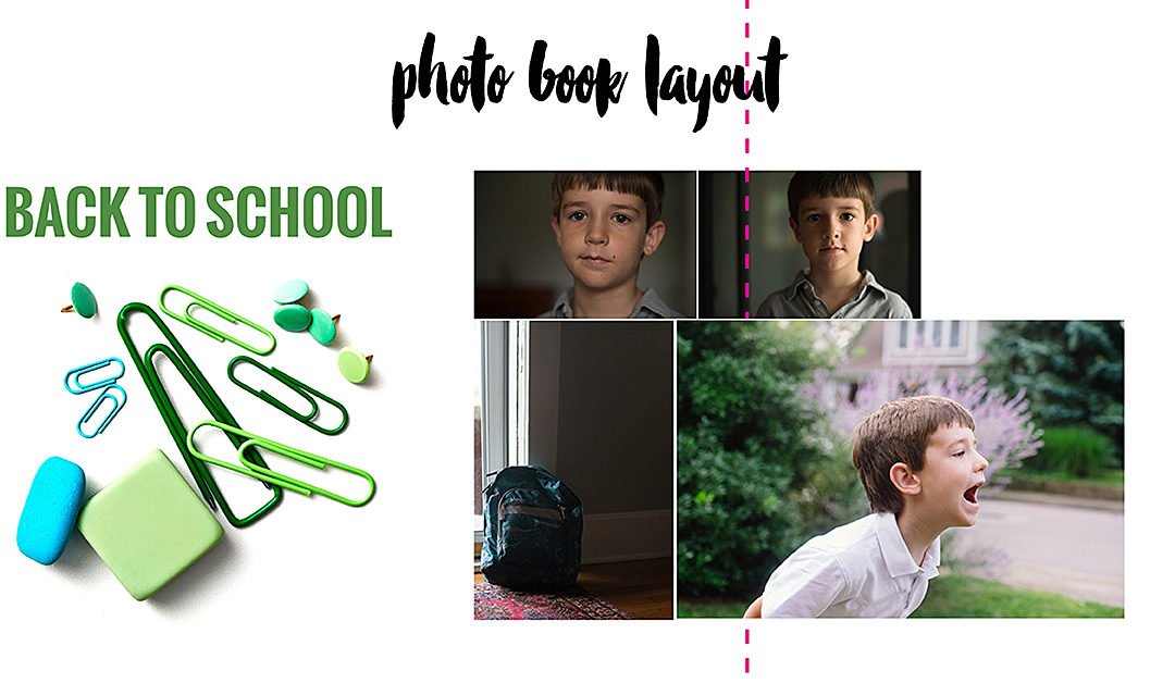
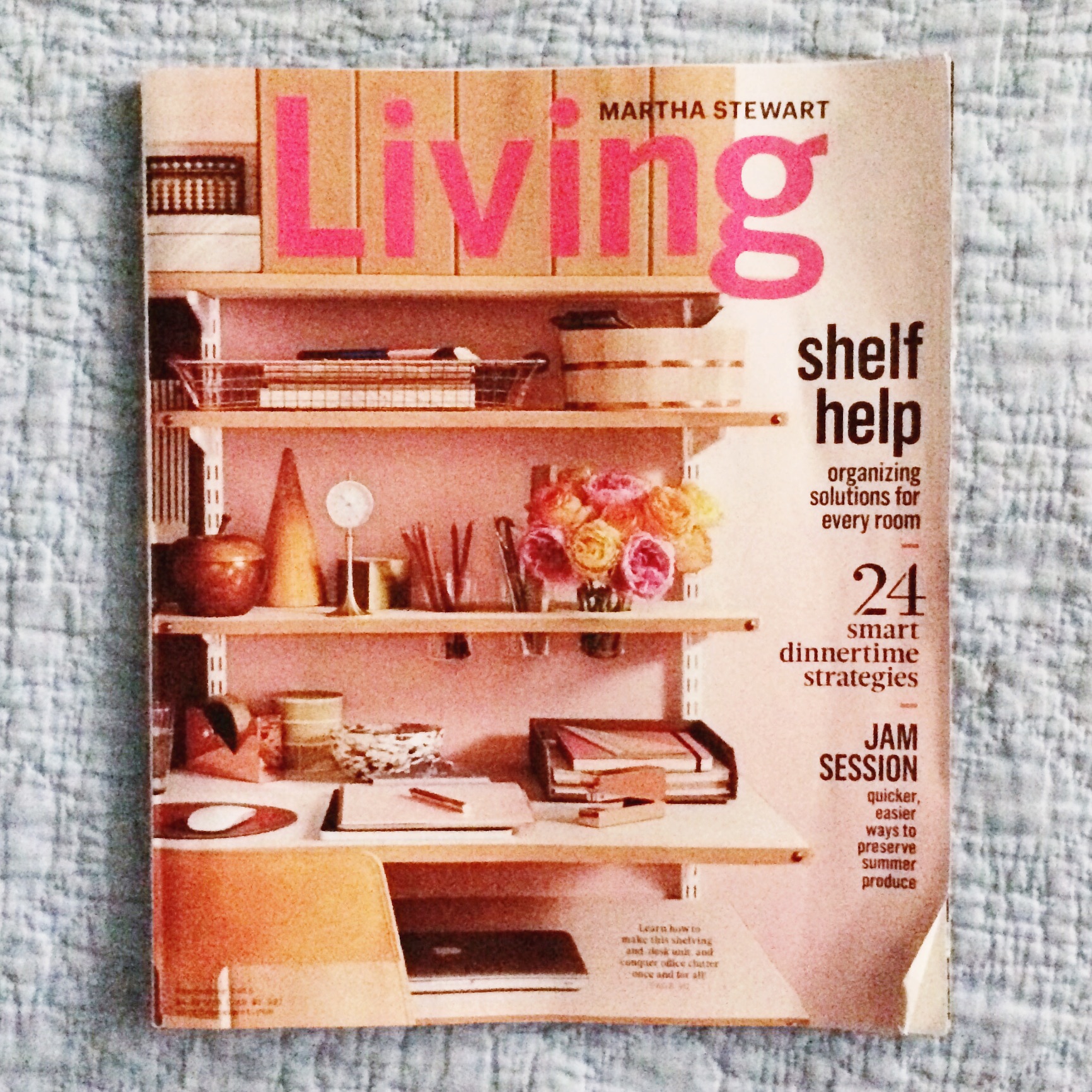
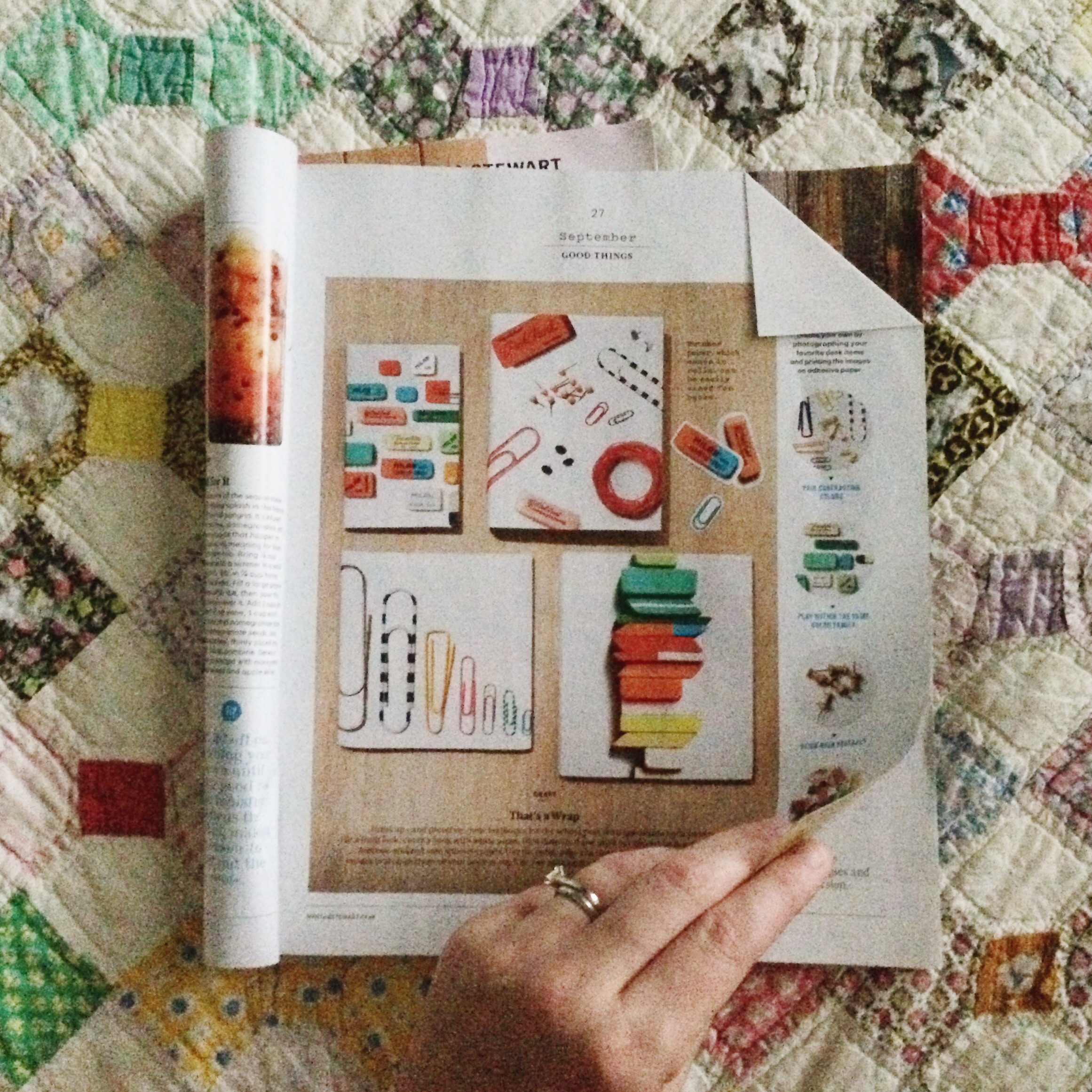
When the most recent issue of Martha Stewart Magazine landed in my mailbox, I noticed a really fun “Good Thing”. The magazine featured clip art of familiar and retro back to school items, like paper clips, erasers, and pins. They recommended downloading their free graphic to use them for school book covers.
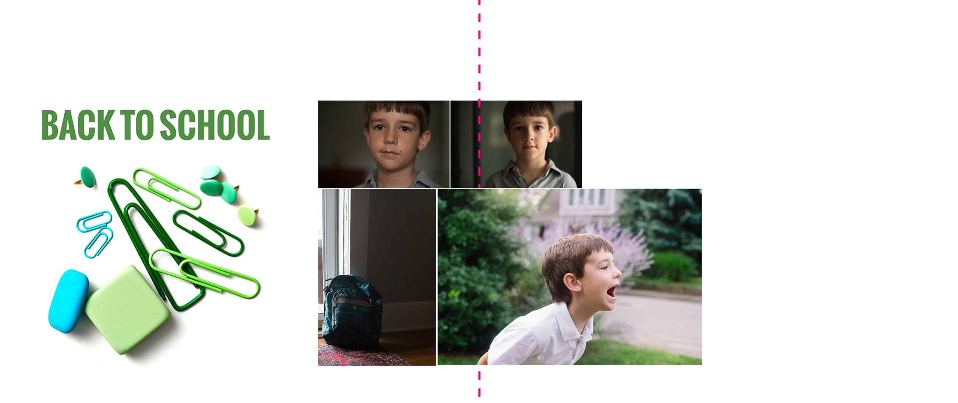
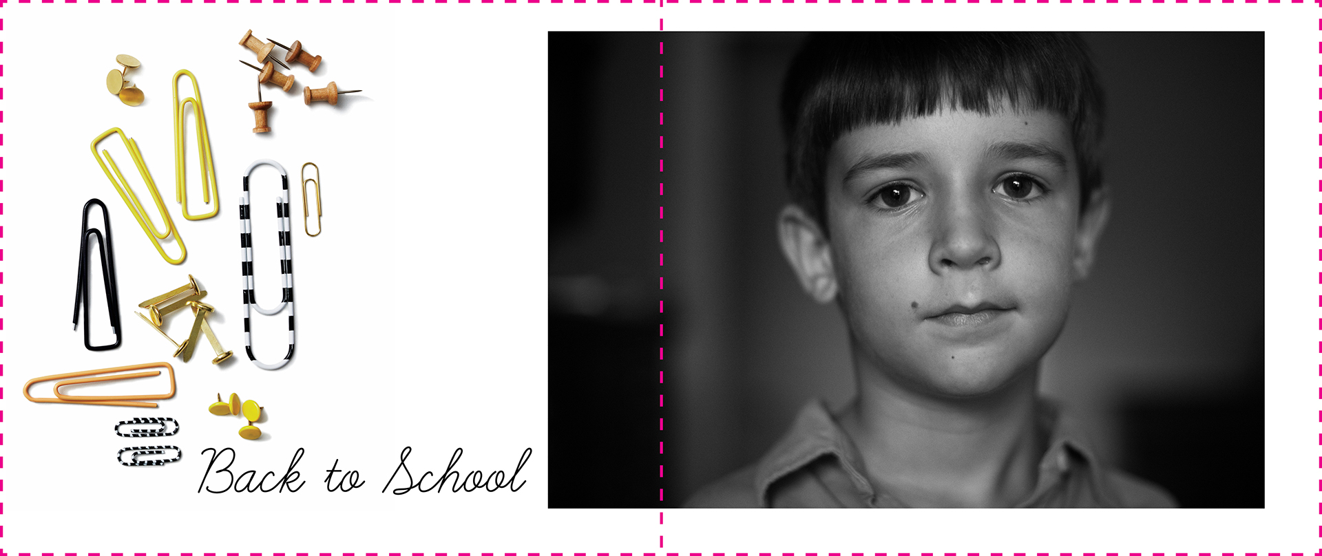
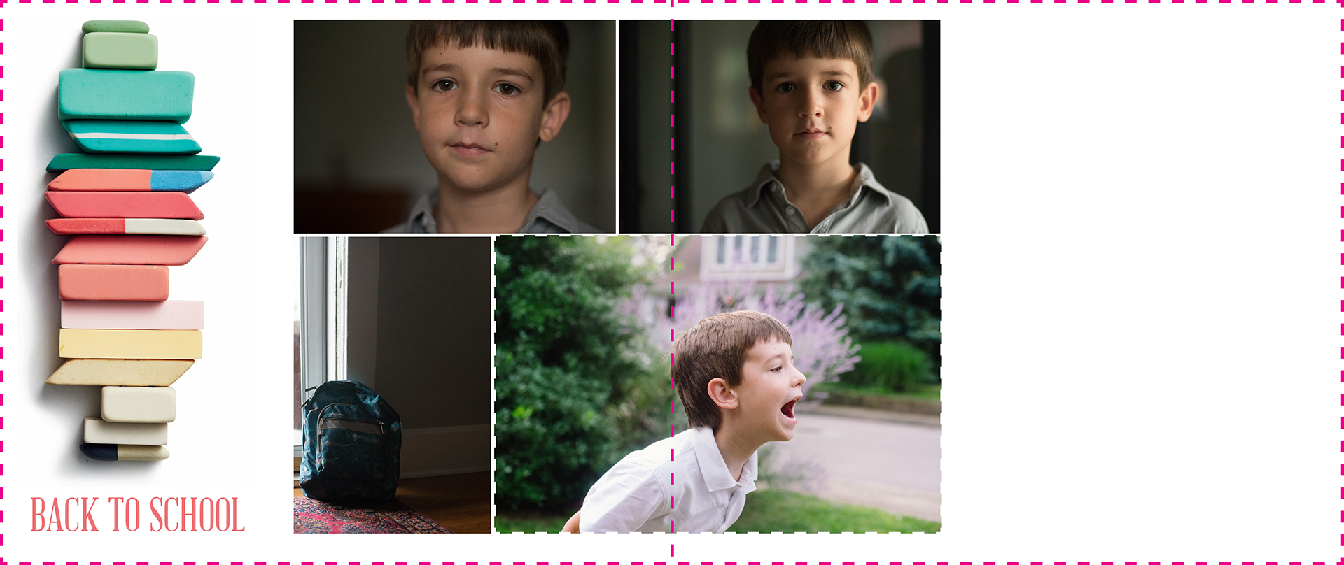
Since my mind is always thinking about photo books….I wondered how it would look to use these in my personal photo book alongside my son’s obligatory Back-to-School photo.
To be honest, these photos are never my favorite. They always feel forced and my son always has really, really puffy eyes in the morning. I liked the idea of using a graphic to liven up the page and make this milestone event a little more fun in its presentation.
Instructions:
If you like my layout examples below, follow my simple instructions to add a little extra somethin’ to your photo book!
1| First, buy a copy of Martha Stewart Living and turn to page 27 for the free download link.
I highly recommend this magazine, not only for the great advice and the free downloadable items they provide each month….but it’s also beautifully laid out and a source of design inspiration. If you don’t already have a subscription, pick up a copy during your next grocery store trip.
2| Go to the website to access the free downloadable graphics.
3| Once you’ve downloaded the graphic, determine which one you would like to use. Open up that particular PDF page in photoshop. Use the rectangle tool to select the area you want to include.
A simple {open apple} +C, {open apple} +N, and {open apple} +V is all it takes to copy and paste into a new file.
4| Save the file as a jpeg into the folder where you keep all of your annual photo book photos. If you don’t have one yet….create one now. You may find other items you want to include in your book that are not from your camera.
5| Finally, insert this photo into your photo book as you would any other photo. Add your kids’ back-to-school photo plus any title or text you want to include and you’re finished!
Here are my examples:


by Stacey Wiseman | Aug 9, 2015 | Family Photographs
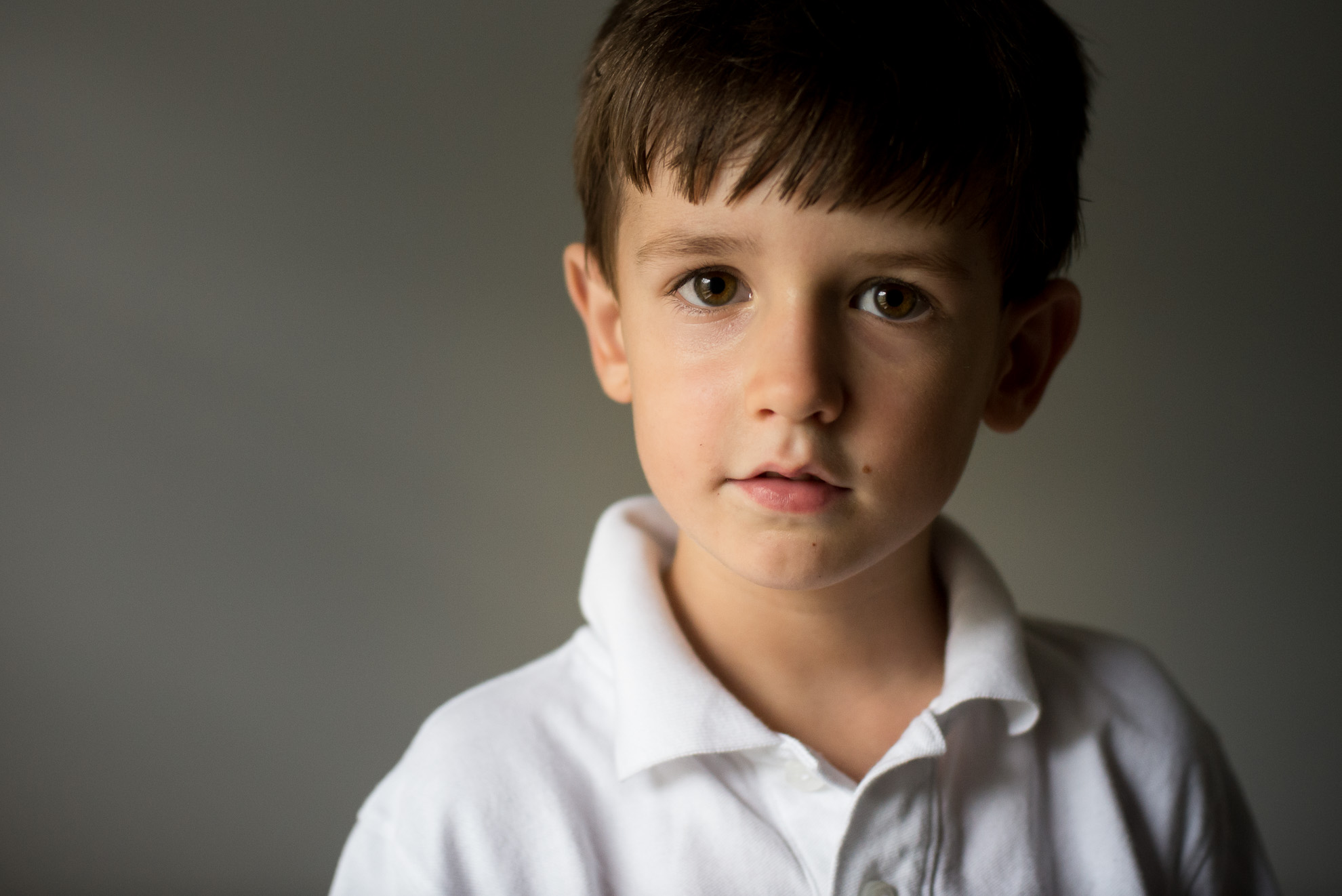
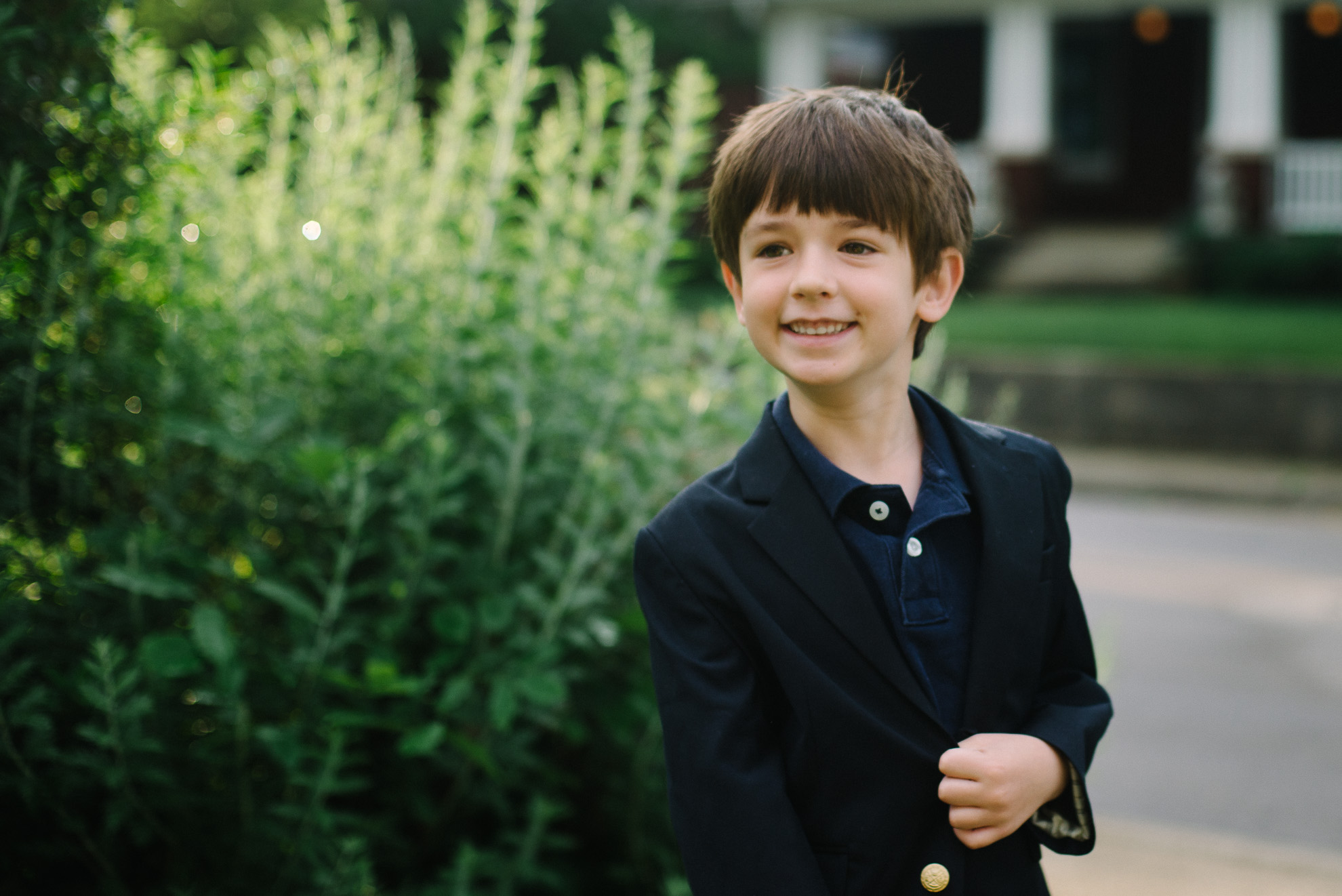
Around this time last year, I was sending my oldest kid off to kindergarten. It wasn’t something I was horribly emotional or stressed about. However, after about two weeks of him entering the imposing 3-story school, I realized this was a big event. He wasn’t adjusting as easily as I originally planned.
My oldest was the one who took every adjustment in stride. End of breastfeeding – no problem. Out of the crib into a convertible bed – easy. Full day preschool – of course. Kindergarten. I thought, done deal. But it took some adjusting. It wasn’t horrible…but required extra attention.
We made it few the first couple of weeks and all of the sudden, he got it. He understood the rhythm, the flow, the procedure. From then on, we were smooth sailing. It was remarkable to see him grow, make new friends, understand the dynamics of school – classes, lunchroom, gym, recess.
As with all parenting, in his new stage, my husband and I learned a new routine as well. I thought I would share a few things I learned during my oldest’s first year in kindergarten.
1. Capture a before and after.
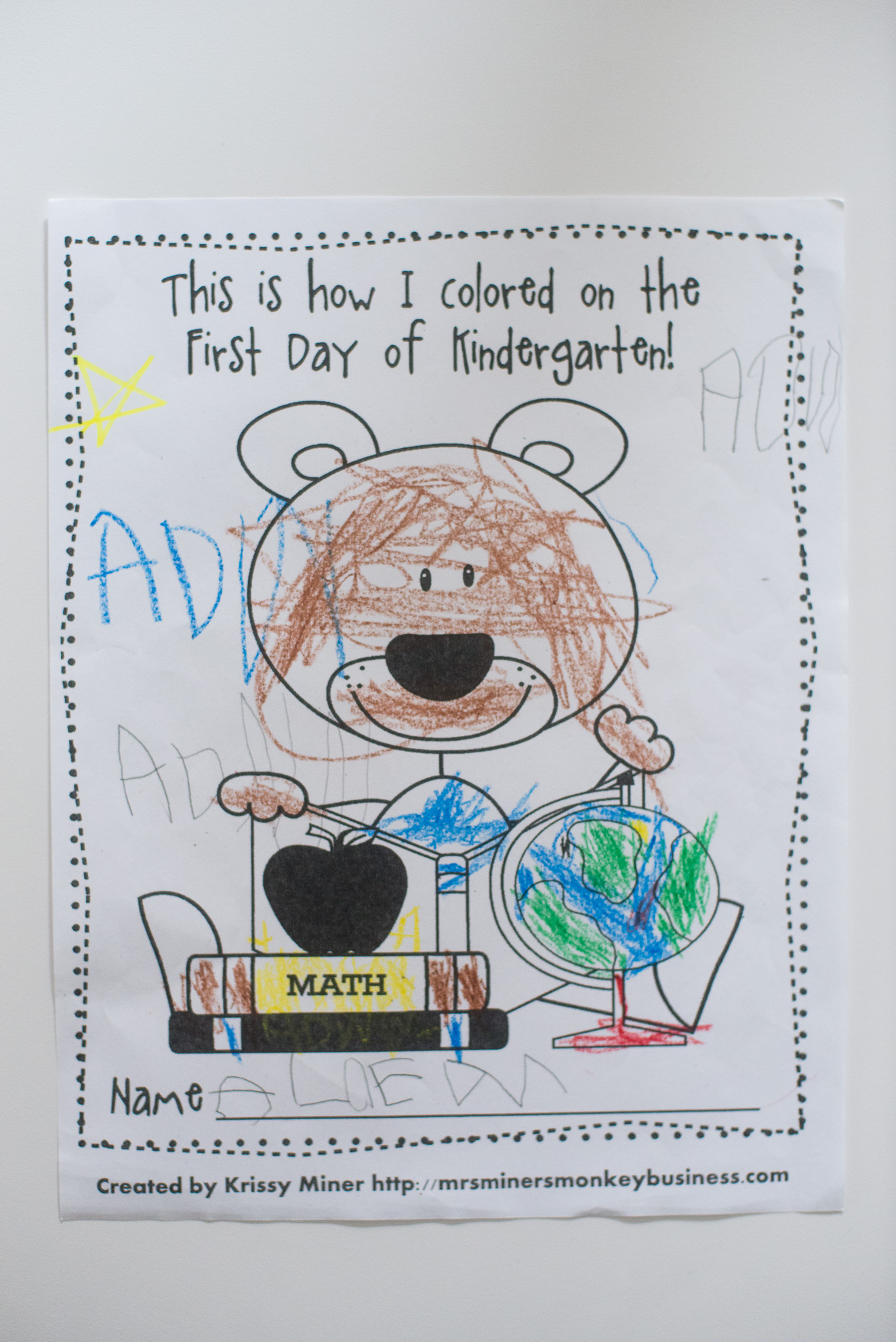
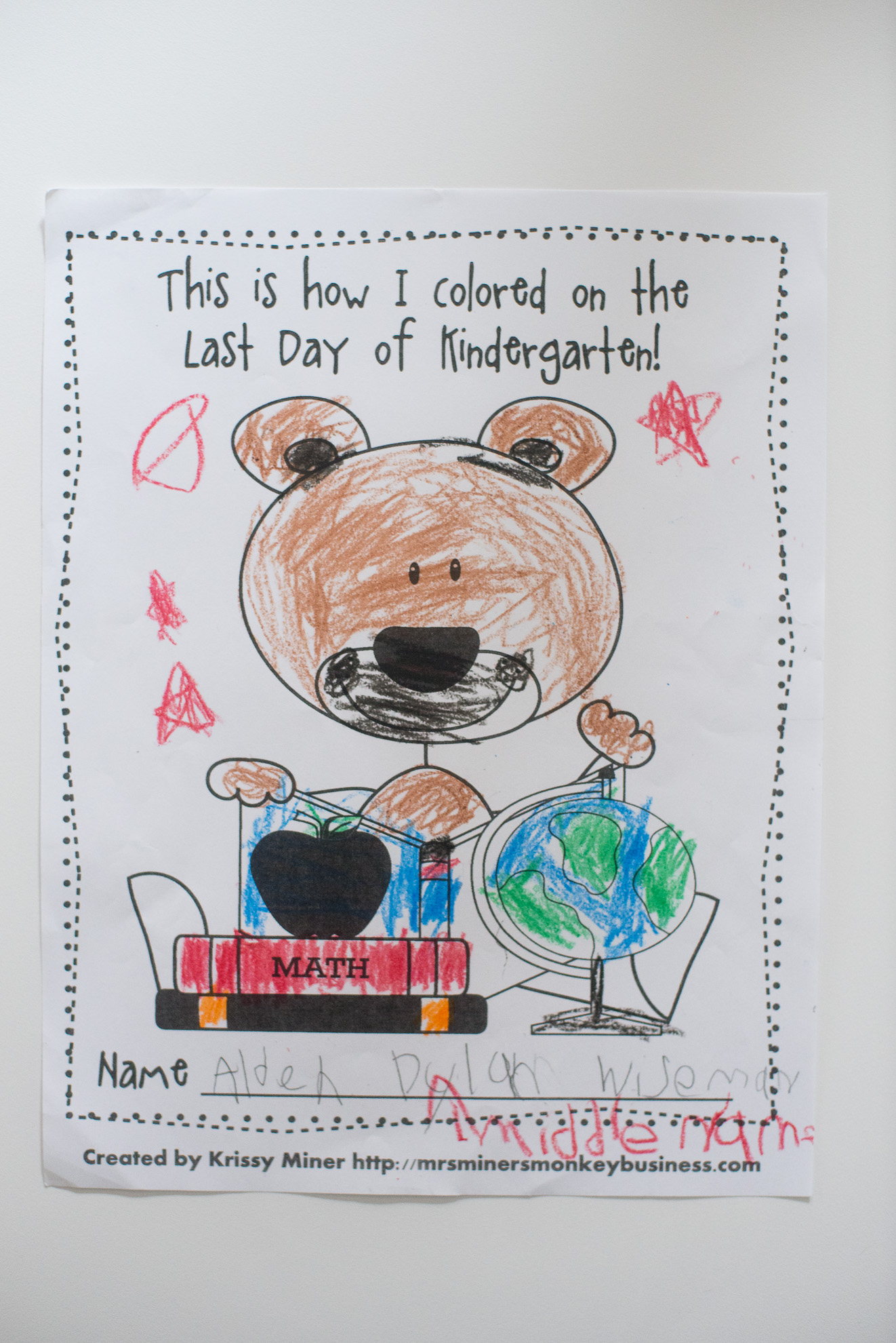
It’s pretty common to take a photo of your kid on the first and last day of school (as shown above). But it’s also important to note other then-and-now-type photographs and activities to mark the year. In my son’s classroom, they had a similar sheet to color on the first and last day of school. This was so much fun to see! While my son’s coloring skills may not be first rate, 😉 I do see improvement!
2. Find a homework spot.
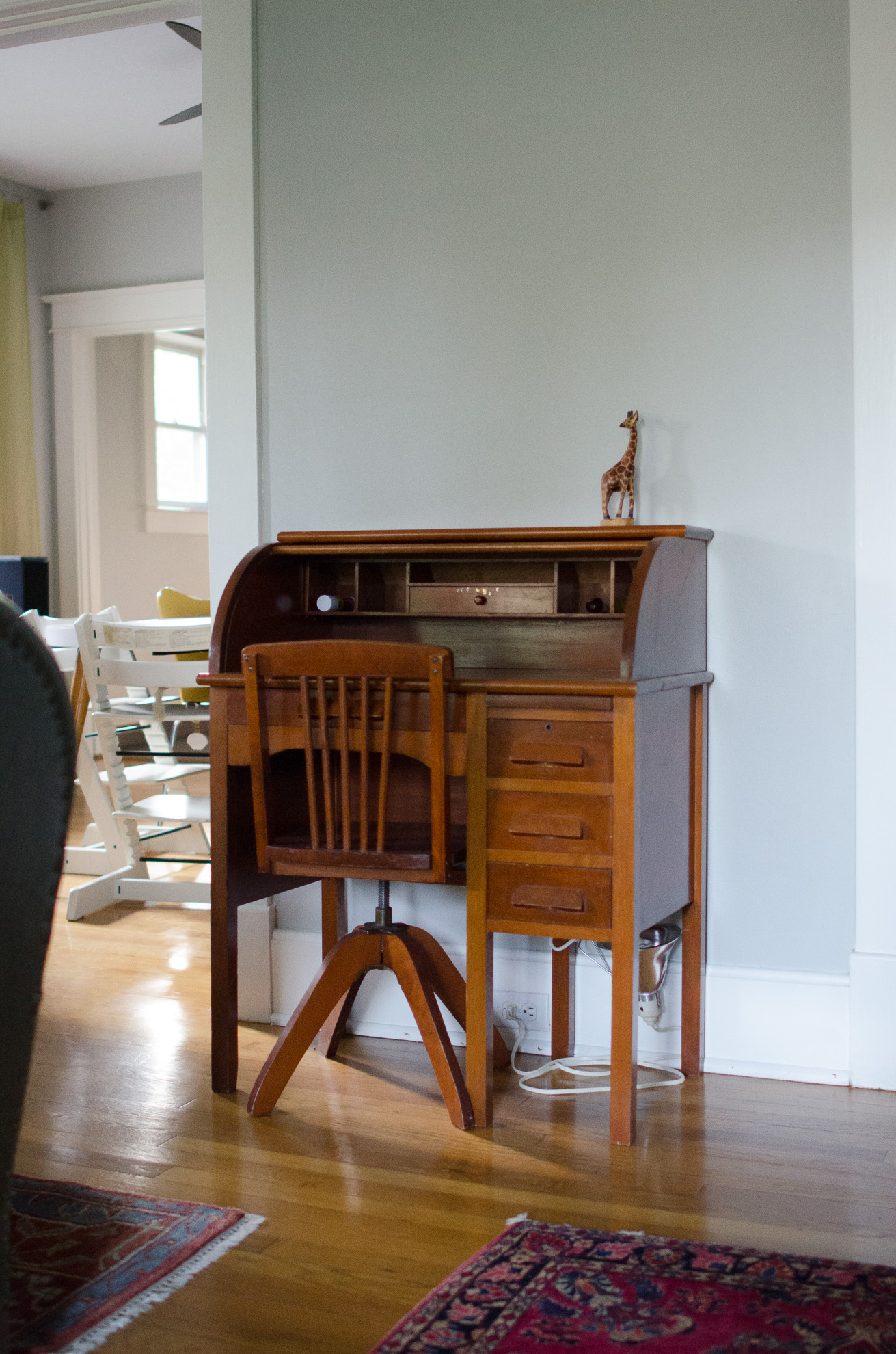
It surprised me to learn that in kindergarten, they have homework. I don’t remember having homework in elementary school – let alone in kindergarten – but at my son’s school they have homework every night. The exercises are pretty easy….it’s mainly to get them in the habit of doing some school work in the evening. To reinforce this lesson, we tried to establish a place for my son to do his homework. For most of the year, homework was accomplished on our dining room table. At the end of the year, we received a beautiful, hand-me-down desk which will be perfect for these small school exercises.
3. Kindergarten comes with paperwork.
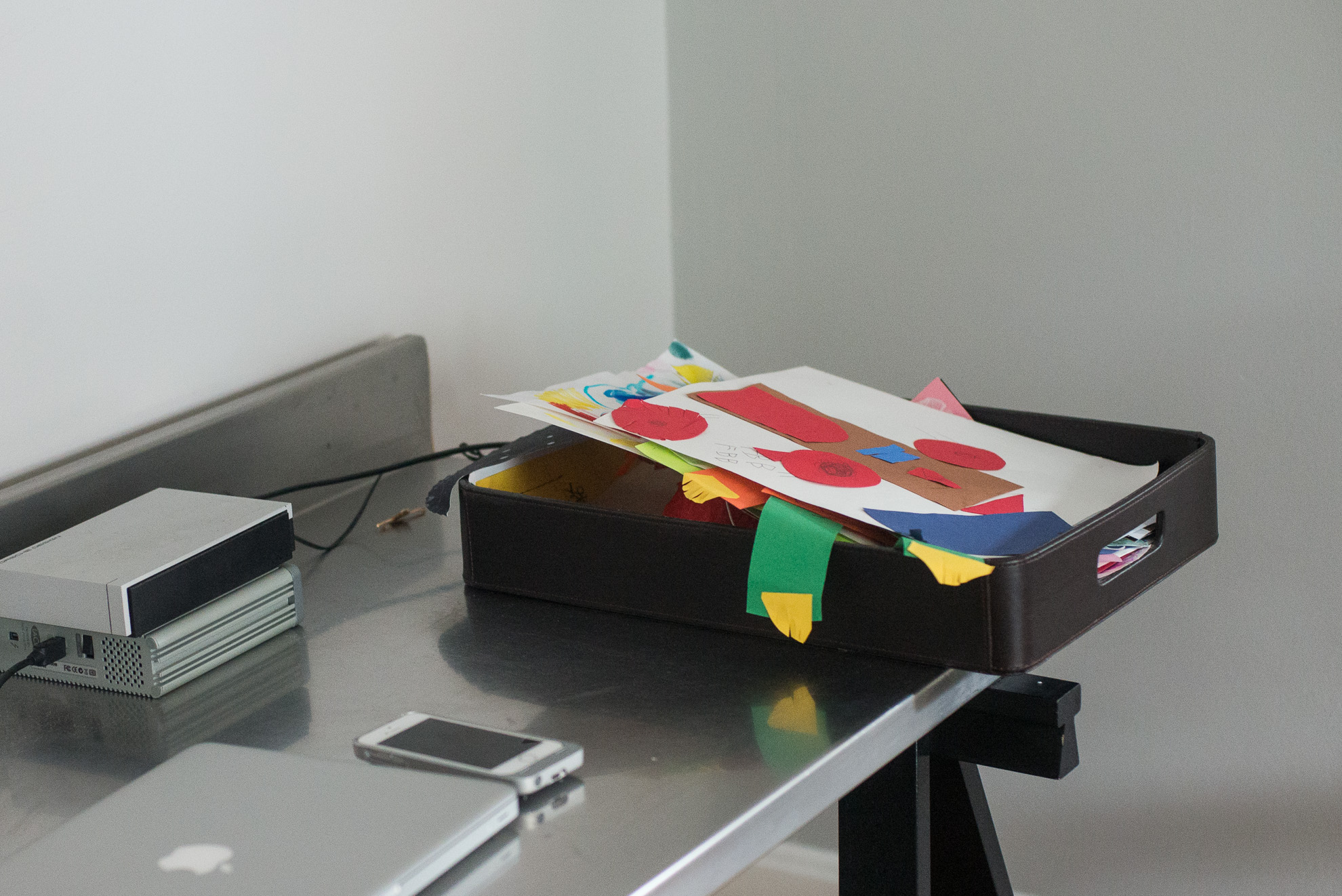
Oh man!!! I completely underestimated the amount of paperwork we’d receive. At the end of each week of preschool, we would receive a couple of cute pictures our little one painted. In kindergarten, it’s like 3-5 papers a day. I was overwhelmed by the number of items he was bringing home. Having a basket or tray to collect the paperwork each day was a must. At the end of the week, I’d go through and decide what I wanted to keep (for a photo book) and what could be thrown away.
4. Holes in the knees.
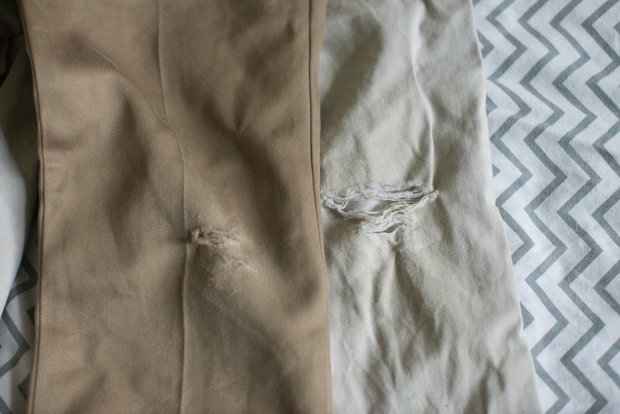
I don’t understand why….but being in kindergarten was the first time my son ever had holes in his pants at his knees. Maybe it was gym class or excessive playing during recess. All I know, we never once had a pair of pants with holes at the knees and after kindergarten, it was every single pair.
5. Prepare for school events.
They’re cheesy but also amazing when your kid is involved. School plays, musicals, and performances were so much fun to see. At my son’s school, there were quite a bit of things to attend – all of them amazed me. The songs and dances he learned stuck with him all summer long. During his end of year performance, it took over 75 minutes for me to locate my son but it didn’t matter. I loved that we were participating in his school activity.
6. Prepare to be amazed.
Kindergarten is a foundational year. It’s a time where the teacher lays the groundwork for all future learning. In the fall, routines were adjusted, classes were introduced and sight words were learned then all of the sudden, everything clicked. In the spring, my son just got it. He started reading and understood the whole school dynamic. It was amazing!
Your Turn.
I’d love to hear from you! What advice would you give to moms with new kindergartners? Or what surprised you the most about your kids’ first year of school?
If you enjoyed this post, sign up for my emails to get a peak into how I document my family’s everyday moments and print my photos in a photo book.

by Stacey Wiseman | May 20, 2015 | Family Photographs, Inspiration, Photo Book Design Layout
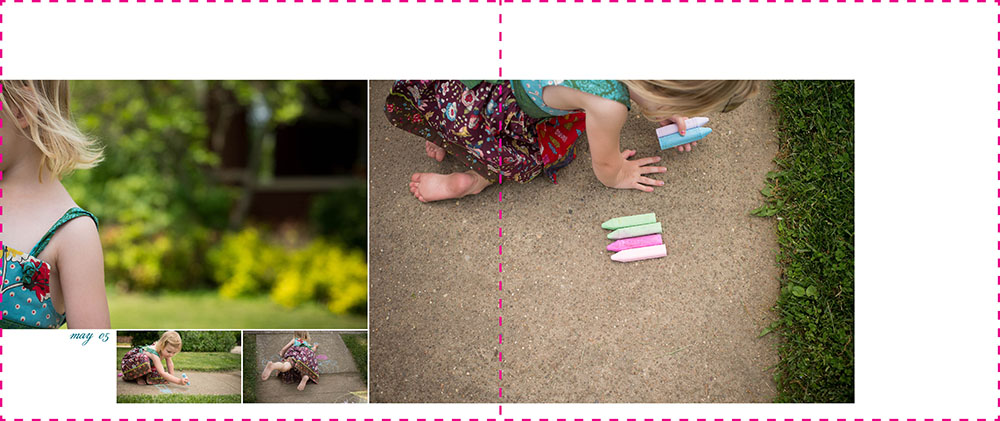
When designing a photo book, an event can be slightly redefined. It doesn’t have to be a huge deal, such as a birthday party or celebrating a graduation. It can also be a smaller activity, like an afternoon of coloring, playing legos, or picking out clothes.
Photo books are actually a collection of these types of events – or moments. Today, I want to share how you can design a layout for a small group of photos describing an everyday event.
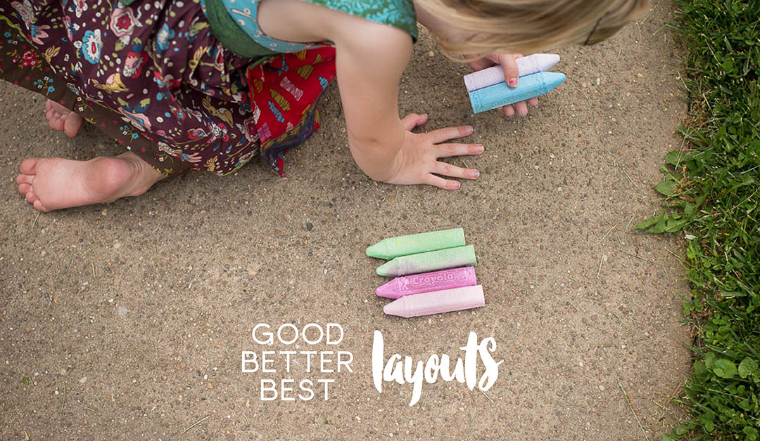
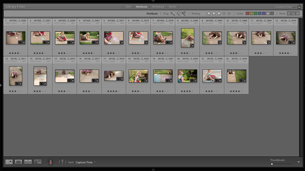
A couple of weeks ago, I was working on a challenge within David duChemin’s The Visual Toolbox for The Photographer Within’s forum. For this particular lesson, we had to capture our subject in a variety of angles and perspectives. When my daughter wanted to use sidewalk chalk, I knew this would be a good time to practice.
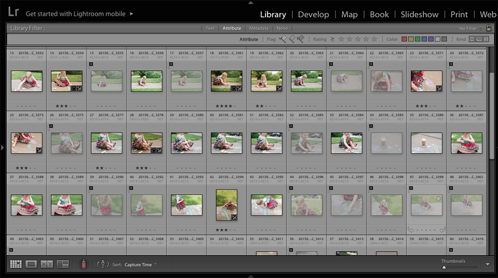
Here are the photos that I captured:


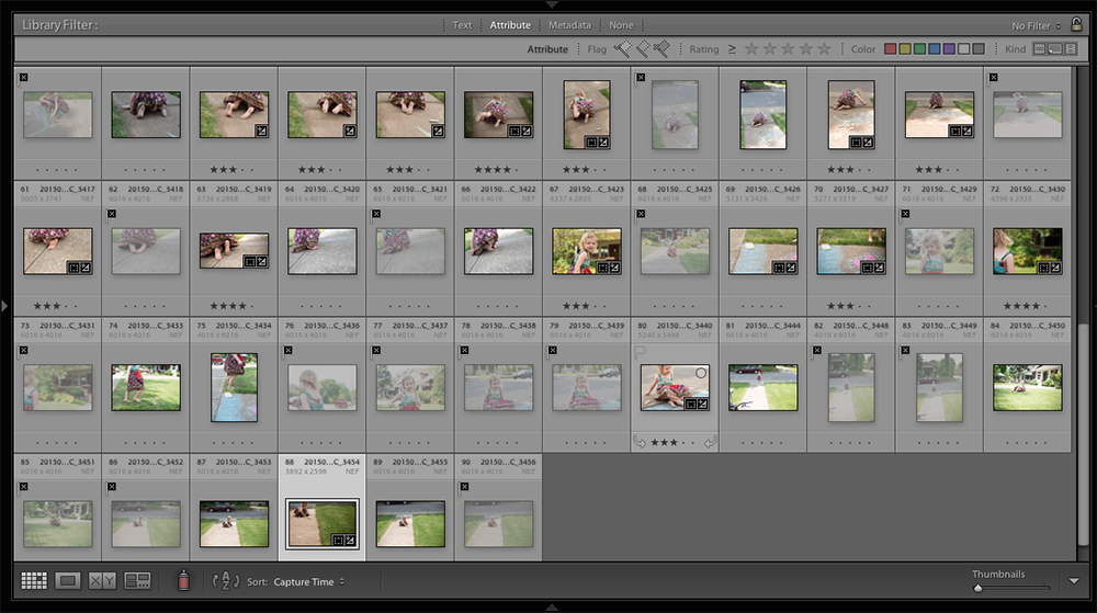
Notice how many photos I’m deleting versus how many I’m keeping. You’ll also see that I’ve starred my favorites. I start with three stars. Once I’ve selected photos that achieve the variety of angles and capture a part of the story, I filter all of my 3-star photos.
My 3-Star Photos

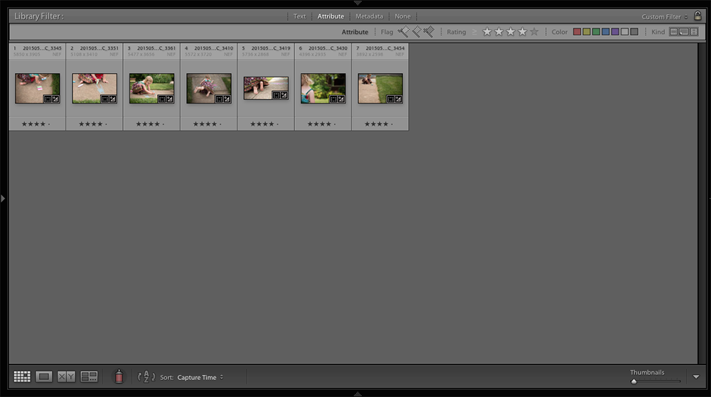
The next step is to narrow down my selection even further by designating 4-stars. These are the photos that really tell the story without being too repetitive.
My 4-Star Photos

With the 4-star photos filtered, I now make sure the editing is exactly the way I want it for a book. I check for white balance and exposure consistency.
When ready, I export out my photos and move to my book design software.
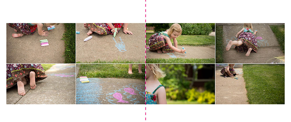
Good Layout

One option for a layout is to prepare a normal grid of photos, vertically centered on the page.
This works but is kind of typical (read: too boring for the activity).
Better Layout

With these photos, I want to accentuate certain actions or details. In layout design, you can use the size of the photo box to establish hierarchy.
This layout improves on the first by adding a central photo that is larger than the others.
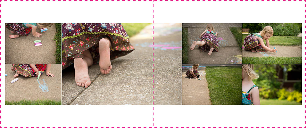
Best Layout

While there is more interest in this layout, I wanted to test out one more layout. In the final layout, I reduced the number of photos and paid more attention to where the white space is happening on the page. Also, I used three different sizes of photo boxes making for a more dynamic layout. Finally, I added the date to complete the layout.
Take Action!
That’s how I work through my photo selection and book layout process. Good, better, best!
Of course, the varieties are endless. You could imagine a completely different layout for these photos, based on your style and preferences. It’s what makes photo book design so fascinating.
Hopefully, this has inspired you to get out there and document an everyday event and create a layout for your photo book!
To get even more layout design inspiration – and – a special discount on my signature workshop, Document Your Year, sign up below for 5 free design lessons.

by Stacey Wiseman | Mar 23, 2015 | Family Photographs, Interview
I’m super excited to showcase Erica Caligiuri in my Monthly Interview series. Erica is one of my favorite photographers who capture their everyday life with personality and beauty. There is a subtlety and humor to her photographs that instantly place me into her home….and life. I love the way she uses color, light and storytelling. Whenever she posts a photo, I instantly know what compelled her to take it.
She’s participating in a monthly video challenge where she documents each month in a short video. Just take a look at her most recent February video – You’ll see her creativity and humor right away. Amazing, right?!?!
Make sure you check out her blog and follow her instagram feed!
Now for our interview:
1| Me and My Camera:
I shoot with a Canon 6D, Sigma 35 f/1.4, Canon 50 f/1.4, Canon 24-105L. I also have an EOS-M that’s great when I want more portability.

2 | My Family:
My husband (and prom date!) Nick, son Ferris, daughter Athena. Funny story about this – in January, I realized that I didn’t have a boring old picture of us in front of the tree, so we put it back up just to take a few! I knew I would regret not having this from our first Christmas as a family of four.

3 | My current photography challenge:
Trying not to overshoot. I don’t want to leave my children the digital equivalent of an attic full of old newspapers. My goal is to keep 200 photos a month, but I almost never make it.

4 | What I have time for now:
My goal for 2015 is to put together 1 video a month. I love capturing the movement and sounds of my children. The process also helps me be thoughtful about what I want to capture and how. Last year, one of my favorite projects was a video of transforming our office into a nursery, capturing my belly growing along the way.

5 | What I don’t have time for now:
I would love to do a color study, and focus on one color per month – working with contrasting colors, seeing how colors convert to BW, experimenting with mood and color. Maybe next year!

6 | My favorite photography subject:
Though my children are often my subjects, they aren’t my favorite. I can too often shoot from a place of anxiety about them growing up and changing so fast. I enjoy shooting new places, when I don’t have any pressure to get a particular shot, and can just let myself be surprised and inspired.

7 | My favorite place to photography inside my home:
Our bedroom.

8 | My favorite time to photograph:
I don’t have a favorite time! I look for whatever light can be a supporting element to a good story.

9 | My favorite photograph right now:
Thank you to my husband for being an awesome human tripod!

10 | What tip, trick or info helped your family photographs the most:
For photography in general: Learn to see light, tone, and contrast the way your camera sees it. Never stop learning about light! For practice, I walk around with my spot meter on, trying to guess how many stops difference between different elements, then I turn on the LCD with histogram to see if it looks the way I envisioned. For family photography, my tip is not to oversimplify your frame. When I was first learning, I thought it was more professional to eliminate “distractions” from the frame. Sometimes that’s a good strategy, but it’s also important to figure out how you can include elements in a thoughtful way. Use the evidence of life (toys, decor, etc.) to add scale, balance, contrast, depth, context, texture, story, etc. Oh, and one more thing- practice with purpose, and don’t practice on your kids! It took me too long to figure that out. It ends up being frustrating for both of you, and getting a cute expression clouds your judgment about whether you’re learning whatever concept you are trying to learn.

Are you addicted yet? She’s really great and I hope you’ll continue to follow her photography.
A big thank you to Erica for letting me interview her!
Would you like to be interviewed? Simply send me an email {info@bookthisproject.com} and I’ll fill you in on the details.

by Stacey Wiseman | Mar 12, 2015 | Family Photographs, Photo Book Design Layout, Photograph
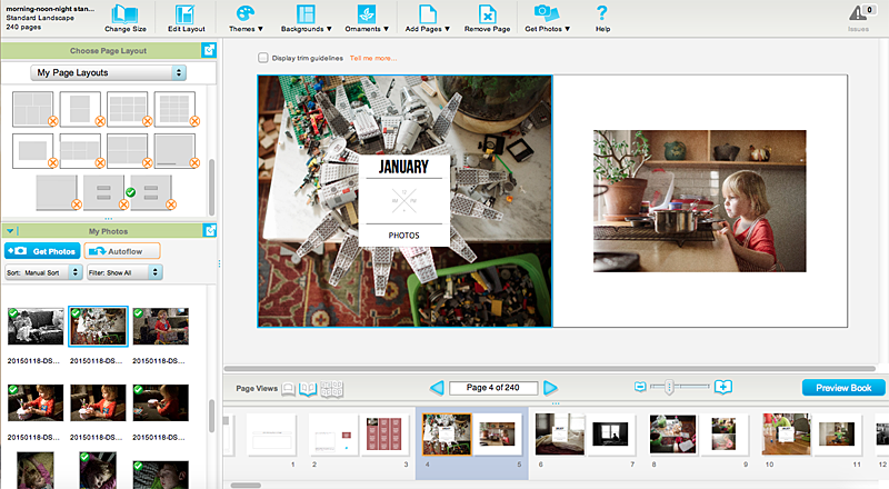
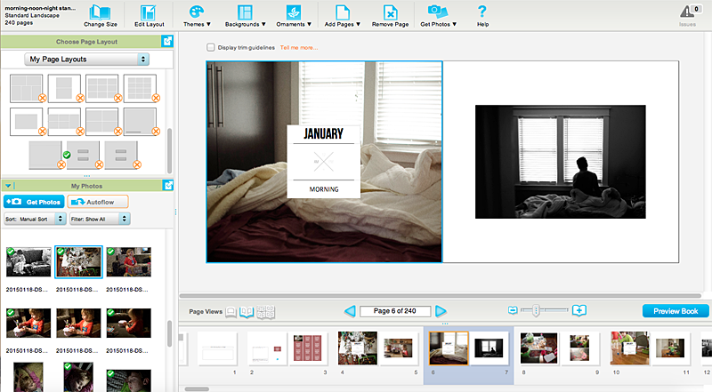
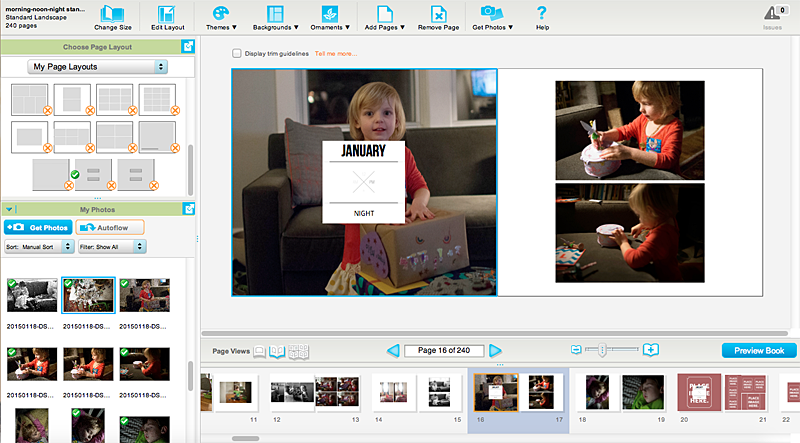
I finally had a chance to pull together my February Morning, Noon, and Night photos. For an added bonus, I even found time to place these photos into my photo book! We had a large snowfall last week that kept us indoors for most of the weekend. It was the perfect opportunity to get caught up with my photos.
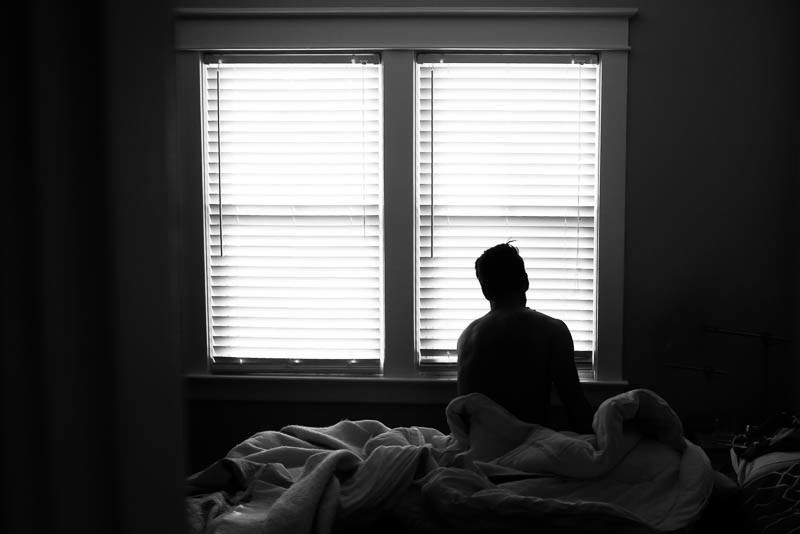
In February, we had a relaxing morning. My husband was drawing which led to my daughter wanting to follow suit. After lunch, my son had a birthday pool party to go to. It’s been about 6 months since we’ve been swimming so this was a lot of fun. The evening included a little silliness, my kids playing with my iPhone.
Morning


Noon


Night

Book Layouts


Are you participating in my monthly challenge? Leave a comment with a link so I can check it out!

by Stacey Wiseman | Jan 22, 2015 | Description, Family Photographs, Photo Book Design Layout, Promotions, Uncategorized
Last weekend, I photographed my morning, noon and night. It’s so great to capture the everyday moments to see how they remain the same and how they change. It’s an easy way to document your life without the huge commitment of taking photos every hour.
This removes the overwhelm from the selection, editing and design process. In fact, for my January submission, I shot 162 photos and selected 29 to edit. I ended up using 24 of those photos. With that simple process, I’m well on my way to design an annual book.
Of course, this book may not include all of the details (chances are….I’m going to design that book too!), but if this is the only photo book you think you’ll make all year, it’s a great one to touch on the details that make up your life.
Morning


Noon


Night


The best part is, I’m working on my book each month as I shoot. Here are a few of my pages.


Want to join along?

by Stacey Wiseman | Jan 20, 2015 | Description, Family Photographs, Photo Book Design Layout

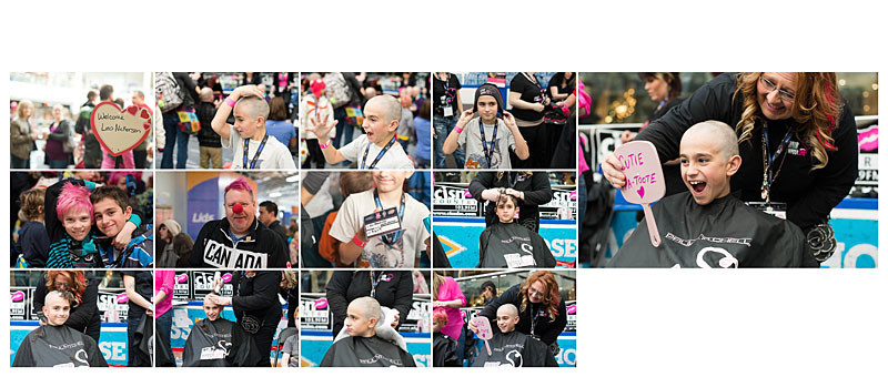
There’s something so magical about being able to design a family’s photo book year after year. This past year, I finished my second photo book for the B Family in Canada and I’m getting ready to start their third book. I’ve documented birthdays, amazing family vacations and even the birth of the fourth child.

The bond of this family is truly remarkable. They’re active, funny, kind-hearted and loving. And yes, I can tell all of this by her photos. I’ve seen silly antics, scattered legos, messy artwork and hockey games. I’ve also seen charity events and immense brotherly love.

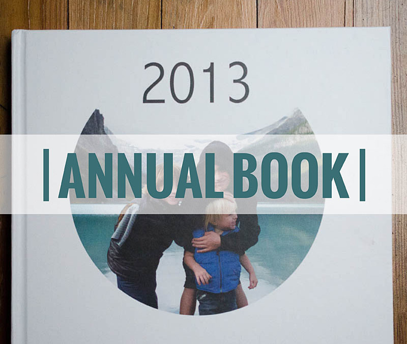
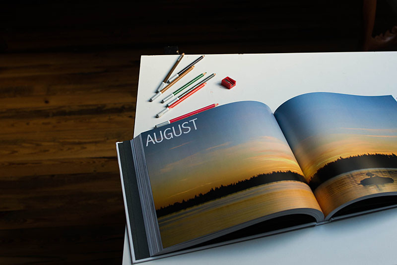
One of the reasons I love working on their photo books, my client includes photos of their daily life but also abstract, macro and flower photography as well. This provides a tremendous amount of flexibility to the layouts and ultimately the flow of the book. In their 2013 book, I used these photographs as a full spread bleed layout. Using these layouts, I’m able to make a big impact to the start of each month with bright, vibrant photos.

I’m so thrilled to design her photo books! Beyond my love of designing, I know how much her family appreciates these family heirlooms – which adds to my excitement to design her next book!

All book photos in this post are copyright protected by Renee Bonuccelli, 2014. All Rights Reserved.
