by Stacey Wiseman | Sep 19, 2014 | Cover Series, Design Series, Family Photographs, Photo Book Design Layout
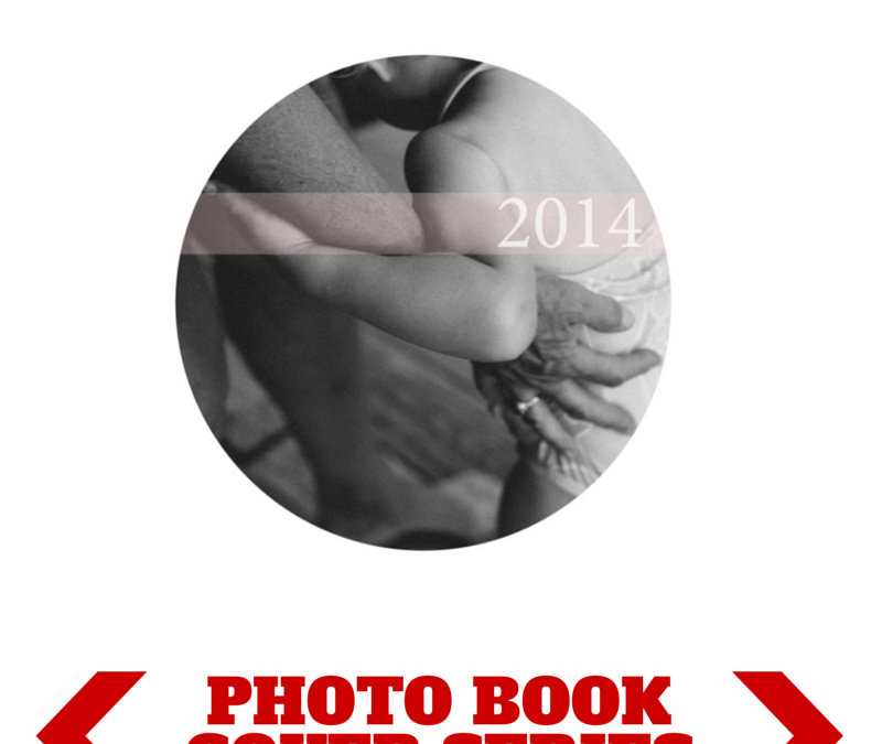
There is something so seductive in a form, shape, color, or font that makes a suggestion. In this cover design, I left a lot of white space on the page. I used a circle photo box, which I find becomes a dominant shape on the page, and then I used the subtle, translucent suggestion of a pale color bar with a white font to indicate the title of the book.


by Stacey Wiseman | Aug 24, 2014 | Cover Series, Design Series, Family Photographs
Hello 2014!
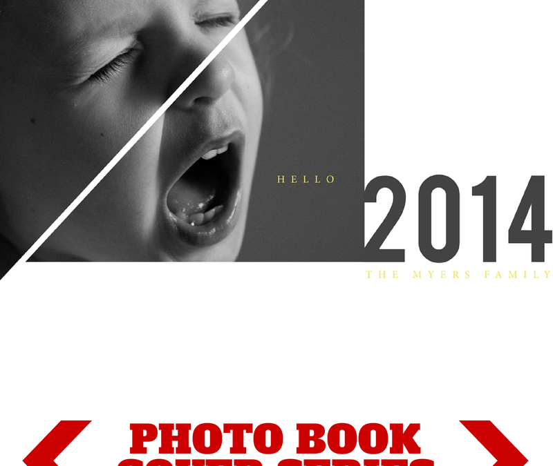
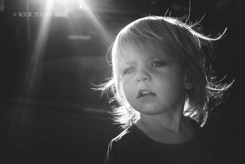
I’ve got a fun photo book cover design today! And it starts with the photo. We all know it’s common for children to have their moments of screaming and crying. Here’s your opportunity to photograph this moment and turn it into something creative for your photo book cover.
I broke up the photograph using triangular shapes via the pen tool in InDesign. This added more interest to the photo but definitely not necessary. The photo in a rectangular box can stand on it’s own too.
Pairing this photo with a bold font for the year and a small, classic font in a stand-out color (yellow) helps to make this dynamic cover design down to each detail.
Let me know in the comments below what you think!


by Stacey Wiseman | Aug 10, 2014 | Family Photographs, Inspiration, Podcast, Tutorial
I have to be honest, of the various steps in making a photo book, editing the photos is not my favorite part. Occasionally I get sucked into the editing process and really enjoy fine-tuning and improving a photo through the various tools in Lightroom (my preferred editing program).
But for the most part, I do very minimal editing. I cover the basics with my go-to steps. Crop, white balance, adjustments in the basics panel (exposure, highlights, shadows, black and white sliders) are common adjustments I make with pretty much every photo. Some photos require additional editing in the tone curve, HSL panel, cloning, filters and the adjustment brushes.
While that explains my typical workflow, it sounds a little cumbersome but I can actually move through the various panels pretty quickly. Another tip, I’ve created presets based on common adjustments I make to most photos.
My video tutorial this month illustrates how I typically move through editing my photos. If you remember, the first video showed how I take the photos; the second video showed how I select the photos for a book. Today, I’m revealing how I edit – without any presets.
Make sure you stay tuned for next month where we finally see how these photos are translated to a book layout!

by Stacey Wiseman | Aug 2, 2014 | Cover Series, Family Photographs, Inspiration
Even though it may seem counterintuitive, if you make something really small and/or really minimal – it can heighten the experience.
Think about it, if you are in a crowded busy place, a whisper isn’t going to make much of an impact. However, if the space is cleared out, there are no distractions, a soft whisper becomes amplified and sole attention. It doesn’t have to be loud at that point because all of the focus zeros in on the very quiet voice speaking. In fact, you listen more attentively and pour your whole energy into what is being said.
The same is true with design. By stripping the page down and adding something very small, it creates laser focus directly in on the photo or small text that is included.
This concept is exhibited in this week’s photo book cover design. I added a soft color and a very small photo. Yet it speaks volumes and makes a large impact. It’s hard to not pay attention to this cover. And I love when being minimal provide maximum results.
Check it out, pin it and share it!


by Stacey Wiseman | Jul 25, 2014 | Cover Series, Family Photographs
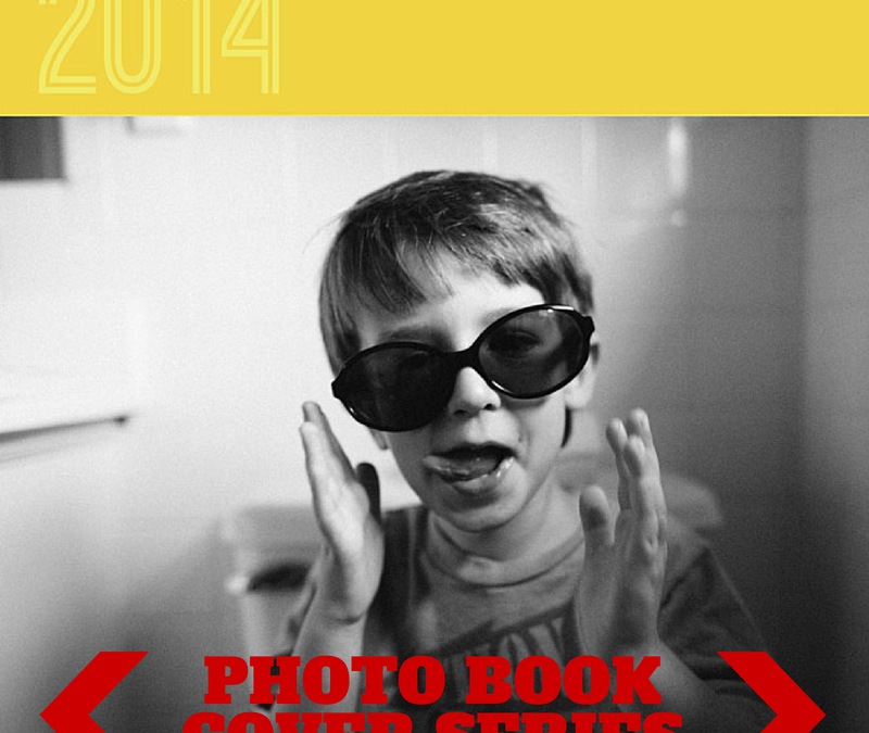
I love this photo book cover design so much because it’s super quick and easy to create. The basis – a black and white photo. Take any b/w photo you have – it could be a family photo, a portrait, a scene from everyday life. Then pair it with a really bold color band at the top.
For this example I chose a bright golden yellow color.
Pair that with a unique font to announce the year and Viola! A simple and fun photo book cover design!!!


by Stacey Wiseman | Jul 11, 2014 | Cover Series, Family Photographs
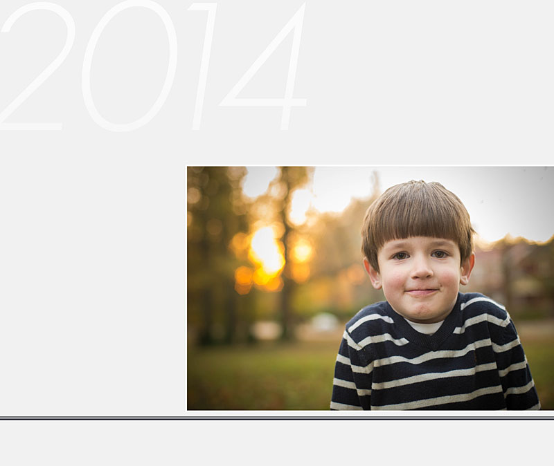
In this photo book cover example, I decided to use two main elements: a line running under the photo and a large font calling out the year, to really set this cover apart. Simple. Yet focused.
Even though it is really simple, the adorable expression on my son’s face totally makes this cover stand out. Find a photo that has that classic expression and use it to make your photo book cover stand out!


by Stacey Wiseman | Jul 8, 2014 | 10in10, Family Photographs, Photograph
On the Fourth of July, I realized it had been a while (a long while actually) since I completed a Day in the Life. While I don’t think our routine has changed all that much in the last few months, it’s always fun to peel back the curtain a bit and reveal what goes on inside our household. Of course, with the holiday, it was somewhat atypical….but still really fun to do.
I hope you enjoy!!!
In the morning, a 10k race happens at the end of our street.

L was a little unsure what to make of the runner in the middle of the road.

Then, a VERY simple breakfast of toast with butter. aka – nothing else in the house, aka – grocery shopping on the agenda today.

After breakfast, I had a quick conference call to chat with a lovely Accountability member.

Now, it was time for cleaning. My husband and I thoroughly cleaned our house.

While the kids watched some television. Or in my daughter’s case, the iPad in her room.

After several hours of cleaning, I decided to get a snack and take the kids to the park while my husband went to the grocery store.

My son picked out the spot for our picnic.

What’s a park visit without a turn at the swing?

If that wasn’t enough activity, it was now time for my afternoon walk. I loaded up my daughter in the stroller…

…hoping she would take a nap.

Success!
This next photo doesn’t really describe anything we did during our day. It’s a Just-Because photo. My daughter’s hair is just now starting to pony-tail-able.

It’s now about dinner time and my husband is getting things ready for the grill.

After dinner it was a little relaxation before…

FIREWORKS!!!

We let our kids stay up for the first time to watch the fireworks. Thankfully, we are able to see our city’s fireworks from our front lawn so my kids could be in pjs and we could easily take them to bed once they were finished. Man, were they wired though! They loved them.
This was my first time truly attempting fireworks. I’ll definitely have to try again next year!
So that was our day! What did you think! I’d love to hear from you and leave you some blog love back. Leave a comment below with your website so I can check out your Day in the Life, or most recent blog! 😉

by Stacey Wiseman | Jul 5, 2014 | Cover Series, Family Photographs
Are you looking to dress up a full photo cover design?
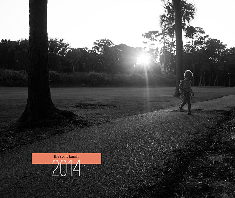
Add a small bar of color to provide a little something extra. In this case, I’ve overlapped the year with color rectangle. Being the year “2014”, I found a way to line up the small upper serif of the “2” with the bottom edge of the rectangle. This adds that little bit of specificity and intention to the design.
One other aspect…select a bold, dramatic color that is in stark contrast with the photograph. As shown here, a black and white photo makes it easier to select and set apart the color.
What do you think?


by Stacey Wiseman | Jun 26, 2014 | Cover Series, Family Photographs
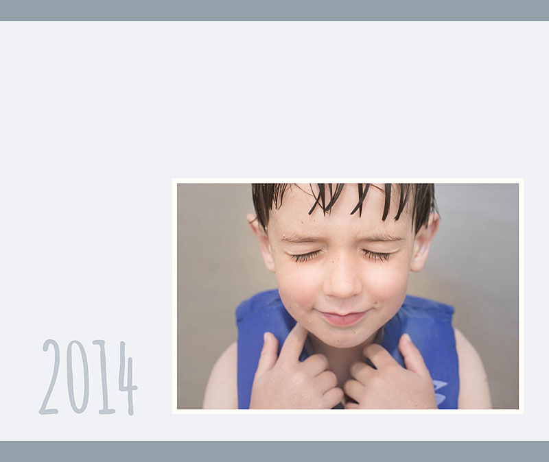
In this week’s photo book cover design, I wanted to create a simple cover with color. I’m playing with the blue on my son’s life jacket to create a light blue color with a deeper blue color at the top and bottom edge. To make the photo stand out a little bit more, I put a white border around it.
Using a creative,handwriting style font adds to the fun of the photo and can give a sense of the book.
If you wanted to adapt this style for your photo book, you could use a family photo or a photo that encapsulates a major even to your year. Pull complimentary colors from the photo to design the background and color for the font. If the color is too strong, you can always adjust the saturation and tint.


by Stacey Wiseman | Jun 8, 2014 | Design Series, Family Photographs, Tutorial
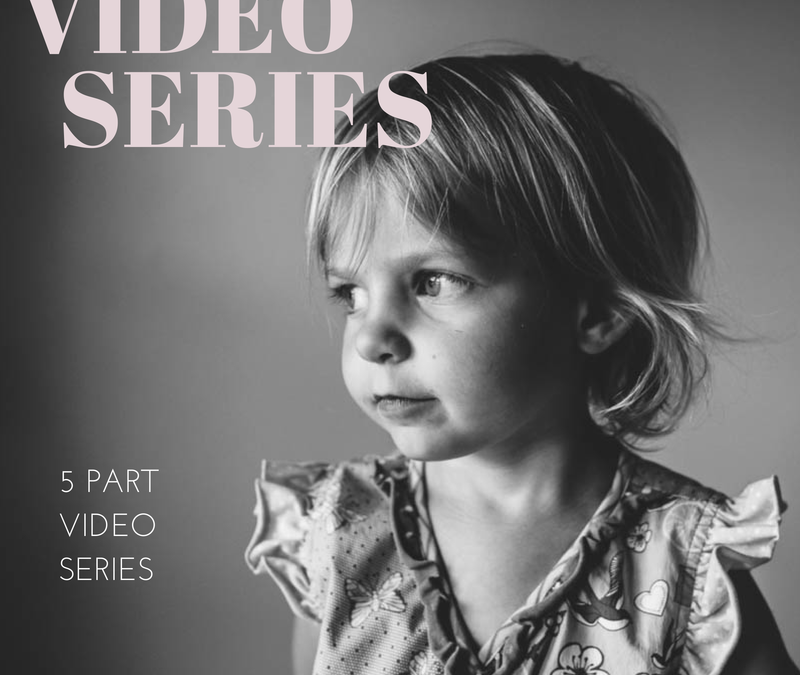
I’m so excited to kick off a new video tutorial series. Throughout 5 videos, I’m going to take you behind-the-scenes of how I pull together a photo book. With this series I’m going to focus specifically on taking photographs in a very familiar location within my home.
This spot is my go-to place for photos of my kids. I’m comfortable with the light, the framing, and the background. I’m using one of my favorite locations to illustrate how, from beginning to end, you can shoot with a photo book in mind.
Here are the topics I’ll cover in this series:
Part 1: Taking the Photographs
Part 2: Selecting the Photographs
Part 3: Editing the Photographs
Part 4: Designing the Layouts
Part 5: Adding Design Elements
For today’s video tutorial, I’m sharing how I take the photographs. My goal is to take a portrait of one – or both – of my kids. We’ll see what I get!
Plus, with this video, you’ll find out my 10 Tips for Attempting Portraits of my Kids.
Now, before you watch this video, I had to use two different cameras because I ran out of memory in my first one. I apologize for the difference in coloring, focal length and quality. Also, I recorded this on a Saturday morning. I’m not fancy or dressed up – this is as accurate as you can get to how I really shoot in my home. 😉
I’d love to hear from you. When you take photos of your kids, does it look like this? Do your kids act crazy? Run away? Fall down? Evade the camera? What are your tricks?!? Tell me your experience in the comments below! <3
I’ll see you next month when I show you my photos!
