by Stacey Wiseman | May 11, 2014 | Cover Series, Family Photographs
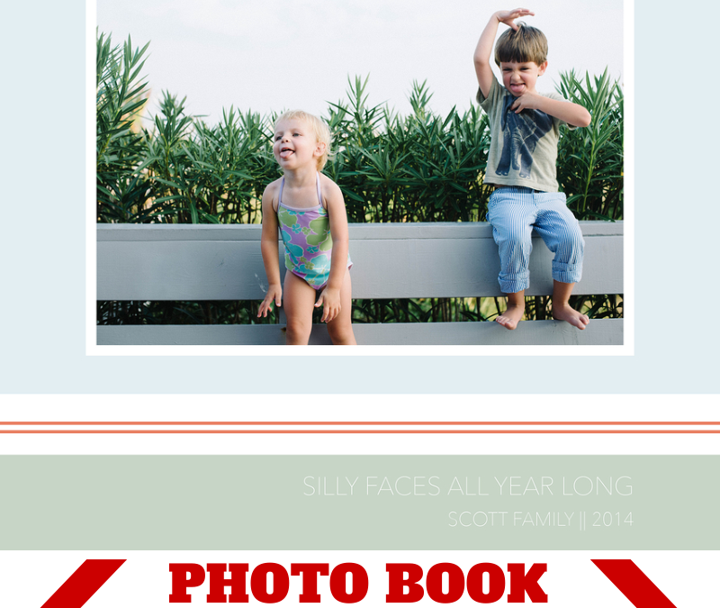
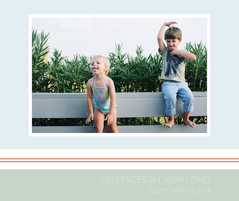
This weekend, I was buying summer clothes for the kids and all of the colorful stripes definitely inspired this cover design.
Focusing on bands of color, one photo, a thin typography, a fun group kid photo, and a clever title defines this photo book cover. The colors for this cover are inspired by the tones in the photograph as well as the beach where we were staying. Adjust the color profile to fit your photo and/or content of your book!
If you love this photo book cover, please pin it to your pinboard!
by Stacey Wiseman | May 3, 2014 | Cover Series, Family Photographs
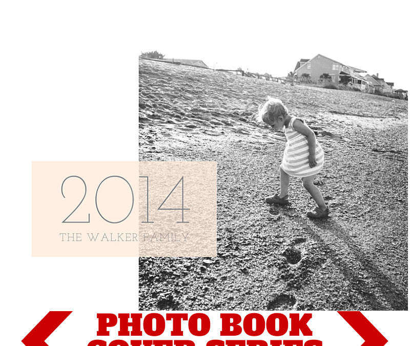
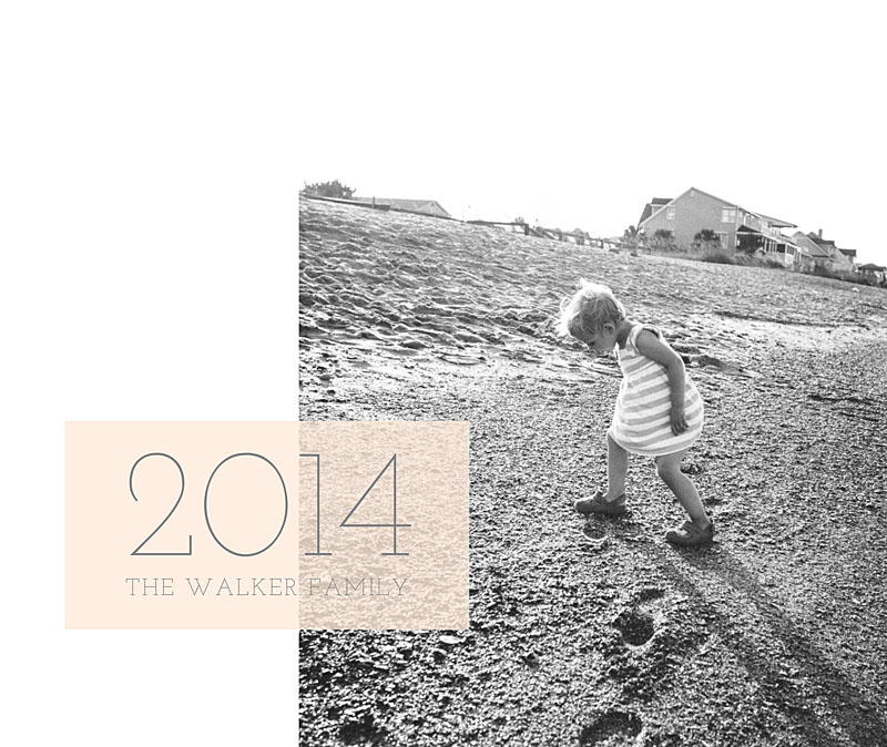
For this photo book cover design, I wanted to try a vertical photo with a landscape orientation cover. In this case, you’ll either have negative space (to fill with color, text, or leave it blank) or you’ll cut off a large part of the image at the top and/or bottom.
In this case, I went with the white space. I added a soft color box overlapping the photo in order to add the title.
Make sure you pin it and I’d love for you to follow bookthisproject!
by Stacey Wiseman | Apr 26, 2014 | Cover Series, Design Series, Family Photographs
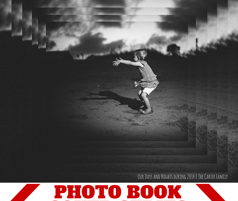
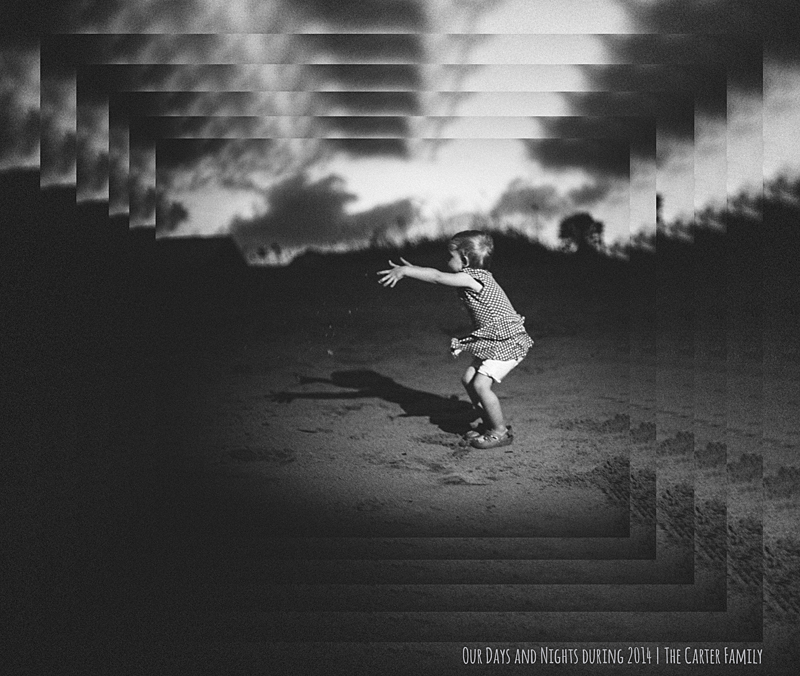
Inspired by a graphic design pin on pinterest, I created this photo book cover design. It features the same image repeated at 90% until I got the final size I wanted to display the entire photo. This cascading pattern stays vertically and horizontally centered as it scales down providing a very dramatic cover.
The key to this photo book cover design is to select a dramatic photo.
Finally, use a small title for your book that doesn’t compete with the photo. In this case, the title is a clever play on the photo – “Our Days and Nights during 2014.”
Make sure you pin this graphic if it inspires your cover or a page in your book!
by Stacey Wiseman | Apr 17, 2014 | Family Photographs, Inspiration, Photography Tip
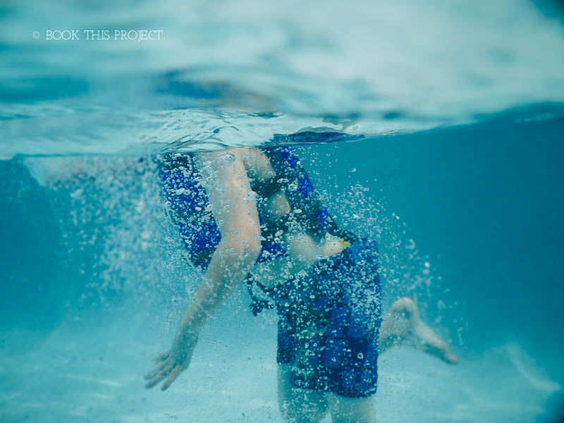
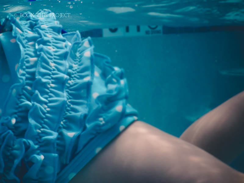
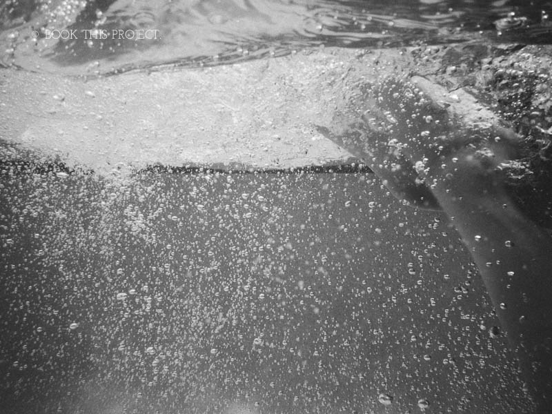 Last year, I added a waterproof camera to my Christmas wish list. I thought it would be a fun way to experiment with my photography and a new way to capture our kids. Our goal is to spend a little more time in the pool this summer…and when we go on vacation – the ocean.
So I was delighted when I received the Nikon COOLPIX AW120 16.1 MP Wi-Fi and Waterproof Digital Camera for Christmas. Even though it was made to be an indestructible camera…it still felt a little weird to actually submerge the camera under water.
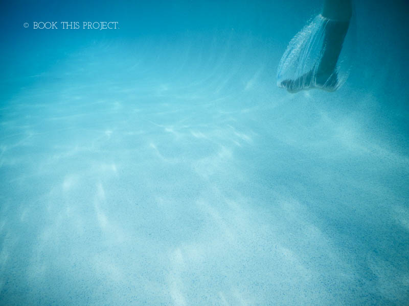
But on our Spring Break vacation, I did it. I dipped the camera underwater looking for those elusive, floating photos.
So here are my 5 tips for taking those fun, underwater photos on your next vacation. (At least my experience with a point and shoot camera.)
1. Shooting Blind.
For this first trip out, my method was about shooting blind. This means, I was in a 3′ high pool, without going underwater myself. I held the camera underwater in the general direction of my target and shot without knowing what I was capturing. This trial-and-error approach means that you have to try several times to get the hang of it. But it’s also really freeing. Don’t worry about limb chops or composition. The goal of the photo is to capture your kids doing something truly fun.

2. Snap and Hold.
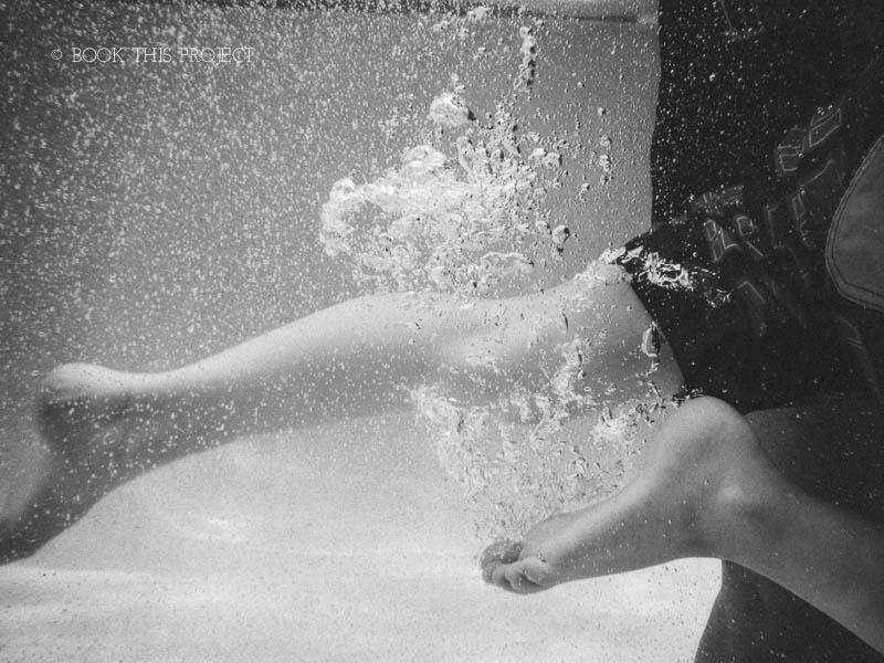
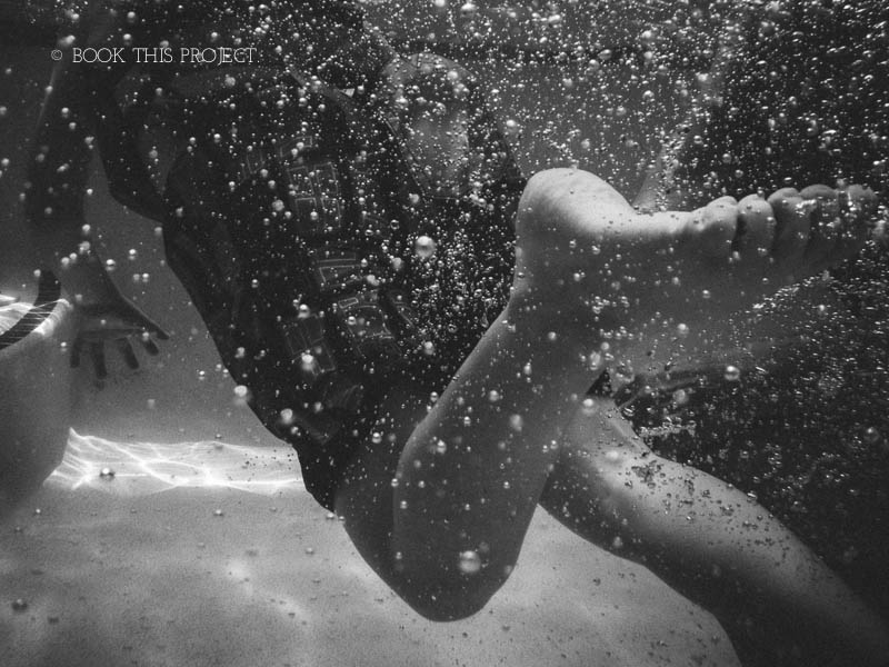
When I was using my camera, I had to hold it underwater, push the shutter about 1-2 second before I really wanted and then hold down on the shutter for about 5 seconds. I was never quite sure when the photo actually snapped. It takes a couple of times to figure out they rhythm. And maybe you won’t ever really figure out when it takes. But there are always different stages of the cannonball jump to capture.

3. Embrace any imperfections.
If you are shooting blind (#1) and holding down the shutter because you’re not sure when the actual shutter will happen (#2), then you need embrace the imperfections in the photos. They won’t all turn out. But that’s ok. They don’t have to. Keep trying. Eventually you’ll get something that you love. With water, it’s almost impossible to get something that isn’t fun, creative, and inspiring.

4. Discover new layers and textures.
One of the beauties of water is the layers associated. The waves, ripples, bubbles, sunlight and calmness. Water captures them all. Use your camera to capture as many different modes of water you can. Test it out by moving your hand to create a tide. Or do like I did and capture as your son or daughter jumps into the water. You’ll get plenty of water bubbles floating to the surface.

5. Video’s worth it.
You have a camera that captures above and below water. By using video you can seamlessly move from one environment to the other – all within a matter of seconds.
If you’re looking to add a little fun to your vacation photos, I highly recommend getting a waterproof camera. The point-and-shoot cameras are lightweight, relatively inexpensive (especially when compared to waterproof housing), and can capture a perspective of your trip that people typically don’t get to see.
I’d love to hear your summer vacation plans! What fun summer trip are you planning now?

by Stacey Wiseman | Mar 28, 2014 | Cover Series, Design Series, Family Photographs
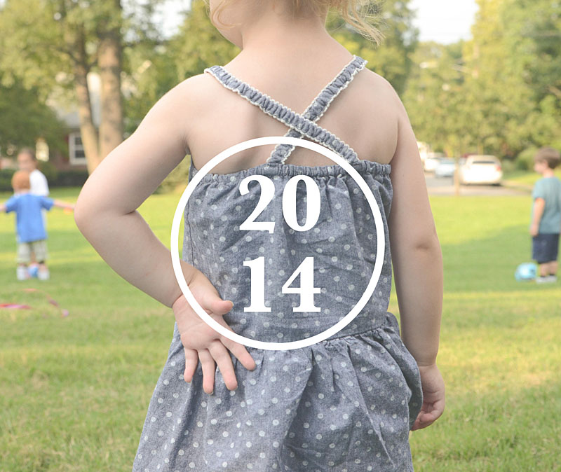
Sometimes it takes an unusual perspective in a portrait to turn a photo book cover into something a little abstract and very interesting.
Try out an unexpected yet defining portrait for your photo book cover. Pair it with a simple title and a straight line graphic – or a circle graphic as shown below.
This is an elegant way to achieve an cover that doesn’t put the focus on the face, the smile, the eyes.


by Stacey Wiseman | Mar 7, 2014 | Cover Series, Family Photographs
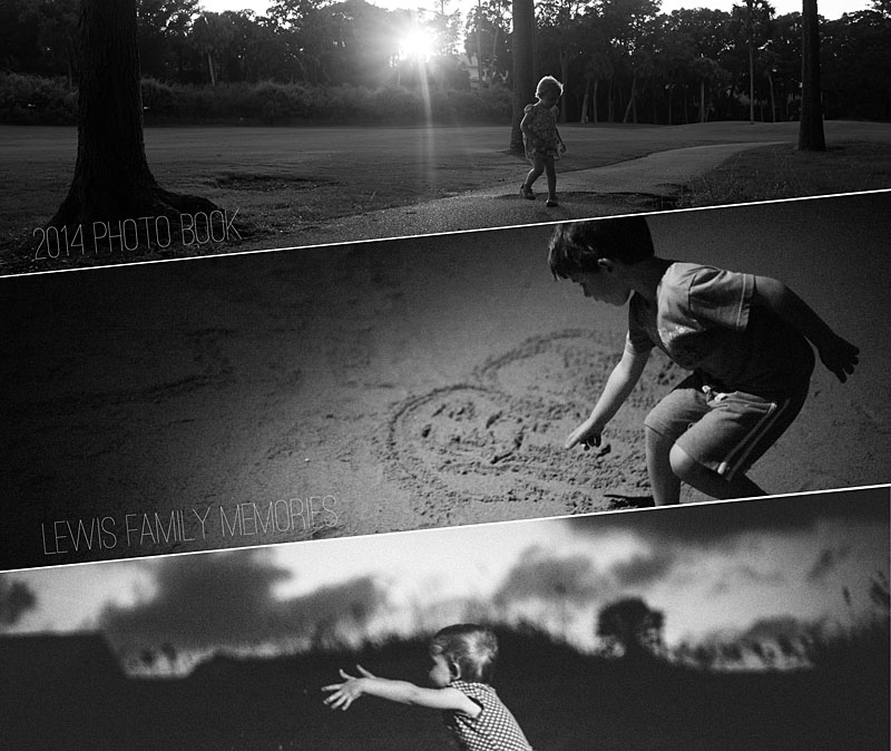
For this photo book cover design example, I decided to shift the rectangular photo boxes to create a dynamic and unusual photo book. This design creates a strong diagonal to the cover. I used this line to rotate the text to follow the line created by the photo boxes. With three photos, there is a variety of photos on the cover – but they are all black and white and strong linear photographs to pull the cover together.


by Stacey Wiseman | Mar 5, 2014 | Family Photographs, Photograph, Photography Tip
One of my photography goals in 2014 was to get in the frame with my kids more. At least once a month!
While this seems easy to do, it actually is quite difficult when you have two small children. To get out the tripod, set everything up, clear the clutter and get them to cooperate…suddenly the task seems impossible.
Following some advice from great blog posts, here’s what I do:
1 : Set up tripod
2 : Put my camera on timer
3 : Give us 10 seconds before the first photo is taken
4 : Program my camera to take 10 photos with a 2 second interval with one click of the shutter
5 : Bribe my kids with a sucker if they cooperate
6 : Let them push the shutter (taking turns) so it is fun and interactive for them
Recipe for success? With me, not quite.
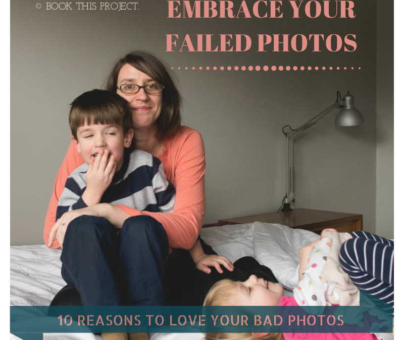
Out of 150 photos (yes – a lot of clicking going on!), I had 0 good photos, 20 “bad” photos and 130 automatic deletes. The elusive photo I wanted of all three of us looking lovingly into the camera didn’t happen.
Some are out of focus. In some I’m talking. In some I’m grabbing them to get back in the photo. Some have closed eyes. Some have grimaces. Some have limb chops.
But you know what? I don’t care. Of my 20 ‘bad’ ones, I still love them. In fact, I cherish them.
Here are 10 reasons why I love my bad photos.
1 : I love my daughter’s smile.

2 : I love my son’s tender heart.

3 : I love that my daughter has a lovey that barely leaves her side.

4 : I love my son’s love of legos.

5 : I love the giggles.

6 : I love my smile.

7 : I love the sibling almost-fights. (He didn’t actually knee her…but it sure looks inevitable in this photo.)

8 : I love Saturday afternoons with my kids.

9 : I love the kisses.

10 : I love my kids.

Of course, on this particular Saturday I don’t need 130 bad photos in my Lightroom catalog to love. About 12 will suffice. And they’ll look great in my annual photo book!
Now I want to see your bad photos! Let me know in the comments below, how have you embraced your bad photos? No need to be shy. Be proud! Blog about your love of bad photos and share a link below. I really want to leave some blog love for your bad photos too! <3
by Stacey Wiseman | Jan 3, 2014 | Cover Series, Family Photographs
It’s time to bring back the weekly photo book cover designs!!!
In 2014, every Friday I’ll be featuring a cover design for a photo book. Some may have a tutorial associated with it…sometimes it will just be the cover. Always feel free to pin it and share it on Facebook.
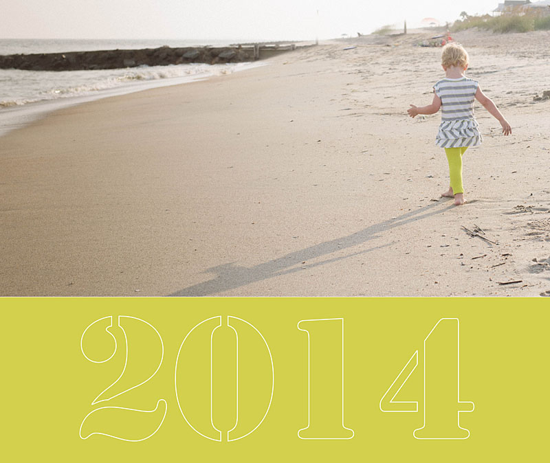
I’m starting the year off with a simple cover. In this example the photo occupies the top two-thirds of the cover and then a bold color forms the base. I use a stencil-type font style to write out ‘2014.’ In this case, I wanted the font to be light because the photos and the color are so bold. To achieve this, I created an outline for the text.

by Stacey Wiseman | Jan 1, 2014 | Family Photographs, Product Feature

[divider_flat] Happy New Year to you all!!!
I have exciting plans in store for 2014! If you want to see something on this blog, leave a comment below or better yet, fill out my very brief survey! 😉
One big change, I’m now hosting my photo book design workshops over at The Photographer Within. This is a great place to learn and talk about photography. My Intro Photo Book Design Workshop kicks off on January 20, 2013. I’m also planning on leading my Advanced Photo Book Design Workshop (on InDesign) there as well as a brand-new and very exciting new type of workshop!!!
If you finished a Project 365, I’ve got a great template available for you (to use with Blurb BookSmart).
Here is what I’ve been busy with over the last year. If you would like to a tutorial on how I created this video, leave a comment below. I’m happy to update my tutorial from last year with revisions I made during this video!
I hope you had a great 2013 and wish you the best in 2014!!!
Cheers!
Stacey
by Stacey Wiseman | Dec 1, 2013 | Family Photographs, Motivation
I’ve been working on my 2012 photo book…because yes…even I fall behind. But with the 30 Day Photo Book Challenge, I decided to tackle it!
To start, I selected my photos and to save time, most of the photos I selected had already been edited. Then I worked with my layouts. I used the template provided in the 30 Day Challenge – this helped to save even more time. Finally, I added some titles and page numbers, did a spell check and reviewed the entire book.
Last night, I used a Black Friday coupon code from Blurb to order several of my 2012 book. This will make great gifts for relatives!
Here is a preview of my book and I’ll update with photos once my book arrives!
#30dayphotobook


 Last year, I added a waterproof camera to my Christmas wish list. I thought it would be a fun way to experiment with my photography and a new way to capture our kids. Our goal is to spend a little more time in the pool this summer…and when we go on vacation – the ocean.