by Stacey Wiseman | Aug 6, 2013 | Family Photographs, Product Feature

In my last Q&A post about how to combine your vacation photos into your family photo book.
But sometimes…it’s best just to make your own vacation photo book. Stay tuned…in an upcoming post, I’ll share a couple of tips about how to photograph with your photo book in mind…and how to design a fun vacation book.
If you are overwhelmed with everything you have going on, I’d love to design your vacation book for you.
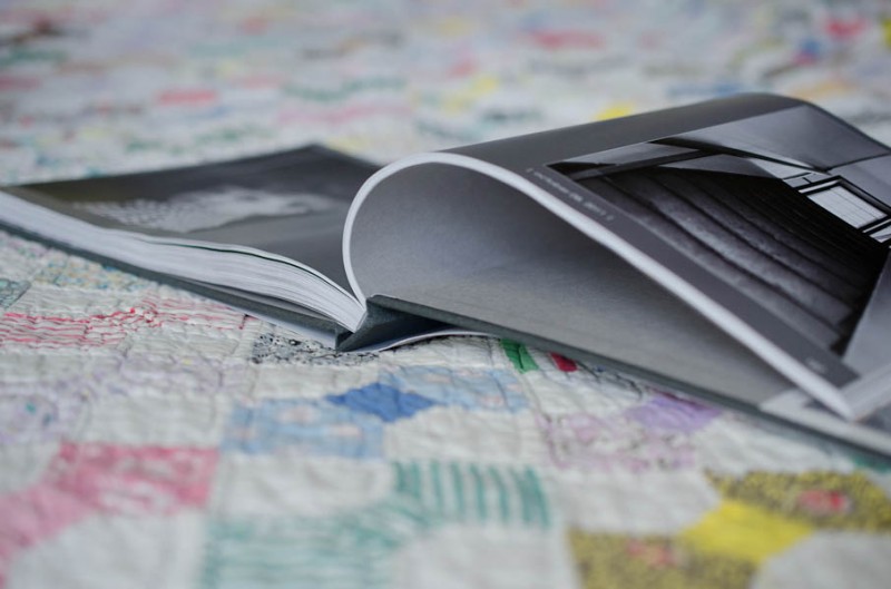
This is a smaller book than my typical family photo book. You upload fewer photos (200) and there are fewer pages (100) but I will design a gorgeous book documenting your family memories.
here are the details:
- One (1) hard linen cover custom photo book.
- 8″ x 10″ Portrait – or – 10″ x 8″ Landscape.
- 100 pages maximum.
- Upload 200 photos maximum.
- One (1) design consultation to ensure the design is just as you want it.
- One (1) hour of revisions to incorporate your comments.
Additional copies, 12”x12” hard cover, additional pages, additional photos, and numerous design review/revisions are available at an additional charge.
Sale price for the month of 2013 August. Only five custom designs are available at this time.
purchase
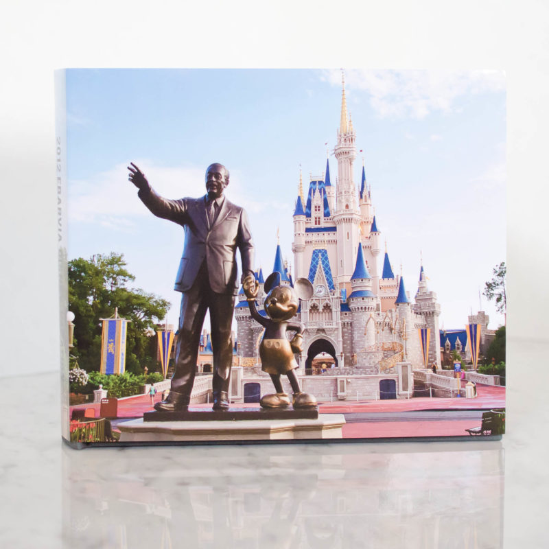 [divider] The photograph for this book is copyright to Tricia Ebarvia, All Rights Reserved. Do not copy, use or distribute without owner’s written consent.
by Stacey Wiseman | Jul 18, 2013 | Family Photographs, Tutorial
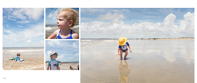
Over the Fourth of July weekend, we took a brief family vacation to the beach. Most of the time when you go to the beach you have to worry about the massive crowds…and trying to avoid the other beach go-ers from getting into your family photos.
In this tutorial, I want to show you that it is possible to capture photos without everyone and their brother in your shots.
The key is to time it just right…to find those moments when a group of people have gone back to the tent to get a drink or reapply suntan lotion.
Another helpful suggestion is to change your position to avoid people in the background. Sometimes that means, moving a little to the left or right. Or getting down low.
Finally, realizing that sometimes it is unavoidable, there are helpful tools in Lightroom and Photoshop to easily clone them out. I’m not the best cloner…so I try to get it close while I’m there.
Here are a couple before-and-after from our recent trip.
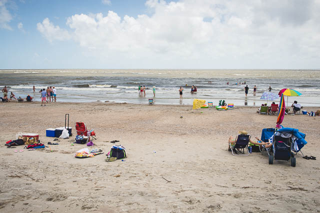
Just to prove it was Fourth of July and there were people on the beach…here is the view from our tent.

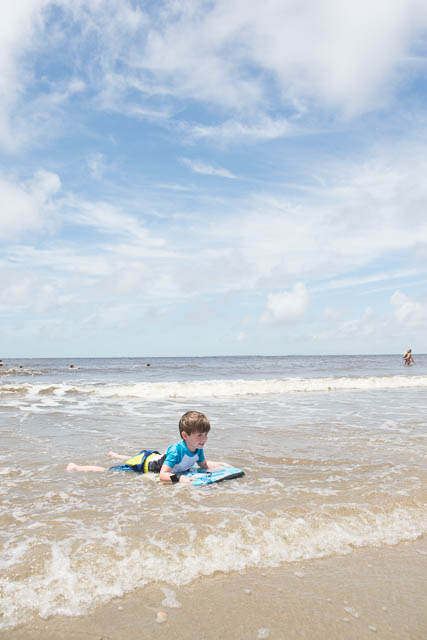
My son was trying a boogie board for the first time. I did take several of photographs as he was riding the wave in but I used the one where he had the most space in between the people to edit.
straight out of the camera (sooc):

edit:
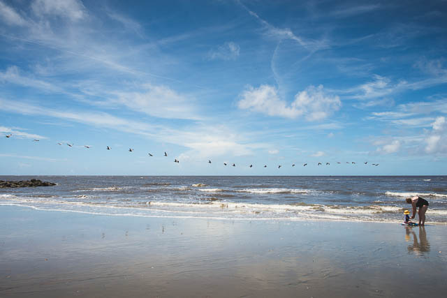
 [divider_flat] Here was a moment where my daughter and mother-in-law was building sandcastles.
You will see in this one…I happened to get lucky, there were fewer people on this side of the beach at the particular moment. There were probably more swimmers to the right, but I used my in-camera crop to minimize those…so I only had to crop out one other family.
sooc:
edited:

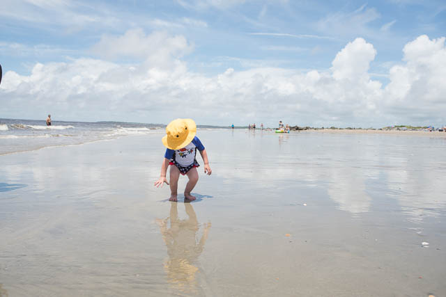
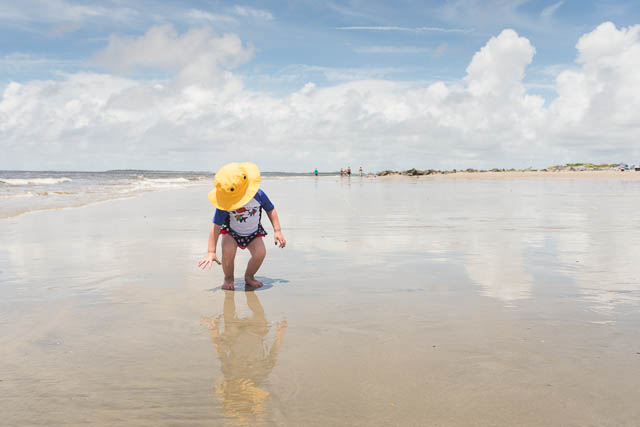
Finally, my daughter and her yellow hat. This one had the most cloning of people and I ended up leaving the people way off in the distance.
sooc:

edited:

[divider_flat] Stayed tuned…Tomorrow I’ll show you how I transformed some of my photos into layouts for my family photo book!
by Stacey Wiseman | May 31, 2013 | 10in10, Family Photographs
Finally! Here are my 10 photos in 10 hours for this past April. You’ll notice some similarities with my May photos…post will be published next week!


by Stacey Wiseman | May 29, 2013 | Family Photographs, wordless wednesday

by Stacey Wiseman | May 22, 2013 | Family Photographs, wordless wednesday

by Stacey Wiseman | Apr 18, 2013 | Family Photographs, Photograph

[divider]It’s no secret that I’m not the chef in our family. My husband cooks all of our dinners – and he is amazing!
But in the middle of March, we had a stomach bug move through the house. At some point, my husband was not moving from the bed and I was responsible for dinner! Oh dear, this was going to be a challenge, because, besides scrambled eggs, it’s been a while since I was responsible for dinner.
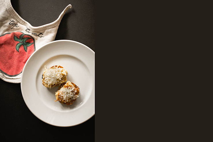
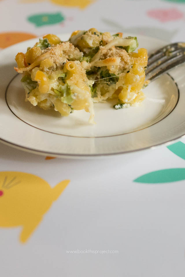
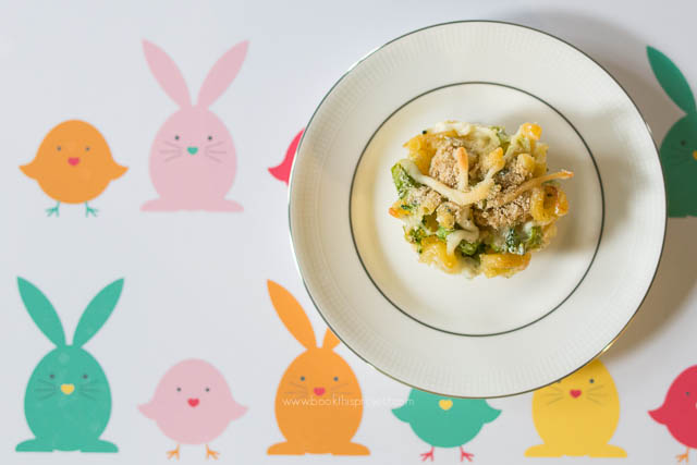
I pulled a very easy sounding recipe from a recent issue of Parenting magazine. The recipe requires some tweaking but my son loved it. I think because of the cupcake shape.
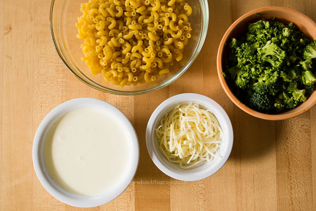
[divider]  Ingredients:
2 cups of dry pasta (but I recommend parboiling the pasta)
1-1/3 cups chopped broccoli
1 egg
3-4 tablespoons of shredded mozzarella and parmesan cheese (I used an Italian cheese pack.)
1/4 teaspoon garlic salt
Mix all of the ingredients together. Fill wells of a muffin pan with mixture – about 3/4 full.
Distribute 1 cup of heavy cream among wells. I added a bit more cream to avoid crunchy pasta (my original mistake!).
[divider]
Top each well with bread crumbs.
Bake at 350 degrees for 20 minutes.
[divider]

[divider]
We now refer to them as pasta cupcakes!
by Stacey Wiseman | Apr 17, 2013 | Family Photographs, wordless wednesday

by Stacey Wiseman | Apr 10, 2013 | Family Photographs, wordless wednesday

by Stacey Wiseman | Apr 10, 2013 | Family Photographs, Photo Book Design Layout, Podcast
It’s time for another video podcast where I illustrate steps / tutorials / examples for photo books. If you remember last month’s podcast, I started to fill in my outline with my monthly photo project – 10 photos in 10 hours. In this month’s video podcast, I fill in my 2013 January photos. You will see how I select photos and how I varied my layouts. And I critique my layouts – so you will see what I hope to change.
My goal is to show you my thought process as I design a photo book. Whether I’m designing your photo book – or you’re designing your own – you will see how the pages begin to come together. I’ll reveal a little bit of the design process each month – so make sure you follow along! Did you know you can sign up for my podcast feed in iTunes!
I’m really excited about this video because I’ll explain why I passed on this image with my son’s locked focus:

[divider] and instead selected this less than stellar image for my photo book.

[divider]
Make sure you leave a comment below with your favorite spread!
by Stacey Wiseman | Mar 22, 2013 | Cover Series, Family Photographs, Photo Book Design Layout
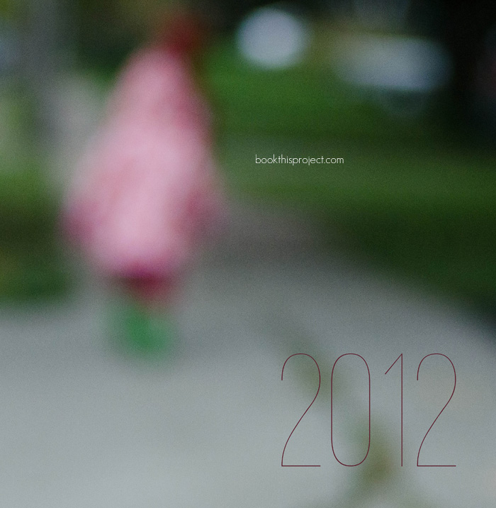
For this photo book cover, I wanted to use an out of focus photo to create a more abstract image for the cover. While this may not be the best photograph to use, it does point out if you like this concept for your cover to shoot with intention throughout the year. Every time you have a potential contender, give it a keyword like “cover” in Lightroom or iPhoto. Then at the end of the year, you can look through all of the options and decide which one works the best!
Here is the full image wrap cover for a square photo book.

Here is the front cover.


 [divider] The photograph for this book is copyright to Tricia Ebarvia, All Rights Reserved. Do not copy, use or distribute without owner’s written consent.
