May One Word | custom photo book
The following is an example of my May page for the One Word Challenge. For this layout, it is only 1 page with a simple border around a 5″x7″ photograph.
The following is an example of my May page for the One Word Challenge. For this layout, it is only 1 page with a simple border around a 5″x7″ photograph.
Here is a very simple cover idea for a photo book for your child. It pulls a dominant color from the photograph and creates a band at the bottom for the text. You can use your child’s name or nickname to personalize it even further. Selecting a font that you love or that really sums up the personality of your child really adds to the cover.
[divider] Do you love this cover idea? Make sure you pin it!
[divider]
Here is the next entry in the Book This Project Color Series!
Here are six color options to pair with a photograph in a landscape size photo book. Submit your photograph to info[at]bookthisproject.com and I will prepare a color profile for you!
Let me know in the comments below, which one is your favorite?
[divider]Here is the original photograph from yesterday’s wordless wednesday post:
[divider] the colors:
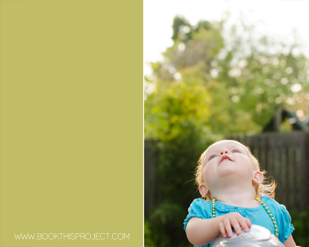
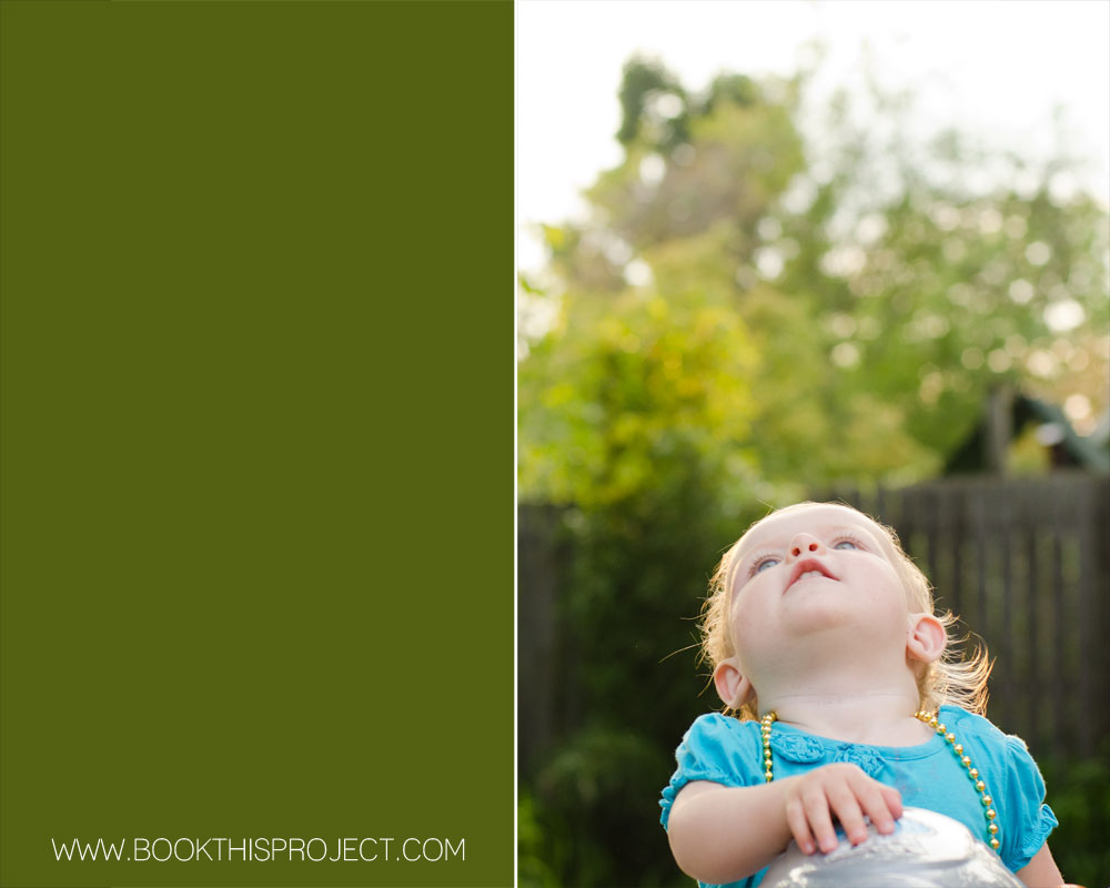
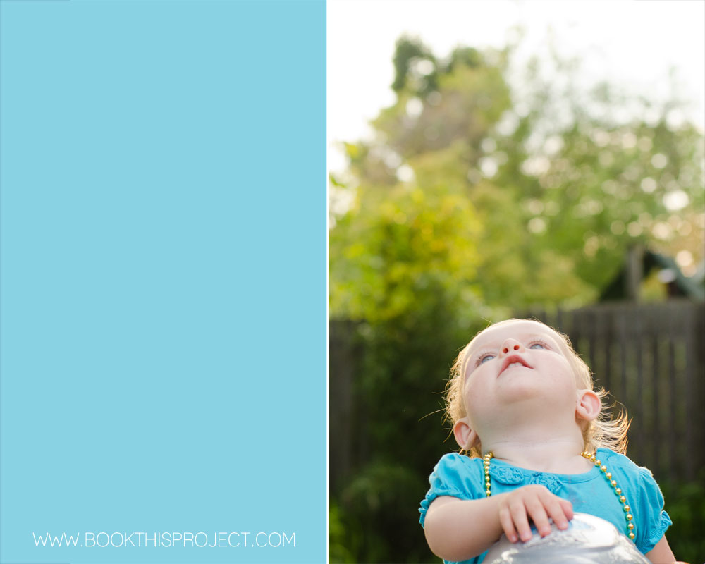
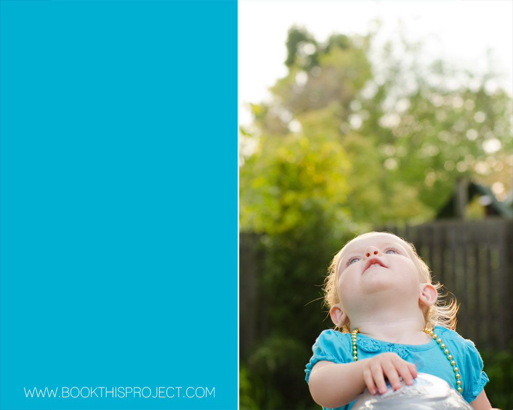
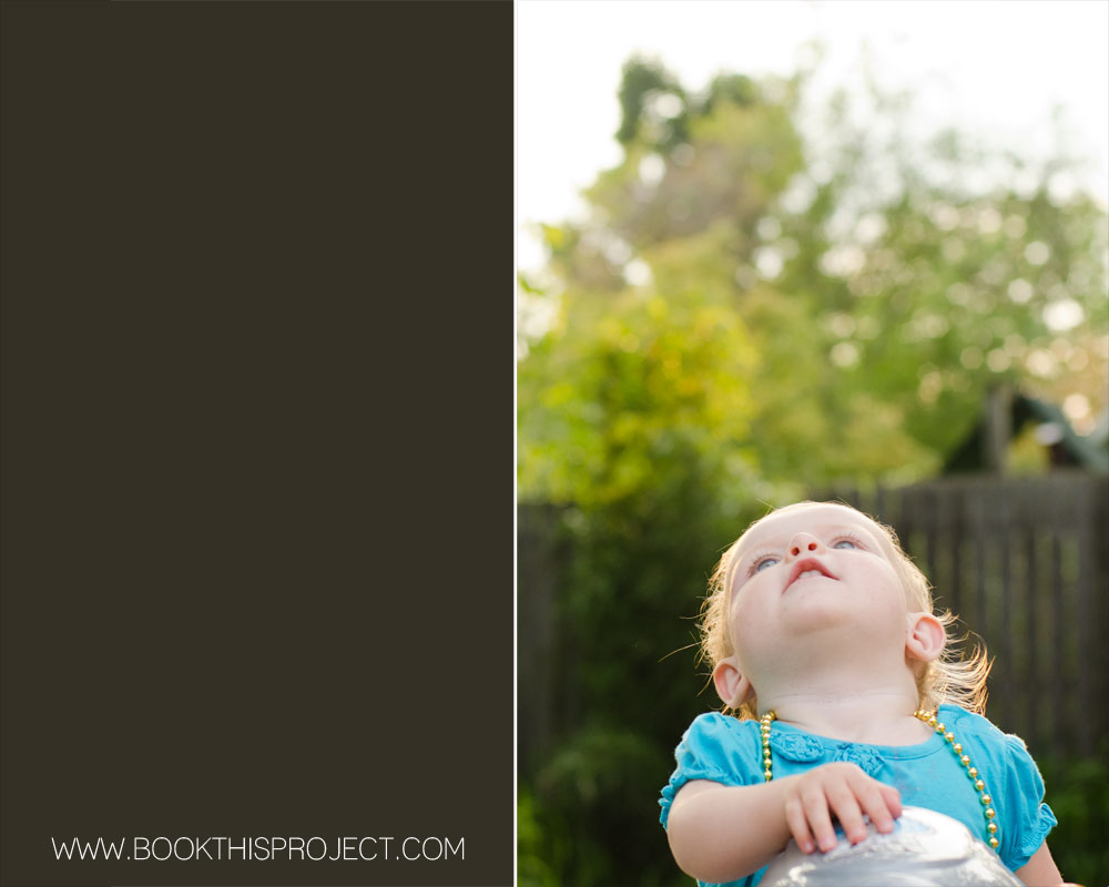
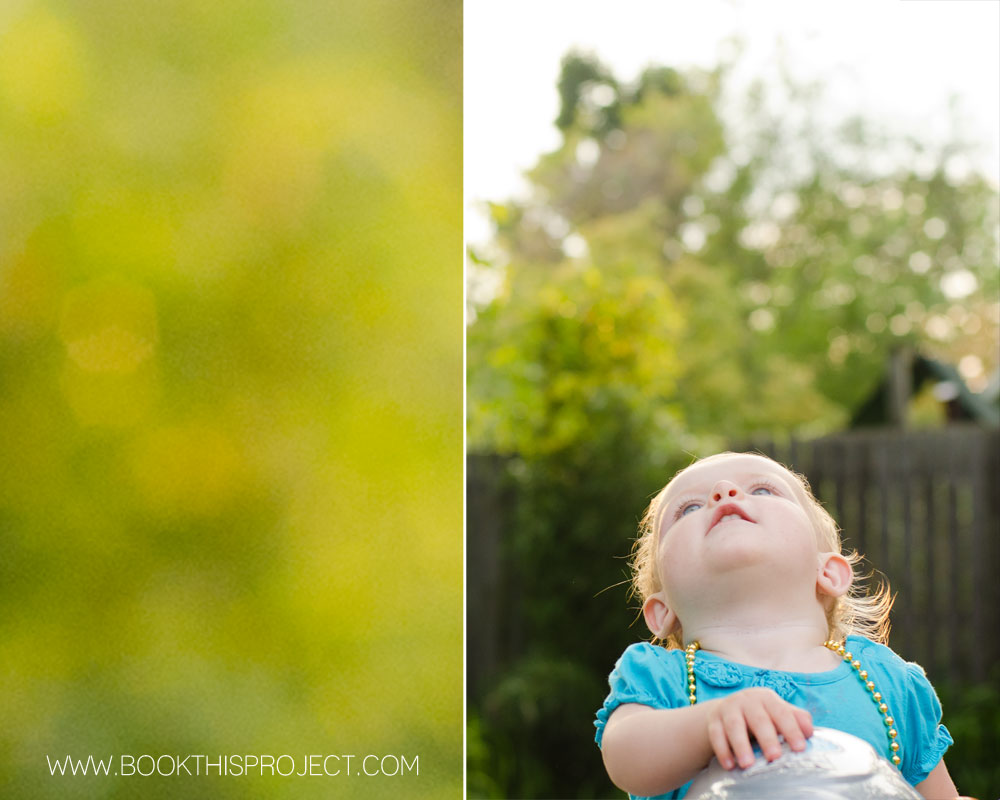 [divider] A free download of the color values are located here:
Here is the next entry in the Book This Project 2012 cover design series.
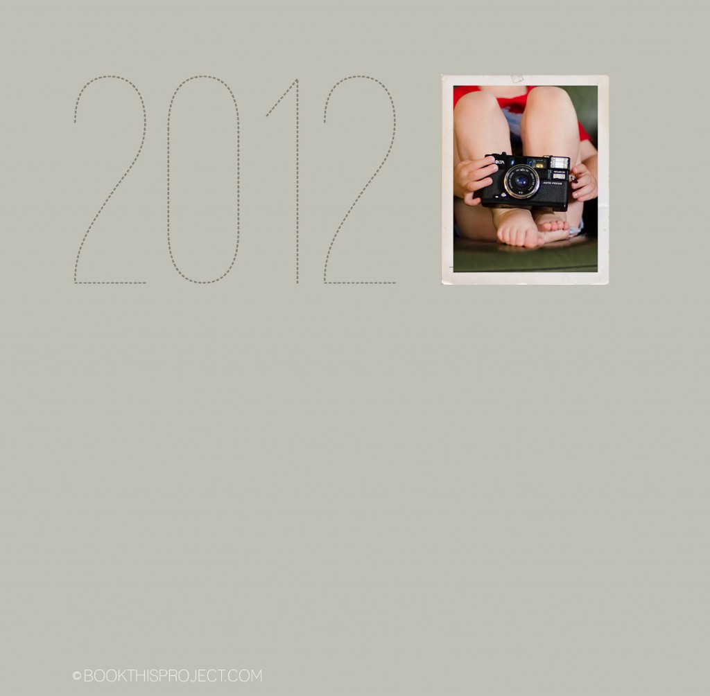 [divider] Make sure you pin it!
2012 cover design series: make sure you pin it!
COLOR! It is so important in design and can add so much to your photo book layouts. I have decided to start a new monthly series that examines the impact color has on layouts. I will take a photograph – or a group of photographs – and run through a series of different design layouts – exploring color, type, size, orientation, and proportion.
First, to start off this series, I want to mention the beautiful and inspiring site: Design Seeds. If you are not familiar with them, I hope you will check out their site, facebook page or pin boards. This site examines the rich color groups found within evocative photographs. If you are ever in a color rut or looking for color inspiration, you should check out their work!
Photo
[divider] Layouts
[divider]Get a free download listing the colors used in this series (RGB and CMYK) – here!
[divider] Would you like one of your photographs featured in this series? Email me your photograph and I will let you know when your photo will appear.
I hope this gets your creative juices flowing!
And if you love any of these, share this post on your facebook page or pin your favorite(s)!
Here is another entry in the 2012 cover design series. Make sure you pin it!
The following is an example of my April page for the One Word Challenge. For this layout, the photo is a full book spread bleed. In order to do this, I had to crop the image but I think it still works and will have a big impact in my family book.
I have decided to start a little series on 2012 family photo book covers. All of these will be featured on this blog + pinterest board…so make sure you follow it!
For the first issue, I based the cover design on this email I received from J.Crew. I loved the two variations of the same color: light and dark.
[divider]Here is the cover:
Following up on my last inspiration post where I translated the cover of an Anthropologie catalog into a layout, this example features a cover of a non-fiction book. It is simple, elegant, and stately.[divider] Inspiration:
Eating Architecture edited by Jamie Horwitz and Paulette Singley
[divider]Photograph:
[divider] Iterations:
And here are five iterations.
[divider] Do you have a favorite?
All of these are on my pinboard “Inspiration and Iterations.” Pin your favorite now!