by Stacey Wiseman | Sep 9, 2014 | Design Series, Inspiration, Photo Book Design Layout
We are four steps into my photo book design process and – finally – I’m placing the photos on the page!
I’ve taken the photos, selected which photos to use, edited the photos and now is the time to figure out how they will work together on the page.
Often times, when I’m selecting photos I have a pretty good idea of a layout arrangement but not exactly sure on the specific layout.
This perfectly describes the photos I’ve selected for this particular photo book.
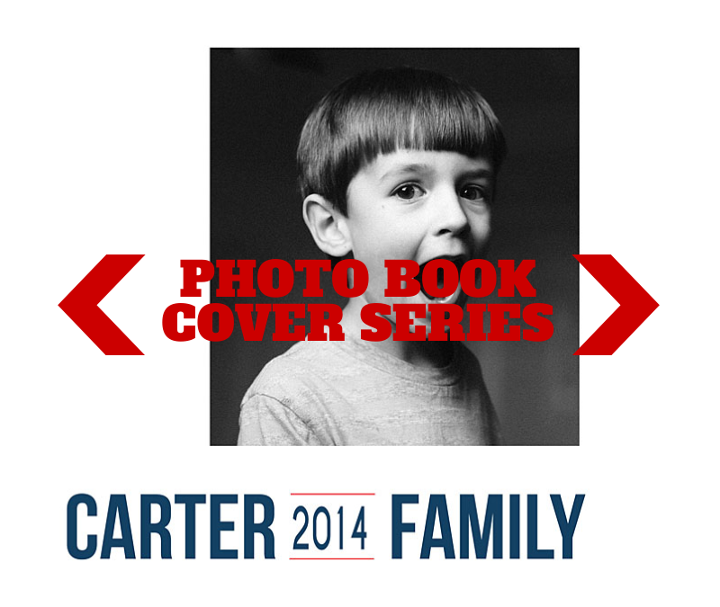
During my selection process, I had an idea to include a solitary portrait of my son and daughter on one page plus a collage of them together on the opposite page. But…I’m not really sure how that will look on the page.
So I test. I try different layouts. I see how the photos look on the page and then determine which one looks the best. What makes the most sense on the page? What scale, spacing, and positioning works the best for the photos.
You should know, there is no wrong answer and what may look best to me, may not be the same for you. And that’s ok. It’s what defines our personal style and vision. That being said, I do think your skills are refined, the longer you design.
Watch this video to see how I test my page layouts.
Next month, I’ll finalize the layout with some text and color!

by Stacey Wiseman | Jul 20, 2014 | Photo Book Design Layout, Tutorial
One of the reasons I LOVE Blurb and will probably never stop making at least several books a year with them is because I can use Adobe InDesign and publish my books through them.
Why do I love InDesign???
Because I can create almost any artistic vision I want with this program. I’ve been using InDesign for 14 years and I used Quark Express (a book publishing software) 3 years before that. In that time, I’ve learned to design efficiently and use the program to achieve particular layouts.
If you’re intrigued by what InDesign can do but don’t know much about it, I’m sharing the numerous reasons I love InDesign. Plus, I’m sharing a few layouts that I would not attempt without InDesign. And seriously, for about 85% of my books, I use InDesign.
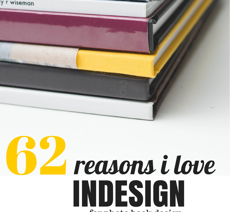
62 Reasons Why I Love InDesign
1. I can see all of the pages in my book at one time in the pages panel.
2. I can easily add as many pages as I want, where I want.
3. I can move the pages with a simple drag and drop.
4. I can delete the pages by dragging them to the trash can.
5. I can change the properties of the page with a right click.
6. I can add any size of photo box.
7. I can type in the dimensions I want for each photo box.
8. I can place the photo box exactly where I want by using guides or typing in coordinates.
9. I can overlap and layer as many photo boxes as I want.
10. I can add a simple border to the photo boxes (and text boxes).
11. I can rotate my photo box to any degree.
12. I can rotate only the content within a photo box to any degree.
13. I can scale a photo within a photo box.
14. I can scale the photo to fill the frame.
15. I can size the frame to match the photo.
16. I can add a grid of photos by using the arrow keys.
17. I can make a circle photo box.

18. I can make a photo box out of any shape.
19. I can place my text any where on (or a portion off) the page.
20. I can adjust the text to any style, size, color and alignment.
21. I can align the text toward the spine or away from the spine – which is awesome for book design.
22. I can adjust the leading and tracking (vertical and horizontal spacing between lines and letters).
23. I can make the text all caps or small caps with one click.
24. I can increase the size of only the first letter of the paragraph with one one click.
25. I can easily outline the text.
26. I can add a photo inside of the letters.
27. I can add a gradient to my text.
28. I can add a gradient to my photos.
29. I can adde a gradient to only my photo box outline.
30. I can use a gradient color or transparency.
31. I can wrap text around a particular area of a photo.

32. I can connect the text between multiple text boxes and pages.
33. I can align the top, bottom, right, left and center edge of any box.
34. I can space boxes by a specific dimension.
35. I can use smart guides for placing and spacing. They are super smart guides.
36. I can create lines with a particular weight, color, and style.
37. I can create a style for objects within my book.
38. I can create custom colors.
39. I can use color for boxes, shapes, text or outlines.
40. I can make a gradient of several colors or shades of colors.

41. I can use transparency for photos, text, and colors.
42. I can create a paragraph style of all text properties and alignment.
43. I can create specific styles for bold, italic, color, hyperlinks, etc.
44. I can link color to a particular text style.
45. I can change any aspect of a color or style and it immediately changes everywhere it’s used.
46. I can create multiple master pages for different sections or types of pages in my book.
47. I can apply a new master page to pages already in my book with a simple right click.
48. I can make a master page that is dependent upon another master page.
49. I can set up consistent margins for a cohesive book.

50. I can customize my page numbers.
51. I can create a Table of Contents with proper page numbers without having to go through my book.
52. I can use layers or I can ignore them.
53. I can display all of my photo book links.
54. I can refresh links when I make a change/edit to a photo in my book.
55. I can spell check, of course.
56. I can easily find out where my text doesn’t fit in a box or my photo resolution is too low.
57. I can create hyperlinks to my text or images.
58. I can assemble all photos, text, and graphics when I’ve completed a project.
59. I can export to blurb in one click.
60. I can export to pdf or jpeg in one click.
61. I can customize my export options.
62. I can make an interactive pdf with embedded hyperlinks.
If you’re interested in learning more, you’ll be excited to hear that I’m opening up my InDesign Workshop where I show you exactly how I design a photo book using InDesign. If you’re unfamiliar with InDesign, I walk you through every tool you need know. Each lesson comes with a pdf download and video tutorials.
This workshop experience is unlike any other because it is a combination of a workshop and a mentorship. I’ll open up the program for three months. Within that time, you can tell me when exactly when you want the lessons to start.
You’ll receive the lessons via email, access to a private Facebook group and two private 1:1 calls to discuss how to apply the material to your specific project.
For more information, click here.
If you want to remember this tutorial, make sure you pin this image.


by Stacey Wiseman | May 24, 2014 | Cover Series, Inspiration, Photo Book Design Layout
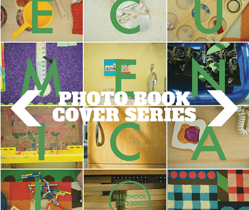
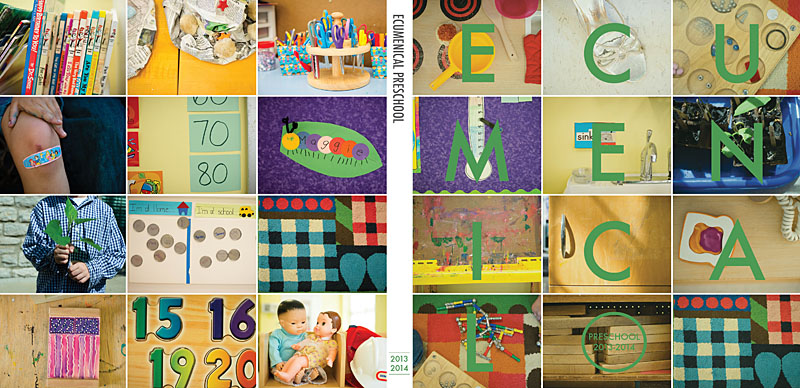
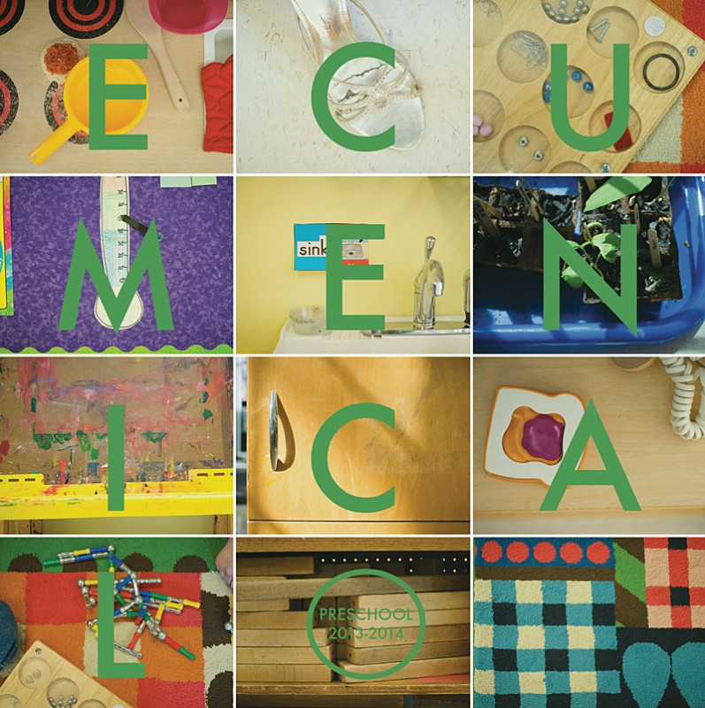
Over the last month, I’ve been working on a special book documenting my son’s preschool friends and activities. Inspired by a current issue of Bon Appetit magazine, I immediately knew that I wanted to capture small details – toys, art supplies, and objects – to make a vibrant and colorful cover. I used a grid of photos with a letter over each one spelling out the name of his school.


For my upcoming Photo Book Design Workshop, I’m going to reveal my entire process on making this photo book. I’ll show you:
- my inspiration
- my pre-book planning
- my photography set-up
- my photo selection
- my photo editing
- my book design
- my final book order
- the final book!
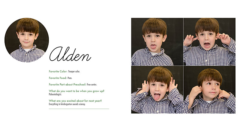
I’m holding an hour group call where you can ask me questions including how my process relates to your book project. It’s going to be so much fun, I can’t wait. Here’s a sample page from the photo book.

To sign up for this amazing opportunity, register at The Photographer Within.
Want more details, check out my FAQs.
Workshop starts June 9th so don’t delay!!! I look forward to seeing you in the workshop!
by Stacey Wiseman | Mar 19, 2014 | Photo Book Design Layout
This is the first of a new blog series I affectionately call: Good, Better, Best.
In these posts, I’ll show how to improve upon a layout. For this example, I’m focusing on the page or section titles.
Good.
I start with a title all in the same font, same line. In this case the font is a size that fills the negative space. It spans over the gutter. But it seems a little boring.

Better.
Then I decide, I want it the text to expand to two lines. This will add a vertical dimension to the title. It’s better…but I still think there’s room to improve.

Best.
I decide to adjust the tracking in the top line and decrease the size of the font in the second line. This creates a very subtle contrast which adds a bit of interest on the page.

This is a great way to adjust how you are using the font on the section pages of your photo book.
If you enjoyed one of the layouts, make sure you pin it…or share on your Facebook page.
[fbshare url=”https://www.bookthisproject.com/2014/03/good-better-best-using-titles-in-a-layout/” type=”button”]
