by Stacey Wiseman | Feb 21, 2014 | Cover Series, Design Series, Photo Book Design Layout
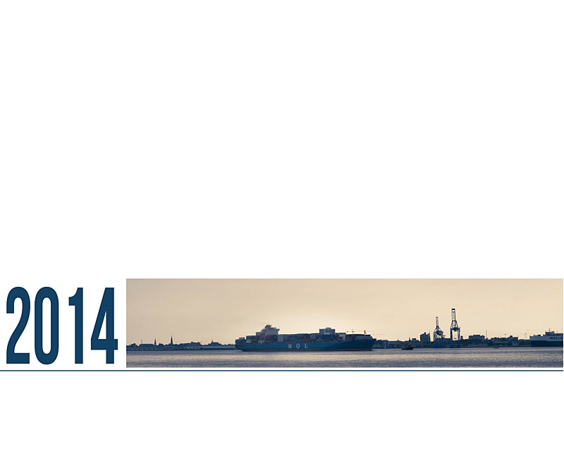
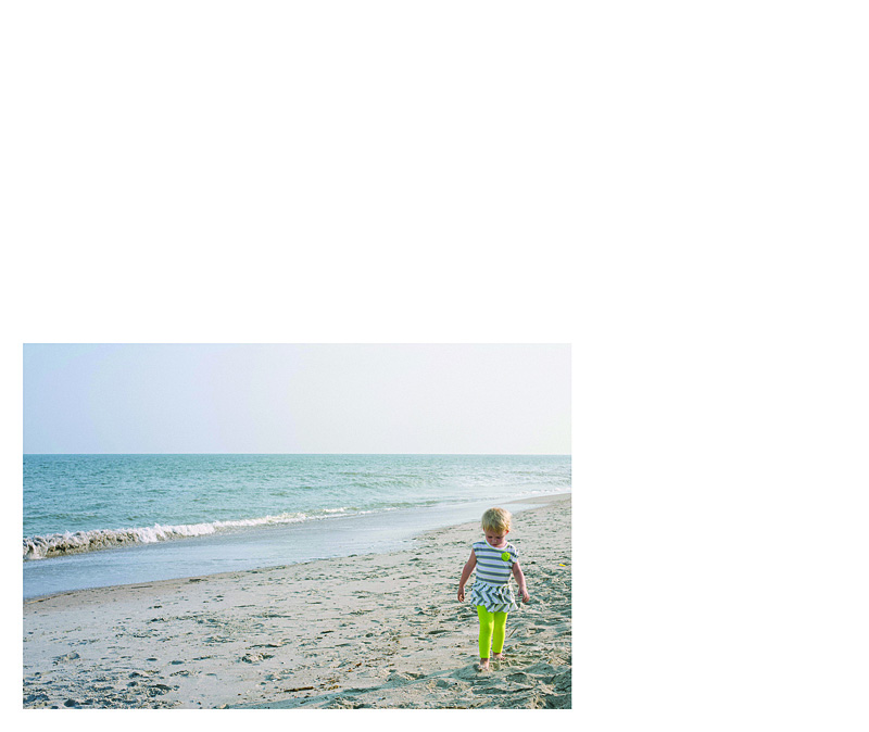
This very simple photo book cover design takes a photo documenting a cargo boat slowly moving freight into a very linear photo. The proportions of the photo have been adjusted to capture the horizon. In this example, the year title fills in the gap to complete the band across the lower half of the cover. A thin blue line underneath the title and the photo really connects the two. It’s simple yet bold.

by Stacey Wiseman | Feb 19, 2014 | Photo Book Design Layout, Q&A, Tutorial

Question: What is a spread?
[divider] Answer: Oh – great question! This is a little more technical of a question when it comes to the book design process. If you are brand new to making, designing or custom design services for photo books, you may come across this term and think, “What in the world is a spread?”
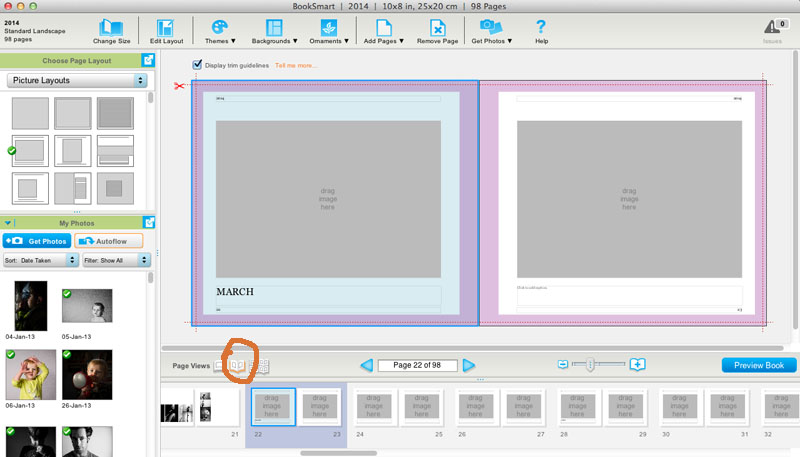
[divider] With books, a spread refers to the pages of a book laid open with both the left and right page showing.
[divider] So why is this important…well, when you are designing books, the typical default is usually to see and design one page at a time.
[divider]
[divider] But, why would we design one page at a time when we actually see the pages together when we are experiencing the actual book. You’ll see great improvements in your layout design when you can design with the spread in mind.
[divider] Yep, paying attention to a book spread, immediately ups the game on your photo book layouts!
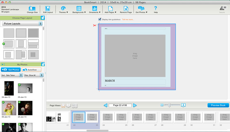
[Click it Tweet][divider] Look for a tool to view the spread as you are designing.
[divider]

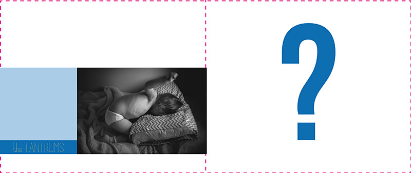
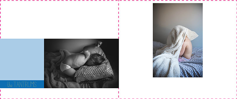
[divider] Without paying attention to the spread, you could design a layout that looks like this:
[divider

[divider] Not terrible…but it could be better. Nothing feels together and well-thought out with this design.
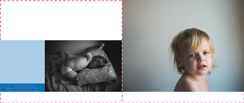
[divider] By paying attention to both the left and right page, we can begin to align the bottom edge of the photo to create a layout like this:
[divider]

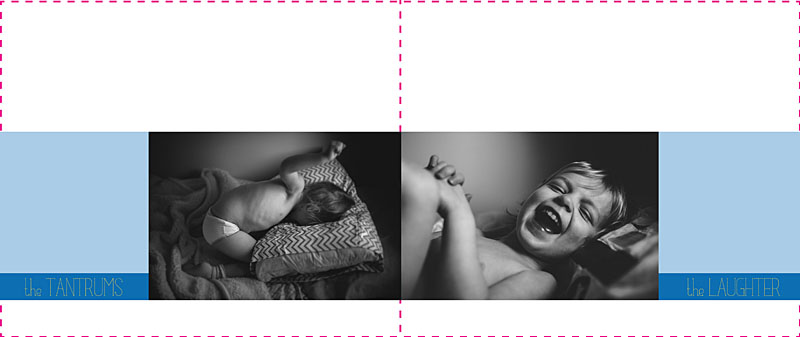
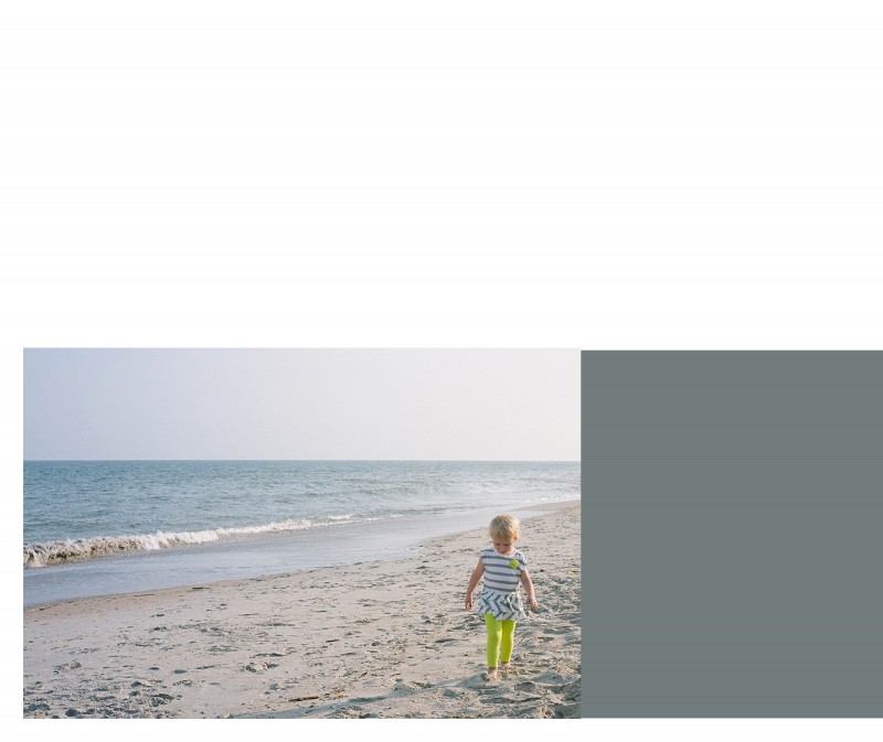
[divider] And if we are really looking for a layout that fully considers the spread and create a story between the two pages, we could create a layout like this:
[divider]

[divider] All because I was designing with the spread in mind.
[divider] I’d love to hear from you, what question do you have about book design? Leave your question in the comments below!
by Stacey Wiseman | Feb 17, 2014 | Photo Book Design Layout, Tutorial
Our winter has been pretty normal up until the start of the new year. January and the start of February has brought a lot of cold, snow and ice. In our neck of the wood, this means a lot of snow days. After it hit double digits of ‘snow days’ from school, the winter blues started to settle in.
[divider] But this
little pin gave me hope that spring is around the corner.
[divider] The Pantone 2014 Spring Colors.
[divider] First, if you’re not following my pin boards,
hop on over and check out my boards! Especially my
color board, where this special pin found it’s way onto.
[divider] Second, when I come across little gems like this, I try to brainstorm fantastic ways to utilize this in my book design. I absolutely love finding ‘pins’ to inspire elements within my books – whether I’m designing for myself or for others.
[divider] In this Design Tutorial, I look at 5 creative ways to use these colors to brighten up your book.
[divider] It can be the colors in a quote:

[divider] Or in a graphic:

[divider] In a color block:

[divider] A patterned graphic:
[divider] Or a neutral color block with a colorful border:
by Stacey Wiseman | Feb 14, 2014 | Cover Series, Photo Book Design Layout
Happy Valentine’s Day!
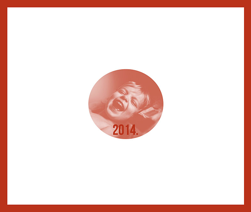
This photo book cover design is all about red and love. Well, because I love this photo of my daughter!
Here I’ve outlined the edge of the cover with a bold red color. Then I used the same color value to create a color fill layer in Photoshop over the photo. I adjusted the layer to “Screen” mode and saved. There you have it. A simple red-inspired photo book cover for Valentine’s Day!

by Stacey Wiseman | Jan 31, 2014 | Cover Series, Design Series, Photo Book Design Layout
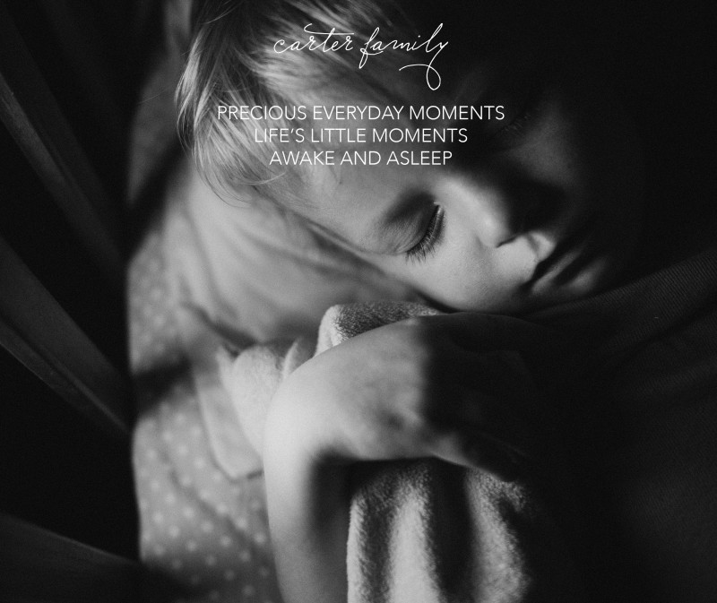
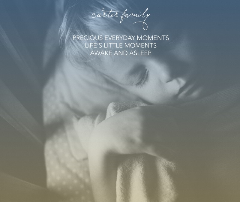
I love sleeping photos of children. It’s so calming to watch your children sleep. I wanted to take this delicate photo and use it for a cover on a photo book. This was actually a vertical orientation photo that I used in a landscape cover. I had enough space at the top and bottom of the photo to make it work.
I started with this…

[divider] But soon realized, I wanted a little bit more to this cover. Something a little un-orthodox. So I applied a dual color gradient and reduced the opacity for a subtle effect.

[divider] Which one do you prefer?
by Stacey Wiseman | Jan 17, 2014 | Cover Series, Photo Book Design Layout
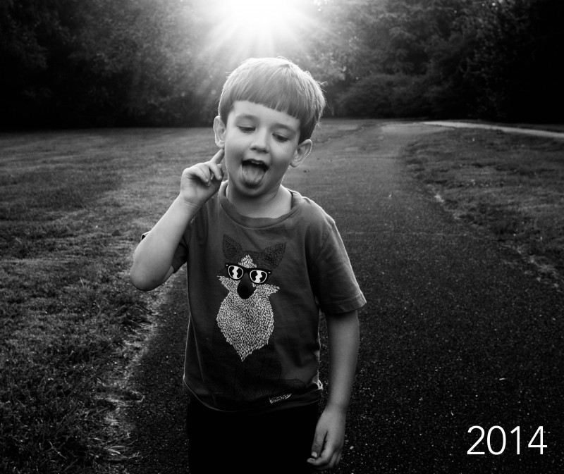
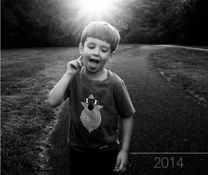
Today’s photo book cover design takes a prominent photo and stretches it over the entire cover. Because the sun was prominently placed at the upper edge, I wanted the year to occur along the bottom edge.

[divider] I started with this image above. Which I liked…but I thought the white was almost too bright for this photo. The “2014” was a (very) slight distraction in the lower right corner, pulling me away from the sun and my son’s face.
So in the version below, I changed the opacity of the date. This allowed it to fade into the background.

[divider] Of course there is no right or wrong answer. To me, the first version, the year is prominently displayed. If it’s important to have that announcement, it makes sense that this would be a white text (and could maybe increase in size). If you wanted a cover that is more about the photo and less about the book title or year, the second version is the one to go with. In this example, you have to almost discover the title of the book.
In this final photo, I wanted to demonstrate that the text of the year, is centered between my son’s hand and the edge of the book. To make sure, I used a line tool to map out the entire distance. Then I centered the text and aligned the center of the text box with the center of the line. You could always create a text box that is the full dimension you want, then center the text…the line just helps to illustrate the point!

[divider] Pin your favorite version and share with your friends!
by Stacey Wiseman | Dec 9, 2013 | Photo Book Design Layout, Podcast, Tutorial
Procrastinators Unite!!! Yes, there is still time to design a book before the end of the year. You can do this!
If you’ve put it off or recently decided you wanted a photo book or looking for a quick way to design a book…this podcast is for you!
In this month’s podcast, I outline 3 different ways you can design a book in 1 hour. …or 1-3 hours.
And if you decide you want your photo book before Christmas, here’s a calendar illustrating the different companies and dates you need to know!
2013_12_BTP podcast_1hr book from Stacey Wiseman on Vimeo.
by Stacey Wiseman | Nov 19, 2013 | Design Series, Photo Book Design Layout
This is the third and final tutorial in this series about one photo per page.
First, I described the various layout options available with only one photo box on the page.
Second, I showed how to add color to these layouts.
Today, I’m going to show how to add text to the layouts.
Let’s look at four ways to add text:
(and don’t forget to pin any layouts you enjoy to your pin board!)
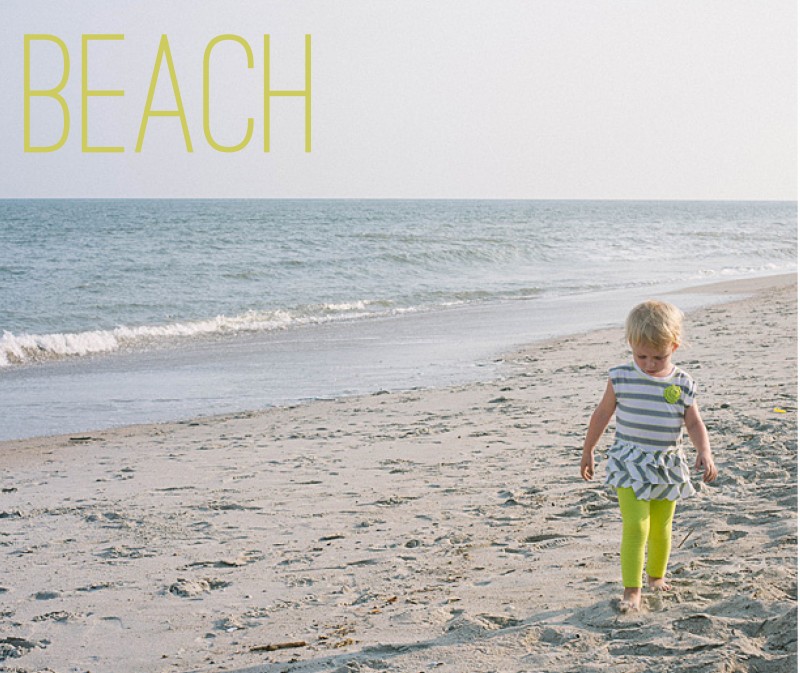
1. Title
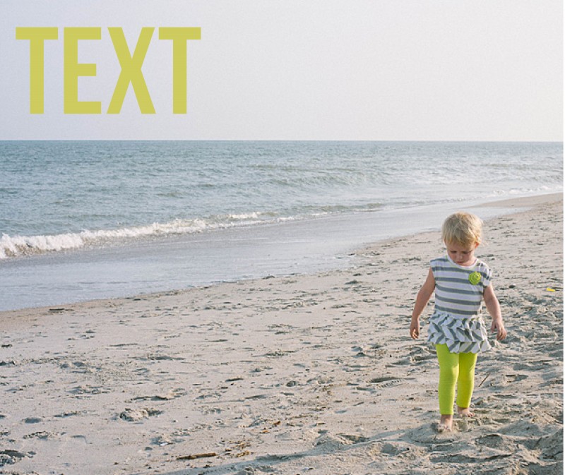
For this title, I used a slim font and the color in her pants. The yellowish color does stand out from the blue of the ocean to make a nice contrast on the page. It’s simple, descriptive, to the point.

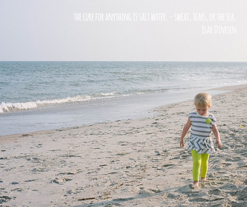
2. Quote
The quote is in a white font, so it does not detract from the overall image. Although I will agree that the color choice could be a little more dramatic, maybe a light gray, to make the quote stand out a little more. Quotes can be a fun way to describe the event without having to come up with a lot of words.

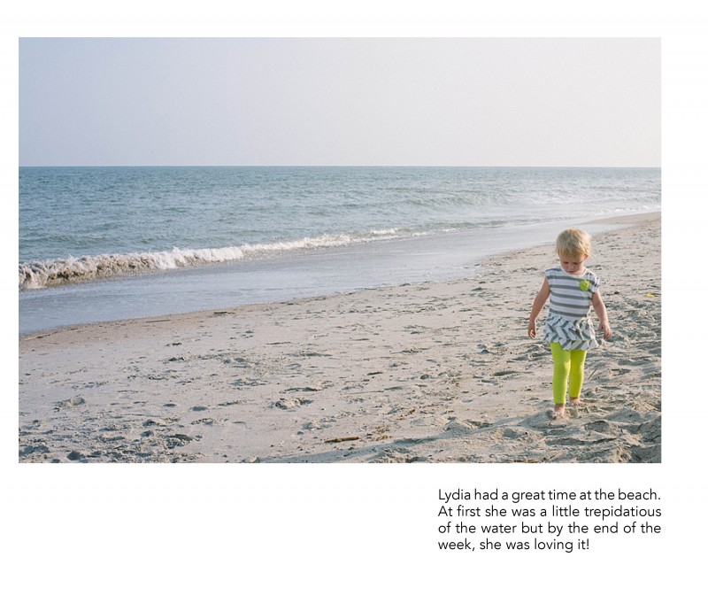
3. Caption
This example uses a right aligned text box directly under the subject. There is definitely more weight to the right side of the page but I think the ocean is enough to act as a backdrop and it really takes your attention to the subject.

4. Text
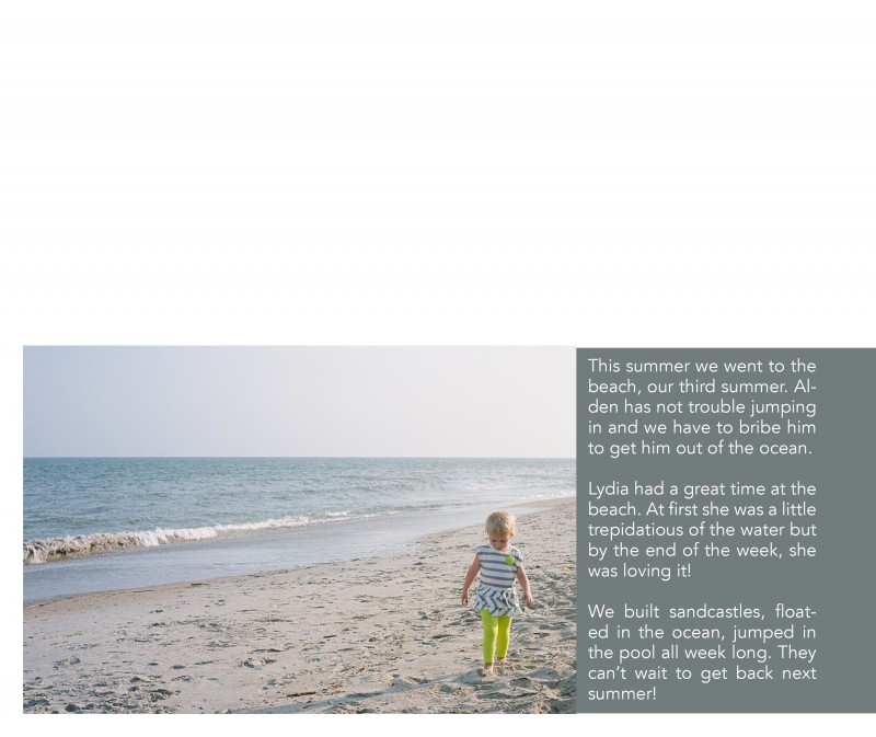
Including a little bit longer of a text or description can work really well for your photo book too! In this example, I placed the text in a color bar so it reads as a seamless bar running along the bottom of the page. There is a lightness from the negative space at the top of the page, yet it is still informative and colorful. I used a simple font in white to contrast against the dark background.

Leave a comment below with your favorite way to incorporate text in your photo book!
[divider]
by Stacey Wiseman | Oct 17, 2013 | Photo Book Design Layout, Tutorial
Last month, you may remember my blog post about creating a photo book layout with a single photo on the page. This month, I want to share how to incorporate color onto those layouts.
There are several difference options when it comes to adding text to your page.
1. Color Font in the Title
For this layout, I used a bold font with color that picks up on the color of my daughter’s leggings. In this example, the title is in an opposite direction of her pants, so it balances out the layout. The color of her leggings is not the greatest (I should have picked a different color of leggings for her…but she has a fashion mind all her own!) but this should give you an idea of how to incorporate a bright color without it overwhelming the page.

2. Background Color
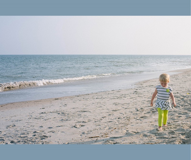
In this example, the color of the ocean is a subtle background color. Since this is a two bleed layout option, there is minimal space on the top and bottom of the photo. This color adds a nice touch to fill some of the void, while still keeping it a simple one-photo layout.

3. Background with a Border.
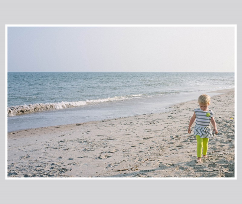
In this example, I used a neutral color of the sand (just above her head) to create a background color. Then I used a thicker white border to get the photo to stand out a little more on the page. This is a way to keep the color palette simple, yet in tones from the photo.

4. Color Block.
For some pages, you may want to include a small touch of color without it extending the entire page. You can easily add photo caption in this color space or leave it blank. In this example, I used a more blue-gray tone from her shirt that I think picks up nicely to the ocean, without it being ‘ocean blue.’

Leave a comment below letting me know your favorite way to add color to your layouts!
by Stacey Wiseman | Sep 21, 2013 | Photo Book Design Layout, Tutorial

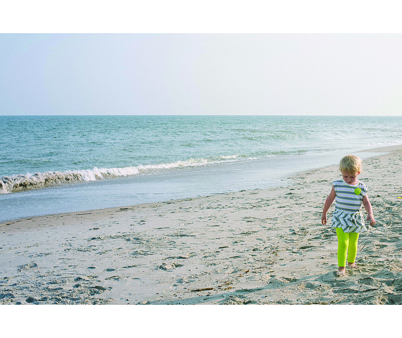
[divider] One key for a simple, elegant photo book is to have a few images – even just one photo – per page. Not every page has to have just one photo per page, but it is a great way to highlight photos and break up the monotony of page after page full of photos. I like to think of it as adding a deep breath to your photo book.
Even though it sounds really simple, one photo on a page – done, I wanted to prepare a design tutorial for you to explain there are actually quite a bit of options when it comes to having just one photo per page. Take a look at my examples below. Determine what you like and try them out in your photo book!
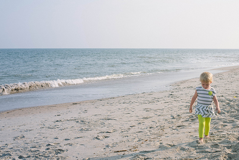
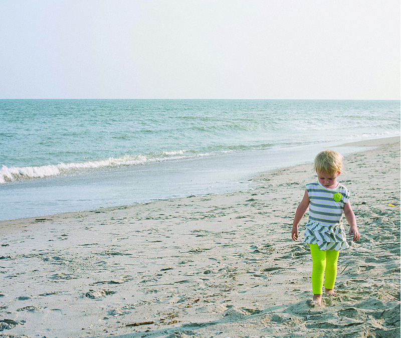
Let’s start with the photo!

[divider] Now the layouts!
1 – Full Page Bleed
If you want your photo to extend off the page on all sides, this is called a bleed. The photo will have to be slightly larger than the page size to ensure when they cut the page, there is no white page at any part of the edge.
One thing to notice, this photo is a 2:3 crop but the page size is a 4:5. This means a portion of the photo will be cut off.

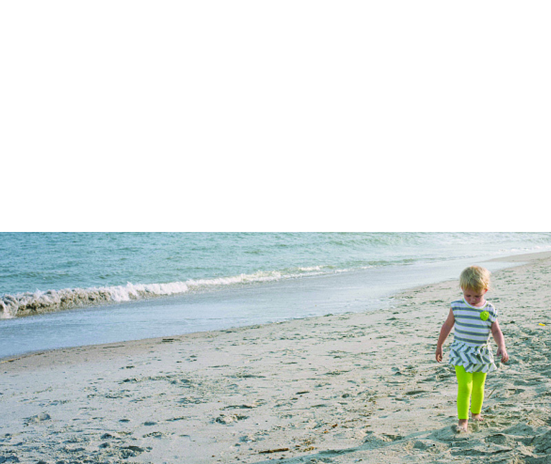
2 – Two Edge Bleed
Another option you have is to bleed the photo on one or two sides. With this option, you will be able to see the entire photo and you will have some white space on the top and bottom. If this was a vertical photo, you would have white space on either side of the photo.

3 – Three Edge Bleed
In this example, I pushed the photo all the way to the bottom of the page so there is a three edge bleed. I also forced the top edge of the photo down to cut off the sky. I did this because the top edge is in center of the page.

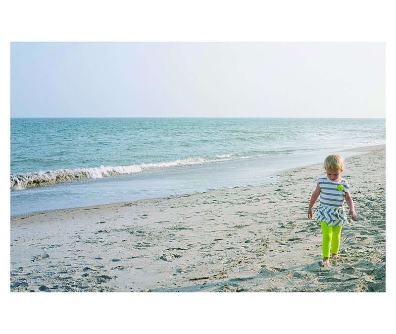
4 – Large Photo
This option is great if you want the photo to be large but not extend off the page, I recommend maintaining the 2:3 proportion as large as it will fill on the page with at least a 1/2″ margin. Center the image or if you have a designed margin, place the photo to this line.

5 – Designed Margin
If you have a designed margin, place the photo to this line. In this example, there is larger white space to the top of the image. This may look a little odd with one page, but if you are consistent and use this margin on a large number of pages, it defines the particular look you have for your book.

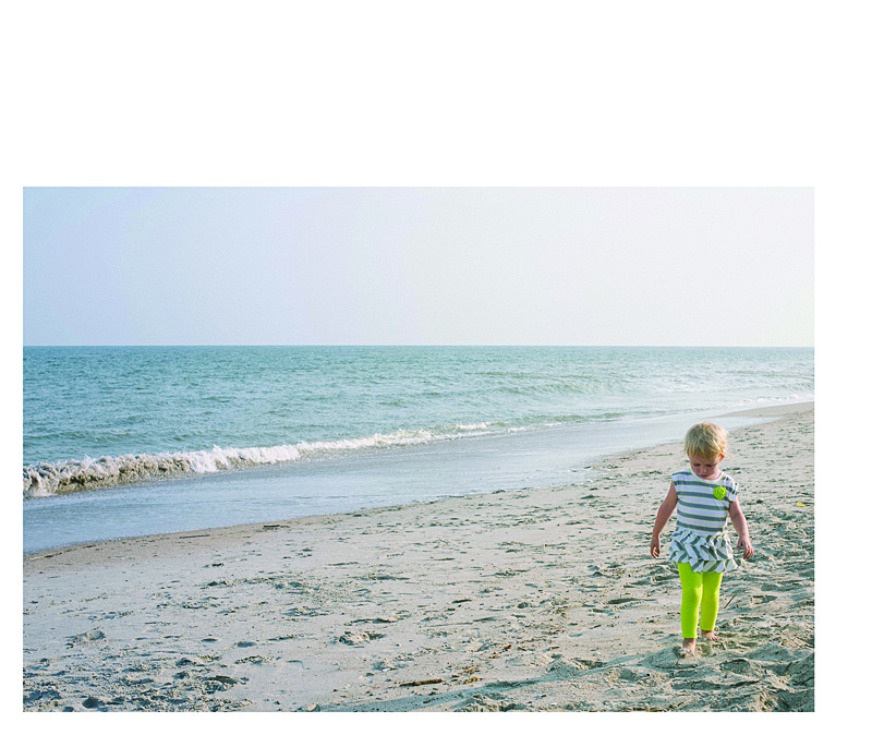
6 – Negative Space
You can make a large impact by reducing the photo and having a lot negative space on the page. This option may look best with particular photos but don’t be afraid to a single photo on the page small. Embrace negative space!

I hope you enjoyed these examples. Next month, I’ll show you how to add color to your single photo page layouts!

